第7章 企業とその顧客
Themes and capstone units
How a profit-maximizing firm producing a differentiated product interacts with its customers
- Firms producing differentiated products choose price and quantity to maximize their profits, taking into account the product demand curve and the cost function.
- Technological and cost advantages of large-scale production favour large firms.
- The responsiveness of consumers to a price change is measured by the elasticity of demand, which affects the firm’s price and profit margin.
- The gains from trade are shared between consumers and firm owners, but prices above marginal cost cause market failure and deadweight loss.
- Firms can increase profit through product selection and advertising. Those with fewer competitors can achieve higher profit margins, and monopoly rents.
- Economic policymakers use elasticities of demand to design tax policies, and reduce firms’ market power through competition policy.
Ernst F. Schumacher’s Small is Beautiful, published in 1973, advocated small-scale production by individuals and groups in an economic system designed to emphasize happiness rather than profits.1 In the year the book was published, the firms Intel and FedEx each employed only a few thousand people in the US. Forty years later, Intel employed around 108,000 people, and FedEx more than 300,000. Walmart had around 3,500 employees in 1973. In 2016 it employed 2.3 million.
Most firms are much smaller than this, but in all rich economies, most people work for large firms. In the US, 52% of private-sector employees work in firms with at least 500 employees. Firms grow because their owners can make more money if they expand, and people with money to invest get higher returns from owning stock in large firms. Employees in large firms are also paid more. Figure 7.1 shows the growth of some highly successful US firms.
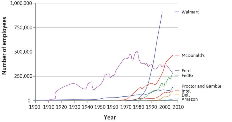
Firm size in the US: Number of employees (1900–2006).
Firm size in the US: Number of employees (1900–2006).
Figure 7.1 Firm size in the US: Number of employees (1900–2006).
Erzo G. J. Luttmer. 2011. ‘On the Mechanics of Firm Growth’. The Review of Economic Studies 78 (3): pp. 1042–68.
What strategies can firms use to prosper and grow like the ones in Figure 7.1? The story of the British retailer Tesco, founded in 1919 by Jack Cohen, suggests one answer.
Jack Cohen, the founder of Tesco, began as a street market trader in the East End of London. The traders would gather at dawn each day and, at a signal, race to their favourite stall site, known as a pitch. Cohen perfected the technique of throwing his cap to claim the most desirable pitch. In the 1950s, Cohen began opening supermarkets on the US model, adapting quickly to this new style of operation. Tesco became the UK market leader in 1995, and now employs almost half a million people in Europe and Asia.
Today Tesco’s pricing strategy aims to appeal to all segments of the market, labelling some of its own-brand products as Finest, and others as Value. The BBC Money Programme summarized the three Tesco commandments as ‘be everywhere’, ‘sell everything’, and ‘sell to everyone’.
‘Pile it high and sell it cheap,’ was Jack Cohen’s motto. He started as a street trader in the East End of London, and opened his first store 10 years later. Today, £1 in every £9 spent in a shop in the UK is spent in a Tesco store, and the company expanded worldwide in the 1990s. In 2014 Tesco had higher profits than any other retailer in the world except Walmart. Keeping the price low as Cohen recommended is one possible strategy for a firm seeking to maximize its profits: even though the profit on each item is small, the low price may attract so many customers that total profit is high.
Other firms adopt quite different strategies. Apple sets high prices for iPhones and iPads, increasing its profits by charging a price premium, rather than lowering prices to reach more customers. For example, between April 2010 and March 2012, profit per unit on Apple iPhones was between 49% and 58% of the price. During the same period, Tesco’s operating profit per unit was between 6.0% and 6.5%.
A firm’s success depends on more than getting the price right. Product choice and ability to attract customers, produce at lower cost and at a higher quality than their competitors all matter. They also need to be able to recruit and retain employees who can make all these things happen.
Figure 7.2 illustrates key decisions that a firm makes. In this unit, we will focus particularly on how a firm chooses the price of a product, and the quantity to produce. This will depend on the demand it faces—that is, the willingness of potential consumers to pay for its product—and its production costs.
The demand for a product will depend on its price, and the costs of production may depend on how many units are produced. But a firm can actively influence both consumer demand and costs in more ways than through price and quantity. As we saw in Unit 2, innovation may lead to new and attractive products, or to lower production costs. If the firm can innovate successfully it can earn economic rents—at least in the short term until others catch up. Further innovation may be needed if it is to stay ahead. Advertising can increase demand. And as we saw in Unit 6, the firm sets the wage, which is an important component of its cost. As we will see in later units, the firm also spends to influence taxes and environmental regulation in order to lower its production costs.
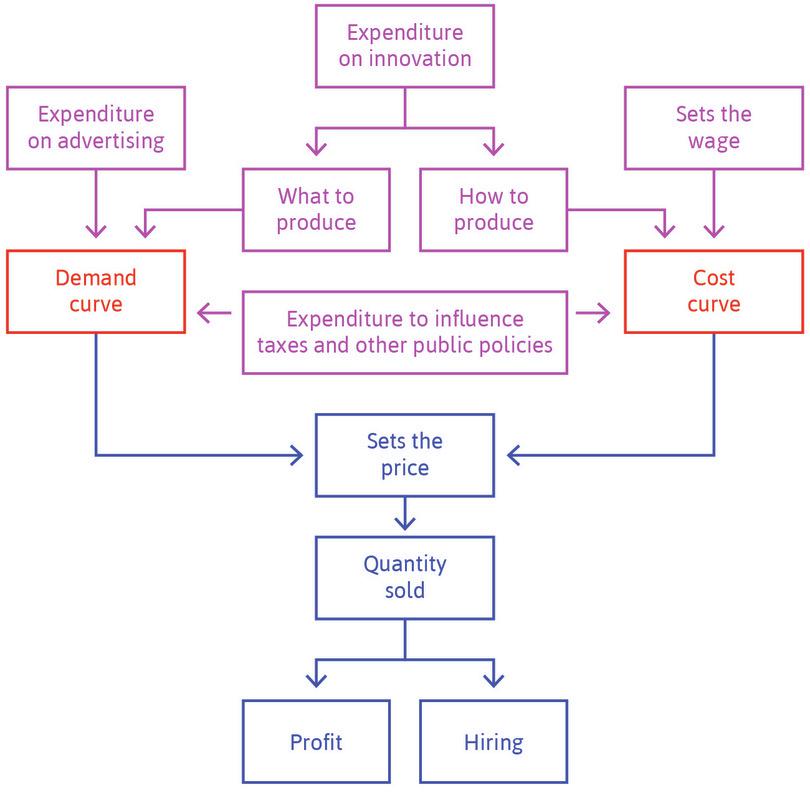
The firm’s decisions.
The firm’s decisions.
Figure 7.2 The firm’s decisions.
7.1 Breakfast cereal: Choosing a price
- demand curve
- The curve that gives the quantity consumers will buy at each possible price.
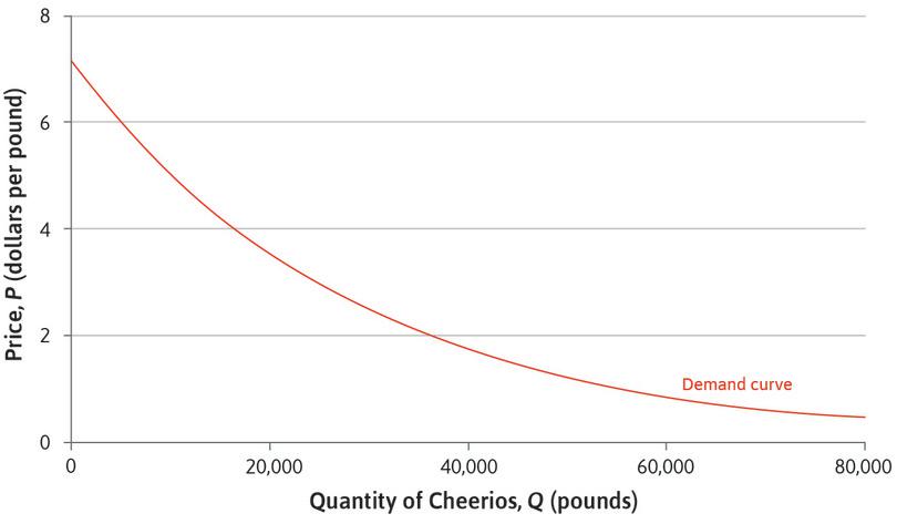
To decide what price to charge, a firm needs information about demand: how much potential consumers are willing to pay for its product. Figure 7.3 shows the demand curve for Apple-Cinnamon Cheerios, a ready-to-eat breakfast cereal introduced by the company General Mills in 1989. In 1996, Jerry Hausman, an economist, used data on weekly sales of family breakfast cereals in US cities to estimate how the weekly quantity of cereal that customers in a typical city would wish to buy would vary with its price per pound (there are 2.2 pounds in 1 kg). For example, you can see from Figure 7.3 that if the price were $3, customers would demand 25,000 pounds of Apple-Cinnamon Cheerios. For most products, the lower the price, the more customers wish to buy.
How economists learn from facts Estimating demand curves using surveys
Jerry Hausman used data on cereal purchases to estimate the demand curve for Apple-Cinnamon Cheerios. Another method, particularly useful for firms introducing completely new products, is a consumer survey. Suppose you were investigating the potential demand for space tourism. You could try asking potential consumers:
‘How much would you be willing to pay for a 10-minute flight in space?’
But they may find it difficult to decide, or worse, they may lie if they think their answer will affect the price eventually charged. A better way to find out their true willingness to pay might be to ask:
‘Would you be willing to pay $1,000 for a 10-minute flight in space?’
In 2011, someone did this, so now we know the consumer demand for space flight.2
Whether the product is cereal or space flight, the method is the same. If you vary the prices in the question, and ask a large number of consumers, you would be able to estimate the proportion of people willing to pay each price. Hence you can estimate the whole demand curve.
Estimated demand for Apple-Cinnamon Cheerios.
Estimated demand for Apple-Cinnamon Cheerios.
Figure 7.3 Estimated demand for Apple-Cinnamon Cheerios.
Adapted from Figure 5.2 in Jerry A. Hausman. 1996. ‘Valuation of New Goods under Perfect and Imperfect Competition’. In The Economics of New Goods, pp. 207–248. Chicago, IL: University of Chicago Press.
If you were the manager at General Mills, how would you choose the price for Apple-Cinnamon Cheerios in this city, and how many pounds of cereal would you produce?
You need to consider how the decision will affect your profits (the difference between sales revenue and production costs). Suppose that the unit cost (the cost of producing each pound) of Apple-Cinnamon Cheerios is $2. To maximize your profit, you should produce exactly the quantity you expect to sell, and no more. Then revenue, costs, and profit are given by:
So we have a formula for profit:
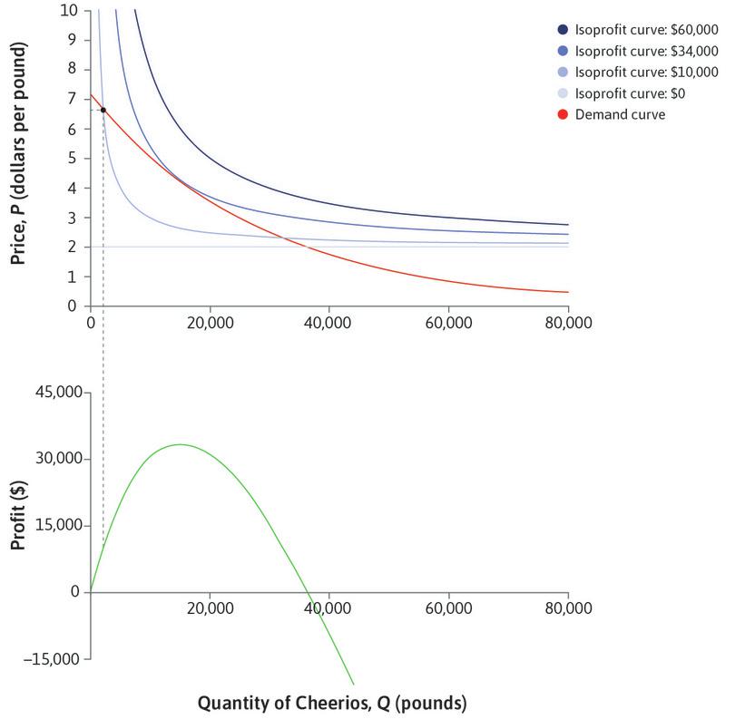
Using this formula, you could calculate the profit for any choice of price and quantity and draw the isoprofit curves, as in Figure 7.4. Just as indifference curves join points in a diagram that give the same level of utility, isoprofit curves join points that give the same level of total profit. We can think of the isoprofit curves as the firm’s indifference curves: the firm is indifferent between combinations of price and quantity that give you the same profit.
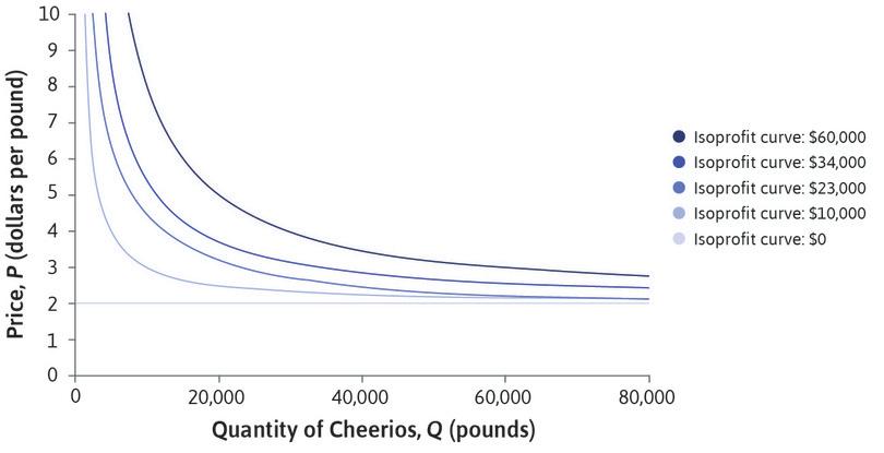
Isoprofit curves for the production of Apple-Cinnamon Cheerios. Note: Isoprofit data is illustrative only, and does not reflect the real-world profitability of the product.
Isoprofit curves for the production of Apple-Cinnamon Cheerios. Note: Isoprofit data is illustrative only, and does not reflect the real-world profitability of the product.
Figure 7.4 Isoprofit curves for the production of Apple-Cinnamon Cheerios. Note: Isoprofit data is illustrative only, and does not reflect the real-world profitability of the product.
Isoprofit curves
The graph shows a number of isoprofit curves for Cheerios.
Figure 7.4a The graph shows a number of isoprofit curves for Cheerios.
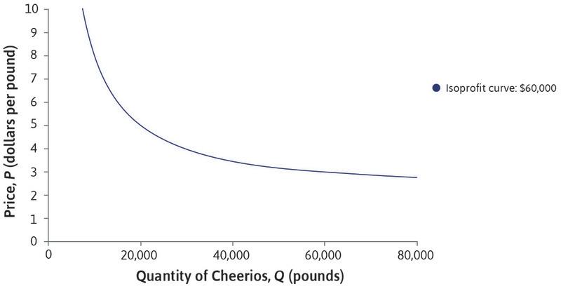
Isoprofit curve: $60,000
You could make $60,000 profit by selling 60,000 pounds at a price of $3, or 20,000 pounds at $5, or 10,000 pounds at $8, or in many other ways. The curve shows all the possible ways of making $60,000 profit.
Figure 7.4b You could make $60,000 profit by selling 60,000 pounds at a price of $3, or 20,000 pounds at $5, or 10,000 pounds at $8, or in many other ways. The curve shows all the possible ways of making $60,000 profit.
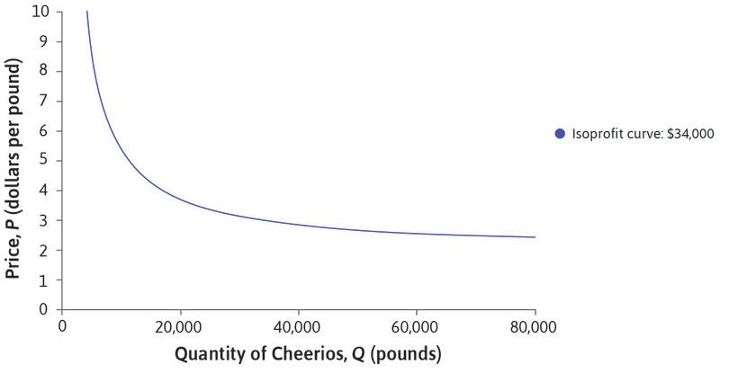
Isoprofit curve: $34,000
The $34,000 isoprofit curve shows all the combinations of P and Q for which profit is equal to $34,000.
Figure 7.4c The $34,000 isoprofit curve shows all the combinations of P and Q for which profit is equal to $34,000.
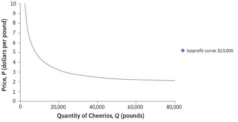
Isoprofit curve: $23,000
The isoprofit curves nearer to the origin correspond to lower levels of profit.
Figure 7.4d The isoprofit curves nearer to the origin correspond to lower levels of profit.
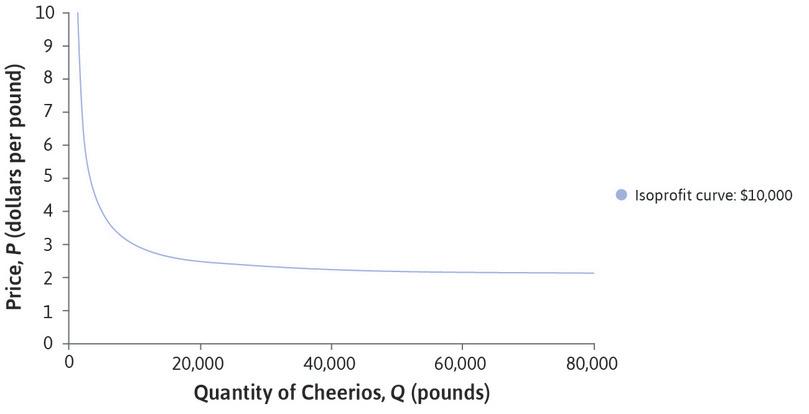
Isoprofit curve: $10,000
The cost of each pound of Cheerios is $2, so profit = (P − 2) × Q. This means that isoprofit curves slope downward. To make a profit of $10,000, P would have to be very high if Q was less than 8,000. But if Q = 80,000 you could make this profit with a low P.
Figure 7.4e The cost of each pound of Cheerios is $2, so profit = (P − 2) × Q. This means that isoprofit curves slope downward. To make a profit of $10,000, P would have to be very high if Q was less than 8,000. But if Q = 80,000 you could make this profit with a low P.
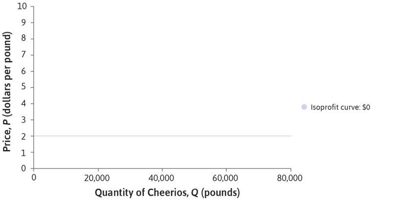
Zero profits
The horizontal line shows the choices of price and quantity where profit is zero: if you set a price of $2, you would be selling each pound of cereal for exactly what it cost.
Figure 7.4f The horizontal line shows the choices of price and quantity where profit is zero: if you set a price of $2, you would be selling each pound of cereal for exactly what it cost.
Question 7.1 Choose the correct answer(s)
A firm’s cost of production is £12 per unit of output. If P is the price of the output good and Q is the number of units produced, which of the following statements is correct?
- At (Q, P) = (2,000, 20), profit = (20 – 12) × 2,000 = £16,000.
- At (Q, P) = (1,200, 24), profit = (24 – 12) × 1,200 = £14,400. At (Q, P) = (2,000, 20), profit = (20 – 12) × 2,000 = £16,000. Therefore, (2,000, 20) is on a higher isoprofit curve.
- At (Q, P) = (2,000, 20), profit = (20 – 12) × 2,000 = £16,000. At (Q, P) = (4,000, 16), profit = (16 – 12) × 4,000 = £16,000. Therefore, these two points are on the same isoprofit curve.
- At P = 12 the firm makes no profit. Therefore (5,000, 12) will be on a horizontal isoprofit curve representing zero profit.
Question 7.2 Choose the correct answer(s)
Consider a firm whose unit cost (the cost of producing one unit of output) is the same at all output levels. Which of the following statements are correct?
- An isoprofit curve joins all combinations of price and output for which the firm’s profit is the same.
- If profit is high, the price must be above the unit cost. Then if output is increased, the price has to be reduced to keep the profit level constant. Therefore, isoprofit curves must slope downward.
- You can calculate the profit for any combination of price and quantity, and draw an isoprofit curve through it by finding other points that give the same profit.
- If the price is above the unit cost, then if output is increased the price must be lowered to keep profit constant, so isoprofit curve slopes downward.
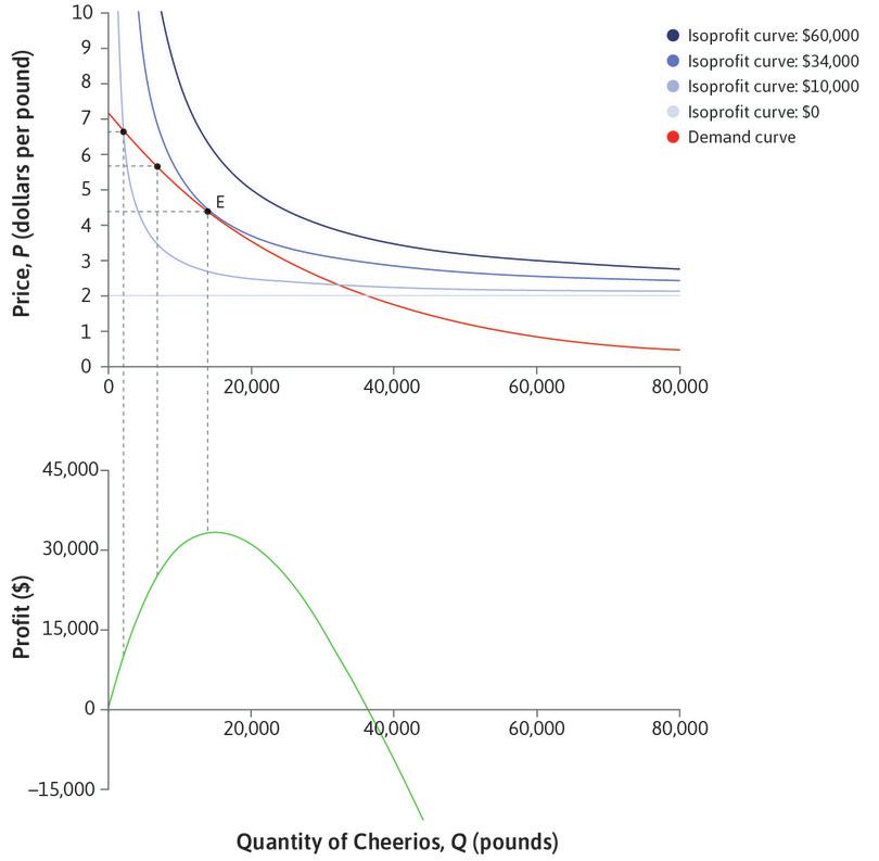
To achieve a high profit, you would like both price and quantity to be as high as possible, but you are constrained by the demand curve. If you choose a high price, you will only be able to sell a small quantity; and if you want to sell a large quantity, you must choose a low price.
The demand curve determines what is feasible. Figure 7.5a shows the isoprofit curves and demand curve together. You face a similar problem to Alexei, the student in Unit 3, who wanted to choose the point in his feasible set where his utility was maximized. You want to choose a feasible price and quantity combination that will maximize your profit.
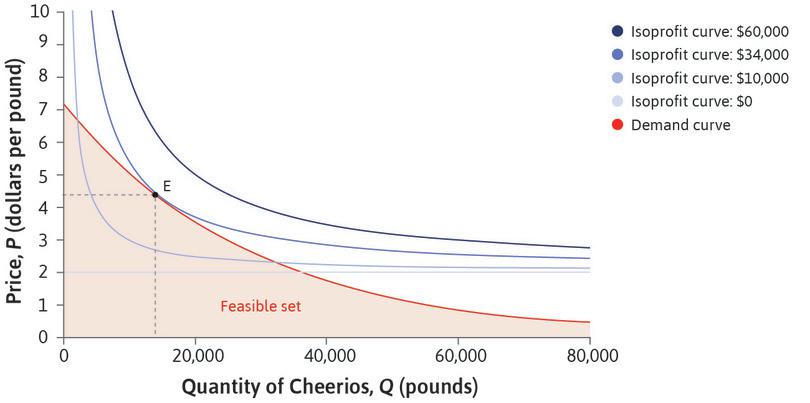
The profit-maximizing choice of price and quantity for Apple-Cinnamon Cheerios.
Figure 7.5a The profit-maximizing choice of price and quantity for Apple-Cinnamon Cheerios.
Demand curve data from Jerry A. Hausman. 1996. ‘Valuation of New Goods under Perfect and Imperfect Competition’. In The Economics of New Goods, pp. 207–248. Chicago, IL: University of Chicago Press.

The profit-maximizing choice
The manager would like to choose a combination of P and Q on the highest possible isoprofit curve in the feasible set.
Figure 7.5aa The manager would like to choose a combination of P and Q on the highest possible isoprofit curve in the feasible set.
Demand curve data from Jerry A. Hausman. 1996. ‘Valuation of New Goods under Perfect and Imperfect Competition’. In The Economics of New Goods, pp. 207–248. Chicago, IL: University of Chicago Press.

Zero profits
The horizontal line shows the choices of price and quantity where profit is zero: if you set a price of $2, you would be selling each pound of cereal for exactly what it cost.
Figure 7.5ab The profit-maximizing choice of price and quantity for Apple-Cinnamon Cheerios.
Demand curve data from Jerry A. Hausman. 1996. ‘Valuation of New Goods under Perfect and Imperfect Competition’. In The Economics of New Goods, pp. 207–248. Chicago, IL: University of Chicago Press.

Profit-maximizing choices
The manager would choose a price and quantity corresponding to a point on the demand curve. Any point below the demand curve would be feasible, such as selling 8,000 pounds of cereal at a price of $3, but you would make more profit if you raised the price.
Figure 7.5ac The manager would choose a price and quantity corresponding to a point on the demand curve. Any point below the demand curve would be feasible, such as selling 8,000 pounds of cereal at a price of $3, but you would make more profit if you raised the price.
Demand curve data from Jerry A. Hausman. 1996. ‘Valuation of New Goods under Perfect and Imperfect Competition’. In The Economics of New Goods, pp. 207–248. Chicago, IL: University of Chicago Press.
Maximizing profit at E
You reach the highest possible isoprofit curve while remaining in the feasible set by choosing point E, where the demand curve is tangent to an isoprofit curve. The manager should choose P = $4.40, and Q = 14,000 pounds.
Figure 7.5ad You reach the highest possible isoprofit curve while remaining in the feasible set by choosing point E, where the demand curve is tangent to an isoprofit curve. The manager should choose P = $4.40, and Q = 14,000 pounds.
Demand curve data from Jerry A. Hausman. 1996. ‘Valuation of New Goods under Perfect and Imperfect Competition’. In The Economics of New Goods, pp. 207–248. Chicago, IL: University of Chicago Press.
Your best strategy is to choose point E in Figure 7.5a: you should produce 14,000 pounds of cereal, and sell it at a price of $4.40 per pound, making $34,000 profit. Just as in the case of Alexei in Unit 3, your optimal combination of price and quantity involves balancing two trade-offs. As manager, we have assumed that you care about profit, rather than any particular combination of price and quantity.
- marginal rate of substitution (MRS)
- The trade-off that a person is willing to make between two goods. At any point, this is the slope of the indifference curve. See also: marginal rate of transformation.
- marginal rate of transformation (MRT)
- The quantity of some good that must be sacrificed to acquire one additional unit of another good. At any point, it is the slope of the feasible frontier. See also: marginal rate of substitution.
- The isoprofit curve is your indifference curve, and its slope at any point represents the trade-off you are willing to make between P and Q—your MRS. You would be willing to substitute a high price for a lower quantity if you obtained the same profit.
- The slope of the demand curve is the trade-off you are constrained to make—your MRT, or the rate at which the demand curve allows you to ‘transform’ quantity into price. You cannot raise the price without lowering the quantity, because fewer consumers will buy a more expensive product.
These two trade-offs balance at the profit-maximizing choice of P and Q.
The manager at General Mills probably didn’t think about the decision in this way.
Perhaps the price was chosen more by trial and error, informed by past experience and market research. But we expect that a firm will find its way, somehow, to a profit-maximizing price and quantity. The purpose of our economic analysis is not to model the manager’s thought process, but to understand the outcome, and its relationship to the firm’s cost and consumer demand.
Even from an economist’s point of view, there are other ways to think about profit maximization. The lower panel of Figure 7.5b shows how much profit would be made at each point on the demand curve.
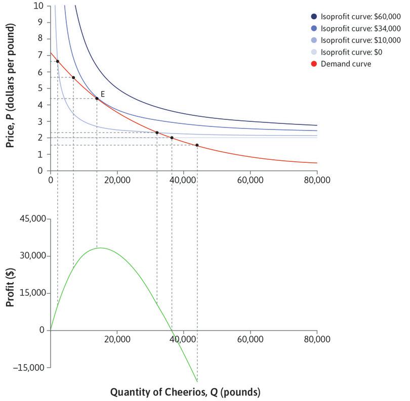
The profit-maximizing choice of price and quantity for Apple-Cinnamon Cheerios.
Figure 7.5b The profit-maximizing choice of price and quantity for Apple-Cinnamon Cheerios.
Demand curve data from Jerry A. Hausman. 1996. ‘Valuation of New Goods under Perfect and Imperfect Competition’. In The Economics of New Goods, pp. 207–248. Chicago, IL: University of Chicago Press.

The profit function
The firm can calculate its profit at each point on the demand curve.
Figure 7.5ba The firm can calculate its profit at each point on the demand curve.
Demand curve data from Jerry A. Hausman. 1996. ‘Valuation of New Goods under Perfect and Imperfect Competition’. In The Economics of New Goods, pp. 207–248. Chicago, IL: University of Chicago Press.
Profit at low quantities
When the quantity is low, so is the profit.
Figure 7.5bb When the quantity is low, so is the profit.
Demand curve data from Jerry A. Hausman. 1996. ‘Valuation of New Goods under Perfect and Imperfect Competition’. In The Economics of New Goods, pp. 207–248. Chicago, IL: University of Chicago Press.

Increasing profits
As quantity increases, profit rises until…
Figure 7.5bc As quantity increases, profit rises until…
Demand curve data from Jerry A. Hausman. 1996. ‘Valuation of New Goods under Perfect and Imperfect Competition’. In The Economics of New Goods, pp. 207–248. Chicago, IL: University of Chicago Press.
Maximum profits
… profit reaches a maximum at E.
Figure 7.5bd … profit reaches a maximum at E.
Demand curve data from Jerry A. Hausman. 1996. ‘Valuation of New Goods under Perfect and Imperfect Competition’. In The Economics of New Goods, pp. 207–248. Chicago, IL: University of Chicago Press.
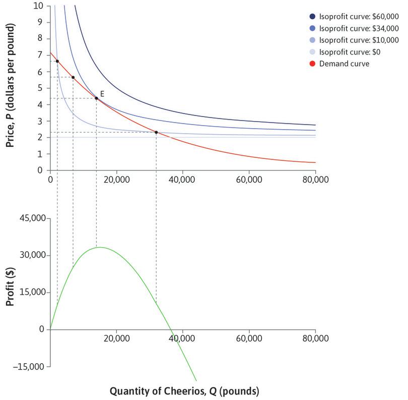
Falling profits
Beyond E the profit falls.
Figure 7.5be Beyond E the profit falls.
Demand curve data from Jerry A. Hausman. 1996. ‘Valuation of New Goods under Perfect and Imperfect Competition’. In The Economics of New Goods, pp. 207–248. Chicago, IL: University of Chicago Press.
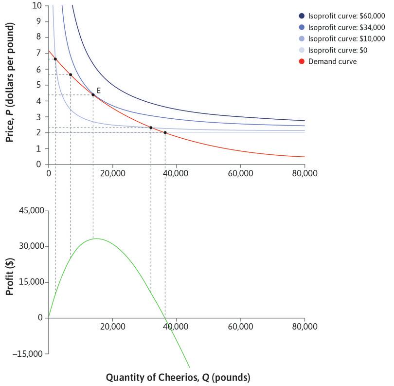
Zero profits
Profit falls to zero when the price is equal to the unit cost, $2.
Figure 7.5bf Profit falls to zero when the price is equal to the unit cost, $2.
Demand curve data from Jerry A. Hausman. 1996. ‘Valuation of New Goods under Perfect and Imperfect Competition’. In The Economics of New Goods, pp. 207–248. Chicago, IL: University of Chicago Press.

Negative profits
To sell a very high quantity, the price has to be lower than the unit cost, so profit is negative.
Figure 7.5bg To sell a very high quantity, the price has to be lower than the unit cost, so profit is negative.
Demand curve data from Jerry A. Hausman. 1996. ‘Valuation of New Goods under Perfect and Imperfect Competition’. In The Economics of New Goods, pp. 207–248. Chicago, IL: University of Chicago Press.
The graph in the lower panel is the profit function: it shows the profit you would achieve if you chose to produce a quantity, Q, and set the highest price that would enable you to sell that quantity, according to the demand function. And it tells us, again, that you would achieve the maximum profit of $34,000 with Q = 14,000 pounds of cereal.
Question 7.3 Choose the correct answer(s)
The table represents market demand Q for a good at different prices P.
| Q | 100 | 200 | 300 | 400 | 500 | 600 | 700 | 800 | 900 | 1,000 |
| P | £270 | £240 | £210 | £180 | £150 | £120 | £90 | £60 | £30 | £0 |
The firm’s unit cost of production is £60. Based on this information, which of the following is correct?
- At Q = 100, profit = (270 – 60) × 100 = £21,000.
- At Q = 400, profit = (180 – 60) × 400 = £48,000. If you calculate the profit for each point on the demand curve you will see that profit is lower at the other points.
- The maximum profit is attained at Q = 400, where profit = (180 – 60) × 400 = £48,000.
- The firm will make a loss (negative profit) at all outputs above 800. At exactly 800, the profit is zero.
Exercise 7.1 Changes in the market
Draw diagrams to show how the curves in Figure 7.5a would change in each of the following cases:
- A rival company producing a similar brand slashes its prices.
- The cost of producing Apple-Cinnamon Cheerios rises to $3 per pound.
- General Mills introduces a local advertising campaign costing $10,000 per week.
To make sketching the curves easier, assume the demand curve is linear. In each case, can you say what would happen to the price and the profit?
7.2 Economies of scale and the cost advantages of large-scale production
Why have firms like Walmart, Intel and FedEx grown so large? An important reason why a large firm may be more profitable than a small firm is that the large firm produces its output at lower cost per unit. This may be possible for two reasons:
-
Technological advantages: Large-scale production often uses fewer inputs per unit of output.
-
Cost advantages: In larger firms, fixed costs such as advertising have a smaller effect on the cost per unit. And they may be able to purchase their inputs at a lower cost because they have more bargaining power.
- economies of scale
- These occur when doubling all of the inputs to a production process more than doubles the output. The shape of a firm’s long-run average cost curve depends both on returns to scale in production and the effect of scale on the prices it pays for its inputs. Also known as: increasing returns to scale. See also: diseconomies of scale.
Economists use the term economies of scale or increasing returns to describe the technological advantages of large-scale production. For example, if doubling the amount of every input that the firm uses triples the firm’s output, then the firm exhibits increasing returns.
- diseconomies of scale
- These occur when doubling all of the inputs to a production process less than doubles the output. Also known as: decreasing returns to scale. See also: economies of scale.
- constant returns to scale
- These occur when doubling all of the inputs to a production process doubles the output. The shape of a firm’s long-run average cost curve depends both on returns to scale in production and the effect of scale on the prices it pays for its inputs. See also: increasing returns to scale, decreasing returns to scale.
Economies and diseconomies of scale
If we increase all inputs by a given proportion, and it:
- increases output more than proportionally, then the technology is said to exhibit increasing returns to scale in production or economies of scale,
- increases output less than proportionally, then the technology exhibits decreasing returns to scale in production or diseconomies of scale,
- increases output proportionally, then the technology exhibits constant returns to scale in production.
Economies of scale may result from specialization within the firm, which allows employees to do the task they do best, and minimizes training time by limiting the skill set that each worker needs. Economies of scale may also occur for purely engineering reasons. For example, transporting more of a liquid requires a larger pipe, but doubling the capacity of the pipe increases its diameter (and the material necessary to construct it) by much less than a factor of two. For proof, check The size and cost of a pipe in the Einstein at the end of this section.
But there are also built-in diseconomies of scale. Think of the firm’s owners, managers, work supervisors and production workers. Suppose that each supervisor can direct 10 production workers, while each manager can direct 10 supervisors. If the firm employs 10 production workers, then the owner can do the management and supervision. If it employs 100 production workers, it needs to add a layer of 10 supervisors. If it grows to 1,000 production workers, it will need to recruit another layer of management to supervise the first layer of supervisors. So increasing production workers requires more than a proportional increase in supervision and management. The only way the firm could increase all inputs proportionally would be to reduce the intensity of supervision, with associated losses in productivity. We’ll call this diseconomy of scale the Dilbert law of firm hierarchy, (after a Dilbert comic strip). See the Einstein at the end of this section for how to calculate the diseconomy of scale that our Dilbert law implies.
Cost advantages
- research and development
- Expenditures by a private or public entity to create new methods of production, products, or other economically relevant new knowledge.
Cost per unit may fall as the firm produces more output, even if there are constant or even decreasing returns to scale. This happens if there is a fixed cost that doesn’t depend on the number of units—it will be the same whether the firm produces one unit, or many. An example would be the cost of research and development (R&D) and product design, acquiring a licence to engage in production, or obtaining a patent for a particular technique. Marketing expenses, such as advertising, are another fixed cost. The cost of a 30-second advertisement during the television coverage of the US Super Bowl football game in 2014 was $4 million, which would only be justifiable if a large number of units would be sold as a result.
A firm’s attempt to gain favourable treatment by government bodies through lobbying, contributions to election campaigns, and public relations expenditures are also a kind of fixed cost. These expenses are more or less independent of the level of the firm’s output.
Secondly, large firms are able to purchase their inputs on more favourable terms, because they have more bargaining power than small firms when negotiating with suppliers.
Demand advantages
- network economies of scale
- These exist when an increase in the number of users of an output of a firm implies an increase in the value of the output to each of them, because they are connected to each other.
Large size may benefit a firm in selling its product, not just in producing it. This occurs when people are more likely to buy a product or service if it already has a lot of users. For example, a software application is more useful when everybody is using a compatible version. These demand-side benefits of scale are called network economies of scale, and there are many examples in technology-related markets.
Because producing large amounts creates economies of scale, reduces costs, and increases demand, large-scale production is a powerful influence on firm size. Production by a small group of people is often too costly to compete with larger firms.
But while small firms typically either grow or die, there are limits to firm growth. We have already seen in Unit 6 that firms may outsource production of components. Firm growth is limited, in part, because sometimes it is cheaper to purchase part of the product than to manufacture it themselves. Apple would be gigantic if it decided that Apple employees would produce the touch screens, chipsets, and other components that make up the iPhone and iPad rather than purchasing these parts from Toshiba, Samsung, and other suppliers. Apple’s outsourcing strategy limits the firm’s size, and increases the size of Toshiba, Samsung, and other firms that produce Apple’s components.
In the next section, we will model the way that a firm’s costs depend on its scale of production.
Question 7.4 Choose the correct answer(s)
Which of the following statements is correct?
- With constant returns, increasing the inputs leads to the same proportional increase in output.
- With decreasing returns, doubling the inputs levels less than doubles output.
- Since the firm can increase output with a less than proportional increase in inputs, its cost per unit will fall.
- With decreasing returns, increasing the inputs leads to a less than proportional increase in output.
Einstein The size and cost of a pipe
We can use simple mathematics to work out how much the cost of making a pipe increases when the area of the cross-section doubles. The formula for the area of a circle is:
Let us assume the area of the pipe was originally 10 cm², and then it was doubled in size to 20 cm². We can use the equation above to find the radius of the pipe in each case.
When the area of the pipe is 10:
When the area of the pipe is 20:
The cost of the material used to make a pipe of given length is proportional to its circumference. The formula for the circumference of a circle is:
When the area of the pipe is 10:
When the area of the pipe is 20:
The pipe has doubled in capacity, but the circumference, and hence the cost, has only increased by a factor of:
We can clearly see that the firm has benefitted from economies of scale.
Diseconomies of scale: CORE’s Dilbert law of firm hierarchy
If every 10 employees at a lower level must have a supervisor at a higher level, then a firm that has 10x production workers (the bottom of the ladder) will have x levels of management, 10x−1 supervisors at the lowest level, 10x−2 at the second lowest level, and so on.
A firm with 1 million (106) production workers will thus have 100,000 (105 = 106−1) lowest-level supervisors. Dilbert did not invent the law. He is too closely watched by his supervisor to have time for that. The CORE team did.
7.3 Production: The cost function for Beautiful Cars
To set the price and the quantity produced for Apple-Cinnamon Cheerios, the manager needed to know the demand function and the production costs. Since we assumed that the cost of producing every pound of Cheerios was the same, the scale of production was determined by the demand for the good. In this section and the next, we will look at a different example, in which costs vary with the level of production.
Consider a firm that manufactures cars. Compared with Ford, which produces around 6.6 million vehicles a year, this firm produces specialty cars and will turn out to be rather small, so we will call it Beautiful Cars.
Think about the costs of producing and selling cars. The firm needs premises (a factory) equipped with machines for casting, machining, pressing, assembling, and welding car body parts. It may rent them from another firm, or raise financial capital to invest in its own premises and equipment. Then it must purchase the raw materials and components, and pay production workers to operate the equipment. Other workers will be needed to manage the production process, market, and sell the finished cars.
- opportunity cost
- When taking an action implies forgoing the next best alternative action, this is the net benefit of the foregone alternative.
- opportunity cost of capital
- The amount of income an investor could have received by investing the unit of capital elsewhere.
The firm’s owners—the shareholders—would usually not be willing to invest in the firm if they could make better use of their money by investing and earning profits elsewhere. What they could receive if they invested elsewhere, per dollar of investment, is another example of opportunity cost (discussed in Unit 3), in this case called the opportunity cost of capital. Part of the cost of producing cars is the amount that has to be paid out to shareholders to cover the opportunity cost of capital—that is, to induce them to continue to invest in the assets that the firm needs to produce cars.
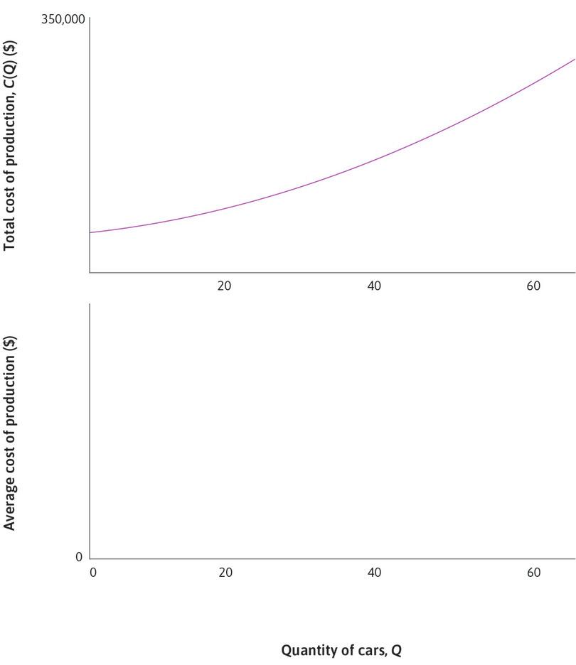
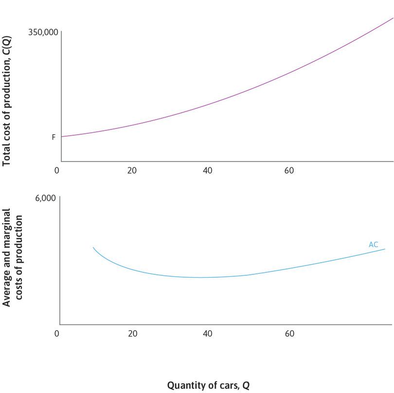
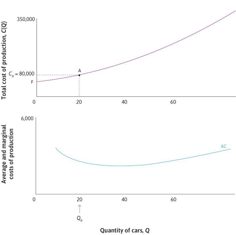
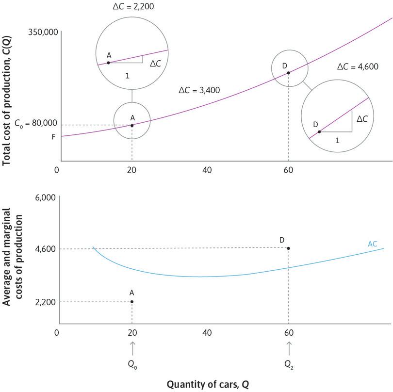
The more cars produced, the higher the total costs will be. The upper panel of Figure 7.6 shows how total costs might depend on the quantity of cars, Q, produced per day. This is the firm’s cost function, C(Q). From the cost function, we have worked out the average cost of a car, and how it changes with Q; the average cost curve (AC) is plotted in the lower panel.
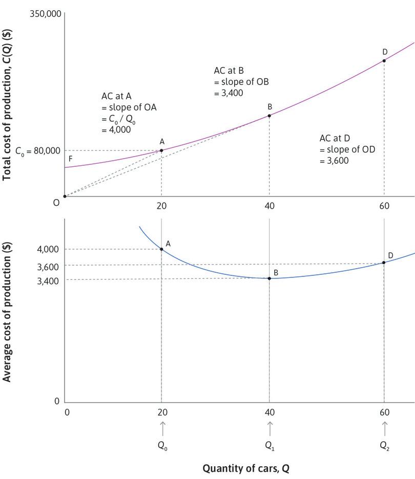
Beautiful Cars: Cost function and average cost.
Figure 7.6 Beautiful Cars: Cost function and average cost.
The cost function
The top panel shows the cost function, C(Q). It shows the total cost for each level of output, Q.
Figure 7.6a The top panel shows the cost function, C(Q). It shows the total cost for each level of output, Q.
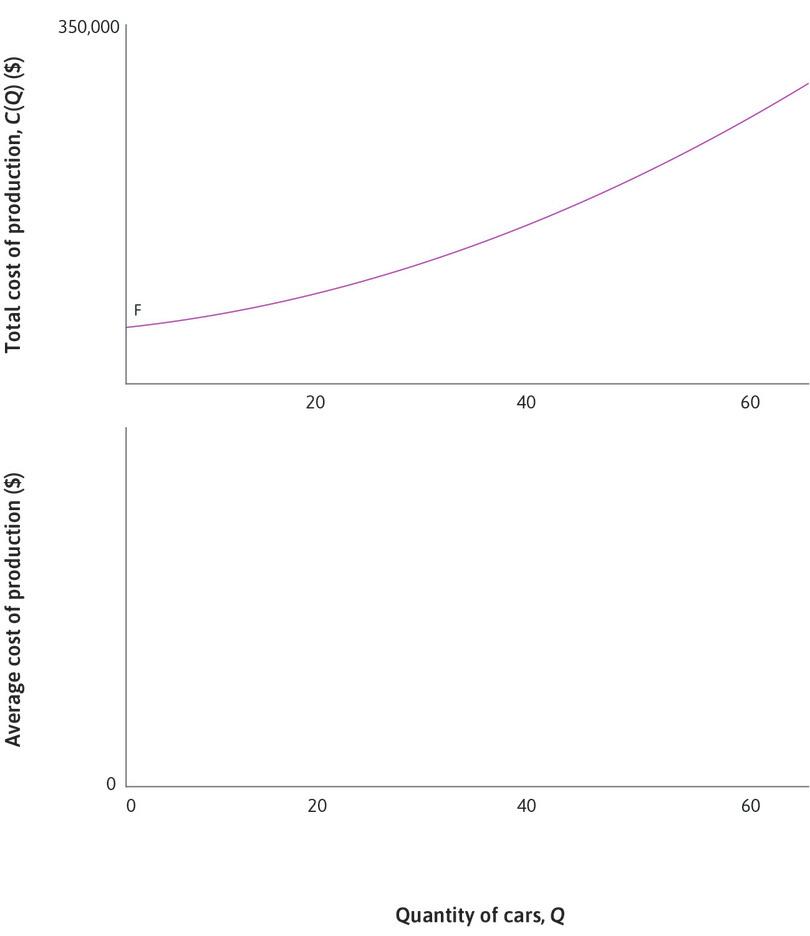
Fixed costs
Some costs do not vary with the number of cars. For example, once the firm has decided the size of its factory and invested in equipment, those costs will be the same irrespective of output. These are called fixed costs. So when Q = 0, the only costs are the fixed costs, F.
Figure 7.6b Some costs do not vary with the number of cars. For example, once the firm has decided the size of its factory and invested in equipment, those costs will be the same irrespective of output. These are called fixed costs. So when Q = 0, the only costs are the fixed costs, F.
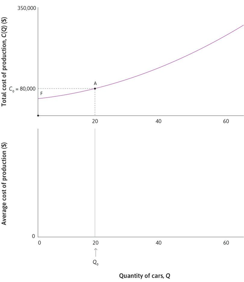
Total costs are increasing
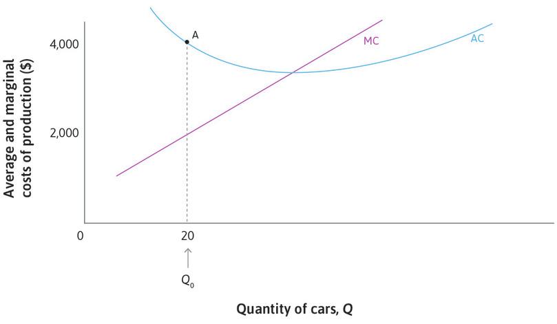
As Q increases, total costs rise and the firm needs to employ more production workers. At point A, 20 cars are produced (we call this Q0) costing $80,000 (we call this C0).
Figure 7.6c As Q increases, total costs rise and the firm needs to employ more production workers. At point A, 20 cars are produced (we call this Q0) costing $80,000 (we call this C0).
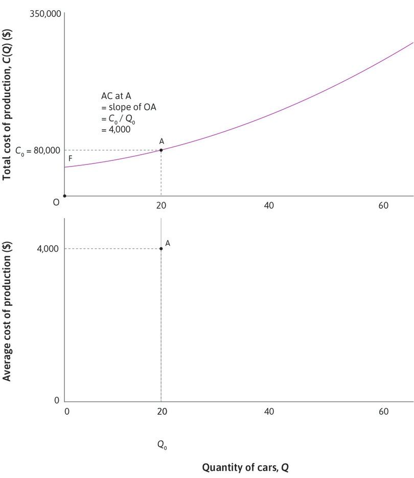
Average cost
If the firm produces 20 cars per day, the average cost of a car is C0 divided by Q0, which is shown by the slope of the line from the origin to A. The average cost is now $80,000/20 = $4,000. We have plotted the average cost at point A on the lower panel.
Figure 7.6d If the firm produces 20 cars per day, the average cost of a car is C0 divided by Q0, which is shown by the slope of the line from the origin to A. The average cost is now $80,000/20 = $4,000. We have plotted the average cost at point A on the lower panel.
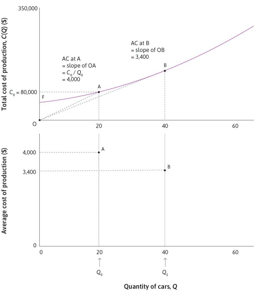
Falling average cost
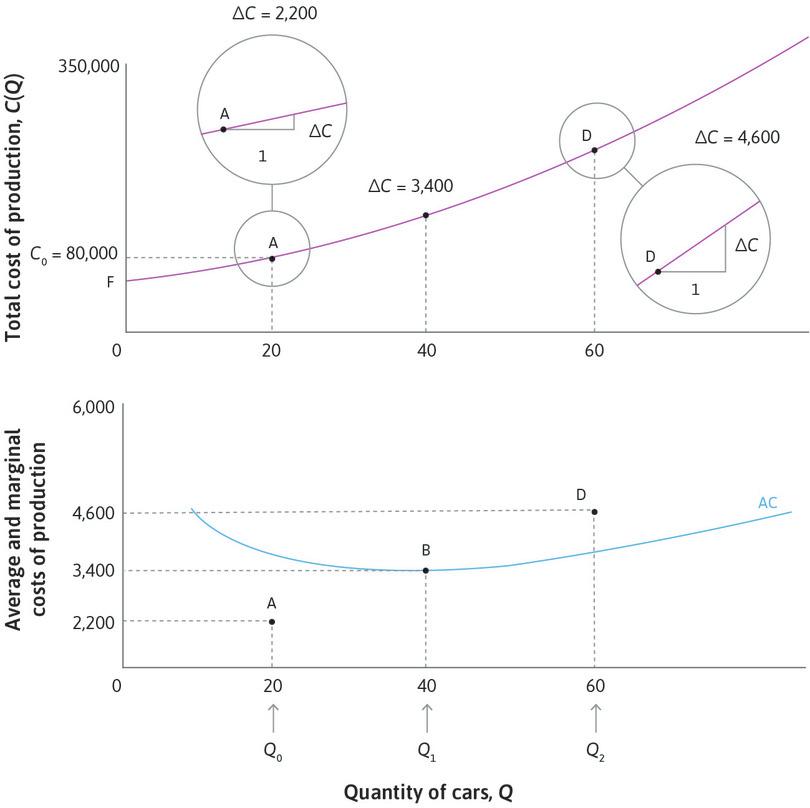
As output rises above A, fixed costs are shared between more cars. The average cost falls. At point B, the total cost is $136,000, average cost is $3,400.
Figure 7.6e As output rises above A, fixed costs are shared between more cars. The average cost falls. At point B, the total cost is $136,000, average cost is $3,400.
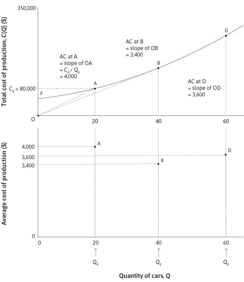
Rising average cost
Average cost is lowest at point B. When production increases beyond B, the line to the origin gets gradually steeper again. At D average cost has risen to $3,600.
Figure 7.6f Average cost is lowest at point B. When production increases beyond B, the line to the origin gets gradually steeper again. At D average cost has risen to $3,600.
The average cost curve
We can calculate the average cost at every value of Q to draw the average cost (AC) curve in the lower panel.
Figure 7.6g We can calculate the average cost at every value of Q to draw the average cost (AC) curve in the lower panel.
- fixed costs
- Costs of production that do not vary with the number of units produced.
We can see in Figure 7.6 that Beautiful Cars has decreasing average costs at low levels of production: the AC curve slopes downward. At higher levels of production, average cost increases so the AC curve slopes upward. This might happen because the firm has to increase the number of shifts per day on the assembly line. Perhaps it has to pay overtime rates, and equipment breaks down more frequently when the production line is working for longer.
- marginal cost
- The effect on total cost of producing one additional unit of output. It corresponds to the slope of the total cost function at each point.
Figure 7.7 shows how to find the marginal cost of a car, that is, the cost of producing one more car. In Unit 3, we saw that the marginal product for a given production function was the additional output produced when the input was increased by one unit, corresponding to the slope of the production function. Similarly, Figure 7.7 demonstrates that the marginal cost (MC) corresponds to the slope of the cost function.
Marginal cost
At each point on the cost function, the marginal cost (MC) is the additional cost of producing one more unit of output, which corresponds to the slope of the cost function. If cost increases by ∆C when quantity is increased by ∆Q, the marginal cost can be estimated by:
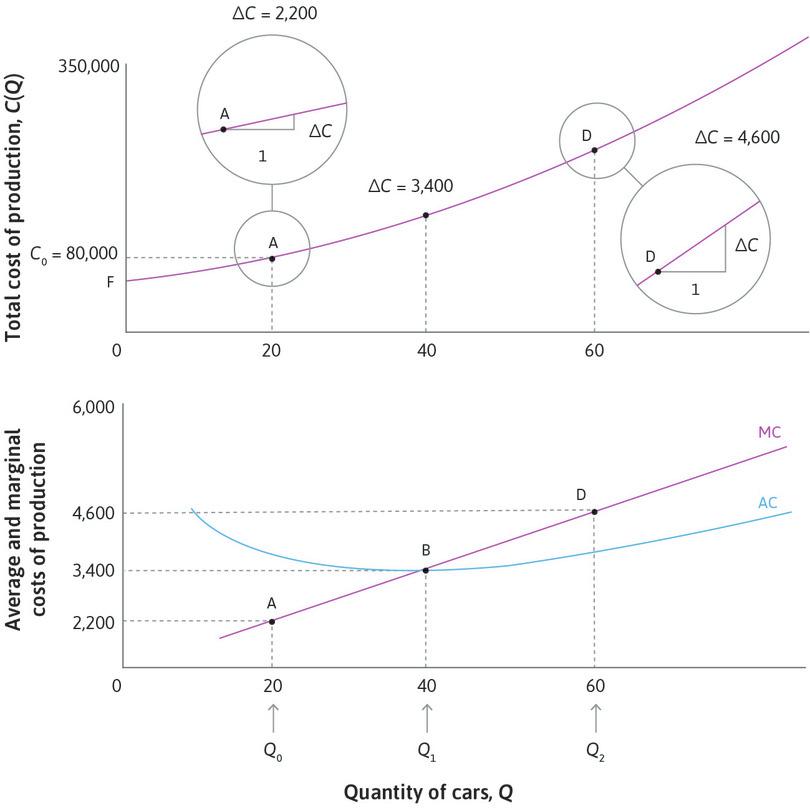
The marginal cost of a car.
Figure 7.7 The marginal cost of a car.
Total cost, average cost and marginal cost
The upper panel shows the cost function (also called the total cost curve). The lower panel shows the average cost curve. We will plot the marginal costs in the lower panel too.
Figure 7.7a The upper panel shows the cost function (also called the total cost curve). The lower panel shows the average cost curve. We will plot the marginal costs in the lower panel too.
Total cost
Suppose the firm is producing 20 cars at point A. The total cost is $80,000.
Figure 7.7b Suppose the firm is producing 20 cars at point A. The total cost is $80,000.
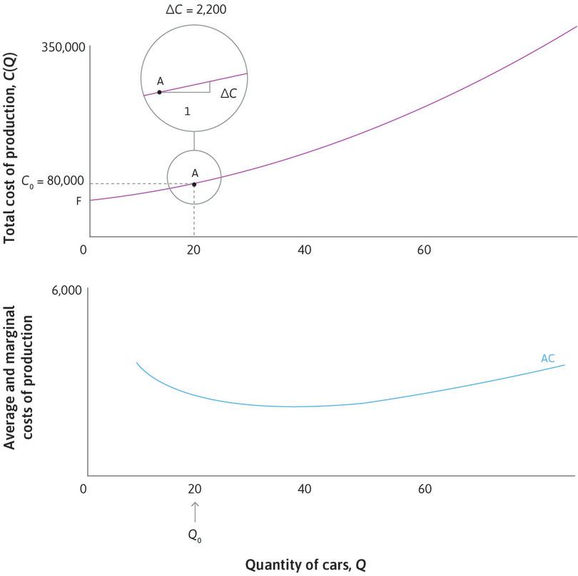
Marginal cost
The marginal cost is the cost of increasing output from 20 to 21. This would increase total costs by an amount that we call ∆C, equal to $2,200. The triangle drawn at A shows that the marginal cost is equal to the slope of the cost function at that point.
Figure 7.7c The marginal cost is the cost of increasing output from 20 to 21. This would increase total costs by an amount that we call ∆C, equal to $2,200. The triangle drawn at A shows that the marginal cost is equal to the slope of the cost function at that point.
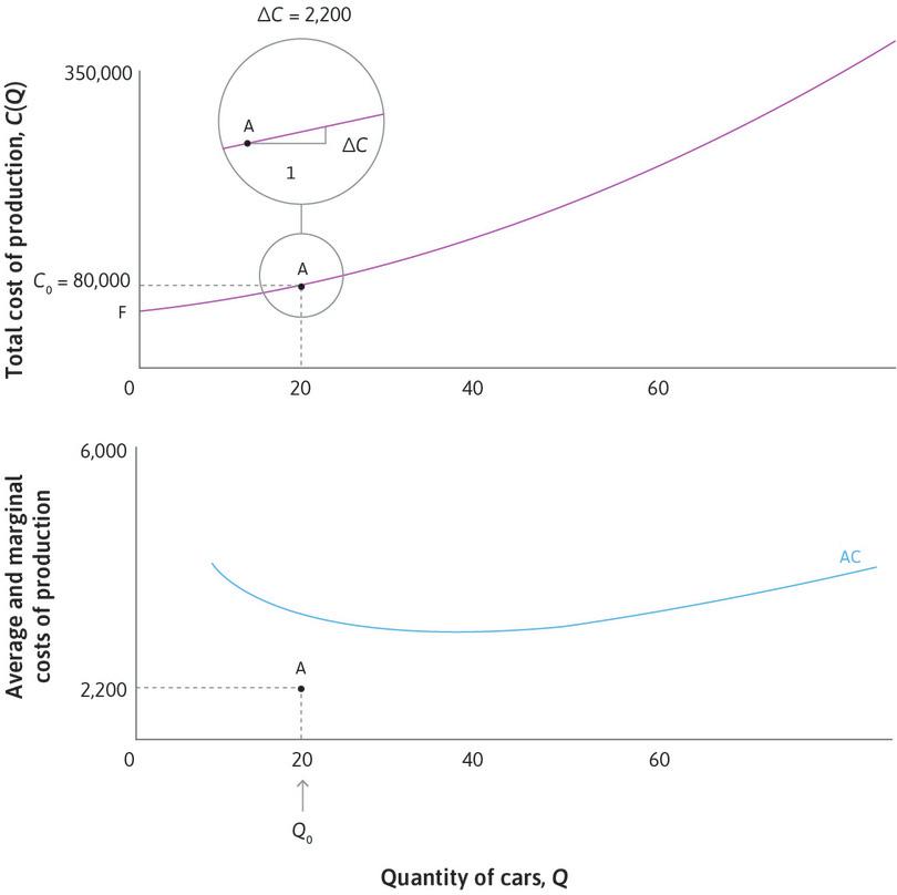
Marginal cost at A
We have plotted the marginal cost at point A in the lower panel.
Figure 7.7d We have plotted the marginal cost at point A in the lower panel.
Marginal cost at D
At point D, where Q = 60, the cost function is much steeper. The marginal cost of producing an extra car is higher: ∆C = $4,600.
Figure 7.7e At point D, where Q = 60, the cost function is much steeper. The marginal cost of producing an extra car is higher: ∆C = $4,600.

Marginal cost at B
At point B, the curve is steeper than at A, but flatter than at D: MC = $3,400.
Figure 7.7f At point B, the curve is steeper than at A, but flatter than at D: MC = $3,400.
The cost function
Look at the shape of the whole cost function. When Q = 0 it is quite flat, so marginal cost is low. As Q increases, the cost function gets steeper, and marginal cost gradually rises.
Figure 7.7g Look at the shape of the whole cost function. When Q = 0 it is quite flat, so marginal cost is low. As Q increases, the cost function gets steeper, and marginal cost gradually rises.
The marginal cost curve
If we calculate marginal cost at every point on the cost function, we can draw the marginal cost curve.
Figure 7.7h If we calculate marginal cost at every point on the cost function, we can draw the marginal cost curve.
By calculating the marginal cost at every value of Q, we have drawn the whole of the marginal cost curve in the lower panel of Figure 7.7. Since marginal cost is the slope of the cost function and the cost curve gets steeper as Q increases, the graph of marginal cost is an upward-sloping line. In other words, Beautiful Cars has increasing marginal costs of car production. It is the rising marginal cost that eventually causes average costs to increase.
Notice that in Figure 7.7 we calculated marginal cost by finding the change in costs, ∆C, from producing one more car. Sometimes it is more convenient to take a different increase in quantity. If we know that costs rise by ∆C = $12,000 when 5 extra cars are produced, then we could calculate ∆C/∆Q, where ∆Q = 5, to get an estimate for MC of $2,400 per car. In general, when the cost function is curved, a smaller ∆Q gives a more accurate estimate.
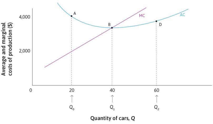
Now look at the shapes of the AC and MC curves, shown again in Figure 7.8. You can see that the AC is downward-sloping at values of Q where the AC is greater than the MC, and it is upward-sloping where AC is less than MC. This is not just a coincidence: it happens whatever the shape of the total cost function. Follow the analysis in Figure 7.8 to see why this happens.
Leibniz: Average and marginal cost functions
Average and marginal cost curves.
Figure 7.8 Average and marginal cost curves.
Average and marginal cost
The diagram shows both the average cost curve and the marginal cost curve.
Figure 7.8a The diagram shows both the average cost curve and the marginal cost curve.
MC < AC when Q = 20
Look at point A on the AC curve. When Q = 20, the average cost is $4,000, but the marginal cost is only $2,000. So if 21 cars rather than 20 are produced, that will reduce the average cost. Average cost is lower at Q = 21.
Figure 7.8b Look at point A on the AC curve. When Q = 20, the average cost is $4,000, but the marginal cost is only $2,000. So if 21 cars rather than 20 are produced, that will reduce the average cost. Average cost is lower at Q = 21.

Average cost curve slopes downward when AC > MC
At any point, like point A, where AC > MC, the average cost will fall if one more car is produced, so the AC curve slopes downward.
Figure 7.8c At any point, like point A, where AC > MC, the average cost will fall if one more car is produced, so the AC curve slopes downward.

Average cost curve slopes upward when AC < MC
At point D where Q = 60, the average cost is $3,600, but the cost of producing the 61st car is $4,600. So the average cost of a car will rise if 61 cars are produced. When AC < MC, the average cost curve slopes upward.
Figure 7.8d At point D where Q = 60, the average cost is $3,600, but the cost of producing the 61st car is $4,600. So the average cost of a car will rise if 61 cars are produced. When AC < MC, the average cost curve slopes upward.
When AC = MC
At point B, where the average cost is lowest, the average and marginal costs are equal. The two curves cross. When AC = MC, the AC curve doesn’t slope up or down: it is flat (the slope is zero).
Figure 7.8e At point B, where the average cost is lowest, the average and marginal costs are equal. The two curves cross. When AC = MC, the AC curve doesn’t slope up or down: it is flat (the slope is zero).
Question 7.5 Choose the correct answer(s)
Consider a firm with fixed costs of production. Which of the following statements about its average cost (AC) and marginal cost (MC) is correct?
- When AC = MC, the cost of an additional unit equals the average cost of all existing units. Therefore, the new AC will be the same and the slope is zero.
- The MC curve can be upward-sloping, horizontal, or downward-sloping, irrespective of the relative size of AC and MC.
- When AC < MC, the cost of an additional unit is greater than the average cost of the existing outputs. So the new AC will be larger. The AC curve is upward-sloping.
- If MC is constant, then the MC curve is horizontal.
Question 7.6 Choose the correct answer(s)
Suppose that the unit cost of producing a pound of cereal is $2, irrespective of the level of output. Which of the following statements is correct?
- The total cost = 2Q, where Q is the output. This is an upward-sloping straight line through the origin.
- The average cost = 2 for all outputs. This is a horizontal straight line.
- The marginal cost = 2 for all outputs. This is a horizontal straight line.
- Both the average and the marginal cost are 2 for all outputs, so the curves representing them coincide.
Exercise 7.2 The cost function for Apple-Cinnamon Cheerios
Of course, cost functions can have different shapes from the one we drew for Beautiful Cars. For Apple-Cinnamon Cheerios, we assumed the average cost was constant, so that the unit cost of a pound of cereal was equal to $2, regardless of the quantity produced.
- Draw the cost function (also called the total cost curve) for this case.
- What do the marginal and average cost functions look like?
- Now suppose that the marginal cost of producing a pound of Cheerios was $2, whatever the quantity, but there were also some fixed production costs. Draw the total, marginal, and average cost curves in this case.
- economies of scope
- Cost savings that occur when two or more products are produced jointly by a single firm, rather being produced in separate firms.
Economists Rajindar and Manjulika Koshal studied the cost functions of universities in the US.3 They estimated the marginal and average costs of educating graduate and undergraduate students in 171 public universities in the academic year 1990–91. As you will see in Exercise 7.3, they found decreasing average costs. They also found that the universities benefitted from what are termed economies of scope: there were cost savings from producing several products—in this case graduate education, undergraduate education, and research—together.4
If you want to know more about costs, George Stigler, an economist, has written an entertaining discussion of the subject in chapter 7 of his book.5
Exercise 7.3 Cost functions for university education
Below you can see the average and marginal costs per student for the year 1990–91 that Koshal and Koshal calculated from their research.
Students MC ($) AC ($) Total cost ($) Undergraduates 2,750 7,259 7,659 21,062,250 5,500 6,548 7,348 40,414,000 8,250 5,838 7,038 11,000 5,125 6,727 73,997,000 13,750 4,417 6,417 88,233,750 16,500 3,706 6,106 100,749,000 Students MC ($) AC ($) Total cost ($) Graduates 550 6,541 12,140 6,677,000 1,100 6,821 9,454 10,339,400 1,650 7,102 8,672 2,200 7,383 8,365 18,403,000 2,750 7,664 8,249 22,684,750 3,300 7,945 8,228 27,152,400
- How do average costs change as the numbers of students rise?
- Using the data for average costs, fill in the missing figures in the total cost column.
- Plot the marginal and average cost curves for undergraduate education on a graph, with costs on the vertical axis and the number of students on the horizontal axis. On a separate diagram, plot the equivalent graphs for graduates.
- What are the shapes of the total cost functions for undergraduates and graduates? (You could sketch them using what you know about marginal and average costs.) Plot them on a single chart using the numbers in the total cost column.
- What are the main differences between the universities’ cost structures for undergraduates and graduates?
- Can you think of any explanations for the shapes of the graphs you have drawn?
7.4 Demand and isoprofit curves: Beautiful Cars
- differentiated product
- A product produced by a single firm that has some unique characteristics compared to similar products of other firms.
Not all cars are the same. Cars are differentiated products. Each make and model is produced by just one firm, and has some unique characteristics of design and performance that differentiate it from the cars made by other firms.
We expect a firm selling a differentiated product to face a downward-sloping demand curve. We have already seen an empirical example in the case of Apple-Cinnamon Cheerios (another differentiated product). If the price of a Beautiful Car is high, demand will be low because the only consumers who will buy it are those who strongly prefer Beautiful Cars to all other makes. As the price falls, more consumers, who might otherwise have purchased a Ford or a Volvo, will be attracted to a Beautiful Car.
The demand curve
For any product that consumers might wish to buy, the product demand curve is a relationship that tells you the number of items (the quantity) they will buy at each possible price. For a simple model of the demand for Beautiful Cars, imagine that there are 100 potential consumers who would each buy one Beautiful Car today, if the price were low enough.
- willingness to pay (WTP)
- An indicator of how much a person values a good, measured by the maximum amount he or she would pay to acquire a unit of the good. See also: willingness to accept.
Each consumer has a willingness to pay (WTP) for a Beautiful Car, which depends on how much the customer personally values it (given the resources to buy it, of course). A consumer will buy a car if the price is less than or equal to his or her WTP. Suppose we line up the consumers in order of WTP, with the highest first, and plot a graph to show how the WTP varies along the line (Figure 7.9). Then if we choose any price, say P = $3,200, the graph shows the number of consumers whose WTP is greater than or equal to P. In this case, 60 consumers are willing to pay $3,200 or more, so the demand for cars at a price of $3,200 is 60.
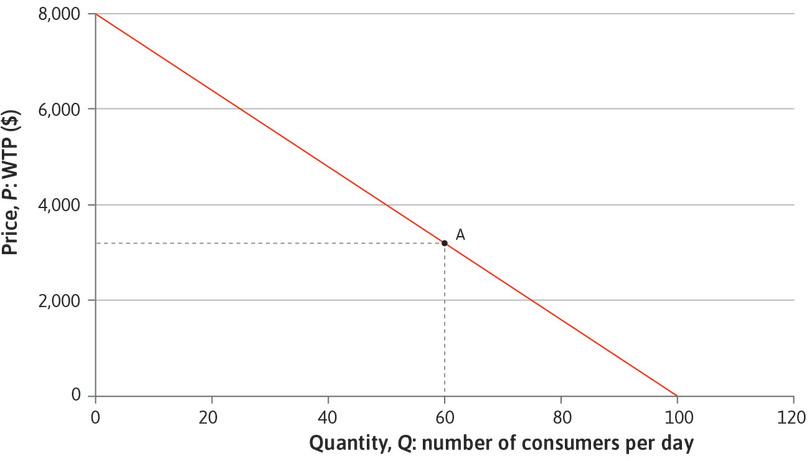
The demand for cars (per day).
Figure 7.9 The demand for cars (per day).
If P is lower, there are a larger number of consumers willing to buy, so the demand is higher. Demand curves are often drawn as straight lines, as in this example, although there is no reason to expect them to be straight in reality: we saw that the demand curve for Apple-Cinnamon Cheerios was not straight. But we do expect demand curves to slope downward: as the price rises, the quantity that consumers demand falls. In other words, when the available quantity is low, it can be sold at a high price. This relationship between price and quantity is sometimes known as the Law of Demand.
The Law of Demand dates back to the seventeenth century, and is attributed to Gregory King (1648–1712) and Charles Davenant (1656–1714). King was a herald at the College of Arms in London, who produced detailed estimates of the population and wealth of England. Davenant, a politician, published the Davenant-King Law of Demand in 1699, using King’s data. It described how the price of corn would change depending on the size of the harvest. For example, he calculated that a ‘defect’, or shortfall, of one-tenth (10%) would raise the price by 30%.
Question 7.7 Choose the correct answer(s)
The diagram depicts two alternative demand curves, D and D′, for a product. Based on this graph, which of the following are correct?
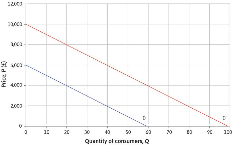
- On demand curve D, when the price is £5,000, the firm can sell 10 units.
- When Q = 70, the corresponding price on D′ is £3,000.
- D′ can be seen as just a rightward shift of D, by 40 units. So for any price, the firm can sell 40 more units on D′ than on D.
- With an output of 30 units, the firm can charge £4,000 more on D′ than on D.
Like the producer of Apple-Cinnamon Cheerios, Beautiful Cars will choose the price, P, and the quantity, Q, taking into account its demand curve and its production costs. The demand curve determines the feasible set of combinations of P and Q. To find the profit-maximizing point, we will draw the isoprofit curves, and look for the point of tangency as before.
The isoprofit curves
The firm’s profit is the difference between its revenue (the price multiplied by quantity sold) and its total costs, C(Q):
- economic profit
- A firm’s revenue minus its total costs (including the opportunity cost of capital).
- normal profits
- Corresponds to zero economic profit and means that the rate of profit is equal to the opportunity cost of capital. See also: economic profit, opportunity cost of capital.
This calculation gives us what is known as the economic profit. Remember that the cost function includes the opportunity cost of capital (the payments that must be made to the owners to induce them to hold shares), which is referred to as normal profits. Economic profit is the additional profit above the minimum return required by shareholders.
Equivalently, profit is the number of units of output multiplied by the profit per unit, which is the difference between the price and the average cost:
From this equation you can see that the shape of the isoprofit curves will depend on the shape of the average cost curve. Remember that for Beautiful Cars, the average cost curve slopes downward until Q = 40, and then upward. Figure 7.10 shows the corresponding isoprofit curves. They look similar to those for Cheerios in Figure 7.3, but there are some differences because the average cost function has a different shape. The lowest (lightest blue) curve shows the zero-economic-profit curve: the combinations of price and quantity for which economic profit is equal to zero, because the price is just equal to the average cost at each quantity.
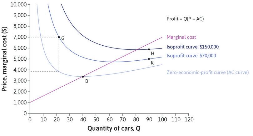
Isoprofit curves for Beautiful Cars.
Figure 7.10 Isoprofit curves for Beautiful Cars.

The zero-economic-profit curve
The lightest blue curve is the firm’s average cost curve. If P = AC, the firm’s economic profit is zero. So the AC curve is also the zero-profit curve: it shows all the combinations of P and Q that give zero economic profit.
Figure 7.10a The lightest blue curve is the firm’s average cost curve. If P = AC, the firm’s economic profit is zero. So the AC curve is also the zero-profit curve: it shows all the combinations of P and Q that give zero economic profit.
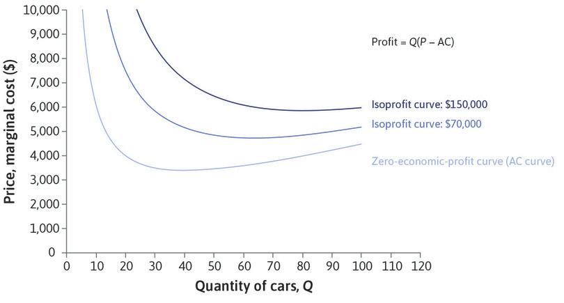
The shape of the zero-economic-profit curve
Beautiful Cars has decreasing AC when Q < 40, and increasing AC when Q > 40. When Q is low, it needs a high price to break even. If Q = 40 it could break even with a price of $3,400. For Q > 40, it would need to raise the price again to avoid a loss.
Figure 7.10b Beautiful Cars has decreasing AC when Q < 40, and increasing AC when Q > 40. When Q is low, it needs a high price to break even. If Q = 40 it could break even with a price of $3,400. For Q > 40, it would need to raise the price again to avoid a loss.

AC and MC
Beautiful Cars has increasing marginal costs: the upward-sloping line. Remember that the AC curve slopes down if AC > MC, and up if AC < MC. The two curves cross at B, where AC is lowest.
Figure 7.10c Beautiful Cars has increasing marginal costs: the upward-sloping line. Remember that the AC curve slopes down if AC > MC, and up if AC < MC. The two curves cross at B, where AC is lowest.
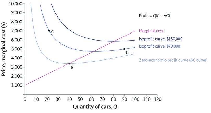
Isoprofit curves
The darker blue curves show the combinations of P and Q giving higher levels of profit, so points G and K give the same profit.
Figure 7.10d The darker blue curves show the combinations of P and Q giving higher levels of profit, so points G and K give the same profit.
Profit = Q(P − AC)
At G where the firm makes 23 cars, the price is $6,820 and the average cost is $3,777. The firm makes a profit of $3,043 on each car, and its total profit is $70,000.
Figure 7.10e At G where the firm makes 23 cars, the price is $6,820 and the average cost is $3,777. The firm makes a profit of $3,043 on each car, and its total profit is $70,000.
Higher prices, higher profits
Profit is higher on the curves closer to the top-right corner in the diagram. Point H has the same quantity as K, so the average cost is the same, but the price is higher at H.
Figure 7.10f Profit is higher on the curves closer to the top-right corner in the diagram. Point H has the same quantity as K, so the average cost is the same, but the price is higher at H.
Notice that in Figure 7.10:
- Isoprofit curves slope downward at points where P > MC.
- Isoprofit curves slope upward at points where P < MC.
- profit margin
- The difference between the price and the marginal cost.
The difference between the price and the marginal cost is called the profit margin. At any point on an isoprofit curve the slope is given by:
To understand why, think again about point G in Figure 7.10 at which Q = 28, and the price is much higher than the marginal cost. If you:
- increase Q by 1
- reduce P by (P − MC)/Q
then your profit will stay the same because the extra profit of (P − MC) on car 29 will be offset by a fall in revenue of (P − MC) on the other 28 cars.
Leibniz: Isoprofit curves and their slopes
The same reasoning applies at every point where P > MC. The profit margin is positive so the slope is negative. And it also applies when P < MC. In this case, the profit margin is negative so an increase in price is required to keep profit constant when quantity rises by 1. The isoprofit curve slopes upward.
Question 7.8 Choose the correct answer(s)
The diagram depicts the marginal cost curve (MC), the average cost curve (AC), and the isoprofit curves of a firm. What can we deduce from the information in the diagram?
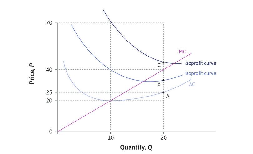
- The profit at any point on the AC curve is zero (since the price equals the average cost, and profit = quantity sold × (price – average cost)).
- The profit level for the isoprofit curve going through B can be calculated at Q = 10, where AC = 20 and P = 40. So the profit is (40 − 20) × 10 = 200.
- The profit level for the isoprofit curve going through C can be calculated at Q = 10, where AC = 20, and P = 70. So the profit is (70 − 20) × 10 = 500. At C, Q = 20, so profit per unit is (P − AC) = 25. Since AC is 25, P must be 50.
- The profit level for the isoprofit curve going through B can be calculated at Q = 10, where AC = 20 and P = 40. So the profit is (40 − 20) × 10 = 200. At B, Q = 20, so profit per unit is (P − AC) = 10. Since AC is 25, P must be 35.
Exercise 7.4 Looking at isoprofit curves
The isoprofit curves for Cheerios are downward-sloping, but for Beautiful Cars they slope downward when Q is low and upward when Q is high.
- In both cases the higher isoprofit curves get closer to the average cost curve as quantity increases. Why?
- What is the reason for the difference in the shape of the isoprofit curves between the two firms?
7.5 Setting price and quantity to maximize profit
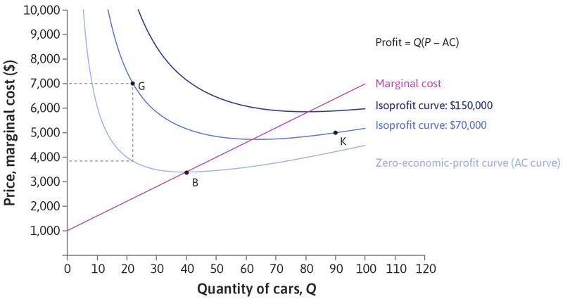
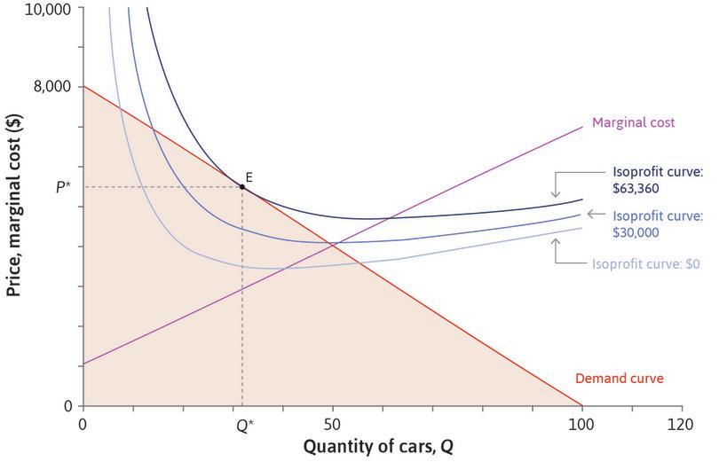
In Figure 7.11 we have shown both the demand curve and the isoprofit curves for Beautiful Cars. What is the best choice of price and quantity for the manufacturer?
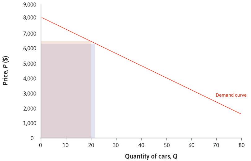
The only feasible choices are the points on or below the demand curve, shown by the shaded area on the diagram. To maximize profit the firm should choose the tangency point E, which is on the highest possible isoprofit curve.
The profit-maximizing choice of price and quantity for Beautiful Cars.
Figure 7.11 The profit-maximizing choice of price and quantity for Beautiful Cars.
The profit-maximizing price and quantity are P* = $5,440 and Q* = 32, and the corresponding profit is $63,360. As in the case of Cheerios, the optimal combination of price and quantity balances the trade-off that the firm would be willing to make between price and quantity (for a given profit level), against the trade-off the firm is constrained to make by the demand curve.
The firm maximizes profit at the tangency point, where the slope of the demand curve is equal to the slope of the isoprofit curve, so that the two trade-offs are in balance:
- The demand curve is the feasible frontier, and its slope is the marginal rate of transformation (MRT) of lower prices into greater quantity sold.
- The isoprofit curve is the indifference curve, and its slope is the marginal rate of substitution (MRS) in profit creation, between selling more and charging more.
At E, the profit-maximizing point, MRT = MRS.
Leibniz: The profit-maximizing price
Compared with the multinational giants of the automobile industry, Beautiful Cars is a small firm: it chooses to make only 32 cars per day. In terms of its production levels (but not its prices) it is more similar to luxury brands like Aston-Martin, Rolls Royce and Lamborghini, each of which produces fewer than 5,000 cars a year. The size of Beautiful Cars is determined partly by its demand function—there are only 100 potential buyers per day, at any price. In the longer term, the firm may be able to increase demand by advertising: bringing its product to the attention of more consumers, and convincing them of its desirable qualities. But if it wants to expand production it will also need to look at its cost structure, as in Figure 7.7. At present it has rapidly increasing marginal costs, so that average cost starts to rise when output per day exceeds 40. With its current premises and equipment it is difficult to produce more than 40 cars. Investment in new equipment may help to reduce its marginal cost, and might make expansion possible.
Constrained optimization
- constrained choice problem
- This problem is about how we can do the best for ourselves, given our preferences and constraints, and when the things we value are scarce. See also: constrained optimization problem.
The profit-maximization problem is another constrained choice problem, like those in earlier units: Alexei’s choice of study time, your own and Angela’s choices of working hours, and the choice of the wage by Maria’s employer.
Each of these problems has the same structure:
- The decision-maker wants to choose the values of one or more variables to achieve a goal, or objective. For Beautiful Cars, the variables are price and quantity.
- The objective is to optimize something: to maximize utility, minimize costs, or maximize profit.
- The decision-maker faces a constraint, which limits what is feasible: Angela’s production function, your budget constraint, Maria’s best response curve, the demand curve for Beautiful Cars.
In each case, we have represented the decision-maker’s choice graphically, by showing the indifference curves, which relate to the objective (iso-utility, isocost, or isoprofit), and the feasible set of outcomes, which is determined by the constraint. And we have found the solution of the problem at the tangency point where the MRS (slope of the indifference curve) is equal to the MRT (slope of the constraint).
Constrained optimization
A decision-maker chooses the values of one or more variables
- … to achieve an objective
- … subject to a constraint that determines the feasible set
Constrained optimization has many applications in economics; such problems can be solved mathematically, as well as graphically.
Question 7.9 Choose the correct answer(s)
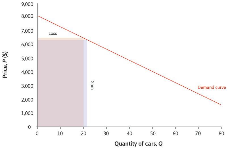
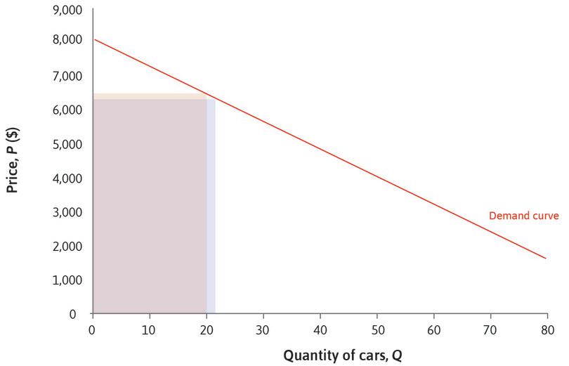
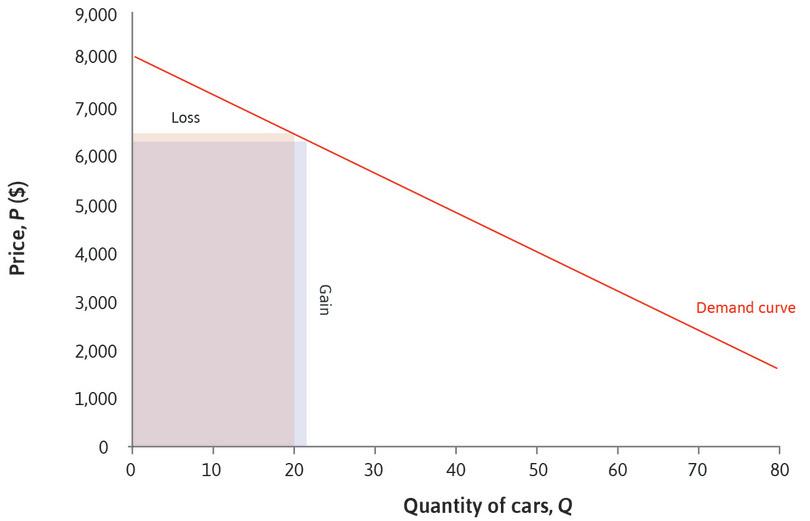
Figure 7.11 depicts the demand curve for Beautiful Cars, together with the marginal cost and isoprofit curves. The quantity-price combination at point E is (Q*, P*) = (32, 5,440). The average cost of producing 50 cars is the same as the average cost of producing 32. Suppose that the firm keeps the price at P = $5,440 but now produces 50 cars instead of 32. Which of the following is correct?
- From the demand curve we can see that at $5,440, the firm can only sell 32 cars.
- The firm’s profit is reduced by the cost of producing the extra 18 cars that now remain unsold.
- The firm’s profit is reduced by the cost of producing the extra 18 cars that now remain unsold.
- The firm’s profit is reduced by the cost of producing the extra 18 cars that now remain unsold.
Question 7.10 Choose the correct answer(s)
Figure 7.11 depicts the demand curve for Beautiful Cars, together with the marginal cost and isoprofit curves. At point E, the quantity-price combination is (Q*, P*) = (32, 5,440) and the profit is $63,360.
Suppose that the firm chooses instead to produce Q = 32 cars and sets the price at P = $5,400. Which of the following statements is correct?
- Since Q is still 32, production costs remain the same, but revenue falls, so profit falls.
- Since Q is still 32, production costs remain the same. Revenue falls by $40 on each car, so by $1,280 in total. So profit is $63,360 – $1,280 = $62,080.
- At E, where Q* = 32 and P* = $5440, the profit is $63,360. So the profit per car is $63,360/32 = $1,980. Since $5,440 – AC = $1,980, AC must be $3,460. AC is the same whatever the price charged.
- At the lower price the market demand is higher than 32, so the firm will have no problem selling all 32 cars at the new price.
Question 7.11 Choose the correct answer(s)
Figure 7.11 depicts the demand curve for Beautiful Cars, together with the marginal cost and isoprofit curves.
Suppose that the firm decides to switch from P* = $5,440 and Q* = 32 to a higher price, and chooses the profit-maximizing level of output at the new price. Which of the following statements is correct?
- At a higher price than P*, the maximum number of cars that can be sold is less than 32, and the firm will not produce more cars than it can sell.
- The firm will produce fewer than 32 cars. The marginal cost curve is upward-sloping, so at a lower output the marginal cost is lower.
- The firm will produce fewer than 32 cars, so its total costs will be lower.
- Any feasible point other than E is on a lower isoprofit curve.
7.6 Looking at profit maximization as marginal revenue and marginal cost
In the previous section we showed that the profit-maximizing choice for Beautiful Cars was the point at which the demand curve was tangent to the highest isoprofit curve. To make maximum profit, it should produce Q = 32 cars and sell them at a price P = $5,440.
- marginal revenue
- The increase in revenue obtained by increasing the quantity from Q to Q + 1.
We now look at a different method of finding the profit-maximizing point, without using isoprofit curves. Instead, we use the marginal revenue curve. Remember that if Q cars are sold at a price P, revenue R is given by R = P × Q. The marginal revenue, MR, is the increase in revenue obtained by increasing the quantity from Q to Q + 1.
Figure 7.12a shows you how to calculate the marginal revenue when Q = 20: that is, the increase in revenue if quantity increases by one unit.
| Revenue, R = P × Q | ||
|---|---|---|
| Q = 20 | P = $6,400 | R = $128,000 |
| Q = 21 | P = $6,320 | R = $132,720 |
| ΔQ = 1 | ΔP = $80 | MR = ΔR/ΔQ = $4,720 |
| Gain in revenue (21st car) Loss of revenue ($80 on each of the other 20 cars) Marginal revenue |
$6,320 −$1,600 |
|
| $4,720 | ||
Calculating marginal revenue.
Figure 7.12a Calculating marginal revenue.
| Revenue, R = P × Q | ||
|---|---|---|
| Q = 20 | P = $6,400 | R = $128,000 |
| Q = 21 | P = $6,320 | R = $132,720 |
| ΔQ = 1 | ΔP = $80 | MR = ΔR/ΔQ = $4,720 |
| Gain in revenue (21st car) Loss of revenue ($80 on each of the other 20 cars) Marginal revenue |
$6,320 −$1,600 |
|
| $4,720 | ||
Revenue when Q = 20
When Q = 20, the price is $6,400, and revenue = $6,400 × 20, the area of the rectangle.
Figure 7.12aa When Q = 20, the price is $6,400, and revenue = $6,400 × 20, the area of the rectangle.
| Revenue, R = P × Q | ||
|---|---|---|
| Q = 20 | P = $6,400 | R = $128,000 |
| Q = 21 | P = $6,320 | R = $132,720 |
| ΔQ = 1 | ΔP = $80 | MR = ΔR/ΔQ = $4,720 |
| Gain in revenue (21st car) Loss of revenue ($80 on each of the other 20 cars) Marginal revenue |
$6,320 −$1,600 |
|
| $4,720 | ||
Revenue when Q = 21
If quantity is increased to 21, the price falls to $6,320. The change in price is ΔP = −$80. The revenue at Q = 21 is shown by the area of the new rectangle, which is $6,320 × 21.
Figure 7.12ab If quantity is increased to 21, the price falls to $6,320. The change in price is ΔP = −$80. The revenue at Q = 21 is shown by the area of the new rectangle, which is $6,320 × 21.
| Revenue, R = P × Q | ||
|---|---|---|
| Q = 20 | P = $6,400 | R = $128,000 |
| Q = 21 | P = $6,320 | R = $132,720 |
| ΔQ = 1 | ΔP = $80 | MR = ΔR/ΔQ = $4,720 |
| Gain in revenue (21st car) Loss of revenue ($80 on each of the other 20 cars) Marginal revenue |
$6,320 −$1,600 |
|
| $4,720 | ||
Marginal revenue when Q = 20
The marginal revenue at Q = 20 is the difference between the two areas. The table shows that the area of the rectangle is larger when Q = 21. The marginal revenue is $4,720.
Figure 7.12ac The marginal revenue at Q = 20 is the difference between the two areas. The table shows that the area of the rectangle is larger when Q = 21. The marginal revenue is $4,720.
| Revenue, R = P × Q | ||
|---|---|---|
| Q = 20 | P = $6,400 | R = $128,000 |
| Q = 21 | P = $6,320 | R = $132,720 |
| ΔQ = 1 | ΔP = $80 | MR = ΔR/ΔQ = $4,720 |
| Gain in revenue (21st car) Loss of revenue ($80 on each of the other 20 cars) Marginal revenue |
$6,320 −$1,600 |
|
| $4,720 | ||
Why is MR > 0?
The increase in revenue happens because the firm gains $6,320 on the 21st car, and this gain is greater than the loss of 20 × $80 from selling the other 20 cars at a lower price.
Figure 7.12ad The increase in revenue happens because the firm gains $6,320 on the 21st car, and this gain is greater than the loss of 20 × $80 from selling the other 20 cars at a lower price.
| Revenue, R = P × Q | ||
|---|---|---|
| Q = 20 | P = $6,400 | R = $128,000 |
| Q = 21 | P = $6,320 | R = $132,720 |
| ΔQ = 1 | ΔP = $80 | MR = ΔR/ΔQ = $4,720 |
| Gain in revenue (21st car) Loss of revenue ($80 on each of the other 20 cars) Marginal revenue |
$6,320 −$1,600 |
|
| $4,720 | ||
Calculating the marginal revenue
The table shows that the marginal revenue can also be calculated as the difference between the gain of $6,320 and the loss of $1,600.
Figure 7.12ae The table shows that the marginal revenue can also be calculated as the difference between the gain of $6,320 and the loss of $1,600.
Figure 7.12a shows that the firm’s revenue is the area of the rectangle drawn below the demand curve. When Q is increased from 20 to 21, revenue changes for two reasons. An extra car is sold at the new price, but since the new price is lower when Q = 21, there is also a loss of $80 on each of the other 20 cars. The marginal revenue is the net effect of these two changes.
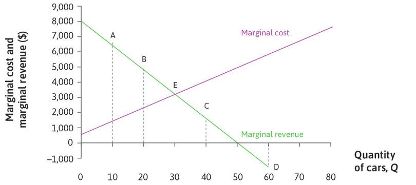
In Figure 7.12b we find the marginal revenue curve, and use it to find the point of maximum profit. The upper panel shows the demand curve, and the middle panel shows the marginal cost curve. The analysis in Figure 7.12b shows how to calculate and plot the marginal revenue curve. When P is high and Q is low, MR is high: the gain from selling one more car is much greater than the total loss on the small number of other cars. As we move down the demand curve P falls (so the gain on the last car gets smaller), and Q rises (so the total loss on the other cars is bigger), so MR falls and eventually becomes negative.
Marginal revenue, marginal cost, and profit.
Figure 7.12b Marginal revenue, marginal cost, and profit.
Demand and marginal cost curves
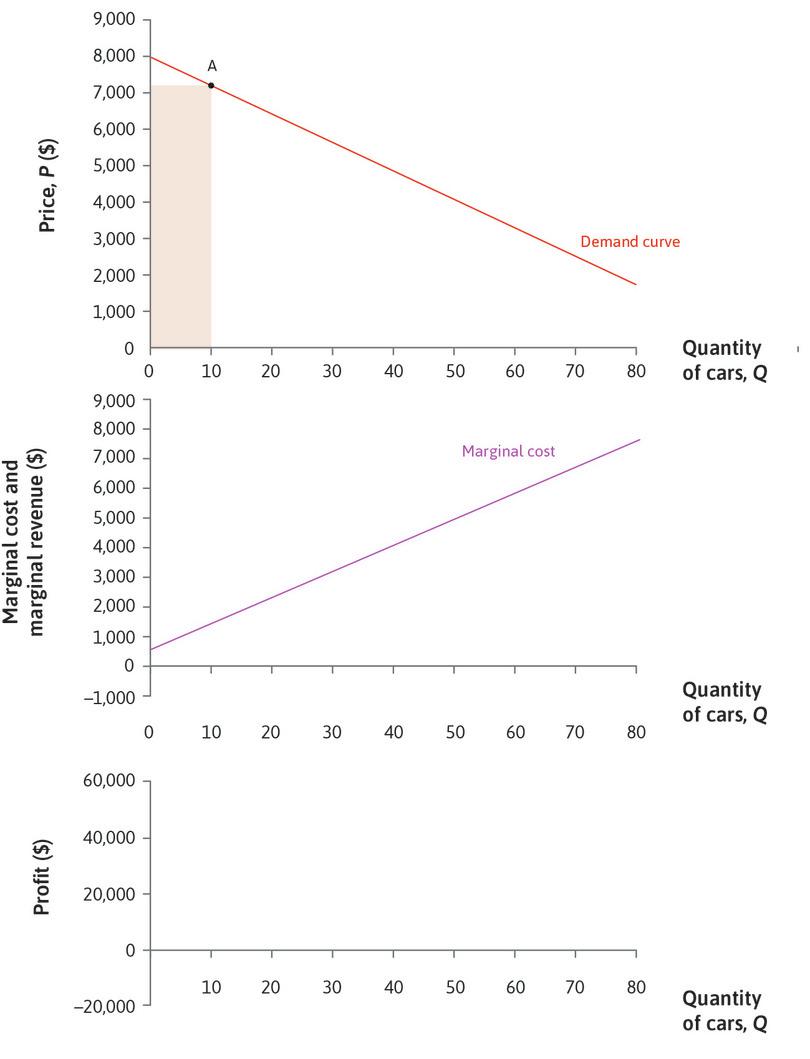
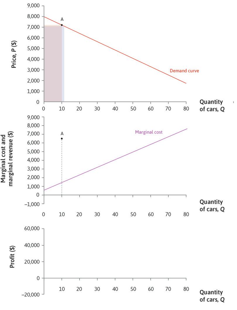
The upper panel shows the demand curve, and the middle panel shows the marginal cost curve. At point A, Q = 10, P = $7,200, revenue is $72,000.
Figure 7.12ba The upper panel shows the demand curve, and the middle panel shows the marginal cost curve. At point A, Q = 10, P = $7,200, revenue is $72,000.
Marginal revenue
The marginal revenue (middle panel) at A is the difference between the areas of the two rectangles: MR = $6,320.
Figure 7.12bb The marginal revenue (middle panel) at A is the difference between the areas of the two rectangles: MR = $6,320.
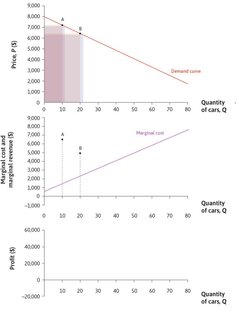
Marginal revenue when Q = 20
Marginal revenue when Q = 20 and P = $6,400 is $4,880.
Figure 7.12bc Marginal revenue when Q = 20 and P = $6,400 is $4,880.
Moving down the demand curve
As we move down the demand curve, P falls and MR falls by more. The gain on the extra car gets smaller, and the loss on the other cars is bigger.
Figure 7.12bd As we move down the demand curve, P falls and MR falls by more. The gain on the extra car gets smaller, and the loss on the other cars is bigger.
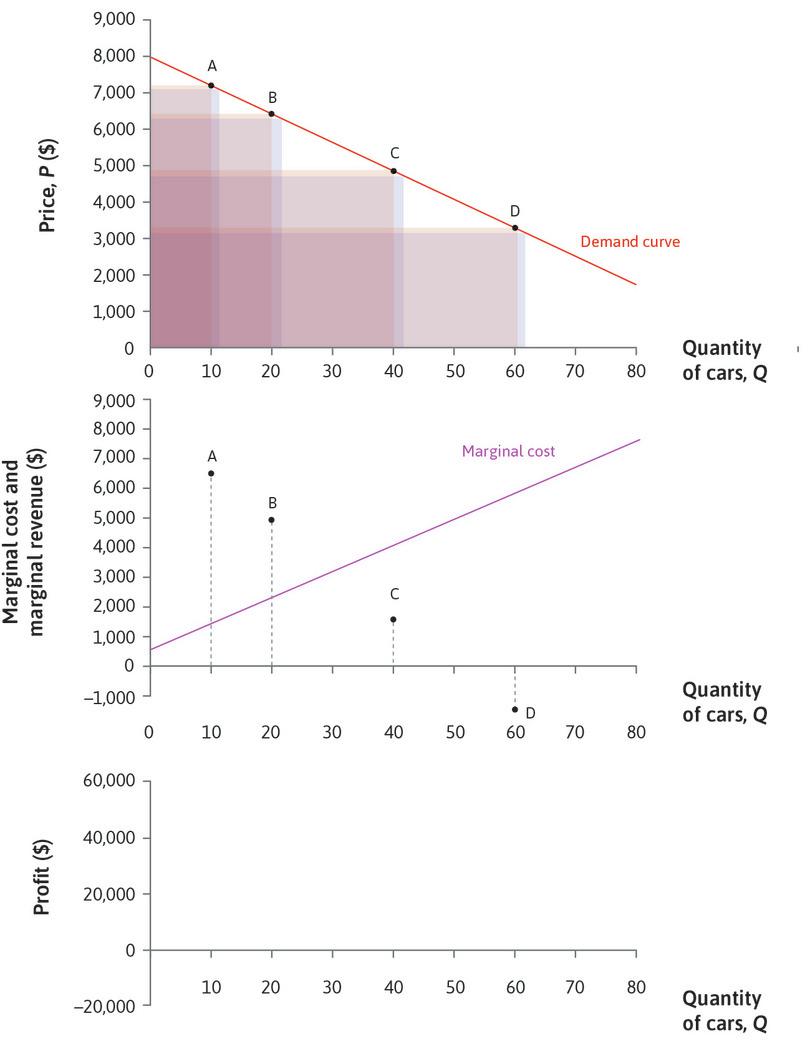
MR < 0
At point D, the gain on the extra car is outweighed by the loss on the others, so the marginal revenue is negative.
Figure 7.12be At point D, the gain on the extra car is outweighed by the loss on the others, so the marginal revenue is negative.

The marginal revenue curve
Joining the points in the middle panel gives the marginal revenue curve.
Figure 7.12bf Joining the points in the middle panel gives the marginal revenue curve.
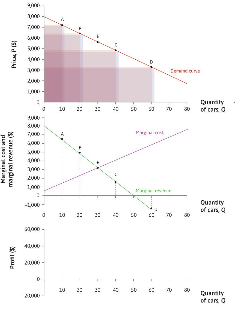
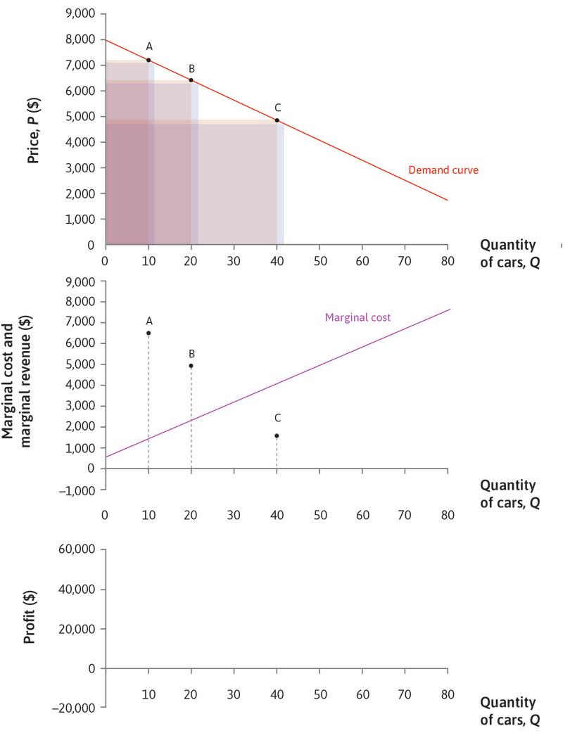
MR > MC
MR and MC cross at point E, where Q = 32. MR > MC at any value of Q below 32: the revenue from selling an extra car is greater than the cost of making it, so it would be better to increase production.
Figure 7.12bg MR and MC cross at point E, where Q = 32. MR > MC at any value of Q below 32: the revenue from selling an extra car is greater than the cost of making it, so it would be better to increase production.

MR < MC
When Q > 32, MR < MC: if the firm was producing more than 32 cars it would lose profit if it made an extra car, and it would increase profit if it made fewer cars.
Figure 7.12bh When Q > 32, MR < MC: if the firm was producing more than 32 cars it would lose profit if it made an extra car, and it would increase profit if it made fewer cars.
The firm’s profit
In the lower panel we have plotted the firm’s profit at each point on the demand curve. You can see that when Q < 32, MR > MC, and profit increases if Q increases. When Q = 32, profit is maximized. When Q > 32, MR < MC, and profit falls if Q rises.
Figure 7.12bi In the lower panel we have plotted the firm’s profit at each point on the demand curve. You can see that when Q < 32, MR > MC, and profit increases if Q increases. When Q = 32, profit is maximized. When Q > 32, MR < MC, and profit falls if Q rises.
The marginal revenue curve is usually (although not necessarily) a downward-sloping line. The lower two panels in Figure 7.12b demonstrate that the profit-maximizing point is where the MR curve crosses the MC curve. To understand why, remember that profit is the difference between revenue and costs, so for any value of Q, the change in profit if Q was increased by one unit (the marginal profit) would be the difference between the change in revenue, and the change in costs:
So:
- If MR > MC, the firm could increase profit by raising Q.
- If MR < MC, the marginal profit is negative. It would be better to decrease Q.
Leibniz: Marginal revenue and marginal cost
You can see how profit changes with Q in the lowest panel of 7.12b. Just as marginal cost is the slope of the cost function, marginal profit is the slope of the profit function. In this case:
- When Q < 32, MR > MC: Marginal profit is positive, so profit increases with Q.
- When Q > 32, MR < MC: Marginal profit is negative; profit decreases with Q.
- When Q = 32, MR = MC: Profit reaches a maximum.
Question 7.12 Choose the correct answer(s)
This figure shows the marginal cost and marginal revenue curves for Beautiful Cars. Which of the following statements is correct, based on the information shown?
- When Q = 40 the marginal cost is greater than the marginal revenue so the marginal profit is negative. This doesn’t mean that profit is negative.
- The marginal revenue is greater at Q = 10 than Q = 20. But because the marginal revenue is positive as output increases from 10 to 20, revenue is increasing: it is higher at Q = 20.
- Marginal profit is zero at E. But this is the profit-maximizing point, so the firm will choose it.
- At all levels of output up to point E, marginal revenue is greater than marginal cost. So profit increases as output increases—it is higher at Q = 20 than Q = 10.
7.7 Gains from trade
- economic rent
- A payment or other benefit received above and beyond what the individual would have received in his or her next best alternative (or reservation option). See also: reservation option.
- gains from exchange
- The benefits that each party gains from a transaction compared to how they would have fared without the exchange. Also known as: gains from trade. See also: economic rent.
- Pareto efficient
- An allocation with the property that there is no alternative technically feasible allocation in which at least one person would be better off, and nobody worse off.
Remember from Unit 5 that when people engage voluntarily in an economic interaction, they do so because it makes them better off: they can obtain a surplus called economic rent. The total surplus for the parties involved is a measure of the gains from exchange or gains from trade. We can analyse the outcome of the economic interactions between consumers and a firm just as we did for Angela and Bruno in Unit 5. We judge the total surplus, and the way it is shared, in terms of Pareto efficiency and fairness.
We have assumed that the rules of the game for allocating Cheerios and cars to consumers are:
-
A firm decides how many items to produce, and sets a price.
-
Then individual consumers decide whether to buy.
These rules reflect typical market institutions for the allocation of consumer goods, although we might imagine alternatives—maybe a group of people who wanted cars could get together to produce a specification, then invite manufacturers to tender for the contract.
In the interactions between a firm like Beautiful Cars and its consumers, there are potential gains for both, as long as the firm is able to manufacture a car at a cost less than the value of the car to a consumer. Recall that the demand curve shows the willingness to pay (WTP) of each of the potential consumers. A consumer whose WTP is greater than the price will buy the good and receive a surplus, since the value to her of the car is more than she has to pay for it.
Similarly, the marginal cost curve shows what it costs to make each additional car (if you start at Q = 0, the marginal cost curve shows how much it costs to make the first car, then the second, and so on). And if the marginal cost is lower than the price, the firm receives a surplus too. Figure 7.13 shows how to find the total surplus for the firm and its consumers, when Beautiful Cars sets the price to maximize its profits.

Gains from trade.
Figure 7.13 Gains from trade.
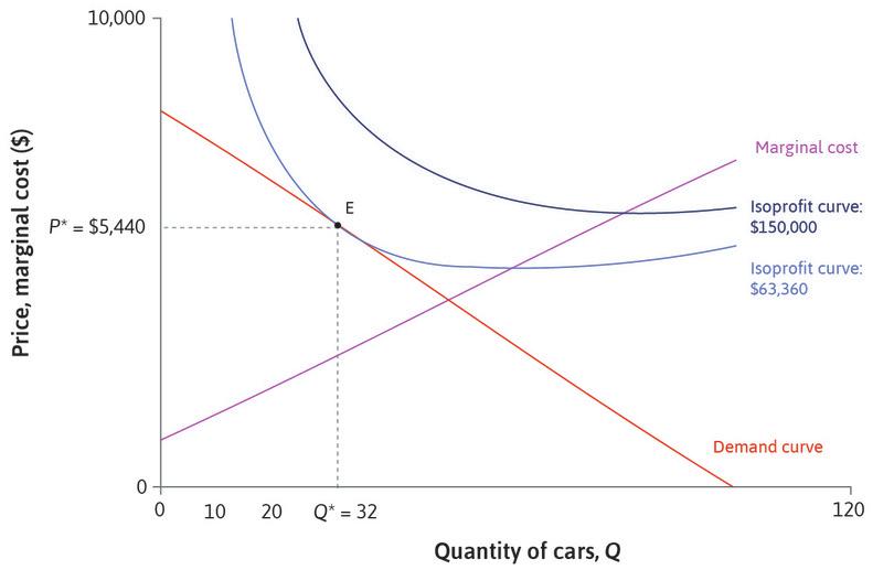
Gains from trade
When the firm sets its profit-maximizing price P* = $5,440 and sells Q* = 32 cars per day, the 32nd consumer, whose WTP is $5,440, is just indifferent between buying and not buying a car, so that particular buyer’s surplus is equal to zero.
Figure 7.13a When the firm sets its profit-maximizing price P* = $5,440 and sells Q* = 32 cars per day, the 32nd consumer, whose WTP is $5,440, is just indifferent between buying and not buying a car, so that particular buyer’s surplus is equal to zero.
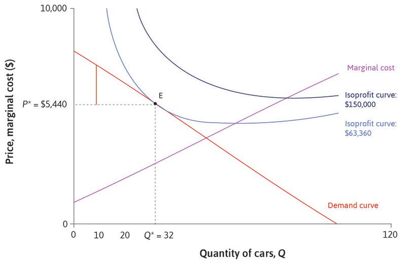
A higher WTP
Other buyers were willing to pay more. The 10th consumer, whose WTP is $7,200, makes a surplus of $1,760, shown by the vertical line at the quantity 10.
Figure 7.13b Other buyers were willing to pay more. The 10th consumer, whose WTP is $7,200, makes a surplus of $1,760, shown by the vertical line at the quantity 10.
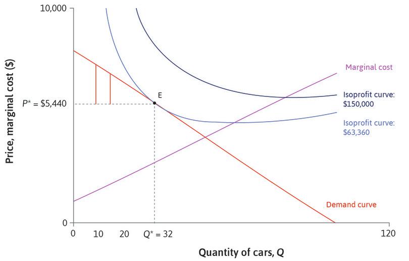
What would the 15th customer have been willing to pay?
The 15th consumer has WTP of $6,800 and hence a surplus of $1,360.
Figure 7.13c The 15th consumer has WTP of $6,800 and hence a surplus of $1,360.

The consumer surplus
To find the total surplus obtained by consumers, we add together the surplus of each buyer. This is shown by the shaded triangle between the demand curve and the line where price is P*. This measure of the consumers’ gains from trade is the consumer surplus.
Figure 7.13d To find the total surplus obtained by consumers, we add together the surplus of each buyer. This is shown by the shaded triangle between the demand curve and the line where price is P*. This measure of the consumers’ gains from trade is the consumer surplus.
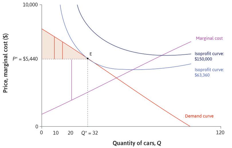
The producer surplus for the 20th car
Similarly, the firm makes a producer surplus on each car sold. The marginal cost of the 20th car is $2,000. By selling it for $5,440, the firm gains $3,440, shown by the vertical line in the diagram between P* and the marginal cost curve.
Figure 7.13e Similarly, the firm makes a producer surplus on each car sold. The marginal cost of the 20th car is $2,000. By selling it for $5,440, the firm gains $3,440, shown by the vertical line in the diagram between P* and the marginal cost curve.
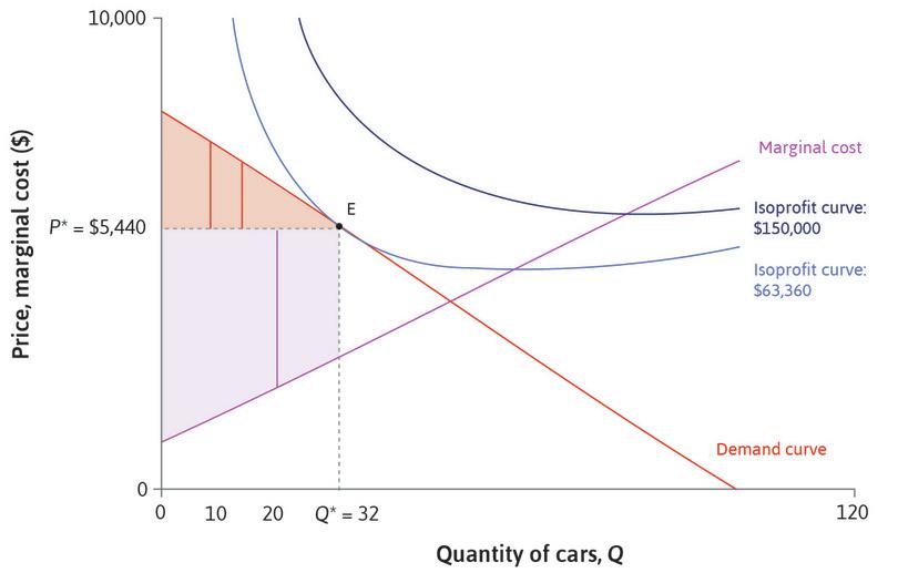
The total producer surplus
To find the total producer surplus, we add together the surplus on each car produced: this is the purple-shaded area.
Figure 7.13f To find the total producer surplus, we add together the surplus on each car produced: this is the purple-shaded area.
The marginal car
The firm obtains a surplus on the marginal car: the 32nd and last car is sold at a price greater than marginal cost.
Figure 7.13g The firm obtains a surplus on the marginal car: the 32nd and last car is sold at a price greater than marginal cost.
Consumer surplus, producer surplus, profit
- The consumer surplus is a measure of the benefits of participation in the market for consumers.
- The producer surplus is closely related to the firm’s profit, but it is not quite the same thing. Producer surplus is the difference between the firm’s revenue and the marginal costs of every unit, but it doesn’t allow for the fixed costs, which are incurred even when Q = 0.
- The profit is the producer surplus minus fixed costs.
- The total surplus arising from trade in this market, for the firm and consumers together, is the sum of consumer and producer surplus.
In Figure 7.13, the shaded area above P* measures the consumer surplus, and the shaded area below P* is the producer surplus. We see from the relative size of the two areas in Figure 7.13 that in this market, the firm obtains a greater surplus share.
As in the voluntary contracts between Angela and Bruno, both parties gain in the market for Beautiful Cars, and the division of the gains is determined by bargaining power. In this case the firm has more power than its consumers because it is the only seller of Beautiful Cars. It can set a high price and obtain a high share of the gains, knowing that consumers with high valuations of the car have no alternative but to accept. An individual consumer has no power to bargain for a better deal because the firm has many other potential customers.
Pareto efficiency
- Pareto efficient
- An allocation with the property that there is no alternative technically feasible allocation in which at least one person would be better off, and nobody worse off.
- Pareto improvement
- A change that benefits at least one person without making anyone else worse off. See also: Pareto dominant.
Is the allocation of cars in this market Pareto efficient? The answer is no, because there are some consumers who do not purchase cars at the firm’s chosen price, but who would nevertheless be willing to pay more than it would cost the firm to produce them. In Figure 7.13 we saw that Beautiful Cars makes a surplus on the marginal car (the 32nd one). The price is greater than the marginal cost. It could produce another car, and sell it to the 33rd consumer at a price lower than $5,440 but higher than the production cost. This would be a Pareto improvement: both the firm and the 33rd consumer would be better off. In other words, the potential gains from trade in the market for this type of car have not been exhausted at E.
Suppose the firm had chosen instead point F, where the marginal cost curve crosses the demand curve. This point represents a Pareto-efficient allocation, with no further potential Pareto improvements—producing another car would cost more than any of the remaining consumers would pay. Figure 7.14 explains why the total surplus, which we can think of as the pie to be shared between the firm and its customers, would be higher at F.
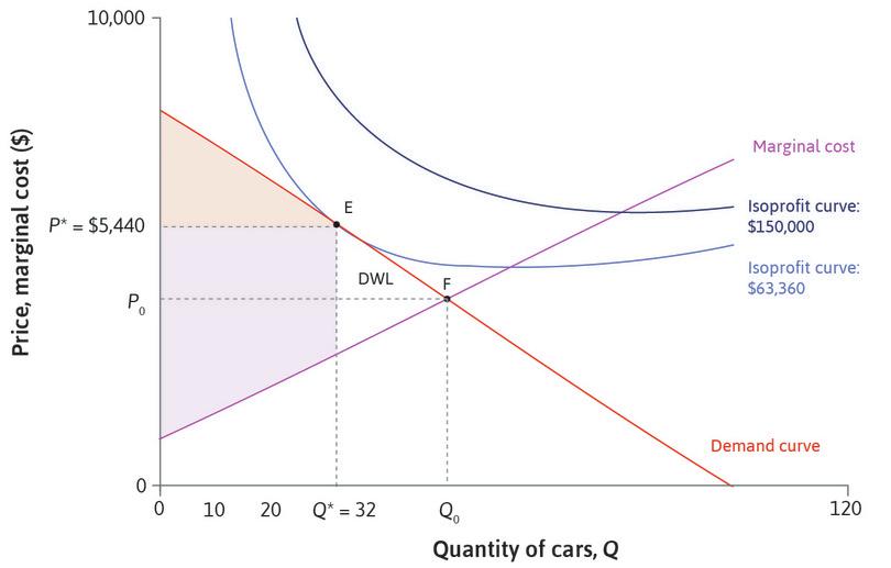
Deadweight loss.
Figure 7.14 Deadweight loss.
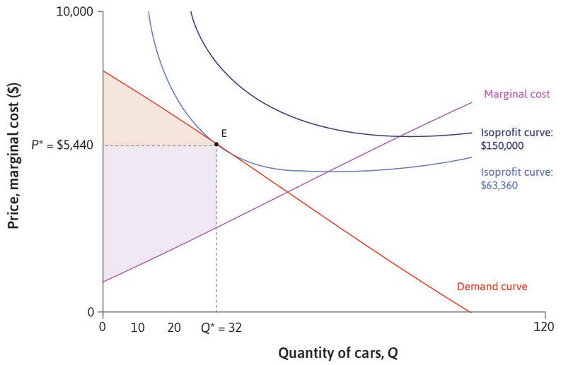
Unexploited gains from trade
The firm’s profit-maximizing price and quantity is at point E, but there are unexploited gains from trade. The firm could make one more car and sell it to the 33rd consumer for more than it would cost to produce.
Figure 7.14a The firm’s profit-maximizing price and quantity is at point E, but there are unexploited gains from trade. The firm could make one more car and sell it to the 33rd consumer for more than it would cost to produce.
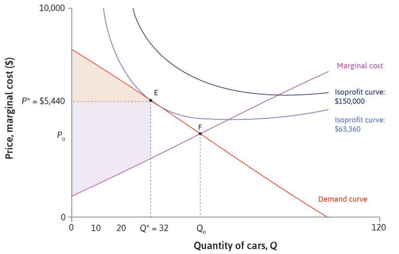
A Pareto-efficient allocation
Suppose the firm chooses F instead, selling Q0 cars at a price P0 equal to the marginal cost. This allocation is Pareto efficient: making another car would cost more than P0, and there are no more consumers willing to pay that much.
Figure 7.14b Suppose the firm chooses F instead, selling Q0 cars at a price P0 equal to the marginal cost. This allocation is Pareto efficient: making another car would cost more than P, and there are no more consumers willing to pay that much.

A higher consumer surplus
The consumer surplus is higher at F than at E.
Figure 7.14c The consumer surplus is higher at F than at E.
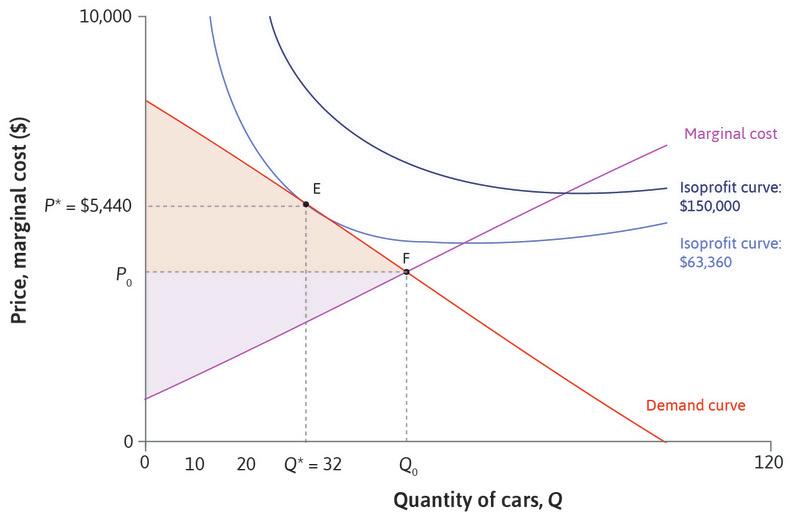
A higher total surplus
The producer surplus is lower at F than at E, but the total surplus is higher.
Figure 7.14d The producer surplus is lower at F than at E, but the total surplus is higher.
Deadweight loss
At E, there is a deadweight loss equal to the area of the white triangle between Q = 32, the demand curve and the MC curve.
Figure 7.14e At E, there is a deadweight loss equal to the area of the white triangle between Q = 32, the demand curve and the MC curve.
The total surplus would be higher at the Pareto-efficient point (F) than at point E. Consumer surplus would be higher, because those who were willing to buy at the higher price would benefit from the lower price, and additional consumers would also obtain a surplus. But Beautiful Cars will not choose F, because producer surplus is lower there (and you can see that it is on a lower isoprofit curve).
- deadweight loss
- A loss of total surplus relative to a Pareto-efficient allocation.
Since the firm chooses E, there is a loss of potential surplus, known as the deadweight loss. On the diagram it is the triangular area between Q = 32, the demand curve, and the marginal cost curve.
It might seem confusing that the firm chooses E when we said that at this point it would be possible for both the consumers and the firm to be better off. That is true, but only if cars could be sold to other consumers at a lower price than to the first 32 consumers. The firm chooses E because that is the best it can do given the rules of the game (setting one price for all consumers). The allocation that results from price-setting by the producer of a differentiated product like Beautiful Cars is Pareto inefficient. The firm uses its bargaining power to set a price that is higher than the marginal cost of a car. It keeps the price high by producing a quantity that is too low, relative to the Pareto-efficient allocation.
As a thought experiment, imagine that the rules of the game were different, and the firm could charge separate prices to each buyer, just below the buyer’s willingness to pay. Then the firm would definitely sell to any potential buyer whose willingness to pay exceeded the marginal cost, and as a result all mutually beneficial trades would take place. It would produce the Pareto-efficient quantity of cars.
To set individual prices in this way (called price discrimination), the firm would need to know the willingness to pay of every buyer. In this hypothetical case the deadweight loss would disappear. The firm would capture the entire surplus: there would be producer surplus, but no consumer surplus. We might think this unfair, but the market allocation would be Pareto efficient.
Exercise 7.5 Changing the rules of the game
- Suppose that Beautiful Cars had sufficient information and so much bargaining power that it could charge each consumer, separately, the maximum they would be willing to pay. Draw the demand and marginal cost curves (as in Figure 7.14), and indicate on your diagram:
- the number of cars sold
- the highest price paid by any consumer
- the lowest price paid
- the consumer and producer surplus
- Can you think of any examples of goods that are sold in this way?
- Why is this not common practice?
- Some firms charge different prices to different groups of consumers—for example, airlines may charge higher fares for last-minute travellers. Why would they do this and what effect would it have on the consumer and producer surpluses?
- Suppose a competition policy has changed the rules of the game. How could this give consumers more bargaining power?
- Under these rules, how many cars would be sold?
- Under these rules, what would the producer and consumer surpluses be?
Question 7.13 Choose the correct answer(s)
Which of the following statements is correct?
- This is correct: to be more precise, each consumer receives a surplus equal to the difference between the WTP and the price, and consumer surplus is the sum of the surpluses of all consumers.
- Producer surplus is the difference between the firm’s revenue and its marginal costs. This is not the same as profit, because it doesn’t account for the fixed costs of production. The profit is the producer surplus minus the fixed costs.
- The deadweight loss is the loss of potential total surplus due to the firm producing below the Pareto-efficient level. It is the sum of the surplus losses of both the consumers and the producer.
- All possible gains would be achieved at the Pareto-efficient output level. But the profit-maximizing choice of a firm producing a differentiated good is not Pareto efficient.
7.8 The elasticity of demand
The firm maximizes profit by choosing the point where the slope of the isoprofit curve (MRS) is equal to the slope of the demand curve (MRT), which represents the trade-off that the firm is constrained to make between price and quantity.
- price elasticity of demand
- The percentage change in demand that would occur in response to a 1% increase in price. We express this as a positive number. Demand is elastic if this is greater than 1, and inelastic if less than 1.
So the firm’s decision depends on how steep the demand curve is: in other words, how much consumers’ demand for a good will change if the price changes. The price elasticity of demand is a measure of the responsiveness of consumers to a price change. It is defined as the percentage change in demand that would occur in response to a 1% increase in price. For example, suppose that when the price of a product increases by 10%, we observe a 5% fall in the quantity sold. Then we calculate the elasticity, ε, as follows:
ε is the Greek letter epsilon, which is often used to represent elasticity. For a demand curve, quantity falls when price increases. So the change in demand is negative if the price change is positive, and vice versa. The minus sign in the formula for the elasticity ensures that we get a positive number as our measure of responsiveness. So in this example we get:
The price elasticity of demand is related to the slope of the demand curve. If the demand curve is quite flat, the quantity changes a lot in response to a change in price, so the elasticity is high. Conversely, a steeper demand curve corresponds to a lower elasticity. But they are not the same thing, and it is important to notice that the elasticity changes as we move along the demand curve, even if the slope doesn’t.
Figure 7.15 shows (again) the demand curve for cars, which has a constant slope: it is a straight line. At every point, if the quantity increases by one (ΔQ = 1), the price falls by $80 (ΔP = –$80):
Since ΔP = −$80 when ΔQ = 1 at every point on the demand curve, it is easy to calculate the elasticity at any point. At A, for example, Q = 20 and P = $6,400. So:
And so:
The table in Figure 7.15 calculates the elasticity at several points on the demand curve. Use the steps in the analysis to see that, as we move down the demand curve, the same changes in P and Q lead to a higher percentage change in P and a lower percentage change in Q, so the elasticity falls.
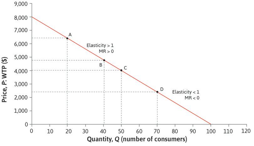
| Elasticity = – % Change in Q / % Change in P | ||||
|---|---|---|---|---|
| A | B | C | D | |
| Q | 20 | 40 | 50 | 70 |
| P | $6,400 | $4,800 | $4,000 | $2,400 |
| ΔQ | 1 | 1 | 1 | 1 |
| ΔP | −$80 | −$80 | −$80 | −$80 |
| % change in Q | 5.00 | 2.50 | 2.00 | 1.43 |
| % change in P | –1.25 | –1.67 | –2.00 | –3.33 |
| Elasticity | 4.00 | 1.50 | 1.00 | 0.43 |
| MR | $4,880 | $1,680 | $80 | −$3,120 |
The elasticity of demand for cars.
Figure 7.15 The elasticity of demand for cars.
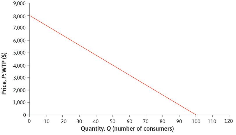
| Elasticity = − % Change in Q/% Change in P | ||||
|---|---|---|---|---|
| A | B | C | D | |
| Q | 20 | 40 | 50 | 70 |
| P | $6,400 | $4,800 | $4,000 | $2,400 |
| ΔQ | 1 | 1 | 1 | 1 |
| ΔP | −$80 | −$80 | −$80 | −$80 |
| % change in Q | 5.00 | 2.50 | 2.00 | 1.43 |
| % change in P | −1.25 | −1.67 | −2.00 | −3.33 |
| Elasticity | 4.00 | 1.50 | 1.00 | 0.43 |
| MR | $4,880 | $1,680 | $80 | −3,120 |
This demand curve is a straight line
At each point on the demand curve if Q increases by 1, P changes by ΔP = −$80.
Figure 7.15a At each point on the demand curve if Q increases by 1, P changes by ΔP = −$80.
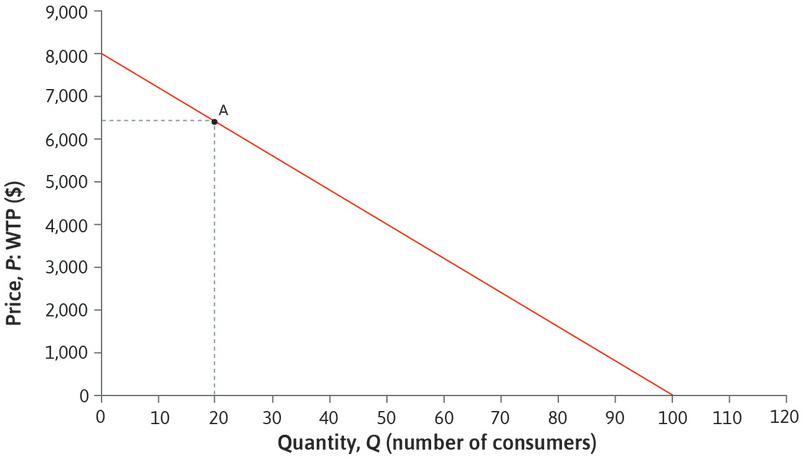
| Elasticity = − % Change in Q/% Change in P | ||||
|---|---|---|---|---|
| A | B | C | D | |
| Q | 20 | 40 | 50 | 70 |
| P | $6,400 | $4,800 | $4,000 | $2,400 |
| ΔQ | 1 | 1 | 1 | 1 |
| ΔP | −$80 | −$80 | −$80 | −$80 |
| % change in Q | 5.00 | 2.50 | 2.00 | 1.43 |
| % change in P | −1.25 | −1.67 | −2.00 | −3.33 |
| Elasticity | 4.00 | 1.50 | 1.00 | 0.43 |
| MR | $4,880 | $1,680 | $80 | −$3,120 |
Elasticity at A
At point A, if ΔQ = 1, the % change in Q is 100 × 1/20 = 5%. Since ΔP = −$80, the % change in price is 100 × (−80)/6,400 = −1.25%. The elasticity is 4.00.
Figure 7.15b At point A, if ΔQ = 1, the % change in Q is 100 × 1/20 = 5%. Since ΔP = −$80, the % change in price is 100 × (−80)/6,400 = −1.25%. The elasticity is 4.00.

| Elasticity = − % Change in Q/% Change in P | ||||
|---|---|---|---|---|
| A | B | C | D | |
| Q | 20 | 40 | 50 | 70 |
| P | $6,400 | $4,800 | $4,000 | $2,400 |
| ΔQ | 1 | 1 | 1 | 1 |
| ΔP | −$80 | −$80 | −$80 | −$80 |
| % change in Q | 5.00 | 2.50 | 2.00 | 1.43 |
| % change in P | −1.25 | −1.67 | −2.00 | −3.33 |
| Elasticity | 4.00 | 1.50 | 1.00 | 0.43 |
| MR | $4,880 | $1,680 | $80 | −$3,120 |
Elasticity is lower at B than at A
At B, Q is higher, so the percentage change when ΔP = 1 is lower. Similarly, P is lower and the percentage change in P is higher. So the elasticity at B is lower than at A. The table shows that it is 1.50.
Figure 7.15c At B, Q is higher, so the percentage change when ΔP = 1 is lower. Similarly, P is lower and the percentage change in P is higher. So the elasticity at B is lower than at A. The table shows that it is 1.50.
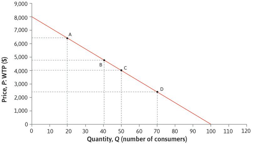
| Elasticity = − % Change in Q/% Change in P | ||||
|---|---|---|---|---|
| A | B | C | D | |
| Q | 20 | 40 | 50 | 70 |
| P | $6,400 | $4,800 | $4,000 | $2,400 |
| ΔQ | 1 | 1 | 1 | 1 |
| ΔP | −$80 | −$80 | −$80 | −$80 |
| % change in Q | 5.00 | 2.50 | 2.00 | 1.43 |
| % change in P | −1.25 | −1.67 | −2.00 | −3.33 |
| Elasticity | 4.00 | 1.50 | 1.00 | 0.43 |
| MR | $4,880 | $1,680 | $80 | −$3,120 |
As Q increases, elasticity decreases
The elasticity is equal to 1 at C, and below 1 at D.
Figure 7.15d The elasticity is equal to 1 at C, and below 1 at D.
| Elasticity = − % Change in Q/% Change in P | ||||
|---|---|---|---|---|
| A | B | C | D | |
| Q | 20 | 40 | 50 | 70 |
| P | $6,400 | $4,800 | $4,000 | $2,400 |
| ΔQ | 1 | 1 | 1 | 1 |
| ΔP | −$80 | −$80 | −$80 | −$80 |
| % change in Q | 5.00 | 2.50 | 2.00 | 1.43 |
| % change in P | −1.25 | −1.67 | −2.00 | −3.33 |
| Elasticity | 4.00 | 1.50 | 1.00 | 0.43 |
| MR | $4,880 | $1,680 | $80 | −$3,120 |
The marginal revenue
The table also shows the marginal revenue at each point. When the elasticity is higher than 1, MR > 0. When the elasticity is below 1, MR < 0.
Figure 7.15e The table also shows the marginal revenue at each point. When the elasticity is higher than 1, MR > 0. When the elasticity is below 1, MR < 0.
We say that demand is elastic if the elasticity is higher than 1, and inelastic if it is less than 1. You can see from the table in Figure 7.15 that the marginal revenue is positive at points where demand is elastic, and negative where it is inelastic. Why does this happen? When demand is highly elastic, price will only fall a little if the firm increases its quantity. So by producing one extra car, the firm will gain revenue on the extra car without losing much on the other cars and total revenue will rise; in other words, MR > 0. Conversely, if demand is inelastic, the firm cannot increase Q without a big drop in P, so MR < 0. In the Einstein at the end of this section, we demonstrate that this relationship is true for all demand curves.
Question 7.14 Choose the correct answer(s)
A shop sells 20 hats per week at $10 each. When it increases the price to $12, the number of hats sold falls to 15 per week. Which of the following statements are correct?
- When the price increases from $10 to $12, demand decreases.
- The percentage price increase is 100 × 2/10 = 20%. It causes a percentage decrease in demand of 100 × 5/20 = 25%.
- Using the figures to estimate the price elasticity of demand gives a value greater than 1, so demand is elastic.
- The percentage price increase is 100 × 2/10 = 20%; the percentage decrease in demand is 100 × 5/20 = 25%. So the elasticity can be estimated as 25/20 = 1.25.
How does the elasticity of demand affect a firm’s decisions? Remember that the car manufacturer’s profit-maximizing quantity is Q = 32. You can see in Figure 7.15 that this is on the elastic part of the demand curve. The firm would never want to choose a point such as D where the demand curve is inelastic because the marginal revenue is negative there; it would always be better to decrease the quantity, since that would raise revenue and decrease costs. So the firm always chooses a point where the elasticity is greater than 1.
- profit margin
- The difference between the price and the marginal cost.
Secondly, the firm’s profit margin (the difference between the price and the marginal cost of production) is closely related to the elasticity of demand. Figure 7.16 represents a different situation of highly elastic demand. The demand curve is quite flat, so small changes in price make a big difference to sales. The profit-maximizing choice is point E. You can see that the profit margin is relatively small. This means that the quantity of cars it chooses to make is not far below the Pareto-efficient quantity, at point F, where the profit margin is zero.
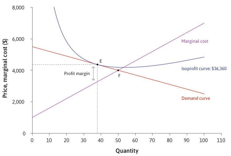
A firm facing highly elastic demand.
Figure 7.16 A firm facing highly elastic demand.
Figure 7.17 shows the decision of a firm with the same costs of car production, but less elastic demand for its product. In this case, the profit margin is high, and the quantity is low. When the price is raised, many consumers are still willing to pay. The firm maximizes profits by exploiting this situation, obtaining a higher share of the surplus, but the result is that fewer cars are sold and the unexploited gains from trade, shown by the deadweight loss, are high.
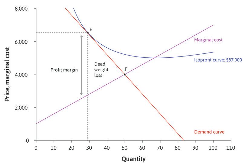
A firm facing less elastic demand.
Figure 7.17 A firm facing less elastic demand.
- price markup
- The price minus the marginal cost divided by the price. It is inversely proportional to the elasticity of demand for this good.
Leibniz: The elasticity of demand
These examples illustrate that the lower the elasticity of demand, the more the firm will raise the price above the marginal cost to achieve a high profit margin. When demand elasticity is low, the firm has the power to raise the price without losing many customers, and the markup, which is the profit margin as a proportion of the price, will be high. The Einstein at the end of this section shows you that the markup is inversely proportional to the elasticity of demand.
Question 7.15 Choose the correct answer(s)
The figure depicts two demand curves, D₁ and D₂.
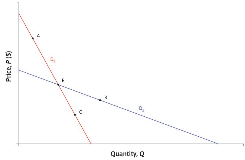
Based on this figure, which of the following statements are correct?
- At E, the price and quantity are the same on both demand curves, but D₁ is steeper, so it is less elastic than D₂.
- The slope is the same at A and C, but at A the price is higher and quantity is lower, so the elasticity is higher.
- The price and quantity are the same on both demand curves, but D₁ is steeper, so the elasticities are not the same.
- The slope is the same at E and C. But at E the price is higher and quantity is lower, so the elasticity is higher.
Einstein The elasticity of demand and the marginal revenue
The diagram shows how to obtain a general formula for the elasticity at a point (Q, P) on the demand curve.
It also shows how the elasticity is related to the slope of the demand curve. A flatter demand curve has a lower slope, indicating higher elasticity.
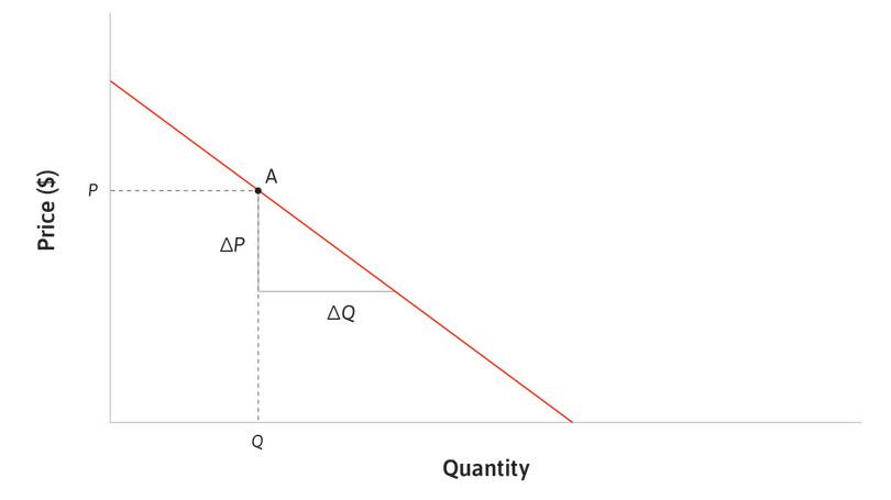
![The elasticity of demand and the marginal revenue.]()
The elasticity of demand and the marginal revenue.
Figure 7.18 The elasticity of demand and the marginal revenue.
At point A, the price is P and the quantity is Q. If the quantity increases by ΔQ, the price falls: it changes by ΔP, which is negative.
Suppose that the demand curve is elastic at A. Then the elasticity is greater than one:
Multiplying by −QΔP (which is positive):
and rearranging, we get:
Consider the special case when ΔQ = 1. The inequality becomes:
Now remember that the marginal revenue at point A is the change in revenue when Q increases by one unit. This change consists of the gain in revenue on the extra unit, which is P, and the loss on the other units, which is QΔP. So this inequality tells us that the marginal revenue is positive.
We have shown that if the demand curve is elastic, MR > 0. Similarly, if the demand curve is inelastic, MR < 0.
The size of the markup chosen by the firm
We can find a formula that shows that the markup is high when the elasticity of demand is low.
We know that the firm chooses a point where the slope of the isoprofit curve is equal to the slope of the demand curve, and that the slope of the demand curve is related to the price elasticity of demand:
Rearranging this formula:
We also know from Section 7.4:
When the two slopes are equal:
Rearranging this gives us:
The left-hand side is the profit margin as a proportion of the price, which is called the markup. Therefore:
The firm’s markup is inversely proportional to the elasticity of demand.
7.9 Using demand elasticities in government policy
Measuring elasticities of demand is useful to policymakers. If the government puts a tax on a particular good, the tax will raise the price paid by consumers, so the effect of the tax will depend on the elasticity of demand:
- If demand is highly elastic: A tax will cause a large reduction in sales. That may be intentional, as when governments tax tobacco to discourage smoking because it is harmful to health.
- If a tax causes a large fall in sales: It also reduces potential tax revenue.
So a government wishing to raise tax revenue should choose to tax products with inelastic demand.
Several countries, including Mexico and France, have introduced taxes intended to reduce the consumption of unhealthy food and drink. A 2014 international study found worrying increases in adult and childhood obesity since 1980. In 2013, 37% of men and 38% of women worldwide were overweight or obese. In North America, the figures were 70% and 61%, but the obesity epidemic does not only affect the richest countries: the corresponding rates were 59% and 66% in the Middle East and North Africa.
Matthew Harding and Michael Lovenheim used detailed data on the food purchases of US consumers to estimate elasticities of demand for different types of food, to investigate the effects of food taxes. They divided food products into 33 categories and used a model of consumer decision making to examine how changes in their prices would change the share of each category in consumers’ expenditure on food, and hence the nutritional composition of the diet, taking into account that the change in the price of any product would change the demand for that product and other products too. Figure 7.19 shows the prices and elasticities for some of the categories.
| Category | Type | Calories per serving | Price per 100 g ($) | Typical spending per week ($) | Price elasticity of demand |
|---|---|---|---|---|---|
| 1 | Fruit and vegetables | 660 | 0.38 | 2.00 | 1.128 |
| 2 | Fruit and vegetables | 140 | 0.36 | 3.44 | 0.830 |
| 15 | Grain, pasta, bread | 1,540 | 0.38 | 2.96 | 0.854 |
| 17 | Grain, pasta, bread | 960 | 0.53 | 2.64 | 0.292 |
| 28 | Snacks, candy | 433 | 1.13 | 4.88 | 0.270 |
| 29 | Snacks, candy | 1,727 | 0.68 | 7.60 | 0.295 |
| 30 | Milk | 2,052 | 0.09 | 2.32 | 1.1793 |
| 31 | Milk | 874 | 0.15 | 1.44 | 1.972 |
Figure 7.19 Price elasticities of demand for different types of food. See the Calories per serving to compare high and low calorie groups of each food type.
Matthew Harding and Michael Lovenheim. 2013. ‘The Effect of Prices on Nutrition: Comparing the Impact of Product- and Nutrient-Specific Taxes’. SIEPR Discussion Paper No. 13-023.
You can see that the demand for lower-calorie milk products (category 31) is the most price-responsive. If their price increased by 10%, the quantity purchased would fall by 19.72%. Demand for snacks and candy is quite inelastic, which suggests that it may be difficult to deter consumers from buying them.
Exercise 7.6 Elasticity and expenditure
Figure 7.19 shows the spending per week in each category of a US consumer whose total expenditure on food is $80, with typical spending patterns across food categories. Suppose that the price of category 30, high-calorie milk products, increased by 10%:
- By what percentage would his demand for high-calorie milk products fall?
- Calculate the quantity he consumes, in grams, before and after the price change.
- Calculate his total expenditure on high-calorie milk products before and after the price change. You should find that expenditure falls.
- Now choose a category for which the price elasticity is less than 1, and repeat the calculations. In this case you should find that expenditure rises.
Harding and Lovenheim examined the effects of 20% taxes on sugar, fat and salt. A 20% sugar tax, for example, would increase the price of a product that contains 50% sugar by 10%. A sugar tax was found to have the most positive effect on nutrition. It would reduce sugar consumption by 16%, fat by 12%, salt by 10%, and calorie intake by 19%.6
For additional insight, this blog illustrates one reaction to Matthew Harding and Michael Lovenheim’s research: The Huffington Post. 2014. ‘There’s An Easy Way To Fight Obesity, But Conservatives Will HATE It’.
Exercise 7.7 Food taxes and health
Food taxes intended to shift consumption towards a healthier diet are controversial. Some people think that individuals should make their own choices, and if they prefer unhealthy products, the government should not interfere. In view of the fact that those who become ill will be cared for at some public expense, others argue that the government has a role in keeping people healthy.
In your own words, provide arguments for or against food taxes designed to encourage healthy eating.
7.10 Price-setting, competition, and market power
- monopoly
- A firm that is the only seller of a product without close substitutes. Also refers to a market with only one seller. See also: monopoly power, natural monopoly.
Our analysis of the firm’s pricing decisions applies to any firm producing and selling a product that is in some way different from that of any other firm. In the nineteenth century the French economist Augustin Cournot carried out a similar analysis using the example of bottled water from ‘a mineral spring which has just been found to possess salutary properties possessed by no other’. Cournot referred to this as a case of monopoly—in a monopolized market there is only one seller. He showed, as we have done, that the firm would set a price greater than the marginal production cost.7
Great economists Augustin Cournot
Augustin Cournot (1801–1877) was a French economist, now most famous for his model of oligopoly (a market with a small number of firms). Cournot’s 1838 book Recherches sur les Principes Mathématiques de la Théorie des Richesses (Research on the Mathematical Principles of the Theory of Wealth) introduced a new mathematical approach to economics, although he feared it would ‘draw on me … the condemnation of theorists of repute’. Cournot’s work influenced other nineteenth century economists such as Marshall and Walras, and established the basic principles we still use to think about the behaviour of firms. Although he used algebra rather than diagrams, Cournot’s analysis of demand and profit maximization is very similar to ours.
We saw in Section 7.6 that when the producer of a differentiated good sets a price above the marginal cost of production, the market outcome is not Pareto efficient. When trade in a market results in a Pareto-inefficient allocation, we describe this as a case of market failure.
Market failure
Market failure occurs when markets allocate resources in a Pareto-inefficient way.
The deadweight loss gives us a measure of the consequences of market failure: the size of the unexploited gains from trade. And we saw in Section 7.7 that the deadweight loss resulting from setting a price above marginal cost is high when the elasticity of demand is low.
So what determines the elasticity demand for a product, and why do some firms face more elastic demand than others? To answer this question, we need to think again about how consumers behave.
Markets with differentiated products reflect differences in the preferences of consumers. People who want to buy a car are looking for different combinations of characteristics. A consumer’s willingness to pay for a particular model will depend not only on its characteristics, but also on the characteristics and prices of similar types of car sold by other firms.
For example, Figure 7.20 shows the purchase prices of a three-door 1.0 litre hatchback in the UK in January 2014, which a consumer could find on a price comparison website.
| Price | |
|---|---|
| Ford Fiesta | £11,917 |
| Vauxhall Corsa | £11,283 |
| Peugeot 208 | £10,384 |
| Toyota IQ | £11,254 |
Car purchase prices in the UK (January 2014, Autotrader.com).
Figure 7.20 Car purchase prices in the UK (January 2014, Autotrader.com).
Although the four cars are similar in their main characteristics, the website compares them on 75 other features, many of which differ between them.
When consumers can choose between several quite similar cars, the demand for each of these cars is likely to be quite elastic. If the price of the Ford Fiesta, for example, were to rise, demand would fall because people would choose to buy one of the other brands instead. Conversely, if the price of the Fiesta were to fall, demand would increase because consumers would be attracted away from the other cars. The more similar the other cars are to a Fiesta, the more responsive consumers will be to price differences. Only those with the highest brand loyalty to Ford, and those with a strong preference for a characteristic of the Ford that other cars do not possess, would fail to respond. Then the firm will have a relatively low price and profit margin.
- monopoly rents
- A form of economic profits, which arise due to restricted competition in selling a firm’s product. See also: economic profits.
In contrast, the manufacturer of a very specialized type of car, quite different from any other brand in the market, faces little competition and hence less elastic demand. It can set a price well above marginal cost without losing customers. Such a firm is earning monopoly rents (economic profits over and above its production costs) arising from its position as the only supplier of this type of car (likewise, an innovative firm earns rents while it is the only firm using a new technology: see Unit 2).
- substitutes
- Two goods for which an increase in the price of one leads to an increase in the quantity demanded of the other. See also: complements.
- market power
- An attribute of a firm that can sell its product at a range of feasible prices, so that it can benefit by acting as a price-setter (rather than a price-taker).
So a firm will be in a strong position if there are few firms producing close substitutes for its own brand, because it faces little competition. Then its elasticity of demand will be relatively low. We say that such a firm has market power. It will have sufficient bargaining power in its relationship with customers to set a high price without losing them to competitors.
Competition policy
This discussion helps to explain why policymakers may be concerned about firms that have few competitors. Market power allows them to set high prices, and make high profits, at the expense of consumers. Potential consumer surplus is lost both because few consumers buy, and because those who buy pay a high price. The owners of the firm benefit, but overall there is a deadweight loss.
A firm selling a niche product catering for the preferences of a small number of consumers (such as a Beautiful Car or a luxury brand like a Lamborghini) is unlikely to attract the attention of policymakers, despite the loss of consumer surplus. But if one firm is becoming dominant in a large market, governments may intervene to promote competition. In 2000 the European Commission prevented the proposed merger of Volvo and Scania, on the grounds that the merged firm would have a dominant position in the heavy trucks market in Ireland and the Nordic countries. In Sweden the combined market share of the two firms was 90%. The merged firm would have been almost a monopoly—the extreme case of a firm that has no competitors at all.
- cartel
- A group of firms that collude in order to increase their joint profits.
A particular concern is that when there are only a few firms in a market they may form a cartel: a group of firms that collude to keep the price high. By working together and behaving as a monopoly, rather than competing, they can increase profits. A well-known example is OPEC, an association of oil-producing countries. OPEC members jointly agree to set production levels to control the global price of oil. The OPEC cartel played a major role in sustaining high oil prices at a global level following the sharp increase in oil prices in 1973 and again in 1979. We return to study the causes of fluctuations in oil prices in Unit 11 and the effect of the oil price shocks on inflation and unemployment in Unit 15.
- competition policy
- Government policy and laws to limit monopoly power and prevent cartels. Also known as: antitrust policy.
While cartels between private firms are illegal in many countries, firms often find ways to cooperate in the setting of prices so as to maximize profits. Policy to limit market power and prevent cartels is known as competition policy, or antitrust policy in the US.
Dominant firms may exploit their position by strategies other than high prices. In a famous antitrust case, the US Department of Justice accused Microsoft of behaving anti-competitively by ‘bundling’ its own Internet Explorer web-browser with its Windows operating system.8 In the 1920s, an international group of companies making electric light bulbs, including Philips, Osram, and General Electric, formed a cartel that agreed a policy of ‘planned obsolescence’ to reduce the lifetime of their bulbs to 1,000 hours, so that consumers would have to replace them more quickly.9 Despite its promise of ‘always low prices’, some people accuse Walmart of using its power unfairly, to reduce wages in the area around its stores, drive smaller retailers out of the market, or reduce the profits of its wholesale suppliers to unsustainable levels.10 A paper by John Vickers examines the economic basis for these claims.11
Exercise 7.8 Multinationals or independent retailers?
Imagine that you are a politician in a town where a multinational retailer is planning to build a new superstore. A local campaign is protesting that it will drive small independent retailers out of business, and thereby reduce consumer choice and change the character of the area. Supporters of the plan argue in turn that this will only happen if consumers prefer the supermarket.
Which side are you on?
Question 7.16 Choose the correct answer(s)
Suppose that in a small town a multinational retailer is planning to build a new superstore. Which of the following arguments could be correct?
- The availability of close substitutes implies elastic demands for those goods.
- Close substitutability between goods implies competition between providers, which typically results in lower prices.
- If the local retailers are driven out, the multinational will have more market power. It will face less elastic demand, and be able to raise prices without losing customers.
- High differentiability (low substitutability) implies less elastic demand.
7.11 Product selection, innovation, and advertising
The profits that a firm can achieve depend on the demand curve for its product, which in turn depends on the preferences of consumers and competition from other firms. But the firm may be able to move the demand curve to increase profits by changing its selection of products, or through advertising.12
Parker Brothers first marketed a property-trading board game under the name Monopoly in 1935. In a series of court cases in the 1970s, Parker Brothers attempted to prevent Ralph Anspach, an economics professor, from selling a game called Anti-Monopoly. Anspach claimed that Parker Brothers did not have exclusive rights to sell Monopoly, since the company had not originally invented it.
After the court ruled in favour of Anspach, many competing versions of Monopoly appeared on the market.
After a change in the law, Parker Brothers established the right to the Monopoly trademark in 1984, so Monopoly is now a monopoly again.
When deciding what goods to produce, the firm would ideally like to find a product that is both attractive to consumers and has different characteristics from the products sold by other firms. In this case demand would be high (many consumers would wish to buy it at each price) and the elasticity low. Of course, this is not likely to be easy. A firm wishing to make a new breakfast cereal, or type of car, knows that there are already many brands on the market. But technological innovation may provide opportunities to get ahead of competitors. After Toyota developed the first mass-produced hybrid car, the Prius, in 1997, there were for some years very few comparable cars available. Toyota effectively monopolized the hybrid market. By 2013 there were several competing brands, but the Prius remained the market leader, with more than 50% of hybrid sales.
If a firm has invented or created a new product, it may be able to prevent competition altogether by claiming exclusive rights to produce it, using patent or copyright laws. Ironically, in the 1970s a company called Parker Brothers spent years fighting in court to protect a monopoly that they had on a profitable board game called Monopoly. This kind of legal protection of monopoly may help to provide incentives for research and development of new products, but at the same time limits the gains from trade. In Unit 21, we analyse intellectual property rights in more detail.
Advertising is another strategy that firms can use to influence demand. It is widely used by both car manufacturers and breakfast cereal producers. When products are differentiated, the firm can use advertising to inform consumers about the existence and characteristics of its product, attract them away from its competitors, and create brand loyalty.
According to Schonfeld and Associates, a firm of market analysts, advertising on breakfast cereals in the US is about 5.5% of total sales revenue—about 3.5 times higher than the average for manufactured products. The data in Figure 7.21 is for the highest-selling 35 breakfast cereal brands sold in the Chicago area in 1991 and 1992. The graph shows the relationship between market share and quarterly expenditure on advertising. If you investigated the breakfast cereals market more closely, you would see that market share is not closely related to price. But it is clear from Figure 7.21 that the brands with the highest share are also the ones that spend the most on advertising. Matthew Shum, an economist, analysed cereal purchases in Chicago using this dataset, and showed that advertising was more effective than price discounts in stimulating demand for a brand. Since the most well-known brands were also the ones spending most on advertising, he concluded that its main function was not to inform consumers about the product, but rather to increase brand loyalty, and encourage consumers of other cereals to switch.13
Advertising expenditure and market share of breakfast cereals in Chicago (1991–92).
Figure 7.21 Advertising expenditure and market share of breakfast cereals in Chicago (1991–92).
Figure 1 in Matthew Shum. 2004. ‘Does Advertising Overcome Brand Loyalty? Evidence from the Breakfast-Cereals Market’. Journal of Economics & Management Strategy 13 (2): pp. 241–72.
7.12 Prices, costs, and market failure
Market failure occurs when the market allocation of a good is Pareto inefficient, and we have seen in this unit that one cause of market failure (we will see others in later units) is firms setting prices above the marginal cost of producing their goods.
Firms set prices above marginal costs when the goods they produce, like cars or breakfast cereals, are differentiated from those produced by other firms, so that they serve consumers with different preferences and face limited competition (or no competition, in the case of a monopolist producing a unique good). Firms can benefit from strategies that reduce competition, but without competition the deadweight loss may be high, so policymakers try to reduce the loss through competition policy.
Product differentiation is not the only reason for a price above marginal cost. A second important reason is decreasing average costs, perhaps due to economies of scale in production, fixed costs, or input prices declining as the firm purchases larger quantities. In such cases, the average cost of production is greater than the marginal cost of each unit, and the average cost curve slopes downward. The firm’s price must be at least equal to average cost—otherwise it makes a loss. And that means the price must be above the marginal cost.
- natural monopoly
- A production process in which the long-run average cost curve is sufficiently downward-sloping to make it impossible to sustain competition among firms in this market.
Of course, decreasing average costs mean that firms can produce at lower cost per unit when operating at a large scale. In domestic utilities such as water, electricity and gas, there are high fixed costs of providing the supply network, irrespective of the quantity demanded by consumers. Utilities typically have increasing returns to scale. The average cost of producing a unit of water, electricity or gas will be very high unless the firm operates at a large scale. If a single firm can supply the whole market at lower average cost than two firms, the industry is said to be a natural monopoly.
In the case of a natural monopoly, policymakers may not be able to induce firms to lower their prices by promoting competition, since average costs would rise with more firms in the market. They may choose instead to regulate the firm’s activities, limiting its discretion over prices in order to increase consumer surplus. An alternative is public ownership. The majority of water supply companies around the world are owned by the public sector, although in England and Wales in 1989, and in Chile in the 1990s, the entire water industry was privatized and is regulated by a public sector agency.
A different kind of example is a film production company. The company spends heavily on hiring actors, camera technicians, a director, purchasing rights to the script, and advertising the film. These are fixed costs (sometimes called first copy costs). The cost of making available additional copies of the film (the marginal cost) is typically low: the first copy is cheap to reproduce. This firm’s marginal costs will be below its average costs (including the normal rate of profit). If it were to set a price equal to marginal cost it would go out of business.
The price of a differentiated product is above the marginal cost as a direct result of the firm’s response to the absence of competing firms and price-insensitivity of consumers. The source of the problem in the cases of utilities and films is the cost structure, rather than lack of competition per se. Electricity is usually not a differentiated product, so buyers of electricity may be strongly price-sensitive, and the film industry is highly competitive. But price must be greater than marginal cost for firms to survive.
However, the two problems—limited competition and decreasing average costs—are often closely related because competition among firms with downward-sloping average cost curves tends to be winner-takes-all. The first firm to exploit the cost advantages of large size eliminates other firms and, as a result, eliminates competition too.
Whatever the underlying reason, a price above marginal cost results in market failure. Too little is purchased: there are some potential buyers whose willingness to pay exceeds the marginal cost but falls short of the market price—so they won’t buy the good and there is a deadweight loss.
7.13 Conclusion
We have studied how firms producing differentiated goods choose the price and the quantity of output to maximize their profit. These decisions depend on the demand curve for the product—especially the elasticity of demand—and the cost structure for producing it. They will choose a price above the marginal cost of production—even more so when competition is limited and the elasticity of demand low.
Increasing returns in production and other cost advantages favour firms operating at large scale, where the unit cost is low. Innovation can also reduce costs and raise profits.
When the market price is above the marginal production cost, there is market failure: the allocation of the good is Pareto inefficient. Firms make economic profits, but consumer surplus is lower than it would be if the price was equal to the marginal cost, and there is a deadweight loss. So policymakers may be concerned when firms achieve a dominant position in a market. They can use competition policy and regulation to limit the exercise of market power.
Concepts introduced in Unit 7
Before you move on, review these definitions:
7.14 References
- Basker, Emek. 2007. ‘The Causes and Consequences of Wal-Mart’s Growth’. Journal of Economic Perspectives 21 (3): pp. 177–198.
- Cournot, Augustin, and Irving Fischer. 1971. Researches into the Mathematical Principles of the Theory of Wealth. New York, NY: A. M. Kelley.
- Gilbert, Richard J., and Michael L. Katz. 2001. ‘An Economist’s Guide to US v. Microsoft’. Journal of Economic Perspectives 15 (2): pp. 25–44.
- Harding, Matthew, and Michael Lovenheim. 2013. ‘The Effect of Prices on Nutrition: Comparing the Impact of Product- and Nutrient-Specific Taxes’. SIEPR Discussion Paper No. 13-023.
- Kay, John. ‘The Structure of Strategy’ (reprinted from Business Strategy Review 1993).
- Koshal, Rajindar K., and Manjulika Koshal. 1999. ‘Economies of Scale and Scope in Higher Education: A Case of Comprehensive Universities’. Economics of Education Review 18 (2): pp. 269–277.
- Krajewski, Markus. 2014. ‘The Great Lightbulb Conspiracy’. IEEE Spectrum. Updated 24 September 2014.
- Schumacher, Ernst F. 1973. Small Is Beautiful: Economics as If People Mattered. New York, NY: HarperCollins.
- Shum, Matthew. 2004. ‘Does Advertising Overcome Brand Loyalty? Evidence from the Breakfast-Cereals Market’.. Journal of Economics & Management Strategy 13 (2): pp. 241–272.
- Statista. 2011. ‘Willingness to pay for a flight in space’. Updated 20 October 2011.
- Stigler, George J. 1987. The Theory of Price. New York, NY: Collier Macmillan.
- The Economist. 2008. ‘Economies of Scale and Scope’. Updated 20 October 2008.
- Vickers, John. 1996. ‘Market Power and Inefficiency: A Contracts Perspective’. Oxford Review of Economic Policy 12 (4): pp. 11–26.
-
Ernst F. Schumacher. 1973. Small Is Beautiful: Economics as If People Mattered. New York, NY: HarperCollins. Note: link to first 80 pages only. ↩
-
‘Willingness to Pay for a Flight in Space’. Statista. Updated 20 October 2011. ↩
-
Rajindar K. Koshal and Manjulika Koshal. 1999. ‘Economies of Scale and Scope in Higher Education: A Case of Comprehensive Universities’. Economics of Education Review 18 (2): pp. 269–77. ↩
-
Economies of Scale and Scope. The Economist. Updated 20 October 2008. ↩
-
George J. Stigler. 1987. The Theory of Price. New York, NY: Collier Macmillan. ↩
-
Matthew Harding and Michael Lovenheim. 2013. ‘The Effect of Prices on Nutrition: Comparing the Impact of Product- and Nutrient-Specific Taxes’. SIEPR Discussion Paper No. 13-023. ↩
-
Augustin Cournot and Irving Fischer. 1971. Researches into the Mathematical Principles of the Theory of Wealth. New York, NY: A. M. Kelley. ↩
-
Richard J. Gilbert and Michael L. Katz. 2001. ‘An Economist’s Guide to US v. Microsoft’. Journal of Economic Perspectives 15 (2): pp. 25–44. ↩
-
Markus Krajewski. 2014. ‘The Great Lightbulb Conspiracy’. IEEE Spectrum. Updated 25 September. ↩
-
Emek Basker. 2007. ‘The Causes and Consequences of Wal-Mart’s Growth’. Journal of Economic Perspectives 21 (3): pp. 177–198. ↩
-
John Vickers. 1996. ‘Market Power and Inefficiency: A Contracts Perspective’. Oxford Review of Economic Policy 12 (4): pp. 11–26. ↩
-
John Kay. ‘The Structure of Strategy’ (reprinted from Business Strategy Review 1993). ↩
-
Matthew Shum. 2004. ‘Does Advertising Overcome Brand Loyalty? Evidence from the Breakfast-Cereals Market’. Journal of Economics & Management Strategy 13 (2): pp. 241–72. ↩
