Unit 15 Inflation, unemployment, and monetary policy
Themes and capstone units
How the rate of unemployment and the level of output in the economy affect inflation, the challenges this poses to policymakers, and how this knowledge can support effective policies to stabilize employment and incomes
- When unemployment is low, inflation tends to rise. When unemployment is high, inflation falls.
- Policymakers and voters prefer low unemployment and low inflation (but not a falling price level).
- They typically cannot have both and face a trade-off instead.
- There is an inflation-stabilizing rate of unemployment, and a wage-price inflation spiral develops if unemployment is kept lower than this.
- Monetary policy affects aggregate demand and inflation through a variety of channels.
- Adverse shocks, such as an oil price increase, can lead to higher unemployment and higher inflation.
- Many governments have given responsibility for monetary policy—often described as inflation targeting—to central banks.
Before his successful 1992 US presidential campaign, Bill Clinton’s electoral strategists had decided that two of their campaign issues should be health policy and ‘change’. But it was the third focus of his campaign—the recession of 1991—that resonated with the public. The reason was the phrase the campaign workers used: ‘The economy, stupid!’
The 1991 recession meant that many Americans lost their jobs, and the Clinton campaign slogan brought this issue to the attention of the voters. When the ballots were counted in November 1992, Clinton received almost 6 million more votes than George H. W. Bush, the incumbent president.
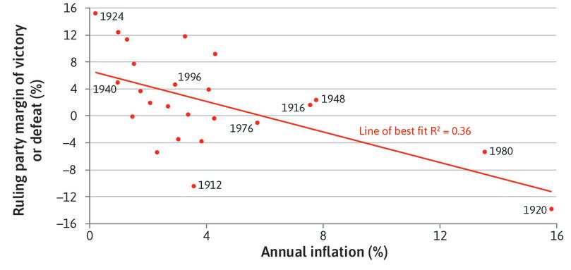
In a democracy, election outcomes are always affected by the state of the economy, and how the public judges the economic competence of the government and the opposition. Two important measures of this economic performance are unemployment and inflation. In Unit 13 we saw that unemployment undermines our wellbeing, but inflation worries us too. Figure 15.1 shows that in US presidential elections, the margin of victory of the ruling party is higher when inflation is lower.
Inflation and presidential election victory in the US (1912–2012).
Figure 15.1 Inflation and presidential election victory in the US (1912–2012).
Inflation before 1950: Michael Bordo, Barry Eichengreen, Daniela Klingebiel, and Maria Soledad Martinez-Peria. 2001. ‘Is the Crisis Problem Growing More Severe?’. Economic Policy 16 (32) (April): pp. 52–82; CPI after 1950: Federal Reserve Bank of St. Louis. 2015. FRED; Electoral results: US National Archives. 2012. ‘1789–2012 Presidential Elections’. US Electoral College.
So if you are a politician worrying about your citizens’ concerns as well as your own career, you should minimize both unemployment and inflation. Is this possible?
We get an insight by looking at how a German minister of finance, trained as an economist, handled his dual role as a politician (at an election rally in the evening) and as an economist (in his office the next day).
Helmut Schmidt was called the ‘super minister’ in the West German government of Chancellor Willy Brandt because he was both minister of economics and minister of finance.
At an election rally in 1972, he claimed that: ‘Five per cent inflation is easier to bear than five per cent unemployment.’ He promised that his party would prioritize lower unemployment whilst keeping inflation low and stable.
Helmut Schmidt (1918–2015) was West German Chancellor from 1974 until 1982. In 1972, inflation in West Germany was 5.5% (up from 5.2% the previous year) and unemployment was 0.7% (up from 0.5% the previous year). By 1975, inflation was 5.9% and unemployment was 3.1%.
The following day Professor Otto Schlecht, head of the economics policy department at the Federal Ministry of Economics, said to Schmidt: ‘Herr Minister, what you said yesterday, which is in the newspapers this morning, is false.’
Schmidt replied: ‘I agree that what I said was technically wrong. But you cannot advise me about what I decide is politically expedient to say to an election rally in front of 10,000 Ruhr miners in the Westfalenhalle in Dortmund.’
Helmut Schmidt’s commitment at the rally and his explanation afterward, show two things about the relationship between economics and politics. The first is that politicians are elected to office, and so respond to the views of voters. The second is that politicians as policymakers face constraints on their choice of policies. They can’t just promise the economic outcomes that voters care about—in Schmidt’s case: low unemployment, and low and stable inflation. The economist in Schmidt was well aware of the constraints but, at the rally, he was speaking as a politician.
- opportunity cost
- When taking an action implies forgoing the next best alternative action, this is the net benefit of the foregone alternative.
While the policymaker wants to deliver both low unemployment and low inflation, the economy operates in such a way that when unemployment goes down, inflation tends to go up. And when inflation falls, unemployment tends to go up. This is a problem we have seen before: policymakers must deliver what is feasible, and this involves trading one objective off against the other. Another way to say this: more inflation is the opportunity cost of lower unemployment, and more unemployment is the opportunity cost of less inflation. Moreover, the economy is subject to shocks that can make both inflation and unemployment worse, limiting the set of feasible outcomes. And experience from the late 1960s showed that inflation would carry on rising if unemployment were too low. This was the setting for Helmut Schmidt’s reflections on his election promise.
- inflation targeting
- Monetary policy regime where the central bank changes interest rates to influence aggregate demand in order to keep the economy close to an inflation target, which is normally specified by the government.
Following the experience of rising inflation across the world, during the late 1980s there was a rethinking of how macroeconomic policy should be designed. In the 1990s, the policy known as inflation targeting by central banks was widely adopted. Many governments delegated the management of fluctuations in the economy to the central bank, with fiscal policy playing a lesser role, and recognized that policies to improve the supply side of their economies—such as increasing competition and better functioning labour markets—were necessary if they wanted to achieve a lower rate of unemployment compatible with low and stable inflation.
As we saw in Unit 11, prices are messages. They send signals about scarce resources. We looked at how shifts in demand or supply for a good resulted in a change in its price relative to other goods and services, and how this signalled a change in the relative scarcity of the good or service. In this unit, we look not at relative prices but at inflation or deflation: a rise or fall in prices in general. We begin by asking how inflation got a bad name.
15.1 What’s wrong with inflation?
Before we turn to the question, we need to clarify a few terms.
- inflation
- An increase in the general price level in the economy. Usually measured over a year. See also: deflation, disinflation.
- deflation
- A decrease in the general price level. See also: inflation.
- disinflation
- A decrease in the rate of inflation. See also: inflation, deflation.
What is the difference between inflation, deflation, and disinflation?
A car analogy is a useful way to think about these differences. We can compare what happens to the price level in the economy with a car’s initial location and the distance covered when it travels at different speeds:
- Zero inflation: A constant price level from year to year means that inflation is zero. This is like a stationary car: the car’s location is constant and the distance travelled per hour is zero.
- Inflation: Now, consider a rate of inflation, such as 2% per year. This means that the price level goes up by 2% each year. This is the case of a car travelling at a constant speed: a car travelling at 20 km per hour means that the distance from the initial location increases by 20 km each hour. After two hours, the car is 40 km away from its initial location; after another hour, it is 60 km away, and so on.
- Deflation: Deflation is when the price level falls. This is equivalent to the car travelling backward at 20 km per hour. After an hour, the car is 20 km behind its initial location, and so on.
- Rising inflation: If the rate of inflation is increasing, the price level is increasing at an increasing rate. Suppose now that the rate of inflation increases from 2% to 4% to 6% in successive years, so the economy experiences rising inflation. This is the case of a car accelerating: the distance travelled from the starting point is increasing at an increasing rate, for example from 20 km per hour in the first hour to 40 km per hour in the second hour, and so on. After two hours, the car is 60 km away from its initial location.
- Falling inflation: This is called disinflation and is equivalent to a car reducing its speed, for example from 60 km per hour to 40 km per hour to 20 km per hour. Once the speed reaches zero, the car’s location does not change. The equivalent in the economy is that when inflation falls to zero, the price level does not change.
Describing a change in price level
- Inflation: The price level is rising
- Deflation: The price level is falling
- Disinflation: The inflation rate is falling
We have seen why voters dislike unemployment. But why do voters dislike inflation? For some people in the economy, such as some pensioners, incomes are fixed in nominal terms, meaning that they receive a fixed number of yuan or dollars or euros. If prices rise during the year, these households can buy fewer goods and services at the end of the year than they could at the beginning. They are worse off and will tend to vote against a party they believe will permit higher inflation.
Whether one loses or benefits from inflation also depends on which side of the credit market one is on. Julia the borrower and Marco the lender (in Unit 10) have a conflict about the interest rate at which Julia borrows. They also have differing interests about inflation, because if prices rise before Julia repays her loan, Marco will find that he can buy less with the repayment than would have been the case if there were zero inflation.
- nominal interest rate
- The interest rate uncorrected for inflation. It is the interest rate quoted by high-street banks. See also: real interest rate, interest rate.
- real interest rate
- The interest rate corrected for inflation (that is, the nominal interest rate minus the rate of inflation). It represents how many goods in the future one gets for the goods not consumed now. See also: nominal interest rate, interest rate.
More generally, using the same logic as we used when discussing the government’s debt in the previous unit, inflation means that:
- Borrowers with nominal debt will benefit: Those with mortgages on fixed nominal interest rate loans, for example, will benefit from inflation, because the debt stays the same in nominal terms, and so becomes smaller in real terms.
- Lenders with nominal assets will lose: Banks or others who have loaned money at fixed nominal interest rates will lose, because when the sum is repaid it will be worth less in terms of the goods or services it can buy. Very high inflation will wipe out the value of nominal assets, which happened in Zimbabwe in 2008–2009.1
- Fisher equation
- The relation that gives the real interest rate as the difference between the nominal interest rate and expected inflation: real interest rate = nominal interest rate – expected inflation.
To take account of inflation when analysing borrowing and lending, we use what is termed the real interest rate, which is defined as follows and is also known as the Fisher equation:
The real interest rate measures the buying power of the repayment of a loan at the prices that exist when the loan is repaid. To see what this means, let’s suppose Julia were to borrow $50 from Marco with a repayment of $55 next year. The nominal interest rate is 10%. But if next year’s prices were 6% higher than this year’s (6% inflation rate), then what Marco could buy with the repayment is not 10% more than he could have bought with the sum he loaned to Julia, but instead only 4%. The real interest rate is 4%.
In addition to redistributing income from creditors (those with assets) and those on nominally fixed incomes (like pensioners) to debtors, in some cases inflation can also make the economy work less well. While there is no evidence that moderate inflation is bad for the economy, when inflation is high it is often also volatile and therefore hard to predict. Large price changes create uncertainty, and make it more difficult for individuals and firms to make decisions based on prices.
- relative price
- The price of one good or service compared to another (usually expressed as a ratio).
- menu costs
- The resources used in setting and changing prices.
In an environment of high and volatile inflation, it is hard to separate the signal about the scarcity of resources (sent by relative prices) from the noise of erratically rising prices. Firms might find it harder to know which sector to invest in, or which crop would be better to plant (quinoa or barley, for example); individuals would find it harder to decide whether quinoa has become more expensive relative to other sources of protein. Moreover, in an inflationary environment, firms have to update their prices more frequently than they would prefer. This requires time and resources, referred to as menu costs.
Would households and firms be better off with falling prices? No. A sustained fall in the price level is undesirable for many of the same reasons that inflation is undesirable, and could have even more dramatic economic consequences. When prices are falling, households will postpone consumption (particularly of expensive items such as fridges, televisions, and cars) because they expect goods will be cheaper in the future. Similarly, deflation increases the debt burden of borrowers, for the same reason that inflation reduces it.
As we have seen in Unit 14, a rise in the debt burden depresses consumption because some affected households save to restore their target wealth and others find themselves credit-constrained. The fall in consumption will induce a drop in aggregate demand and economic activity. Weaker aggregate spending will tend to depress prices further and can trigger a vicious circle of falling prices and economic stagnation.
This happened in Japan. The Japanese economy was one of the great success stories of the period after the Second World War. The upward slope of its hockey stick was remarkably steep, as you saw in Unit 1. Living standards, as measured by GDP per capita, went from less than one-fifth of the level in the US in 1950 to more than 70% by 1980. But in the past 25 years, Japan has faced low growth and rising unemployment. For the first time for an advanced economy in the postwar period, there has been persistent deflation: deflation was observed in 12 years out of 21 between 1995 and 2015.
Many economists think that a little bit of inflation is a good thing, as long as it remains stable. In the next unit we will see one reason why this is the case. The process of innovation and change that characterizes a dynamic economy means that, in any given year, workers in some firms and sectors will be more in demand than in others. With rising prices, a fall in real income among the losers may be masked by the fact that nominal incomes are rising, or at least not falling. For example, many people will not even notice a slight fall in their real wage due to modest inflation, but nobody would fail to notice a reduction in his or her nominal wage. With some low inflation, the adjustment of workers and resources between different firms and industries in response to changes in relative wages can take place without losers experiencing falling nominal wages. Inflation greases the wheels of the labour market.
Another important reason to prefer a bit of inflation to none is that it gives monetary policy more room to manoeuvre. As we will see later, positive inflation allows the real interest rate to go lower in order to offset a major recession than if inflation is zero.
Question 15.1 Choose the correct answer(s)
The following table shows the annual inflation rate (the GDP deflator) of Japan, the UK, China, and South Sudan in the period 1996–2015 (Source: World Bank).
| 1996–2000 | 2001–2005 | 2006–2010 | 2011–2015 | |
|---|---|---|---|---|
| Japan | −1.9% | −0.9% | -0.5% | 1.6% |
| UK | 2.1% | 1.7% | 1.8% | 1.8% |
| China | 8.1% | 2.4% | 2.1% | 0.8% |
| South Sudan | 54.1% | 6.5% | 0.6% | −18.7% |
Based on this information, which of the following statements is correct?
- Japan experienced a falling price level—deflation—between 1996 and 2010. Disinflation describes a falling inflation rate but the inflation rate became less negative over time.
- In the UK the inflation rate remained stable. This means that the price level increased at a stable rate, not that the price level remained stable.
- China has been experiencing disinflationary pressure (falling inflation) and not deflationary pressure (which is a falling price level).
- The price level is lower in 2015 than in 2011 because inflation was negative, but it was not negative enough to outweigh the high inflation rate over 1996–2000.
Question 15.2 Choose the correct answer(s)
The following table shows the nominal interest rate and the annual inflation rate (the GDP deflator) of Japan in the period 1996–2015 (Source: World Bank).
| 1996–2000 | 2001–2005 | 2006–2010 | 2011–2015 | |
|---|---|---|---|---|
| Interest rate | 1.5% | 1.4% | 1.3% | 1.2% |
| Inflation rate | –1.9% | –0.9% | –0.5% | 1.6% |
Based on this information, which of the following statements are correct?
- Using the Fisher equation, the real interest rate in 1996–2000 was 1.5 – (–1.9) = 3.4%.
- The real interest rates for the four periods are: 3.4%, 2.3%, 1.8%, and –0.4% respectively. Therefore the real interest rate has been falling consistently over the period.
- It was positive in the first three periods and turned negative in 2011–2015.
- The decline in the real interest rate each year is larger than the decline in the nominal interest rate because the inflation rate was also rising.
15.2 Inflation results from conflicting and inconsistent claims on output
Inflation arises from conflicts among economic actors, when they are powerful enough that their claims on goods and services are inconsistent.
To see how this works, think of an economy composed of many firms (each of which is owned by a single individual) and their employees, who are also the consumers of the various goods produced by the firms. To keep track of what is happening in the firms, we assume that prices are set by the marketing department and wages by the human resources (HR) department.
Initially the marketing department in each firm is setting prices based on the markup that maximizes its profits, given the degree of competition in the markets in which it sells (as we saw in Units 7 and 9). And the HR department is also setting the real wage for its workers (which is the nominal wage in the firm, divided by the price level in the economy) as the lowest wage consistent with workers actually working, given the level of unemployment in the economy (as we saw in Units 6 and 9).
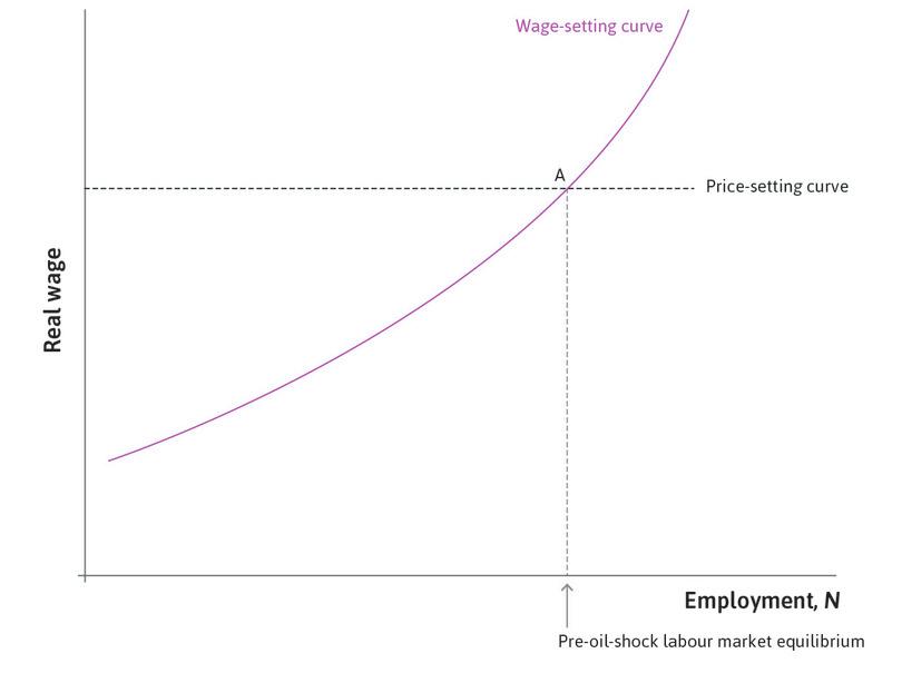
If, once all firms have set their wages and prices, the wage rate and the price level are consistent with the firms maximizing their profits, then there will be no reason for either prices or wages to be changed. At this unemployment rate, the price level is constant (inflation is zero). This is the level of unemployment where the wage-setting and price-setting curves intersect, that is, the labour market Nash equilibrium that we saw in Unit 9.
- protectionist policy
- Measures taken by a government to limit trade; in particular, to reduce the amount of imports in the economy. These are designed to protect local industries from external competition. They can take different forms, such as taxes on imported goods or import quotas.
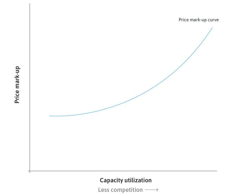
Suppose now that the government adopts protectionist policies, which make it difficult for foreign firms to enter its markets. Then the markets facing the firm become less competitive, so that the firm can charge a higher markup on its costs. If this is the case across the economy, the resulting increase in the price level will lower the real wage of the workers. But while the owner of an individual firm is happy with the higher price that the marketing department can now charge, the workers are unhappy with the fall in the real wage. The result is that workers now lack the motivation to work. So the HR department of the firm will raise its nominal wage, and all other firms will do the same. Both prices and wages have risen and the economy experiences inflation.
Will it end there? No. The nominal wage increase has raised the cost of production to firms and they will use this as the basis of their markup pricing, leading to a further increase in prices and a fall in the real wage, which the HR department will correct by again raising the nominal wage. The process of rising wages and prices will continue as long as:
- firms are powerful enough to charge the higher markup
- workers at the given unemployment rate have enough bargaining power to require the initial real wage in order to motivate them to work
In the example given, inflation rose while unemployment did not change, following a change in the competitive conditions facing firms that allowed them to raise their markup, increasing the owners’ profits. But there are other ways that the process could have begun from the same starting point. Suppose the degree of competition in product markets remains the same, but the level of employment rises. At the new lower level of unemployment the firms would want to pay workers a higher real wage to keep them working. This induces the marketing departments of firms to raise their prices, so as to maintain the markup that competitive conditions allowed. And the inflationary process would begin.
To summarize, inflation may result from:
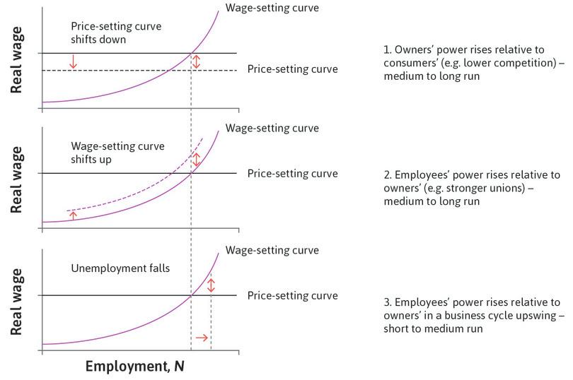
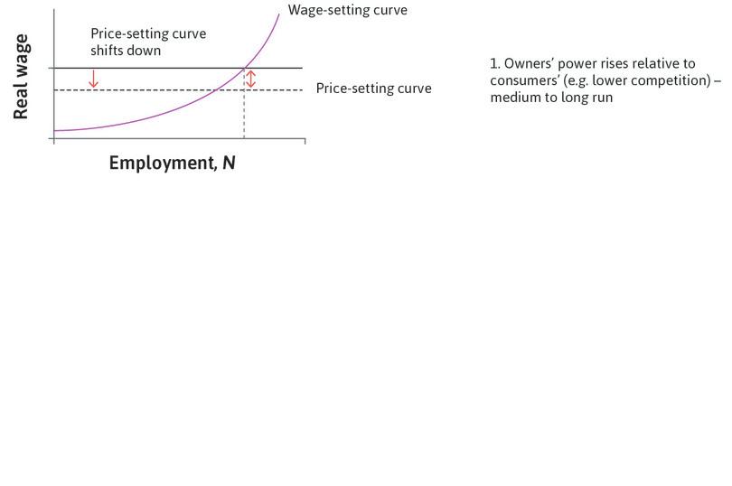
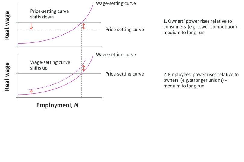
- An increase in the bargaining power of firms over their consumers: This is caused by a reduction in competition, which allows firms to charge a higher markup. It is a downward shift of the price-setting curve.
- An increase in the bargaining power of workers over firms: This allows them to get a higher wage in return for working hard.
There are two ways that the increase in the bargaining power of workers could take place:
- A shift upward of the wage-setting curve: The wage they would receive is higher at every level of employment.
- An increase in the level of employment, moving along the wage-setting curve: In this case, the wage-setting curve is unchanged.
We studied reasons for the shift in the wage-setting curve, such as improved generosity of unemployment benefits or stronger trade unions, in Unit 9. The movement along the wage-setting curve, rather than a shift in the curve, is what we will analyse next.
- wage inflation
- An increase in the nominal wage. Usually measured over a year. See also: nominal wage.
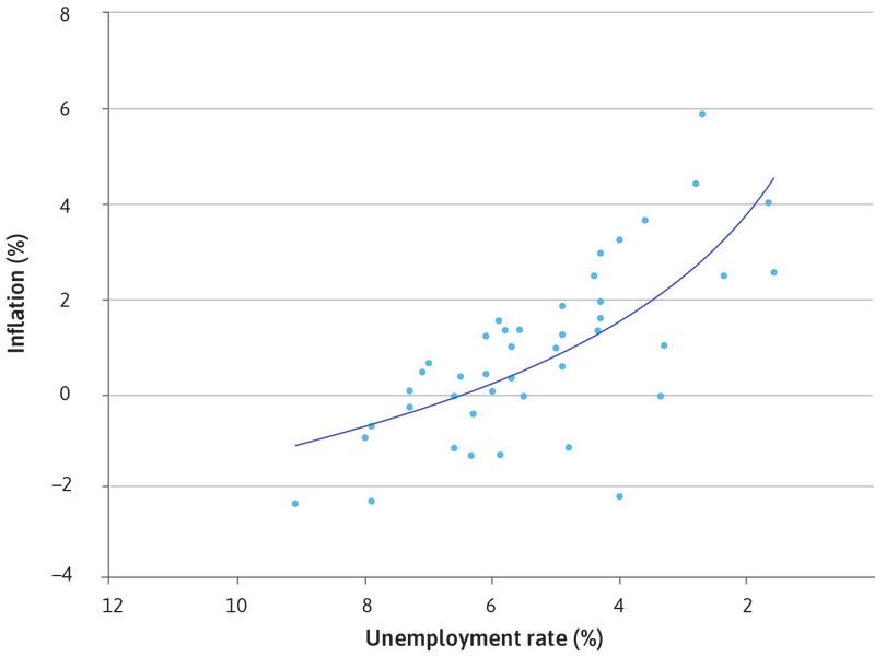
Figure 15.2 summarizes three causes of inflation. In Section 15.3, we explain how the changes in bargaining power illustrated in Figure 15.2 translate into inflation. The third cause—higher employment may result in inflation—came to light when William (Bill) Phillips, the economist, published a scatter plot of annual wage inflation and unemployment in the British economy. This is shown in Figure 15.3.
Phillips’s original curve: Wage inflation and unemployment (1861–1913).
Figure 15.3 Phillips’s original curve: Wage inflation and unemployment (1861–1913).
Ryland Thomas and Nicholas Dimsdale. (2017). ‘A Millennium of UK Data’. Bank of England OBRA dataset.
Great economists Bill Phillips
A. W. (‘Bill’) Phillips (1914–1975) was an unusually colourful character for a world-renowned economist. Raised in New Zealand, Phillips spent time as a crocodile hunter, a movie director, and a prisoner of war in Indonesia during the Second World War, before finally becoming a professor at the London School of Economics.
Phillips had engineering know-how, and while studying sociology in London in 1949, he built a hydraulic machine to model the British economy. The Monetary National Income Analogue Computer (MONIAC) used transparent pipes and coloured water to bring economists’ equations to life. It was like the hydraulic economy model produced by Irving Fisher half a century earlier (mentioned in Unit 2), but much more elaborate. MONIAC had tanks for each of the components of domestic GDP, such as investment, consumption, and government expenditures. Imports and exports were shown by water being added or drained from the model. The machine could be used to model the effect on the economy of shocks to different variables, such as tax rates and government spending, which would set in motion flows between the tanks. Working versions of the machine can still be found in the London Science Museum and universities around the world.2
- Phillips curve
- An inverse relationship between the rate of inflation and the rate of unemployment.
In a 1958 paper, Phillips made another major contribution to the study of economics. By drawing a scatterplot of the data for the rates of unemployment and inflation in the British economy between 1861 and 1913, he found that low rates of unemployment were associated with high rates of inflation, and high unemployment with low inflation. The relationship has since been referred to as the Phillips curve.
Question 15.3 Choose the correct answer(s)
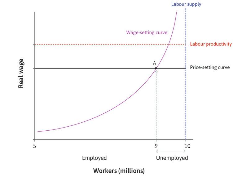
The following diagram depicts the model of the labour market:
Suppose now that the government adopts policies that make it difficult for foreign firms to enter its markets. Assume that the level of employment and the labour supply remain constant. Which of the following statements regarding mechanisms by which inflation is created are correct?
- A higher markup implies a downward shift in the price-setting curve.
- Wages rise because the economy is below the wage-setting curve at the unchanged unemployment rate. The wage-setting curve does not shift.
- This process is described in the text.
- This process is described in the text.
Question 15.4 Choose the correct answer(s)
The following diagram depicts the model of the labour market:
Suppose there is an increase in workers’ bargaining power that causes inflation. Which of the following statements are correct?
- The wage-setting curve rises if workers’ bargaining power increases.
- An increase in the unemployment level along a given wage-setting curve results in a fall in the real wage required to motivate to work, to below the price-setting curve. This represents a decline in workers’ bargaining power and will lead to deflation, not inflation.
- The increase in workers’ bargaining power can be due to an upward shift of the wage-setting curve or a decline in unemployment along the wage-setting curve. Once this has occurred, there is no further shift in the curves. Inflation is due to the fact that the economy is no longer at the intersection of the two curves.
- Inflation occurs due to the fact that the economy is no longer at the intersection of the two curves, and does not involve further moves in the curves.
15.3 Inflation, the business cycle, and the Phillips curve
When central banks report their interest rate decision to the public, they normally justify a rise in the interest rate by saying that forecast inflation is up. They are raising the interest rate to dampen aggregate demand, raise cyclical unemployment, and as a result, bring inflation back toward target.
Conversely, if they are announcing a lower interest rate, they explain that this is because there is a danger of inflation falling too low (possibly into deflation). Just as a reduction in aggregate demand and employment will bring inflation down, a rise in aggregate demand and employment will increase inflation.
To model inflation, we assume that the HR departments of firms set nominal wages (for example, in dollars, pounds, or euros) once a year, and that the marketing departments set prices immediately after wages. The real wage that employees care about is their nominal wage relative to the economy-wide level of prices, and is defined as:
- real wage
- The nominal wage, adjusted to take account of changes in prices between different time periods. It measures the amount of goods and services the worker can buy. See also: nominal wage.
It is the real wage on the vertical axis in the labour market diagram in Question 15.4.
To see how inflation comes about in a business cycle upswing, we begin with the economy at the labour market equilibrium and with constant prices, and consider a rise in aggregate demand, which reduces unemployment below the equilibrium.
- When unemployment is low, the HR department needs to set higher wages: The cost of job loss is low and workers expect higher real wages if they are to work effectively.
- Higher wages mean higher costs for firms: The marketing department will raise prices to cover the higher costs. As long as competitive conditions have not changed, the firm’s markup will be unchanged.
- The price level will have gone up: Once all firms in the economy have set higher prices, the economy has experienced wage and price inflation. And real wages have not increased: the percentage increase in W equals the percentage increase in P, so W/P is unchanged.
- wage-price spiral
- This occurs if an initial increase in wages in the economy is followed by an increase in the price level, which is followed by an increase in wages and so on. It can also begin with an initial increase in the price level.
What happens next? We assume that aggregate demand remains high enough to keep unemployment below the labour market equilibrium. At the next annual round of wage-setting, the HR department is in the same position as the previous year: with continuing low unemployment, workers are disappointed with their real wage. It must raise nominal wages. When costs go up, the marketing department raises prices once more. This is called the wage-price spiral. It explains why, at low unemployment, the price level rises, not just in the year that unemployment fell, but year after year.
If there is a recession instead of a boom, the wage-price spiral operates in reverse, and the price level falls year after year.
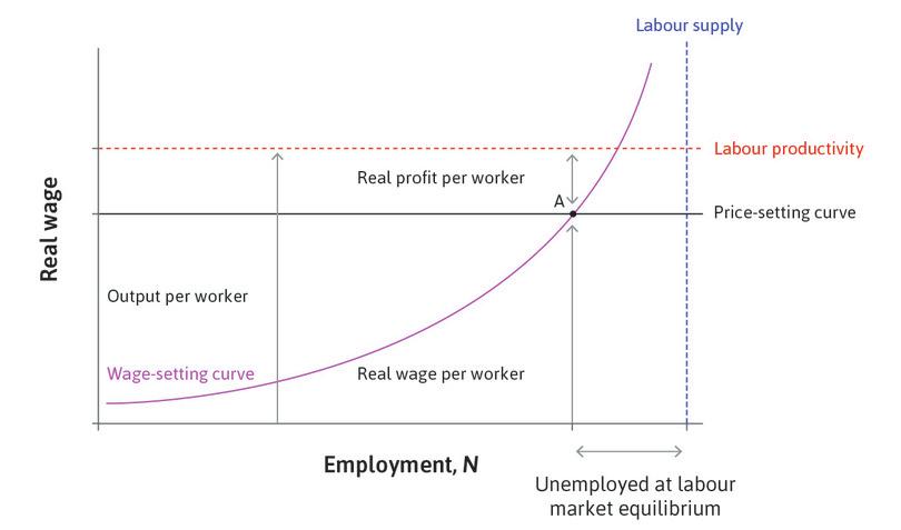
We now ask why prices would have been constant year after year before the boom in aggregate demand reduced unemployment. We will see that when the labour market is in equilibrium (the normal phase of the business cycle), there is no pressure for wages and prices to change. From Unit 9 we know that labour market equilibrium is where the wage-setting curve and the price-setting curve intersect. But why is this unemployment rate so special for the rate of inflation?
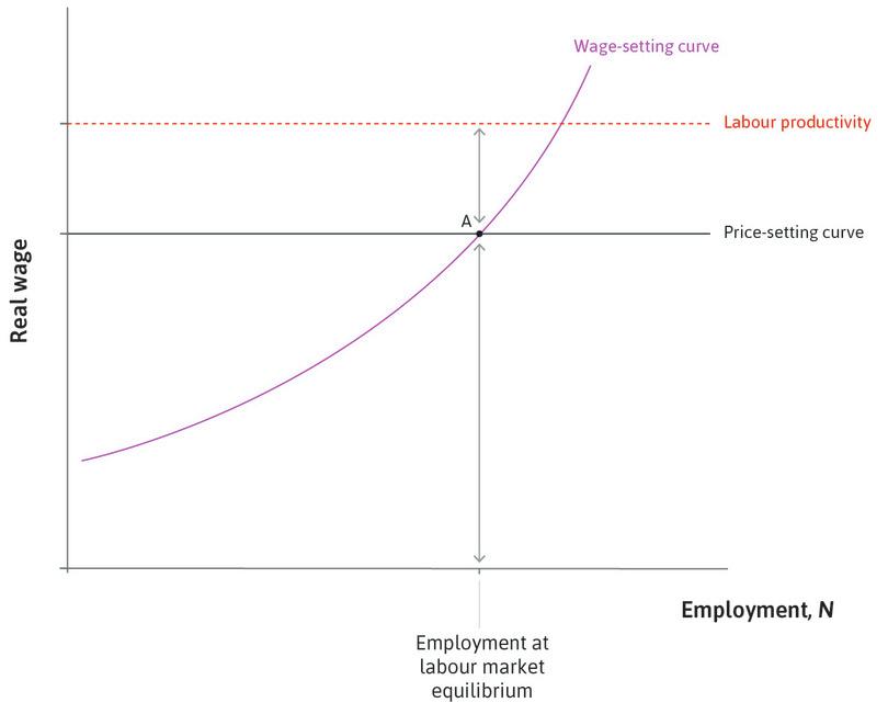
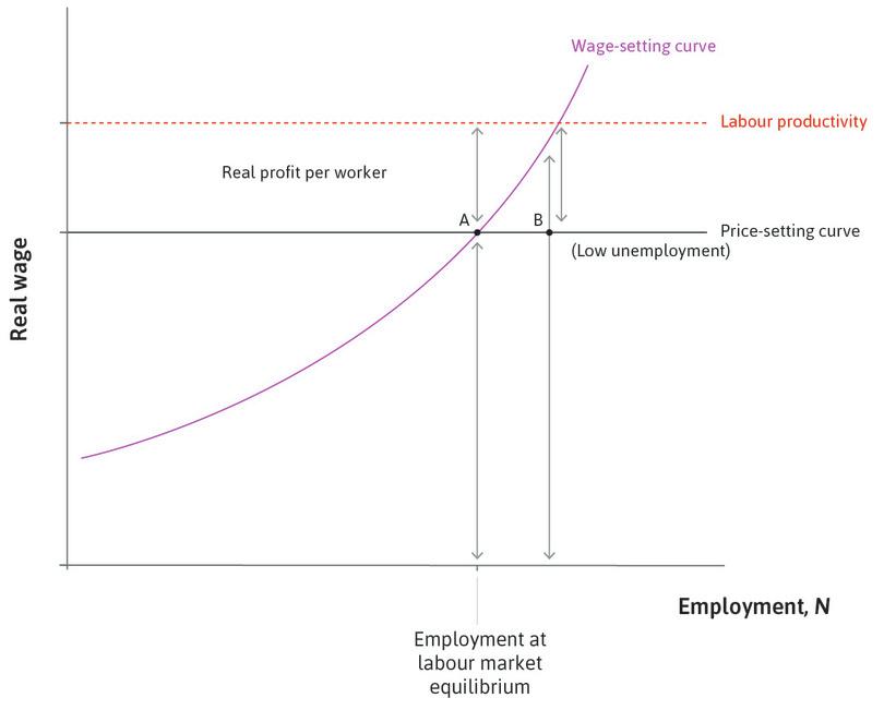
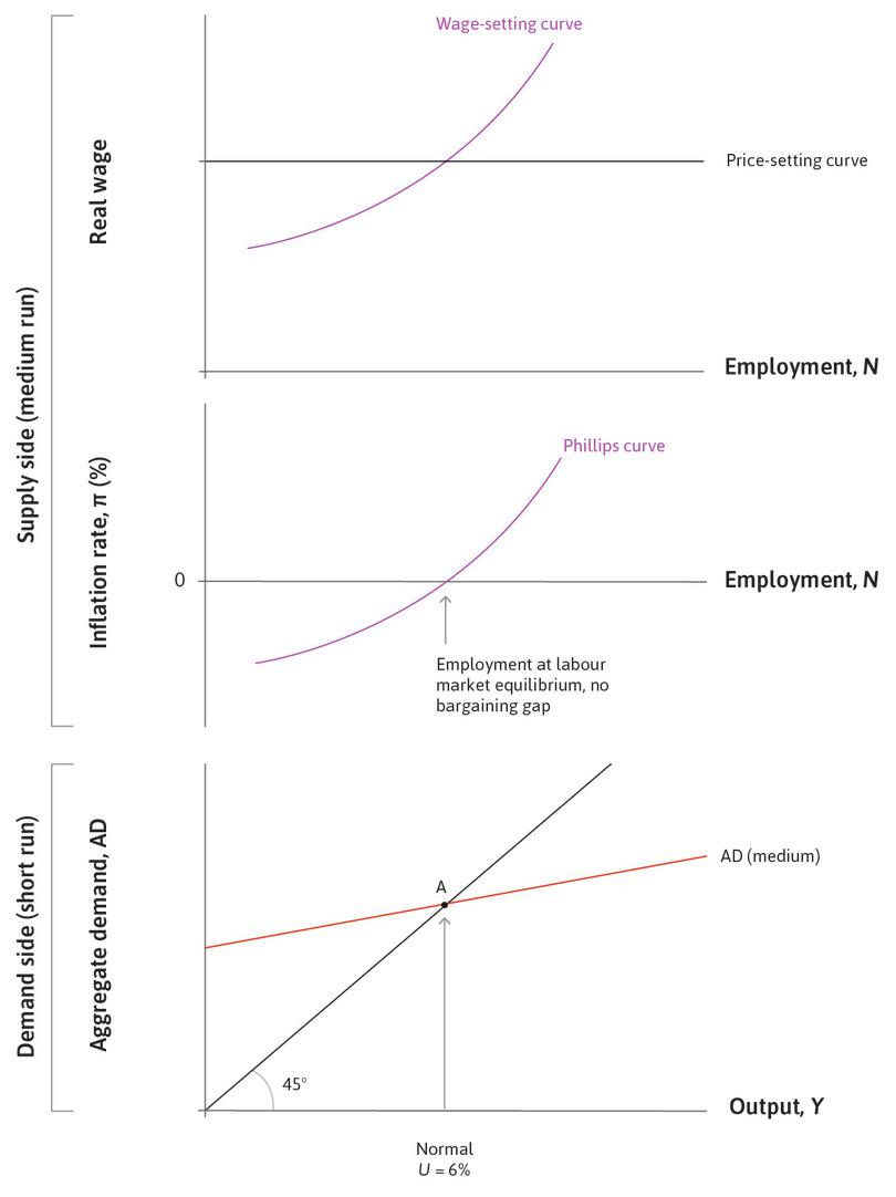
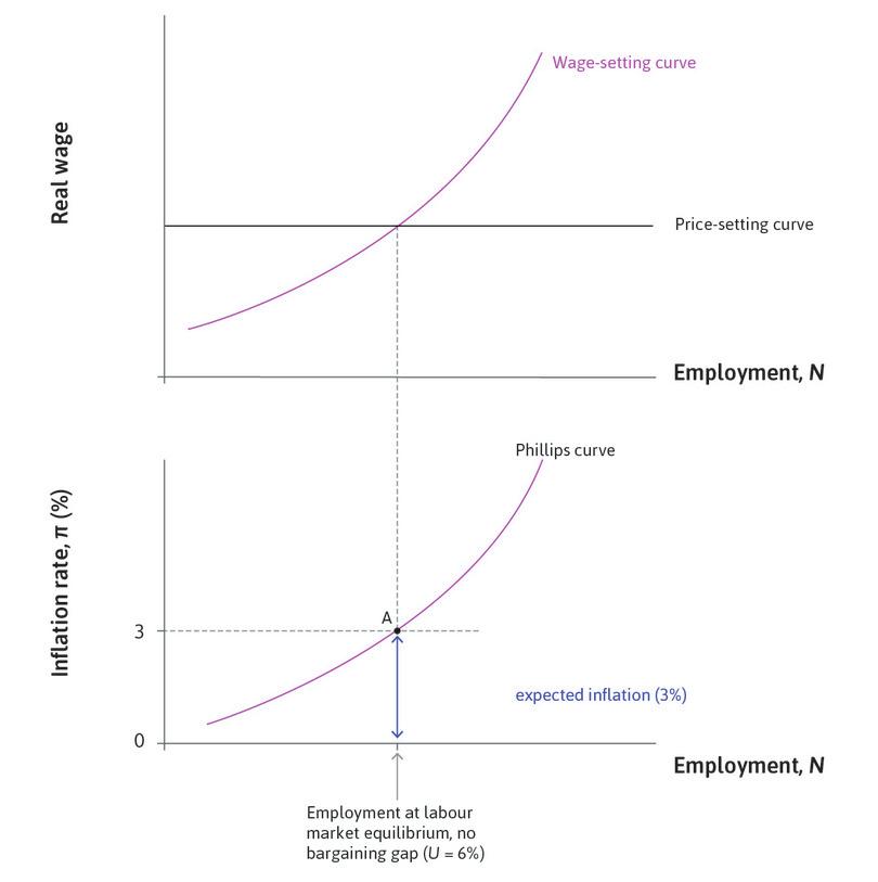
In Figure 15.4a, it is only at point (A), where the real wage on the wage-setting curve coincides with the real wage on the price-setting curve, that the labour market is at a Nash equilibrium. As we saw in Unit 9, at this point both workers and firms are doing the best that they can, given the actions of the other. At A, the claims of owners for profits and of workers for wages add up exactly to the size of the pie (the sum of the double-headed arrows showing the profits per worker and real wages is equal to output per worker, which is shown by the red dashed line). This means that the HR department will have no reason to raise wages, and with no increase in costs, the marketing department will keep prices unchanged. The real wage will remain constant and no one will be disappointed.
In an economy at the unemployment rate at labour market equilibrium (point A), wages and prices will be stable and inflation will be zero.
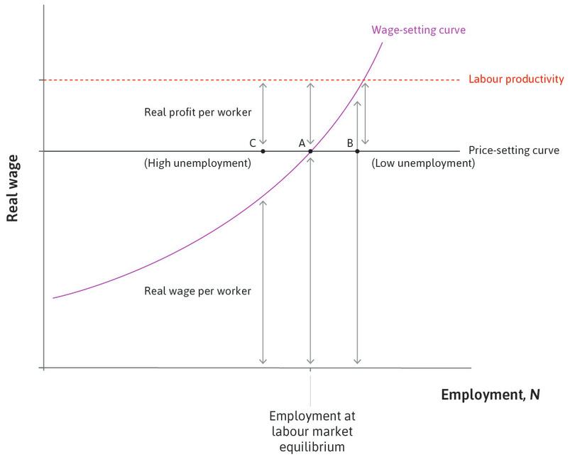
We now use the labour market diagram to show what happens in a boom, when unemployment is lower than at A. Figure 15.4b shows how workers’ claims to real wages and firms’ claims to real profits sum to more than total productivity when unemployment is below equilibrium, and sum to less than total productivity when unemployment is above equilibrium. When unemployment is below equilibrium this leads to upwards pressure on wages and prices, or a rising wage-price spiral. When unemployment is above equilibrium it leads to downwards pressure on wages and prices, or a declining wage-price spiral.
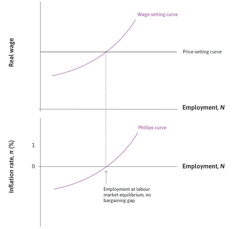
If we sketch the relationship between inflation and unemployment from the three phases of the business cycle, we get something similar to the one Phillips discovered in the data: when unemployment is lower, inflation is higher and vice versa.
- bargaining gap
- The difference between the real wage that firms wish to offer in order to provide workers with incentives to work, and the real wage that allows firms the markup that maximizes profits given the degree of competition.
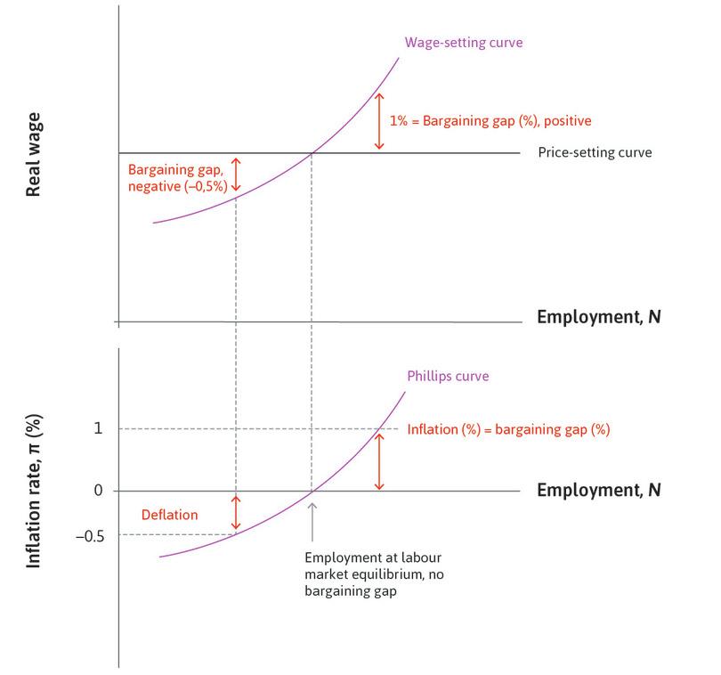
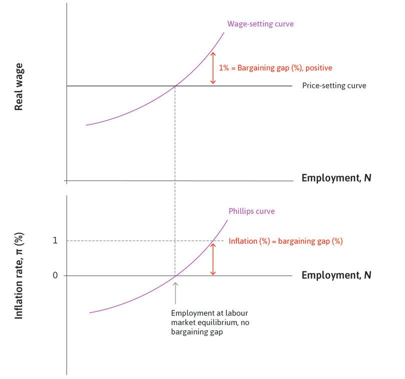
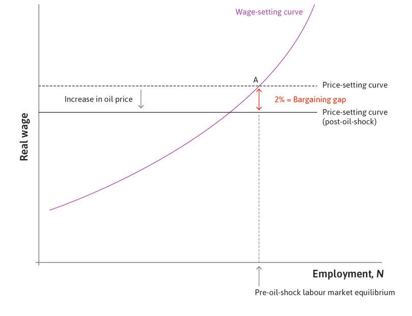
The big message from the model of inflation and conflict over the pie is that if employment is above or below the labour market equilibrium then the price level is either rising or falling. When the real wage given by the wage-setting curve and that given by the price-setting curve are not equal, we say there is a bargaining gap equal to the vertical distance between the two curves.
- If unemployment is lower than at the equilibrium: There is a positive bargaining gap and there is inflation.
- If unemployment is higher than at the equilibrium: There is a negative bargaining gap and there is deflation.
- If there is labour market equilibrium: The bargaining gap is zero and the price level is constant.
For example, if the wage on the price-setting curve is 100 and on the wage-setting curve it is 101, the bargaining gap is 1%.
The bargaining gap and the Phillips curve
We can summarize the causal chain from the bargaining gap to inflation like this:
Remember, the triple bar indicates that inflation is defined as the percentage increase in prices. So, to work out the inflation rate, we use the following:
Bargaining gap
The difference between the real wage that firms wish to offer in order to provide workers with incentives to work (the wage-setting curve), and the real wage that allows firms the markup on costs required to motivate them to continue in business (the price-setting curve).
- When the bargaining gap is positive, the real wage on the wage-setting curve is above the price-setting curve, and the claims of employers and owners to output per worker are inconsistent.
- The percentage bargaining gap is equal to the wage on the wage-setting curve, minus the wage on the price-setting curve, divided by the wage on the price-setting curve.
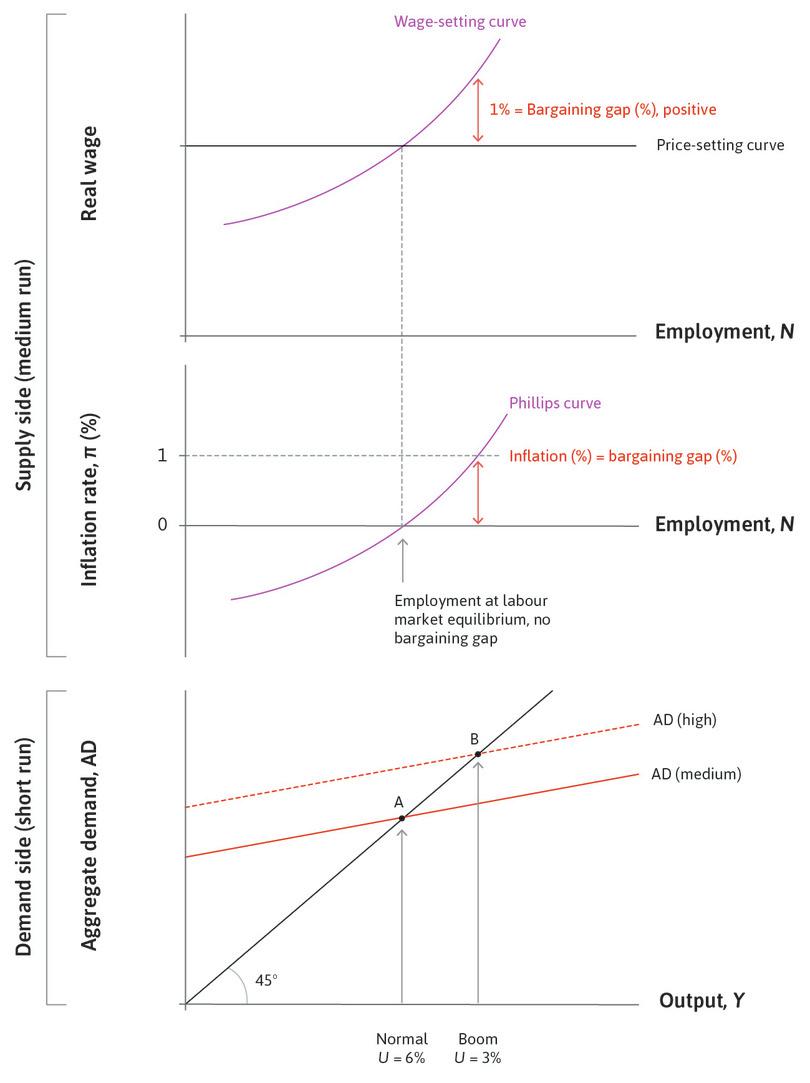
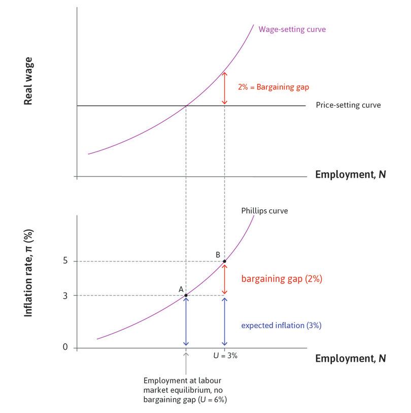
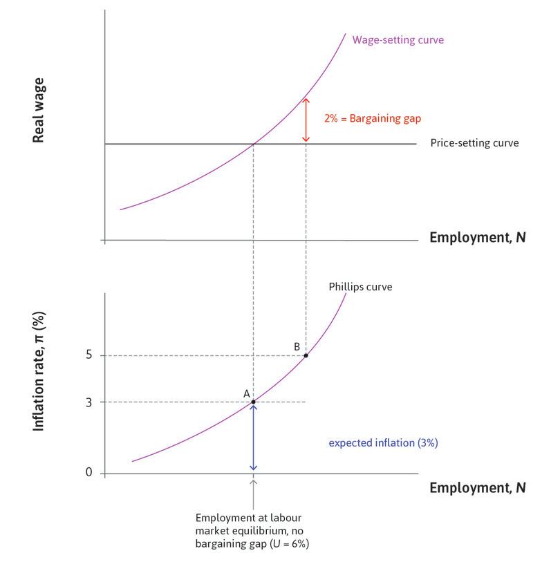
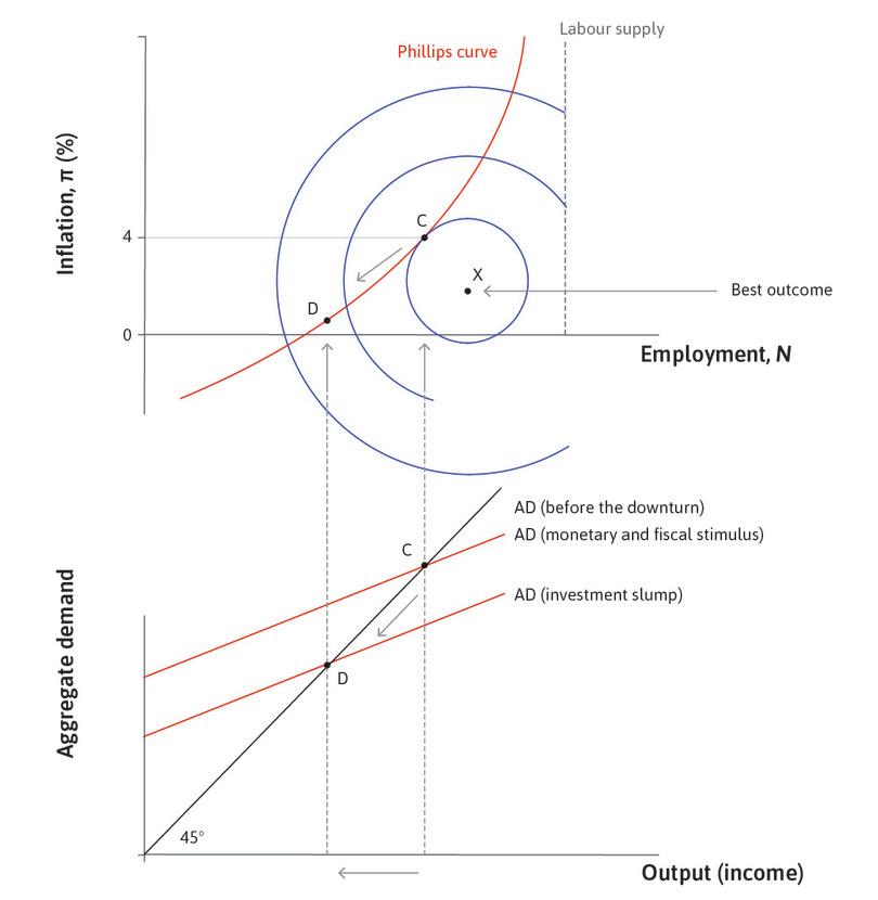
In Figure 15.4c, we draw a new diagram beneath the wage-setting curve and price-setting curve. This is the Phillips curve diagram, with inflation on the vertical axis and employment on the horizontal axis. If we begin with employment at the labour market equilibrium, and inflation of zero, we note that the economy can remain here: there is no pressure for the price level to rise or fall. This gives a point on the Phillips curve. Now consider a higher level of employment due to stronger aggregate demand. A positive bargaining gap opens up and wages and prices will rise. Firms increase wages in response to the fall in unemployment. The price level rises as firms put up their prices in response to the rise in their labour costs. If the bargaining gap is 1%, prices and wages will rise by 1%. This gives a second point on the Phillips curve.
As long as employment remains above the labour market equilibrium, employees will be disappointed at the end of the year. Their real wage will not have risen by 1% as they had anticipated, so they will bargain for another 1% rise. The result: wages and prices will rise by 1% the following year as well: firms will put up wages by 1% to take the real wage up to the wage-setting curve, and they will put up prices by 1% in response to that cost increase. We will observe lower unemployment and higher inflation as in Phillips’ original empirical scatter plot.
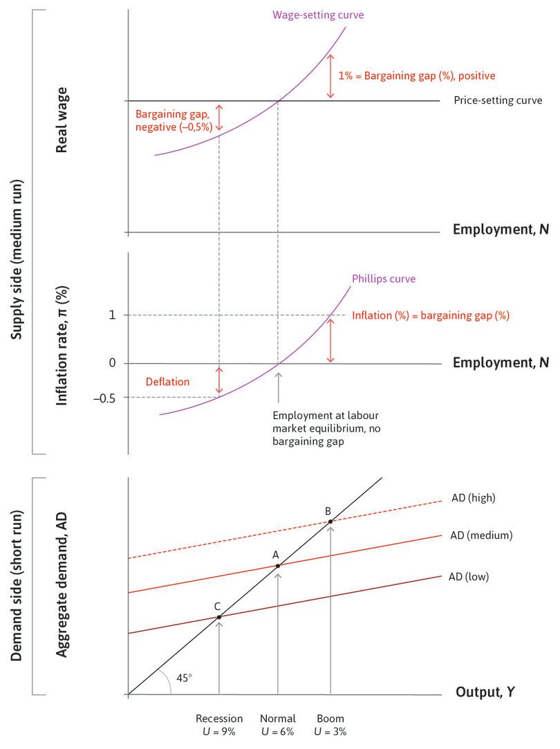
To complete the picture, we include the multiplier model beneath the labour market and Phillips diagrams to bring the short- and medium-run models together. This highlights that:
- At a higher level of aggregate demand (a boom) inflation is positive: Unemployment is lower, which means there is a positive bargaining gap, so wages and prices are rising continuously.
- At a lower level of aggregate demand (a recession), there is deflation: Unemployment is higher, which means there is a negative bargaining gap.
Exercise 15.1 The bargaining gap in a recession
Suppose the economy is initially at labour market equilibrium with stable prices (inflation is zero). At the beginning of year 1, investment declines and the economy moves into recession with high unemployment.
- Explain why a negative bargaining gap arises.
- Assume the negative bargaining gap is 1%. Draw a diagram with years on the horizontal axis and the price level on the vertical axis. Starting from a price index of 100, sketch the path of the price level for the 5 years that follow, assuming the bargaining gap remains at –1%.
- Who are the winners and losers in this economy?
Exercise 15.2 Positive and negative shocks
Draw a labour market diagram where the economy is at labour market equilibrium with stable prices. Now consider:
- A positive shock to aggregate demand that reduces the unemployment rate by 2 percentage points.
- A negative shock that increases it by 2 percentage points.
- What happens to the bargaining gap in each case?
- What would you expect to happen to the price level in each case? Explain your answers.
Question 15.5 Choose the correct answer(s)
See Figure 15.4d for diagrams of the labour market model, the Phillips curve, and the multiplier model of aggregate demand. The unemployment rates and the bargaining gaps at different states of the economy are shown.
Based on this information, which of the following statements is correct?
- There is always a positive rate of unemployment in the labour market model (see Unit 9). If U is below 3%, then there would be an even larger positive bargaining gap than with U = 3 and even higher inflation. Inflation is zero in the diagram only when the unemployment rate is 6%.
- At point B unemployment is below the labour market equilibrium, creating a positive bargaining gap.
- The bargaining gap created as a result of the recession is –0.5%, which is negative.
- The Phillips curve shows a positive correlation between employment and the inflation rate, which means a negative correlation between the unemployment rate and the inflation rate.
15.4 Inflation and unemployment: Constraints and preferences
Phillips’ original curve, and the model in Figure 15.4d, suggest that there is a lasting trade-off between inflation and unemployment. For example, with the Phillips curve in the figure, if the government is happy to have inflation of 1% each year, then it can support a boom level of aggregate demand with an unemployment rate of 3% year after year.
- feasible set
- All of the combinations of the things under consideration that a decision-maker could choose given the economic, physical or other constraints that he faces. See also: feasible frontier.
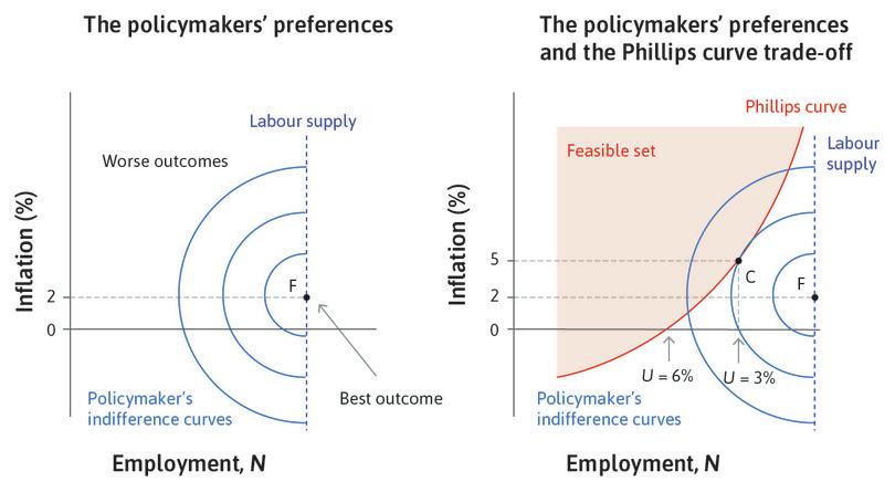
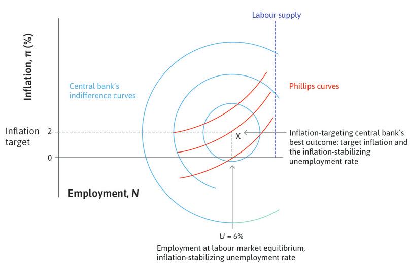
If it prefers stable prices (zero inflation), then it needs to keep aggregate demand at the normal level, with unemployment of 6%. This suggests that the Phillips curve is a feasible set from which the policymaker can select the desired combination of unemployment and inflation. The policymaker prefers low inflation and high employment, and those preferences can be represented in the usual way in the form of indifference curves.
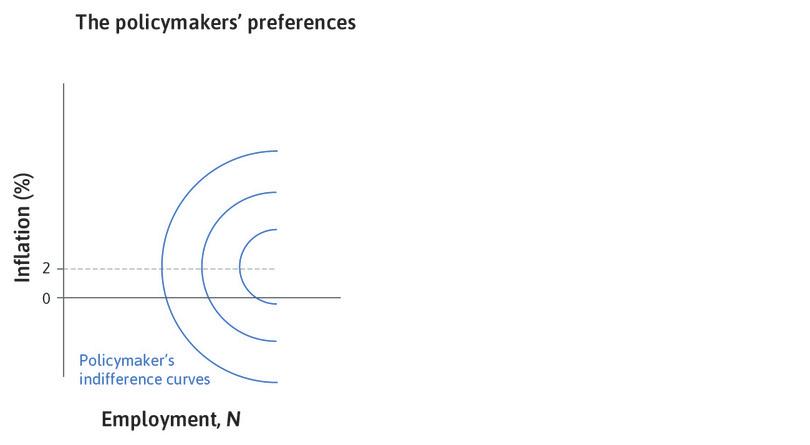
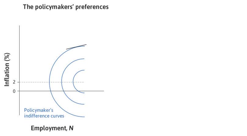
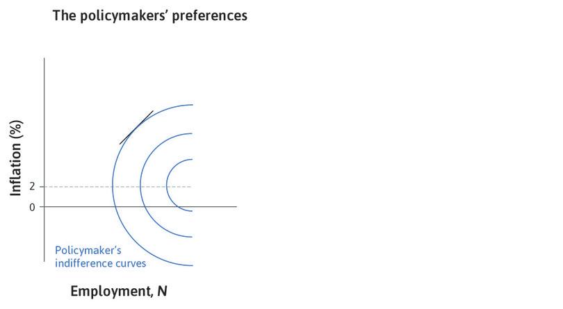
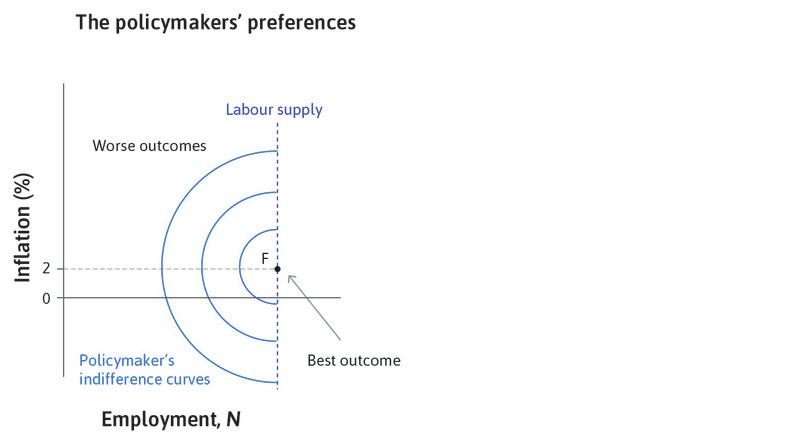
Work through the steps of the analysis in Figure 15.5 to see how the policymaker’s preferences are described by indifference curves.
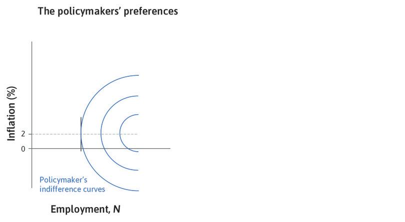
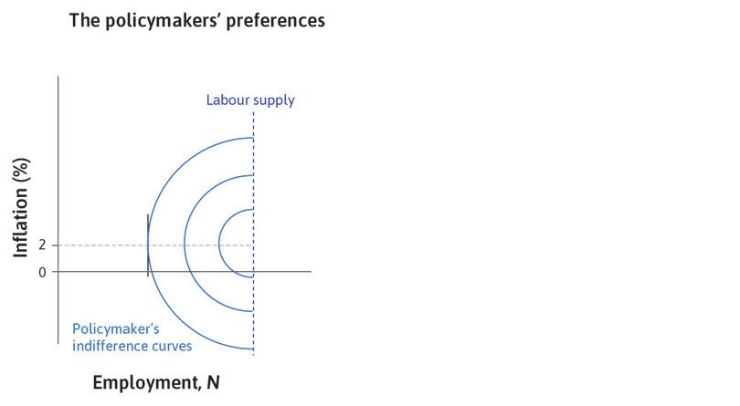
Note first some important features of the diagram. Typically when drawing indifference curves, a choice further from the origin is preferred since more of what is on each axis is preferred. In this case, the policymaker’s best outcome is shown by point F, with inflation at the target and full employment. As we saw at the end of Section 15.1, the policymaker is likely to prefer low (stable) inflation to zero. This means the indifference curves become vertical at, say, 2% inflation. Above target inflation, the indifference curves are positively sloped, as getting employment closer to full employment is worth accepting higher (above target) inflation. Below the target, the indifference curves are negatively sloped, as getting employment closer to full employment is worth accepting lower (below target) inflation.
We assume that there are diminishing marginal returns to the two targets of high employment and low inflation. This implies that when the outcome is further from the inflation target but closer to full employment, the indifference curve is flatter because the policymaker places more value on getting closer to the inflation target. Conversely, when the outcome is further from full employment but closer to the inflation target, the indifference curve is steeper because the policymaker places more value on getting closer to full employment.
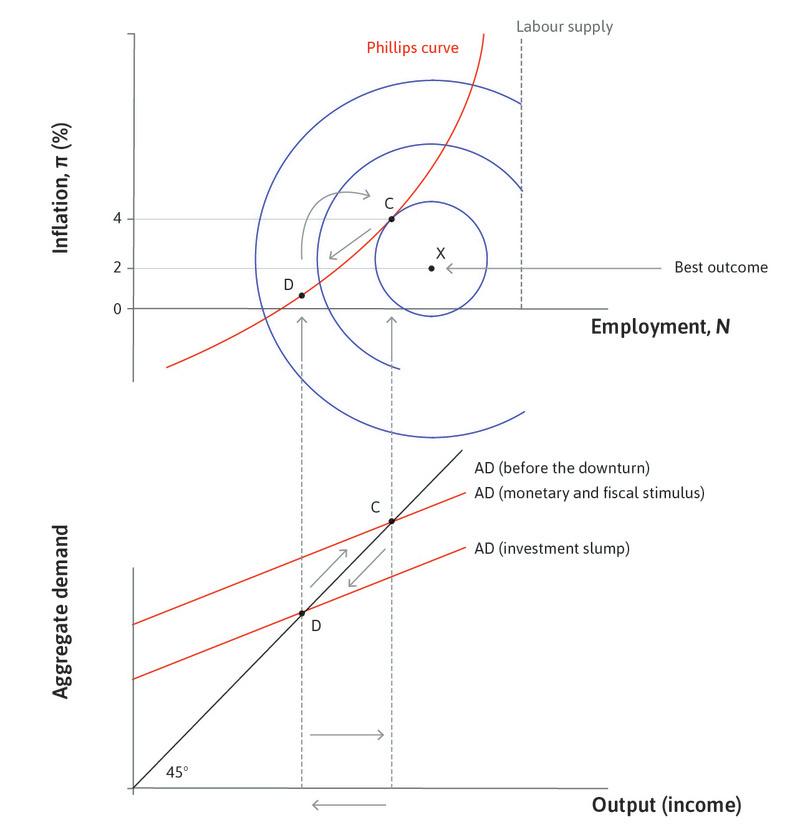
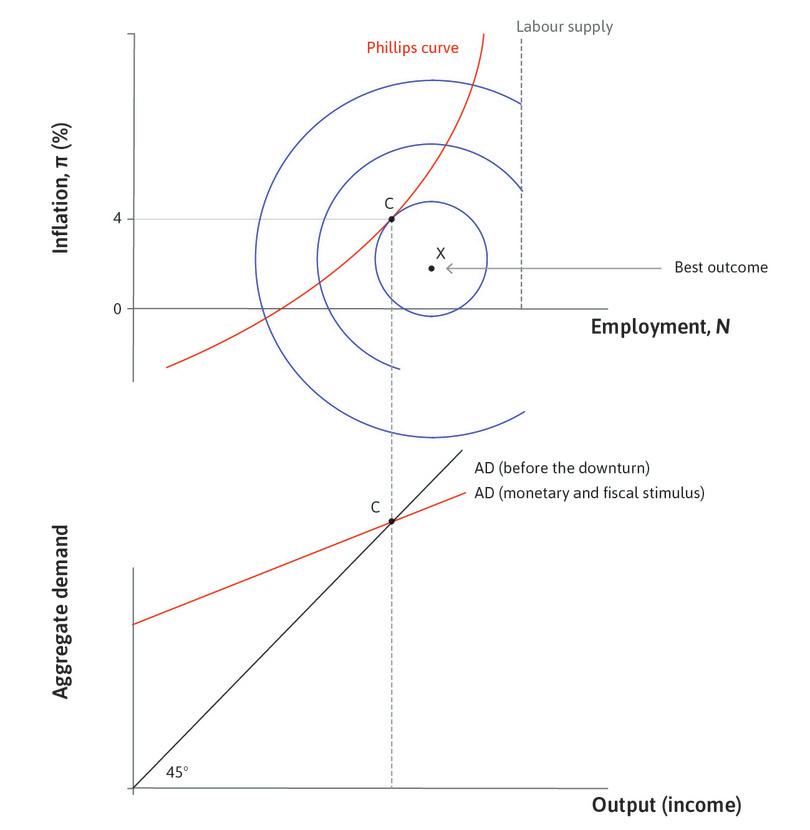
In the right-hand panel of the figure, the indifference curves and the Phillips curve are shown. The policymaker sees the Phillips curve as the feasible set and will try to use monetary or fiscal policy to choose the level of aggregate demand so that employment is at C. This is the indifference curve closest to the best outcome of F, which is consistent with the Phillips curve trade-off.
In this example, the policymaker prefers a combination of unemployment of 3% and inflation of 5% to another feasible combination of unemployment of 6% and a stable price level (zero inflation).
Exercise 15.3 The Phillips curve and the policymaker’s preferences
The following questions refer to Figure 15.5.
- What would the policymaker’s indifference curves look like if the policymaker cared only about low unemployment?
- Which point on the Phillips curve would that policymaker choose?
- What would the policymaker’s indifference curves look like if the policymaker cared only about low inflation?
- Which point on the Phillips curve would this policymaker choose?
- What would the indifference curves look like if, to be re-elected, the policymaker needed the support of pensioners more than that of working-age people?
15.5 What happened to the Phillips curve?
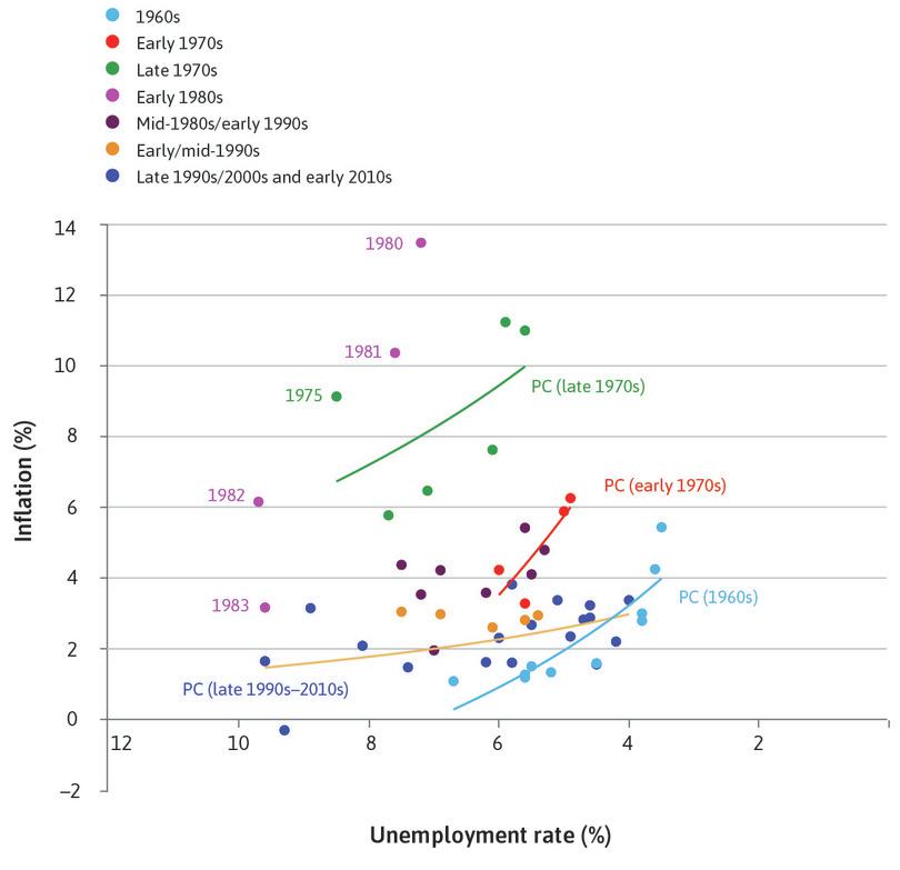
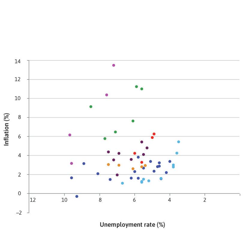
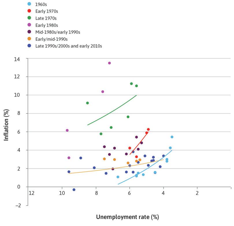
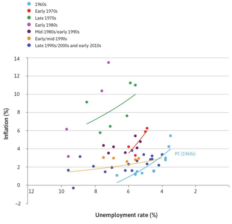
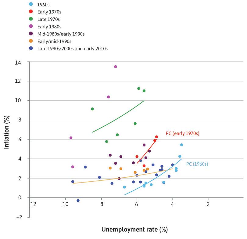
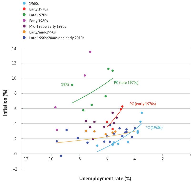
The model in Figure 15.5 suggests that a policymaker who is able to adjust the level of aggregate demand can pick any combination of inflation and unemployment along the Phillips curve. But the data in Figure 15.6 suggests that the trade-off between inflation and unemployment is not a stable one. There is a mass of data points and no discernible, positively sloped Phillips curve.
Figure 15.6 shows the inflation and unemployment combinations for the US for each year between 1960 and 2014. Note that on the horizontal axis, the scale for the unemployment rate declines as we move to the right in the figure. A Phillips curve sketched through the observations in the 1960s gives a reasonably good picture of the inflation-unemployment trade-off in that decade. But that curve clearly does not fit in other periods. The figure shows how the Phillips curve changed over time.
In his presidential address to the American Economic Association in December 1967, Milton Friedman provided an explanation for why the Phillips curve is not stable. He referred to the recent experience in the US. Since 1966 unemployment had been steady, averaging 3.7%, but inflation had increased from 3.0% to 4.2%. He said that the only way unemployment could be kept as low as 3% was by allowing inflation to keep increasing: ‘There is always a temporary trade-off between inflation and unemployment; there is no permanent trade-off,’ he claimed.3 This is what Helmut Schmidt knew, but did not want to admit to the voters, in 1972.
If there is no permanent trade-off, then the Phillips curve is not a feasible set in the same way as the feasible consumption frontier was: the feasible consumption frontier stays in place when a different point on it is chosen. By contrast, Friedman, supported by evidence from many countries from the late 1960s, showed that if a government tries to keep unemployment ‘too low’ the result will be not just higher inflation, but rising inflation as well.
Inflation means rising prices. Rising inflation means prices increasing at an ever-faster rate. This means that the Phillips curve would keep shifting upward.
15.6 Expected inflation and the Phillips curve
We now explain why the Phillips curve shifts: why does inflation keep rising when governments try to keep unemployment too low? We will show that there is only one unemployment rate at which inflation is stable, and that this is the labour market Nash equilibrium.
We need to go back to two familiar points:
- People are forward-looking: We explained this in Units 6, 9, 10 and 13. They take actions now in anticipation of things they expect to happen. To stress this, economists say that ‘expectations matter’.
- People treat prices as messages: Friedrich Hayek taught us this (see Unit 11). Therefore people also treat changes in prices as messages about what will happen in the future, just as people treat a build-up of clouds as a prediction of rain.
- expected inflation
- The opinion that wage- and price-setters form about the level of inflation in the next period. See also: inflation.
With these two building blocks, we can see why Friedman was right. As well as the battle for the pie between workers and the owners of firms that is the fundamental cause of rising prices, Friedman showed that, at low unemployment, inflation keeps increasing. This is because of the way that wage- and price-setters form their views about what will happen to inflation, which is called expected inflation. The behaviour of inflation will reflect both elements.
Introducing expected inflation
We introduce the role of expected inflation by returning to the Phillips curve.
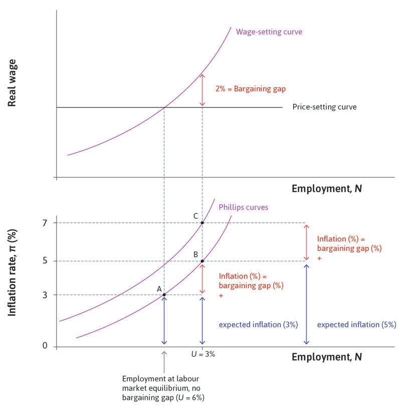
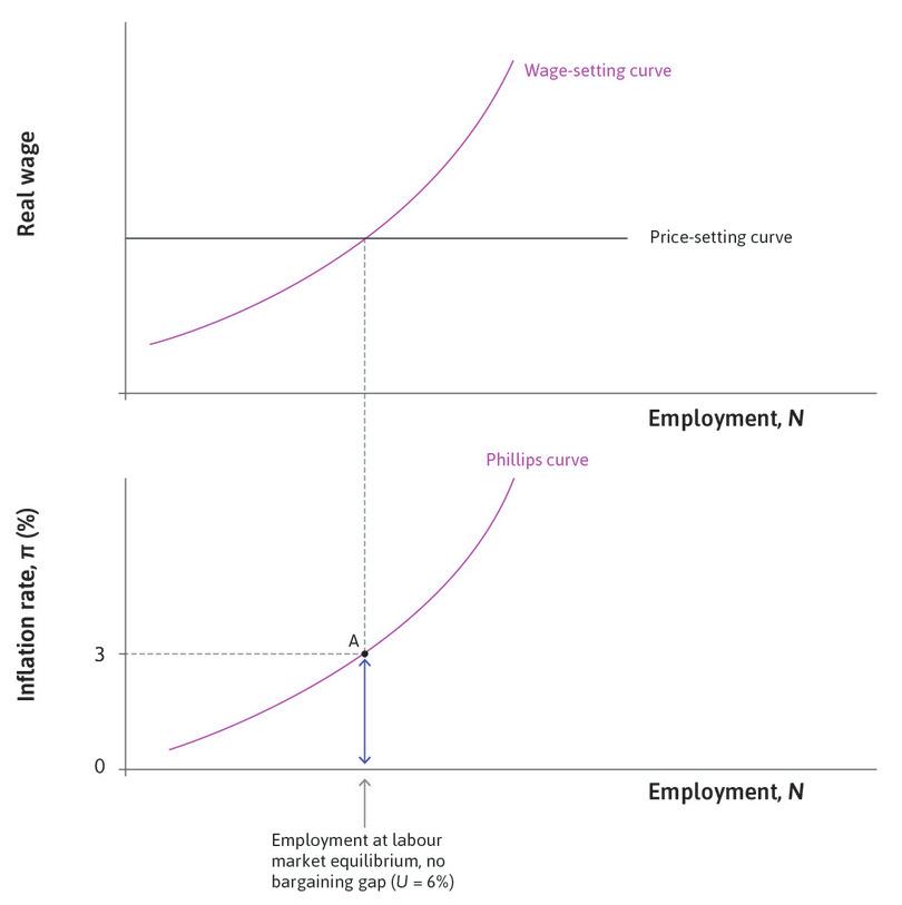
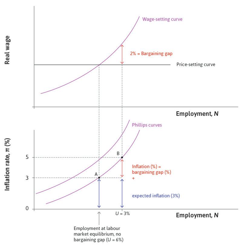
Look at Figure 15.7. You will notice that at the labour market equilibrium with an unemployment rate of 6%, the inflation rate is 3% and not zero as in Figure 15.4d.
If wage- and price-setters expect prices to rise by 3% per annum, and the level of aggregate demand is ‘normal’ and keeps unemployment at 6%, then the economy can remain at the labour market equilibrium with inflation remaining constant at 3% per annum. Every year, wages and prices will rise by 3% and the real wage will remain at the intersection of the wage- and price-setting curves. This is point A.
Now consider a boom, which takes the economy to lower unemployment at point B. What will happen to inflation? Workers expect prices to rise by 3% and will require a nominal wage increase of 3% just to keep their real wage unchanged. But they require an additional 2% rise to give them an expected real wage rise on the wage-setting curve, so wages increase by 5%. With their costs rising by 5%, firms will increase prices by 5%. In the boom, inflation will be 5%. This gives a Phillips curve like the one we have seen before. The only difference is that inflation at labour market equilibrium is 3% rather than zero.
When inflation is not zero, we can summarize the causal chain from expected inflation and the bargaining gap to inflation like this:
To work out the inflation rate:
But Friedman pointed out that with low unemployment, inflation would not remain at 5% at point B. To see why, we ask what happens next.
The shifting Phillips curve
With low unemployment continuing, workers will be disappointed with the outcome, since they did not achieve their expected real wage. Why not? Workers expected a 2% real wage increase at B from their nominal pay rise of 5% (to give the real wage on the wage-setting curve), but they did not get this because firms raised their prices by 5%.
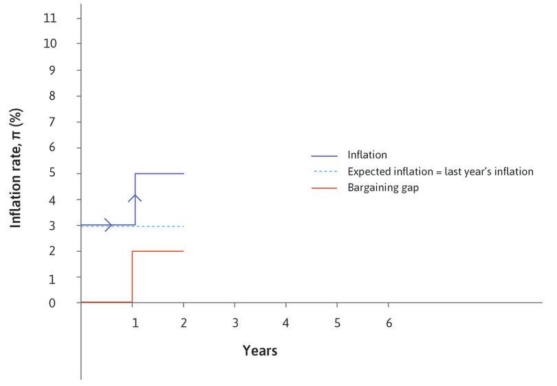
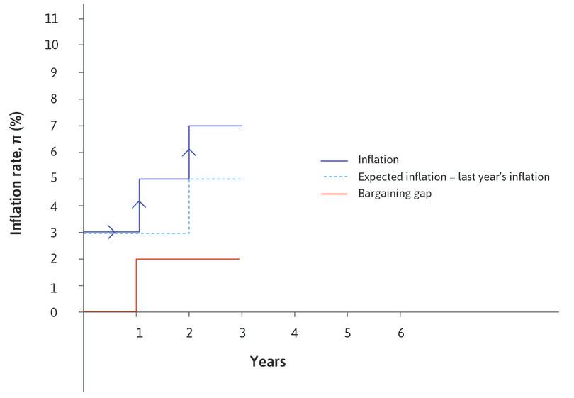
But the story does not end there. We know that both parties cannot be satisfied with the outcome at low unemployment, because their claims add up to more than the size of the pie. Now, we assume that workers expect inflation next year to be equal to inflation last year. So at the next wage-setting round, the human resources department has to take into account the fact that their employees expect prices to rise by 5%. Another interpretation is that HR includes inflation over the past year in the wage settlement, to make up for the shortfall in the real wage that workers experienced because inflation turned out to be higher than expected. So in order to achieve another real wage increase of 2%, the HR department sets a wage increase of 7%. The process continues with the rate of inflation increasing over time.
The table in Figure 15.8 summarizes the situation. We compare the situation over a three-year period with unemployment at two levels: 6% and 3%.
| Year | Expected inflation (previous year's inflation) | Unemployment | Bargaining gap | Inflation outcome: expectations plus bargaining gap | |
|---|---|---|---|---|---|
| Stable inflation | 1 | 3% | 6% | 0% | 3% |
| 2 | 3% | 6% | 0% | 3% | |
| 3 | 3% | 6% | 0% | 3% | |
| Rising inflation | 1 | 3% | 3% | 2% | 5% |
| 2 | 5% | 3% | 2% | 7% | |
| 3 | 7% | 3% | 2% | 9% |
Unstable Phillips curves: Expected inflation and the bargaining gap.
Figure 15.8 Unstable Phillips curves: Expected inflation and the bargaining gap.
The first column of Figure 15.8 reflects forward-looking behaviour. Expected inflation over the year ahead is based on the previous year’s inflation. The second column shows the unemployment rate. The third column shows the bargaining gap. The fourth column is the inflation outcome, which reflects expectations and the bargaining gap.
We can summarize the causal chain from the last period’s inflation rate to this period’s inflation rate like this:
To work out the inflation rate:
We can show the data in the table in Figure 15.8 and in the Phillips curve and labour market diagrams in Figure 15.9. The stable inflation case is at point A with unemployment of 6% and inflation of 3%, year after year. At low unemployment (3%), the Phillips curve shifts up from the one through point B to the one through point C when expected inflation rises from 3% to 5%.
- inflation-stabilizing rate of unemployment
- The unemployment rate (at labour market equilibrium) at which inflation is constant. Originally known as the ‘natural rate’ of unemployment. Also known as: non-accelerating rate of unemployment, stable inflation rate of unemployment. See also: equilibrium unemployment.
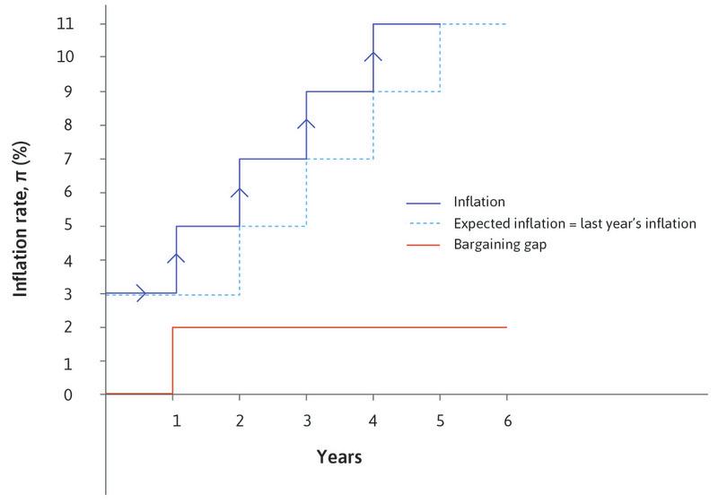
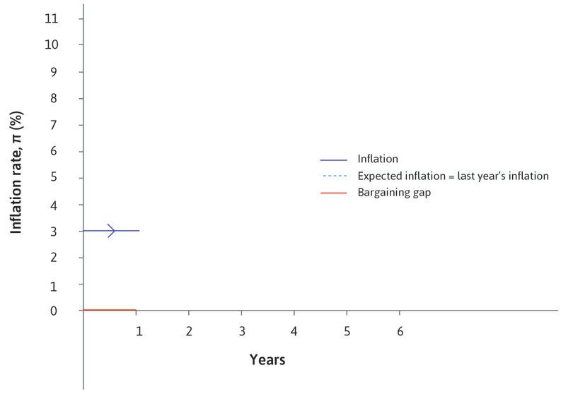
By plotting the path of inflation over time in Figure 15.10 we can see the distinctive contributions of the bargaining gap and expected inflation to inflation. In this example, the bargaining gap opens up in year 1 because of the move to low unemployment. The assumption that unemployment remains below the inflation-stabilizing rate is reflected in the persistence of the bargaining gap. Inflation rises in every period because the previous period’s inflation feeds into expected inflation and therefore into wage and price inflation. Note that the real wage does not change, but remains on the price-setting curve.
Exercise 15.4 A negative aggregate demand shock with high unemployment
Copy Figure 15.9, making sure you leave plenty of space to the left of the 6% unemployment marker. Assume that from an initial position at A, there is a negative shock to private sector demand such as depressed private investment, which raises unemployment to 9%.
- Show the inflation, expected inflation, and the bargaining gap at the new level of unemployment on your diagram.
- What do you predict will happen to inflation over the following two years, assuming there is no further change in unemployment?
- Draw the Phillips curves and write a brief explanation of your findings.
Exercise 15.5 Inflation, expected inflation, and the bargaining gap
Use the same axes as in Figure 15.10 to plot inflation, expected inflation, and the bargaining gap in a single diagram. Assume that the price level is constant in period zero. The economy is hit by a recession at the beginning of period 1 and unemployment remains at a constant high level until the beginning of period 6.
- Plot the path of the bargaining gap.
- Plot the path of inflation and expected inflation.
- Give a brief explanation of why the bargaining gap might have disappeared and state any other assumptions you are making. Summarize your findings.
Question 15.6 Choose the correct answer(s)
Figure 15.6 is a scatter plot of the inflation rate and the unemployment rate for the US for each year between 1960 and 2014.
Based on this information, which of the following statements is correct?
- This is clearly not true from the graph.
- The Phillips curve shifted higher until the 1980s, but shifted lower in the 1990s-2010s.
- This reflects the slope of the Phillips curve in the 1960s.
- On the contrary, a flatter Phillips curve means that a small fall in the inflation rate is associated with a large rise in the unemployment rate. However this also means that a relatively large fall in the unemployment rate is associated with only a small rise in the inflation rate.
Question 15.7 Choose the correct answer(s)
Figure 15.9 depicts the diagrams of the labour market model and the Phillips curve that incorporates inflation expectations.
Based on this information, which of the following statements is correct?
- In this diagram the labour market equilibrium occurs at 3% inflation on the lower of the two Phillips curves. But at the labour market equilibrium of 6% unemployment, inflation will be constant whatever level it starts at. The Phillips curve will not shift up when the economy is at labour market equilibrium.
- With unemployment at 3%, initially the wage rises to 5% along the Phillips curve. The shift in the curve occurs in the next stage when the previous period’s inflation feeds into the next period’s expected inflation.
- With the unemployment rate stable at 3%, the bargaining gap remains at 2%. This causes the further rises in the inflation rate.
- The Phillips curve continues to shift upwards as long as there is a positive bargaining gap, caused by the low unemployment rate.
15.7 Supply shocks and inflation
Friedman was correct in two ways:
- Expected inflation shifts the Phillips curve.
- Policymakers were wrong to think of the Phillips curve as a feasible set from which they could simply select the most electorally popular combination of inflation and unemployment.
But there are other causes of high and rising inflation. The Phillips curve will shift up if the price-setting curve shifts down or the wage-setting curve shifts up. Recall Figure 15.2: if the power of owners of firms relative to consumers increases, the marketing department raises prices and kicks off a wage-price spiral. In that example, owners of firms in the home economy became more powerful because the government adopted policies that made it more difficult for foreign firms to enter the economy. Similarly, a wage-price spiral can begin if the power of employees increases relative to owners—as would be the case if trade unions become more powerful and exercise that power to achieve higher wage increases from the HR department.
- supply shock
- An unexpected change on the supply side of the economy, such as a rise or fall in oil prices or an improvement in technology. See also: wage-setting curve, price-setting curve, Phillips curve.
- demand shock
- An unexpected change in aggregate demand, such as a rise or fall in autonomous consumption, investment, or exports. See also: supply shock.
Shocks that move the Phillips curve by changing the labour market equilibrium are described as supply shocks, because the labour market represents production or supply in the economy. They are different from demand shocks, like a change in investment or in consumption, which work via their effect on aggregate demand. While a negative demand shock will increase unemployment and reduce inflation, a negative supply shock can lead to increased unemployment and inflation at the same time.
Changes in the global economy can also cause supply shocks that trigger inflation. A particularly important change for understanding the shifts in Phillips curves, such as those for the US economy shown in Figure 15.6, is a change in the world oil price (we look at other possible causes in Units 16 and 17). The labour market model and the Phillips curve can explain why a one-off increase in the world oil price can lead to a combination of:
- a one-off increase in the price level (inflation) at the time of the shock, and
- rising inflation over time
To do this, we show that a rise in the oil price:
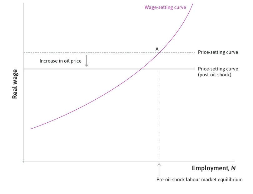
- Shifts the price-setting curve down: This leads to a positive bargaining gap and inflation.
- Shifts the Phillips curve up: It will continue to shift up as expected inflation rises.
An increase in the oil price pushes down the price-setting curve. A typical firm uses imported oil in the production process. With increased costs for oil, the firm’s profits can only remain unchanged if real wages fall. At the level of the economy as a whole, the national pie to be divided between owners and employees shrinks when more has to be paid for imports.
We show in the Einstein at the end of this section how to modify the price-setting curve once firms in the economy use imported materials in production.
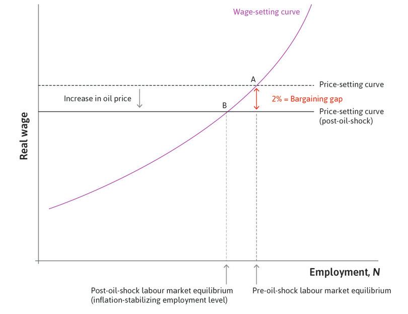
A rise in the oil price creates a bargaining gap and triggers a wage-price spiral through its effect on the price level. Firms raise their prices to protect their profit margins when the cost of imported oil rises. Firms across the economy will behave this way so the price level will rise. This reduces the real wage of employees, so the price-setting curve shifts down (to see how firms set their prices following an oil price rise, see the Einstein at the end of this section). At the initial employment level this opens up a bargaining gap between the real wage on the price-setting curve and the real wage on the wage-setting curve. That is, the rise in prices satisfies firms, but the corresponding fall in real wages does not satisfy workers.
In Figure 15.11, the price-setting curve shifts down following the oil shock. In this example, a bargaining gap of 2% opens up between the wage-setting curve and the post-shock price-setting curve. This fits the scenario in Figure 15.10, where a bargaining gap of 2% appears at the beginning of year 1. This increases inflation from its pre-existing level of 3% to 5% and as expected inflation adjusts, inflation rises thereafter every year. The Phillips curve shifts up year by year.
As long as employment remains at its pre-oil-shock level, inflation will increase every period, as illustrated in Figure 15.10. The new labour market equilibrium and post-shock inflation-stabilizing employment level is shown in Figure 15.11. Unemployment is higher at the new labour market equilibrium where the post-shock price-setting curve intersects the wage-setting curve.
Shocks to the world oil price are a major source of macroeconomic disturbance.
Following the early 1970s oil shock, for example, US inflation jumped from 6.2% in 1973 to 9.1% in 1975 and unemployment went from 4.9% to 8.5% at the same time.
This pattern was common across the developed world. For example, in the same period, inflation in Spain rose from 11.4% to 17% and unemployment increased from 2.7% to 4.7%.
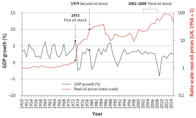
We can see from Figure 15.12 that there were two big recessions in the UK in the 1970s. They were due to the oil shocks of 1973–74 and 1979–80, which were associated with a rise in both unemployment and inflation to their highest levels since the Second World War (you can see the effect on inflation in Figure 13.19a and Figure 13.19b).
UK GDP growth and real oil prices (1950–2015).
Figure 15.12 UK GDP growth and real oil prices (1950–2015).
UK Office for National Statistics; Ryland Thomas and Nicholas Dimsdale. (2017). ‘A Millennium of UK Data’. Bank of England OBRA dataset.
High inflation in the 1970s and early 1980s was associated with high unemployment in many countries. Unemployment in the UK peaked at nearly 12% in the mid-1980s.
The model helps us to understand why the rise in the oil price led to rising inflation and high unemployment. But it also helps to explain the role that high unemployment played in bringing inflation down.
In the model, the only ways that high inflation can be brought down are:
- a reduction in the bargaining gap
- a fall in expected inflation
If unemployment is sufficiently high, then there will be a negative bargaining gap and inflation will fall. Remember that for the bargaining gap to be negative, unemployment has to rise above the new higher inflation-stabilizing unemployment rate. Once inflation begins to fall, it will continue to fall as the Phillips curve shifts downwards and the economy follows the path shown in Figure 15.10 in reverse.
UK Inflation and unemployment rate (1950–2015).
Figure 15.13 UK Inflation and unemployment rate (1950–2015).
UK Office for National Statistics; Ryland Thomas and Nicholas Dimsdale. (2017). ‘A Millennium of UK Data’. Bank of England OBRA dataset.
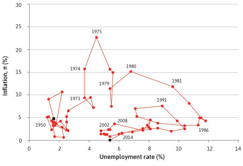
Figure 15.13 shows a scatterplot of unemployment and inflation for the British economy from 1950 to 2014. Instead of fitting Phillips curves to the observations, as in Figure 15.6, the points are joined and dated. This helps us to follow the path taken by the economy. Notice the large increase in unemployment in the 1980s associated with bringing inflation down. This is sometimes referred to as the cost of disinflation.
But there’s a puzzle here: why did the third oil shock from 2002–08 not lead to increased inflation, just like the earlier ones? This section should have provided you with some starting points to investigate this, and a speech given in 2006 by David Walton, an economist, will help you.4 If you read both carefully, you might ask the following questions:
- Was the unit cost increase smaller due to less energy-intensive production? This would have made the increase in the materials cost per unit of output smaller and reduced the size of the initial downward shift in the price-setting curve.
- Did the wage-setting curve shift downwards at the same time as the third oil price shock? This also would have reduced or perhaps even eliminated the bargaining gap opened up by the oil price shock.
- Did a wage-price spiral fail to develop because expected inflation did not adjust upward, as in the past oil shocks?
What could stop expected inflation rising? In the next section, we examine the role of monetary policy.
Exercise 15.6 An oil shock
Think about the three questions related to oil shocks that we listed above. In each case:
- Explain the mechanism linking the oil shock to inflation using a diagram.
- Identify some evidence (for example, data or commentary in the economics press) that is consistent with the hypothesis proposed.
Einstein The price-setting curve with imported materials
In the Einstein in Unit 9, we explained how the price-setting curve for the economy as a whole results from the decisions of individual firms. Here we take a shortcut and go straight to the economy as a whole. Firms in the economy use both the products of other firms in the economy and imported products as inputs. The cost of these inputs will be affected by wage costs and costs of imported materials. Once we put together all the firms in an economy, we have only two types of cost: labour and imported materials. (Here we are setting aside the opportunity cost of the capital goods used in production that are the property of the firm owners and the basis of their profits.)
In Unit 9, we assumed that other than the firm’s own capital goods, there were no inputs other than labour and hence no costs other than wages. In this case, the value of a firm’s output was the same as the firm’s value added. Expressed on a per worker basis this was divided into wage and profits:
Here, there are imported materials such as oil that are necessary to produce the output. As a result, the firm’s costs include not only wages but also the costs of purchasing these imported materials.
This makes it clear that unlike in Unit 9 where there were just two claimants on the value of the output (wages and profits), we now have three: labour costs, imported materials costs, and profits. This affects the price-setting curve, as we shall see.
In the Unit 9 Einstein, λ represented value added per worker, or labour productivity. Now, where we have inputs other than labour, we define q as the units of output per worker, which is not the same thing as labour productivity because output now exceeds value added by the value of imported inputs.
Since output per worker is q and the nominal wage is W, the firm’s unit labour cost (ulc) is:
Now the firm’s cost per unit is its unit labour cost (ulc) plus its unit imported materials cost (umc).
So unit costs (uc) are:
We define the markup, μ, as the share of the price that represents profits to the firm (what is left over after subtracting unit costs):
Note that umc/P is the imported materials cost as a share of the price of a unit of output, while ulc/P is the wage cost as a share of the price of a unit of output. For example, suppose the price per unit is $5, imported materials cost $1 per unit and labour costs $2.50 per unit. Then imported materials comprise 20% of the cost, wages another 50%, and the share of profit, or the markup, is:
which is 30%.
Substituting ulc = W/q gives us:
Multiplying each side by q and rearranging, and remembering that P is both the price of the individual firm’s output and the general price level in the economy, we get the price-setting curve:
This shows that the real wage per worker is equal to output per worker, q, minus a share μ that goes as profits to the owner, minus a share umc/P that goes to foreign producers who supply the imported materials. Any increase in unit materials costs such as a rise in the price of oil will shift the price-setting curve down.
In the absence of imported materials, q = λ and umc = 0, and we get the familiar expression for the price-setting curve from Unit 9:
An equivalent but alternative version of the markup equation is provided in the next section.
The markup price-setting equation for the firm
As we saw in the Einstein in Unit 9, the price set by a profit maximizing firm is a markup on its costs, where the markup μ is the share of the price that was the firm’s profits, and is lower the more competition there is in the product market.
When explaining the process of inflation, economists often simplify by setting aside changes in the degree of competition so as to focus on the ways that increasing costs contribute to price increases. For this it is useful to have an equation describing how firms will set different prices as their costs change, assuming that the degree of competition in product markets (and therefore μ) is unchanged.
For this purpose economists use the following equation:
where the percentage markup on costs is m, umc is the unit cost of materials, and ulc is the unit cost of labour.
The markup price-setting equation says that if unit costs are $3.00 and the markup m is 10%, the price will be $3.30. So the extra $0.30 charged above unit costs is equal to 10% of those costs. If we want to know μ in this case, we ask what the extra $0.30 is as a share of the total price, rather than as a share of the cost. Then μ = $0.30/$3.30 = 0.09 or 9%.
One advantage of using m is that it makes it easy to see that if the markup is fixed, then a rise in unit costs must imply a proportionate price rise (for example, an increase in unit costs of 5% must imply a price rise of 5%). This follows directly from the markup price-setting equation above.
We can also ask what happens to P when just one part of the costs rise, such as the imported materials cost. Assuming m remains constant, the percentage change in the price is equal to the percentage change in total unit costs:
We now divide both the numerator and the denominator of the first term on the right hand side by umc, and the second term by ulc:
This is equivalent to:
In words, the percentage change in P is equal to the percentage change in umc times umc’s share of unit costs, plus the percentage change in ulc times ulc’s share of unit costs. For example, suppose the markup is 60% and unit cost is $5, of which $4 is labour cost and $1 is imported materials, so the price is P = 1.6 × $5 = $8. Wages are 80% of the cost, so if wages go up 10% then the price will rise by 80% × 10% = 8%. In this example, unit costs rise to $4.4 + $1 = $5.4 and the price rises to P = 1.6 × $5.4 = $8.64 (a rise of 8%). Equally, if the price of imports, such as oil, were to rise by 10% then the price would rise by 20% × 10% = 2%.
15.8 Monetary policy
We use the Phillips curve and the policymaker’s indifference curves to look at shocks and policy responses. Before doing so, we need to recall how monetary policy affects the economy.
As we saw, we can explain why people might dislike rising or volatile inflation, but most people have no reason to object to a (slowly) rising price level. In fact, many central banks around the world have policies to target an inflation rate of 2%. They either set this objective for themselves, or the government sets the objective for them. It means they are doing best if prices rise each year by a rate close to 2%.
When central banks target an inflation rate of 2%, the best answer to the question ‘why does the price level rise at 2%?’ becomes ‘because the central bank makes it happen’.
As we first saw in Unit 10, when inflation is forecast to be higher or lower than this, the central bank can take action to adjust the level of aggregate demand and employment so as to steer the economy toward a 2% target.
When they can, central banks use changes in the policy interest rate as their monetary policy instrument to stabilize the economy. Monetary policy relies on the central bank being able to control interest rates, and on changes in interest rates influencing aggregate demand. For example, higher interest rates make it more expensive to borrow money to spend. It is important to remember that it is the real interest rate that affects spending. But when the central bank sets the policy rate, it sets it in nominal terms. So by setting a particular nominal rate it is aiming for a specific real interest rate, and it therefore takes account of the effect of expected inflation (see our Einstein at the end of this section for more about the Fisher equation).
The transmission of monetary policy
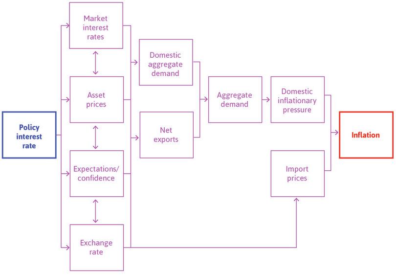
Figure 15.14 shows how the Bank of England views the transmission of monetary policy from its interest rate decision to aggregate demand and inflation in ‘normal’ situations—that is, when the interest rate is its policy instrument.
The Bank of England.
Look at the boxes in the first column of Figure 15.14.
Market interest rates
- policy (interest) rate
- The interest rate set by the central bank, which applies to banks that borrow base money from each other, and from the central bank. Also known as: base rate, official rate. See also: real interest rate, nominal interest rate.
- lending rate (bank)
- The average interest rate charged by commercial banks to firms and households. This rate will typically be above the policy interest rate: the difference is the markup or spread on commercial lending. Also known as: market interest rate. See also: interest rate, policy rate.
In Unit 10 we explained that, although the central bank sets the policy interest rate, commercial banks set the market interest rate (also referred to as the bank lending rate) that households and firms pay when they take out loans. When the central bank cuts the policy rate to stimulate spending, the market interest rate typically falls by approximately the same amount. To set the policy rate, the central bank will therefore work backwards, starting with its desired level of aggregate demand:
- It will estimate a target for the total aggregate demand, Y, to stabilize the economy, based on the labour market equilibrium and the Phillips curve.
- It will then estimate the real interest rate, r, which will produce this level of aggregate demand, based on shifting the aggregate demand line into the desired position in the multiplier diagram.
- Finally it calculates the nominal policy rate, i, that will produce the appropriate market interest rate.
Think about how a fall in the market interest rate affects the decision to build a new house. The cost of taking out a loan to finance the construction of the house will fall, so as the interest rate falls, investors will consider more new housing projects to be financially viable. Through this channel, a lower policy rate will raise investment by businesses and households, and a higher policy rate will lower it (see Figure 14.9).
Asset prices
This refers to financial assets in the economy such as government bonds and shares issued by companies. When the central bank changes the interest rate, this has a ripple effect through all the interest rates in the economy, from mortgage rates to the interest rates on 20-year government bonds. As we saw in the Einstein in Unit 10, when the interest rate goes down, the price of the asset goes up. So a fall in interest rates will be expected to feed through to spending, because households who own the assets will feel wealthier.
Profit expectations and confidence
In Units 13 and 14 we stressed the importance of profit expectations and confidence for the investment decisions of firms. When setting the interest rate, the central bank tries to build confidence through consistent policymaking and good communication with the public. If it lowers the policy rate and explains its reasoning, this can lead firms to expect higher demand, who will therefore increase investment. Similarly, if it increases the confidence of households that they will not lose their jobs, then they may also increase their spending.
Exchange rate
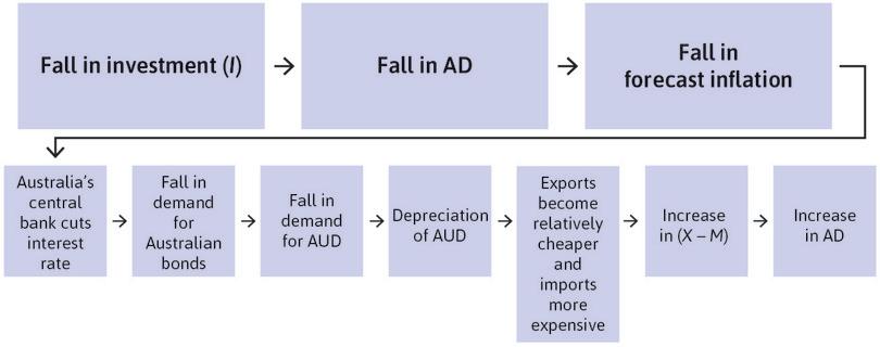
We return in the next section to the way monetary policy affects aggregate demand through the exchange rate channel: this will shift the aggregate demand line by changing net exports, (X − M).
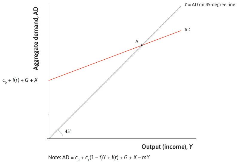
In the multiplier model of aggregate demand, the transmission channels from the policy rate to domestic aggregate demand are reflected in the investment function (including new housing), which shifts when the real interest rate changes. We write this function I(r). The expectations and asset price effects will shift the investment function as we saw in Figure 14.5, and the consumption function, by changing c₀ (Figure 14.11a).
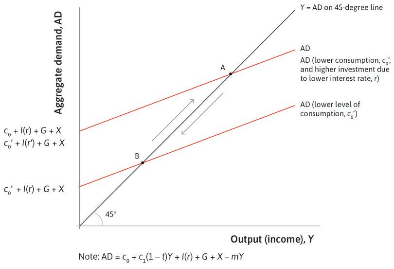
In the multiplier diagram, the intercept of the aggregate demand line with the vertical axis includes investment, which means that the line shifts whenever the interest rate is changed by the central bank, or when business confidence changes. If the central bank is trying to boost the economy in a business cycle downturn, it cuts the interest rate. By signalling its willingness to support growth, the central bank also aims to influence the confidence of decision-makers in firms and households and help shift the economy from the low-investment equilibrium illustrated in the coordination game in Figure 13.17 to a high-investment equilibrium.
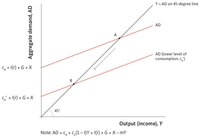
Figure 15.15 shows how monetary policy can be employed to stabilize the economy following a downturn caused by a drop in consumption (for example, as a result of a fall in consumer confidence). Follow the steps in the analysis in Figure 15.15 to see how a cut in the real interest rate brings the economy out of recession. In this example, we assume that the decline in the interest rate to r′ only increases investment and not autonomous consumption, which remains at c₀′.
A warning
Using simple diagrams like Figure 15.15 may give the impression that the central bank is able to stabilize the economy by accurate diagnosis of a shock and precise intervention with a change in the interest rate. This is far from the case! The economy emits all kinds of noisy signals and it is difficult to decide, for example, whether a downturn is a temporary blip or signifies a long-term weakness. The models we use help us to organize our thinking about the causal links in the economy and what policies might be warranted. They do not give a complete recipe for effective stabilization.
Figure 15.15 shows how the central bank could attempt to counteract a recession. But how should the central bank react to a consumption boom? It needs the opposite policy. A boom will shift the aggregate demand line upwards, so the central bank must pursue policies that dampen demand and return the aggregate demand line back to its starting point. The central bank can do this by raising the interest rate.
But why would it want to curtail a boom? From the Phillips curve, we know that a boom leads to higher inflation, and, if expectations adjust to past inflation, to rising inflation. High and rising inflation imposes costs on the economy.
We have shown how monetary policy can be used by the central bank to stabilize the economy in a recession. The government could also have played this role by cutting taxes, or by boosting spending.
Why monetary policy, and what are its limits? Fiscal policy is complicated to adjust and inflexible. Instead, to keep aggregate demand close to the level it desires, the central bank can adjust the interest rate up and down by small amounts month-by-month.
There are two important limitations, however, to the usefulness of monetary policy in stabilization:
- The short-term nominal interest rate cannot go below zero: But this is the central bank’s policy instrument.
- A country without its own currency does not have its own monetary policy.
The zero lower bound
If the policy interest rate were negative, people would simply hold cash rather than put it in the bank, because they would have to pay the bank for holding their money (that’s what a negative interest rate means). This is the zero lower bound on the nominal interest rate. It matters because when the economy is in a slump, a nominal interest rate of zero may not be low enough to achieve a sufficiently low real interest rate to drive up interest-sensitive spending and get the economy going again. Remember that the real interest rate is equal to the nominal interest rate minus inflation. So the zero lower bound on the nominal interest rate means that the lower bound on the real interest rate is equal to minus the inflation rate. Policy interest rates were reduced close to zero in many economies after the global financial crisis, but this was not enough to restore aggregate demand to the labour market equilibrium. For this reason, some economists argue that countries with inflation targets of 2% should raise them to 4% in order to allow real interest rates to become more negative in a slump.5
- zero lower bound
- This refers to the fact that the nominal interest rate cannot be negative, thus setting a floor on the nominal interest rate that can be set by the central bank at zero. See also: quantitative easing.
- quantitative easing (QE)
- Central bank purchases of financial assets aimed at reducing interest rates on those assets when conventional monetary policy is ineffective because the policy interest rate is at the zero lower bound. See also: zero lower bound.
This is also why economies that were badly hit by the global financial crisis introduced a new kind of monetary policy called quantitative easing (QE). The aim of QE is to increase aggregate demand by buying assets, even when the policy interest rate is zero.
How is QE supposed to work?
- The central bank buys bonds and other financial assets: It creates additional base money for this purpose.
- This raises demand for bonds and other financial assets: So the central bank shifts the demand curve for those assets to the right, which pushes up the price. This also decreases the yield and interest rate on bonds, as explained in the Einstein in Unit 10.
- This boosts spending: Particularly on housing and consumer durables, because both the cost of borrowing and return to holding financial assets has gone down.
So, even when the interest rate the central bank directly controls is stuck at zero, it can use QE to try to reduce the interest rate on a variety of other financial assets. The empirical evidence suggests that the effects of QE in boosting aggregate demand are positive but small.
No national monetary policy
- common currency area
- A group of countries that use the same currency. This means there is just one monetary policy for the group. Also known as: currency union.
Monetary policy may not be available to a country. Members of the Eurozone gave up their own monetary policy when they joined the currency union. The Eurozone is called a common currency area (or currency union) because all the members use the euro. This means there is just one monetary policy for the whole of the Eurozone. The European Central Bank (ECB) in Frankfurt sets the policy interest rate, because it controls the base money used by all banks in the Eurozone. This interest rate may be more appropriate for some members than for others. In particular, after the financial crisis, unemployment was low and falling in Germany but in the southern Eurozone countries such as Spain and Greece, it was high and rising fast. There were many complaints that the ECB’s monetary policy remained too restrictive for too long for the needs of the latter countries.
Exercise 15.7 Fiscal or monetary policy?
Think back to the discussion of the government finances in Unit 14.
- In the event of a financial crisis, would it be preferable for the government to stabilize the economy using fiscal or monetary policy?
- What are the dangers of using fiscal policy?
- When might the government have no choice but to use fiscal policy?
Question 15.8 Choose the correct answer(s)
Which of the following statements is correct regarding monetary policy?
- This is explained in the Unit 10 Einstein.
- The central bank can set the real interest rate to below zero by setting the nominal interest rate below the inflation rate (recall the Fisher equation). The problem is that they are unable to set the nominal interest rate below zero, so the real interest rate cannot go below minus the inflation rate.
- Quantitative easing involves the central bank buying bonds and other financial assets, shifting the demand curve for these assets to the right. This leads to a rise in the price of the assets and a fall in the interest rates (yields) on those assets.
- Members of the currency union lose their ability to set the interest rate nationally. Instead the interest rate is set by the central bank for the common currency area (for example, the ECB for the Eurozone).
Einstein The real interest rate and the Fisher equation
From Unit 10, the interest rate tells you how many dollars (or euros, pounds, or the currency you use) you will have to pay in the future in exchange for borrowing $1 today. If you are a lender, it tells you how many dollars you will receive in the future by giving up the use of $1 today.
The interest rates that you see quoted in bank windows or bank websites are nominal interest rates. That is to say, they do not take inflation into account. If you are a lender, what you really want to know is how many goods you will get in the future in exchange for the goods you don’t consume now. If you are a borrower, what matters is how many goods you will have to give up in the future to pay the interest, rather than the total interest measured in dollars. The opportunity cost of the loan is the goods you have to give up, not the money you have to give up. To make this distinction, you need to take account of inflation.
Households and firms make decisions based on real interest rates. Firms will judge which investment projects are worth undertaking using real interest rates, and lenders will charge a higher level of interest on their loans if inflation is expected to erode their lending margins in the future.
The equation for the real interest rate is known as the Fisher equation, named after Irving Fisher, whose physical model of the economy we saw in Unit 2. The Fisher equation states that the real interest rate (per cent per annum) equals the nominal interest rate (per cent per annum) minus the inflation expected over the year ahead:
When evaluating an investment project, the expected inflation rate needs to be taken into account. For a given nominal interest rate, higher inflation reduces the real interest rate, reducing the real cost of borrowing. We can also see that when prices are expected to fall over the year ahead—that is, expected inflation is negative, or deflation is expected—it raises the real interest rate above the nominal interest rate. At the higher real interest rate, some investment projects that would have been undertaken in the absence of forecast deflation are ruled out.
15.9 The exchange rate channel of monetary policy
- exchange rate
- The number of units of home currency that can be exchanged for one unit of foreign currency. For example, the number of Australian dollars (AUD) needed to buy one US dollar (USD) is defined as number of AUD per USD. An increase in this rate is a depreciation of the AUD and a decrease is an appreciation of the AUD.
Monetary policy in the US works mainly through the effect of changes in the interest rate on investment, particularly on new housing and consumer durables. But in many other economies, especially smaller ones, an important channel for monetary policy is through the effect of interest rate changes on the exchange rate and the economy’s competitiveness in international markets, and hence on net exports.
Why does the interest rate affect the exchange rate? Much of the demand for different countries’ currencies comes from international investors who want to hold and trade financial assets from around the world. These investors prefer to earn a higher return, so they prefer assets with a high yield, or interest rate. For this reason, if a country’s central bank lowers the interest rate, demand for that country’s bonds declines: international investors are less attracted to their financial assets. With the demand for bonds lower, the demand for the currency to buy those bonds declines. The decline in demand for the currency will lead to depreciation, that is, a decline in its price in terms of other currencies.
Take the case of a slowdown in the Australian economy caused by a decline in investment demand. The Reserve Bank of Australia responds to this by cutting the interest rate. This lowers the yield on Australian financial assets, making them less attractive to international investors. For example, when the Reserve Bank of Australia reduces the interest rate, there is less demand for three-month or ten-year Australian government bonds. If the demand for Australian financial assets like government bonds goes down, then the demand for the Australian dollars needed to buy them also goes down.
Because of this, the cut in the interest rate leads to a depreciation of the Australian dollar, which means that it will buy a smaller number of US dollars, Chinese yuan, euros, or any other currency. Depreciation makes Australian exports and home-produced goods more competitive, boosting aggregate demand and stabilizing the economy. Both higher export demand for home-built products (X) and lower demand from Australians for goods and services produced abroad (M) raise aggregate demand in the home economy.
The foreign exchange market is a market in which currencies are traded against each other, such as the Australian dollar (AUD) and the US dollar (USD). The exchange rate is defined as the number of units of home currency for one unit of foreign currency, in other words:
When one USD buys more AUD, the AUD is said to have depreciated. When one AUD buys more USD, the AUD is said to have appreciated.
A depreciation of the home country’s exchange rate makes their exports cheaper, and imports from abroad more expensive. For example, if a T-shirt in Australia costs 20 AUD, and the exchange rate with the USD is 1.07 (remember this is the number of AUD for one USD), then the T-shirt costs 20/1.07 = 18.69 USD in the US. Equivalently, a T-shirt sold for 18.69 USD in the US would cost 20 AUD in Australia. If the exchange rate of the Australian dollar then depreciates to 1.25, what happens to the price of exports and imports of T-shirts in Australia? Exports of Australian T-shirts become cheaper; a 20 AUD T-shirt now costs only 16 USD in the US rather than 18.69 USD. In contrast, imports of US T-shirts into Australia become more expensive—a 18.69 USD T-shirt now costs 23.36 AUD rather than 20 AUD.
Figure 15.16 is a rough summary of the chain of events in Australia.
Exercise 15.8 Why bonds?
Explain why a change in the central bank’s policy interest rate affects the exchange rate through the market for financial assets (such as government bonds).
Question 15.9 Choose the correct answer(s)
The following is a table of the British pound (GBP) exchange rate against the dollar (USD) and euro (Source: Bank of England):
| 24 Nov 2014 | 23 Nov 2015 | |
|---|---|---|
| USD/GBP | 1.5698 | 1.5131 |
| euro/GBP | 1.2622 | 1.4256 |
In this table, the exchange rates are defined as the number of USD or euro per GBP. Based on this information, which of the following statements are correct?
- 1 GBP bought fewer USD on 24 Nov 2015 than one year earlier, so the USD appreciated against the GBP.
- 1 GBP bought more euros on 24 Nov 2015 than one year earlier, so the GBP appreciated against the euro.
- The GBP depreciated relative to the USD over the period, so exports of British goods became cheaper.
- Euros became cheaper relative to the GBP over the year, so goods imported from Europe also became cheaper.
15.10 Demand shocks and demand-side policies
To see how policymakers respond to demand shocks in practice, think about the recession in the US after the bursting of the tech bubble. The table in Figure 15.17 illustrates the fiscal and monetary policy mix used during the US recession in 2001 when after a decade of expansion, the growth rate of the US economy slowed.
The top row shows that the annual growth rate of real GDP decreased from 4.1% to 0.9%. The bottom two rows in Figure 15.17 show that the slowdown led to rising unemployment and falling inflation, exactly as we would expect from a negative demand shock. The end of the boom of the late 1990s, during which firms had been over-optimistic about the profits to be made on investment in new technology and had overestimated the need for new capacity in ICT-producing industries, triggered the slowdown (see Unit 11 for more about the tech bubble and Figure 14.5 for the model of investment with supply and demand effects shifting the investment function).
| 2000 | 2001 | 2002 | 2003 | ||
|---|---|---|---|---|---|
| Real gross gomestic product (annual % change) | 4.1 | 0.9 | 1.8 | 2.8 | |
| Contribution to % change in GDP | Change in non-residential investment | 1.15 | −1.2 | −0.66 | 0.69 |
| Change in residential investment | −0.07 | 0.09 | 0.39 | 0.66 | |
| Change in government expenditure | 0.10 | 0.88 | 0.74 | 0.36 | |
| Change in other contributions | 2.92 | 1.13 | 1.33 | 1.09 | |
| Federal Reserve nominal interest rate (annual average, %) | 6.24 | 3.89 | 1.67 | 1.13 | |
| Unemployment rate (%) | 4 | 4.47 | 5.8 | 6 | |
| Inflation rate (%) | 3.4 | 2.8 | 1.6 | 2.3 | |
The policy mix: Fiscal and monetary policy in the US following the collapse of the tech bubble.
Figure 15.17 The policy mix: Fiscal and monetary policy in the US following the collapse of the tech bubble.
Federal Reserve Bank of St. Louis. 2015. FRED.
The recession and the policy response
The figure shows that the contribution of non-residential investment to the percentage change in GDP was much larger than either residential investment or government expenditure in 2000. It fell in 2001, pulling the economy into recession.
The recession could have been much worse in the absence of the strong response from monetary and fiscal policy.
In 2001, the Federal Reserve started rapidly decreasing the nominal interest rate, from a high of 6.2% on average in 2000, to 3.9% in 2001, and a low of 1.1% in 2003.
- Monetary policy: We can see from Figure 15.17 that this large drop in nominal interest rates helped boost residential investment in 2001 and 2002. Its contribution to growth became much larger than before. It also helped non-residential investment to recover, but the adjustment was slower: the contribution of non-residential investment to growth became positive only in 2003.
- Fiscal policy: To compensate for the stagnation in firms’ private investment, the government used expansionary fiscal policy. It introduced large tax cuts and increased spending in 2001 and 2002. The multiplier model helps explain the logic of the government’s policy, and the large increase in the contribution of public expenditure to growth in 2001 and 2002.6
We can see from Figure 15.17 that the swift action of the government and central bank helped to stabilize the economy. Inflation and GDP growth bounced back rapidly from the recession. Unemployment was slower to react, however, continuing to creep up in 2003. In fact, the US unemployment rate did not drop all the way down to its 2000 level, perhaps suggesting that the US economy was operating above capacity in the run-up to the tech bubble.
The recession and the model
We can apply the model we have developed to the case of a slump in investment spending in the US economy in Figure 15.18. From the multiplier diagram in the lower panel, we know that a fall in investment spending shifts the aggregate demand line down, and leads to a new goods market equilibrium in the economy with lower output and higher unemployment. Figure 15.17 showed that this is what happened in the US after the tech bubble ended. Unemployment increased from 4% in 2000 to 6% in 2003, and inflation fell from 3.4% in 2000 to 1.6% in 2002.
Following the logic of the Phillips curve, inflation will fall in response to a rise in unemployment. Work through the steps of the analysis in Figure 15.18 to see the consequences of the shock, and the government’s response of a fiscal stimulus and the Federal Reserve’s response of looser monetary policy.
Note that now, the best outcome for the policymaker is not full employment. Rather, it is the level of employment (and unemployment) that maintains labour market equilibrium, to avoid consistently rising or falling inflation. In Figure 15.18, point X is the policymaker’s best outcome. Inflation is at target and employment is consistent with constant inflation. It is clear from the indifference curves that the recession reduces wellbeing in the economy.
Exercise 15.9 A construction boom
- What happens when there is a positive shock to aggregate demand from a boom in the construction of new housing? Explain using the multiplier diagram and the Phillips curve diagram.
- What would you expect the central bank to do?
15.11 Macroeconomic policy before the global financial crisis: Inflation-targeting policy
- great moderation
- Period of low volatility in aggregate output in advanced economies between the 1980s and the 2008 financial crisis. The name was suggested by James Stock and Mark Watson, the economists, and popularized by Ben Bernanke, then chairman of the Federal Reserve.
The 25 years before the global financial crisis in 2008 came to be known as the great moderation. A look back at Figure 15.12 tells us why. Despite a major oil shock in the 2000s, the British economy and many other economies continued to experience steady growth, low inflation and low unemployment. This is a remarkable contrast with the high inflation and high unemployment of the 1970s.
There were two important features of the 1990s and 2000s prior to the crisis:
- inflation targeting
- Monetary policy regime where the central bank changes interest rates to influence aggregate demand in order to keep the economy close to an inflation target, which is normally specified by the government.
- Central banks were made independent of government control: Monetary policy was placed in the hands of these independent central banks in most advanced and many developing countries.
- Inflation targeting: These banks used their policy instruments to keep the economy close to a target rate of inflation. As shown in Figure 15.19, by 2012, 28 countries had adopted inflation targeting, usually with a band (range) of what was judged an acceptable level of inflation.
Why make central banks independent and give them inflation targets? The lessons of Figure 15.6 about the instability of Phillips curves, and the high costs of unemployment incurred by countries in the 1980s as they brought inflation down, created the impetus. Policymakers globally believed there would be an inflation-stabilizing unemployment rate.
Beginning in the 1990s, governments increasingly took the view that central banks should be given responsibility for keeping the economy close to a target rate of inflation. This is typically around 2% in developed economies, but higher in some developing economies, as the table in Figure 15.19 shows. Since many voters will prefer lower unemployment even if it comes with higher inflation, as we saw in Section 15.1, how can central banks credibly commit not to deviate from their announced inflation target?
| Country | Inflation targeting adoption rate | Inflation rate at adoption date (%) | 2010 end-of-year inflation (%) | Target inflation rate (%) |
|---|---|---|---|---|
| New Zealand | 1990 | 3.30 | 4.03 | 1–3 |
| Canada | 1991 | 6.90 | 2.23 | 2 ± 1 |
| UK | 1992 | 4.00 | 3.39 | 2 |
| Australia | 1993 | 2.00 | 2.65 | 2–3 |
| Sweden | 1993 | 1.80 | 2.10 | 2 |
| Czech Republic | 1997 | 6.80 | 2.00 | 3 ± 1 |
| Israel | 1997 | 8.10 | 2.62 | 2 ± 1 |
| Poland | 1998 | 10.60 | 3.10 | 2.5 ± 1 |
| Brazil | 1999 | 3.30 | 5.91 | 4.5 ± 1 |
| Chile | 1999 | 3.20 | 2.97 | 3 ± 1 |
| Colombia | 1999 | 9.30 | 3.17 | 2–4 |
| South Africa | 2000 | 2.60 | 3.50 | 3–6 |
| Thailand | 2000 | 0.80 | 3.05 | 0.5–3 |
| Hungary | 2001 | 10.80 | 4.20 | 3 ± 1 |
| Mexico | 2001 | 9.00 | 4.40 | 3 ± 1 |
| Iceland | 2001 | 4.10 | 2.37 | 2.5 ± 1.5 |
| Korea, Republic of (South Korea) | 2001 | 2.90 | 3.51 | 3 ± 1 |
| Norway | 2001 | 3.60 | 2.76 | 2.5 ± 1 |
| Peru | 2002 | −0.10 | 2.08 | 2 ± 1 |
| Phillipines | 2002 | 4.50 | 3.00 | 4 ± 1 |
| Guatemala | 2005 | 9.20 | 5.39 | 5 ± 1 |
| Indonesia | 2005 | 7.40 | 6.96 | 5 ± 1 |
| Romania | 2005 | 9.30 | 8.00 | 3 ± 1 |
| Serbia | 2006 | 10.80 | 10.29 | 4–8 |
| Turkey | 2006 | 7.70 | 6.40 | 5.5 ± 2 |
| Armenia | 2006 | 5.20 | 9.35 | 4.5 ± 1.5 |
| Ghana | 2007 | 10.50 | 8.58 | 8.5 ± 2 |
| Albania | 2009 | 3.70 | 3.40 | 3 ± 1 |
Countries who had inflation-targeting central banks by 2012.
Figure 15.19 Countries who had inflation-targeting central banks by 2012.
Sarwat Jahan. 2012. ‘Inflation Targeting: Holding the Line’. International Monetary Fund Finance & Development.
To tackle this concern, many countries increased the independence of the central bank. Politicians, like the West German superminister Helmut Schmidt, may want to promise lower unemployment now—even if this leads to rising inflation later—to be re-elected. Making the central bank independent, with an explicit inflation target, makes it easier for the central bank to resist political pressure. This prevents a wage-price spiral. The central bank is committed to act to keep inflation close to the target and this, in turn, is expected to help keep the inflation rate expected by workers and firms close to target.
Figure 15.20 illustrates the relationship between the degree of central bank independence in the mid-1980s, and average inflation between 1962 and 1990, across OECD countries. There is a strong negative correlation between the two variables. Countries with little central bank independence in the mid-1980s were those where inflation was, on average, higher over the 30-year period.
Inflation and central bank independence: OECD countries.
Figure 15.20 Inflation and central bank independence: OECD countries.
CPI inflation: OECD. 2015. OECD Statistics. Independence of central bank: Vittorio Grilli, Donato Masciandaro, Guido Tabellini, Edmond Malinvaud, and Marco Pagano. 1991. ‘Political and Monetary Institutions and Public Financial Policies in the Industrial Countries’. Economic Policy 6 (13): pp. 341–392.
We can’t conclude from this correlation how, or even if, central bank independence limited inflation, but many suspected that central bank independence would make it easier to control inflation. As a result, the high-inflation countries granted much more independence to their central bank, with a low inflation target embedded in official statutes.
New Zealand, which had high inflation in 1989, pioneered inflation targeting. Inflation fell and remained low. Other high-inflation countries soon followed, in particular Mediterranean countries like Portugal, Greece, Spain, Italy, and France.
This evidence suggests that central bank independence does help to reduce inflation.
Under the policy of inflation targeting, whenever the economy was experiencing lower unemployment than the inflation-stabilizing rate (moving to the northeast on a Phillips curve and on to a less favourable indifference curve), the central bank would raise the interest rate and dampen aggregate demand. Similarly, following a fall in aggregate demand (as a result of a fall in business confidence, for example) and facing the threat of recession, the central bank would cut the interest rate and bring the economy back toward its inflation target. We described the actions of the Federal Reserve in these terms in Figure 15.17.
Figure 15.21 shows the Phillips curve and indifference curves for an economy with an inflation-targeting central bank. The economy has stable inflation at point X, where inflation is at the policymaker’s 2% target and unemployment at labour market equilibrium is 6%. Labour market equilibrium, and hence the inflation-stabilizing rate of unemployment, will be different in different countries. For example, during the 2000s, it was estimated at 5.9% in the UK, and 7.7% in Germany.
If an aggregate demand shock reduces unemployment below 6%, inflation rises along the Phillips curve. In response, the central bank would raise the interest rate to reduce aggregate demand and raise unemployment. Unless the central bank acts promptly, a wage-price spiral can begin, with the Phillips curve shifting upward. Likewise, if inflation should fall below target, the central bank will lower the interest rate to put upward pressure on inflation.
The commitment of central banks to an inflation target helps explain why the third oil shock in the 2000s did not provoke a return to the high inflation of the 1970s. The commitment meant that even if the inflation rate rose temporarily, no one expected it to last because the central bank was committed to preventing it. With stable inflation expectations, there was no reason for a wage-price spiral to begin.
Question 15.10 Choose the correct answer(s)
Figure 15.21 depicts the Phillips curve and the indifference curves of an economy. This economy has an independent central bank with an inflation target of 2%.
Based on this information, which of the following statements is correct?
- The Phillips curve shows that this is not achievable. This reflects the fact that there is always positive unemployment in the labour market model. The central bank will try to achieve the inflation-stabilizing unemployment rate of 6%, as this is the labour market equilibrium.
- This is true in the upward-sloping parts of the indifference curves. Where the indifference curves are downward sloping (for example, when unemployment is higher than 6% and the inflation is lower than 2%), it would choose to trade higher inflation for higher unemployment.
- The negative bargaining gap would lead to lower inflation, which would lead to lower inflation expectations next period, which would shift the Phillips curve down.
- An aggregate demand shock that increases unemployment will reduce inflation along the Phillips curve. Therefore the central bank should lower interest rate to put upward pressure on inflation, in order to bring it back up to the target rate.
15.12 Another reason for rising inflation at low unemployment
Why is there a trade-off in the economy between unemployment and inflation? So far, the answer is that when unemployment is high in the economy, employees face a high cost of job loss, and employers will be able to get workers to work conscientiously at a lower wage than would be the case when unemployment is lower.
But there is a second reason for the relationship between low unemployment and high inflation. In Figure 15.22, the horizontal axis shows the degree of capacity utilization in the economy. When capacity utilization rises as we move to the right along the horizontal axis, fewer machines are idle, there are fewer empty tables in restaurants, and other indicators (for example, more people working overtime shifts) show a reduction of spare capacity in factories and shops. In Unit 14 we explained the usual response of firms to rising capacity utilization: that they increase investment to expand their ability to meet orders.
- capacity-constrained
- A situation in which a firm has more orders for its output than it can fill. See also: low capacity utilization.
However, building new plants and installing new equipment takes time. Meanwhile, at current prices, firms have more orders than they can fill. Economists say they are capacity-constrained. They lose nothing by raising prices in these conditions. Moreover, their competitors—firms producing similar products—are capacity-constrained too, so these firms face less competition, meaning that their demand curves are now steeper (less price-elastic). So all firms will tend to respond to higher capacity utilization by raising the markup of prices above costs, and this will kick off a wage-price spiral.
15.13 Conclusion
Voters want the economy to operate with low unemployment and low but positive inflation. But achieving this outcome is not easy. In the short run there is a trade-off between inflation and unemployment, which means that policy makers could choose to reduce unemployment at a cost of higher inflation. But this can lead to higher inflation expectations and a wage-price spiral, which means that inflation is not just temporarily higher, but continues to rise over time.
Central banks are believed to be more likely to consider the future impact of their actions than politicians, who respond to short-term democratic pressures. For this reason, many countries have adopted inflation targeting with independent central banks, who rely on the nominal interest rate as their policy tool in response to both supply and demand shocks.
The new macroeconomic policy framework of inflation targeting seemed to be working well when tested by the oil shock in the 2000s. Then came the global financial crisis, which rocked the consensus. Many central banks hit the zero lower bound for nominal interest rates, leading to a renewed interest in fiscal policy as a stabilization tool.
Concepts introduced in Unit 15
Before you move on, review these definitions:
- Disinflation, expected inflation
- Real interest rate
- Conflicting claims on output
- Phillips curve, shifting Phillips curve
- Bargaining gap
- Policymaker’s preferences
- Monetary policy transmission, exchange rate channel
- Exchange rate
- Quantitative easing
- Supply shocks, demand shocks
- Central bank independence
- Inflation target
- Capacity-constrained firms
15.14 References
- Carlin, Wendy and David Soskice. 2015. Macroeconomics: Institutions, Instability, and the Financial System. Oxford: Oxford University Press. Chapters 3, 4, 9–13.
- Friedman, Milton. 1968. ‘The Role of Monetary Policy’. The American Economic Review 58 (1): pp. 1–17.
- Phillips, A W. 1958. ‘The Relation Between Unemployment and the Rate of Change of Money Wage Rates in the United Kingdom, 1861–1957’. Economica 25 (100): p. 283.
- The Economist. 2003. ‘Bush’s Push’. Updated 6 January 2003.
- The Economist. 2013. ‘Controlling Interest’. Updated 21 September 2013.
- The Economist. 2013. ‘In Dollars They Trust’. Updated 27 April 2013.
- Walton, David. 2006. ‘Has Oil Lost the Capacity to Shock?’. Oxonomics 1 (1): pp. 9–12.
-
‘In Dollars They Trust’. The Economist. Updated 27 April 2013. ↩
-
A. W. Phillips. 1958. ‘The Relation Between Unemployment and the Rate of Change of Money Wage Rates in the United Kingdom, 1861–1957’. Economica 25 (100): p. 283. ↩
-
Milton Friedman. 1968. ‘The Role of Monetary Policy’. American Economic Review 58 (1): pp. 1–17. ↩
-
David Walton. 2006. ‘Has Oil Lost the Capacity to Shock?’. Oxonomics 1 (1): pp. 9–12. ↩
-
‘Controlling Interest’. The Economist. Updated 21 September 2013. ↩
-
‘Bush’s Push’. The Economist. Updated 6 January 2003. ↩

