Unit 13 Economic fluctuations and unemployment
Themes and capstone units
How economies fluctuate between booms and recessions as they are continuously hit by good and bad shocks
- Fluctuations in the total output of a nation (GDP) affect unemployment, and unemployment is a serious hardship for people.
- Economists measure the size of the economy using the national accounts: these measure economic fluctuations and growth.
- Households respond to shocks by saving, borrowing, and sharing to smooth their consumption of goods and services.
- Due to limits on people’s ability to borrow (credit constraints) and their weakness of will, these strategies are not sufficient to eliminate shocks to their consumption.
- Investment spending by firms (on capital goods) and households (on new housing) fluctuates more than consumption.
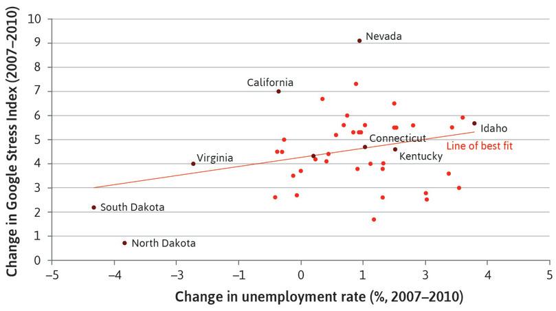
Losing your job hurts. It causes stress. Following the global financial crisis in 2008, unemployment went up, as did the number of searches for antistress medication on Google. By plotting the increase in search intensity against the increase in the unemployment rate in the different states of the US (Figure 13.1), we see that states that had a larger increase in the unemployment rate between 2007 and 2010, also had a larger increase in searches for antistress medication. This suggests that higher unemployment is related to higher stress. We say the two are correlated.
Changes in unemployment and wellbeing during the financial crisis: Evidence from the US states (2007–2010).
Figure 13.1 Changes in unemployment and wellbeing during the financial crisis: Evidence from the US states (2007–2010).
Yann Algan, Elizabeth Beasley, Florian Guyot, and Fabrice Murtin. 2014. ‘Big Data Measures of Human Well-Being: Evidence from a Google Stress Index on US States’. Sciences Po Working Paper.
The upward-sloping line summarizes the data by finding the line that best fits the scatter of points. This is called a line of best fit or a linear regression line. When a line of best fit is upward sloping, it means that higher values of the variable on the horizontal axis (in this case the rise in unemployment) are associated with higher values of the variable on the vertical axis (in this case, the increase in Google searches for antistress medication).
Many kinds of evidence show that being unemployed or fearing unemployment is a major source of unhappiness for people. It ranks alongside major disease and divorce as a stressful life event.
Economists have estimated that becoming unemployed produces more unhappiness than is measured solely by the loss of earnings from being out of work. Economists Andrew Clark and Andrew Oswald have measured the effect of important life events on how happy people claim to be when they are asked. In 2002, they calculated that the average British person would need to be compensated by £15,000 ($22,500) per month after losing their job in order to be as happy as they were when they were employed. This is considerably larger than the loss of earnings (which at the time were £2,000 per month on average).1
The compensation needed to restore wellbeing is an enormous amount, much greater than the monetary loss associated with a spell of unemployment. The reason is that unemployment dramatically reduces self-esteem and leads to a much greater reduction in happiness. As we saw in Unit 1, wellbeing depends on more than just income.
Correlation may not be causation
- reverse causality
- A two-way causal relationship in which A affects B and B also affects A.
- linear regression line
- The best-fitting line through a set of data.
Can we draw the conclusion from the data in Figure 13.1 that higher unemployment causes higher stress? Maybe we have it the wrong way round, and actually Google searches cause unemployment. Economists call this reverse causality. We can rule this out because it is unlikely that individual Google searches on the side effects of antidepressants could cause an increase in unemployment at the state level. Yet there are other possible explanations for this pattern.
The Spurious Correlations website shows how dangerous it is to draw a conclusion from correlation. James Fletcher. 2014. ‘Spurious Correlations: Margarine Linked to Divorce?’. BBC News.
A natural disaster like Hurricane Katrina in the US state of Louisiana in 2005 could have triggered an increase in both stress and unemployment. This is an example where a third factor—in this case, the weather—might account for the positive correlation between searches for antidepressants and unemployment. It warns us to be careful in concluding that an observed correlation implies a causal relationship between variables.
- correlation
- A statistical association in which knowing the value of one variable provides information on the likely value of the other, for example high values of one variable being commonly observed along with high values of the other variable. It can be positive or negative (it is negative when high values of one variable are observed with low values of the other). It does not mean that there is a causal relationship between the variables. See also: causality, correlation coefficient.
To establish a causal relationship between variables, economists devise experiments (like those in Unit 4) or exploit natural experiments (like the comparison of East and West Germany in Unit 1 or the estimate of the size of employment rents in Unit 6).
In Exercise 13.1, we show you a tool that you can use to examine your ideas about how the overall wellbeing in a country can be compared with wellbeing in other countries. What is your recipe for a better life in your country? How important do you think unemployment is? Do other things matter more or just as much—for example, good education, clean air, a high level of trust among citizens, high income, or not too much inequality?
In this unit, we learn about why economies go through upswings, during which unemployment falls, and downswings, during which it rises. We focus on the total spending (by households, firms, the government and people outside the home economy) on the goods and services produced by people employed in the home economy.
Exercise 13.1 The OECD Better Life Index
The OECD is an international organization based in Paris, with 35 member countries, most with high levels of GDP per capita. It was formed in 1948 to facilitate postwar reconstruction in Western Europe. The OECD is an important source of internationally comparable statistics on economic and social performance.
The Better Life Index, was created by the Organization for Economic Cooperation and Development (OECD). It lets you design a measure of the quality of life in a country by deciding how much weight to put on each component of the index.
- Should a better life index include the following elements: income, housing, jobs, community, education, environment, civic engagement, health, life satisfaction, safety, and work-life balance? For each of these elements, explain why or why not.
- Use the Better Life Index tool to create your own better life index for the country where you are living. How does this country score on the topics that are important to you?
- Rank the countries in the database using your own newly created better life index, and compare it with a ranking based exclusively on income.
- For both of these indices, choose two countries with contrasting rankings and briefly suggest why this may be the case.
13.1 Growth and fluctuations
Economies in which the capitalist revolution has taken place have grown over the long run, as illustrated in the hockey stick charts for GDP per capita in Unit 1.
- logarithmic scale
- A way of measuring a quantity based on the logarithm function, f(x) = log(x). The logarithm function converts a ratio to a difference: log (a/b) = log a – log b. This is very useful for working with growth rates. For instance, if national income doubles from 50 to 100 in a poor country and from 1,000 to 2,000 in a rich country, the absolute difference in the first case is 50 and in the second 1,000, but log(100) – log(50) = 0.693, and log(2,000) – log(1,000) = 0.693. The ratio in each case is 2 and log(2) = 0.693.
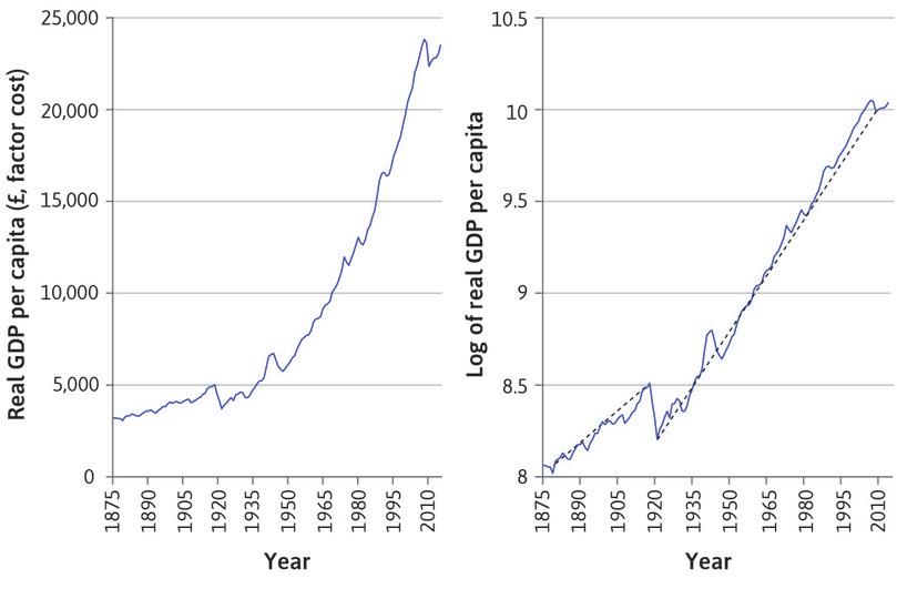
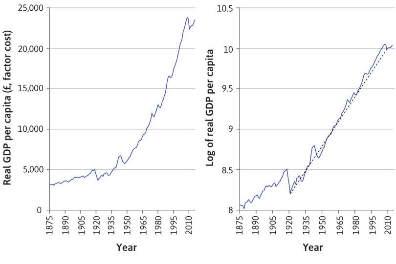
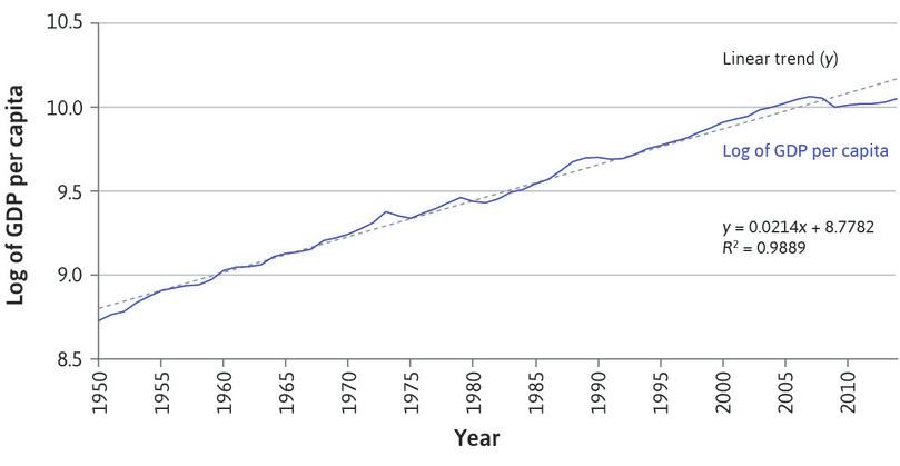
But growth has not been smooth. Figure 13.2 shows the case of the British economy, for which data over a long period is available. The first chart shows GDP per person (per capita) of the population from 1875. This is part of the hockey stick graph from Unit 1. The chart next to it shows the same data but plots the natural logarithm (‘log’) of GDP per capita. This is a way of presenting the ratio scale that we used in Unit 1.
See the Einstein at the end of this section to explore the relationship between plotting the log of a variable and the use of a ratio scale on the vertical axis.
By looking at the graph in levels of GDP per capita in the left-hand panel of Figure 13.2, it is hard to tell whether the economy was growing at a steady pace, accelerating, or decelerating over time. Transforming the data into natural logs in the right-hand panel allows us to answer the question about the pace of growth more easily. For example, for the period after the First World War, a straight line from 1921 to 2014 fits the data well. For a graph in which the vertical axis represents the log of GDP per capita, the slope of the line (the dashed black line) represents the average annual growth rate of the series. Immediately we notice that growth was steady from 1921 to 2014 (with a little uptick during the Second World War). You can see that a line drawn through the log series from 1875 to 1914 is flatter than the line from 1921, indicating that the growth rate was lower.
We will explore long-run growth further in Units 16 and 17. In this unit we focus on fluctuations. These are the deviations from the dotted black line showing the long-run growth rate in Figure 13.2.
- gross domestic product (GDP)
- A measure of the market value of the output of the economy in a given period.
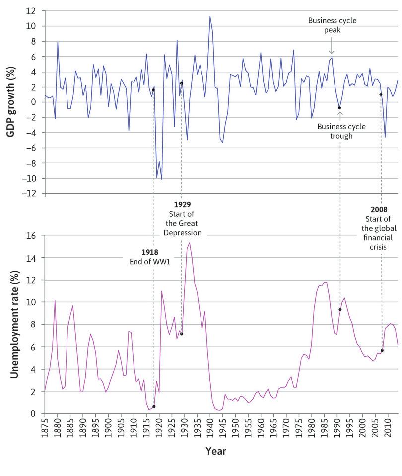
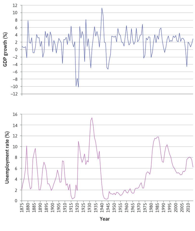
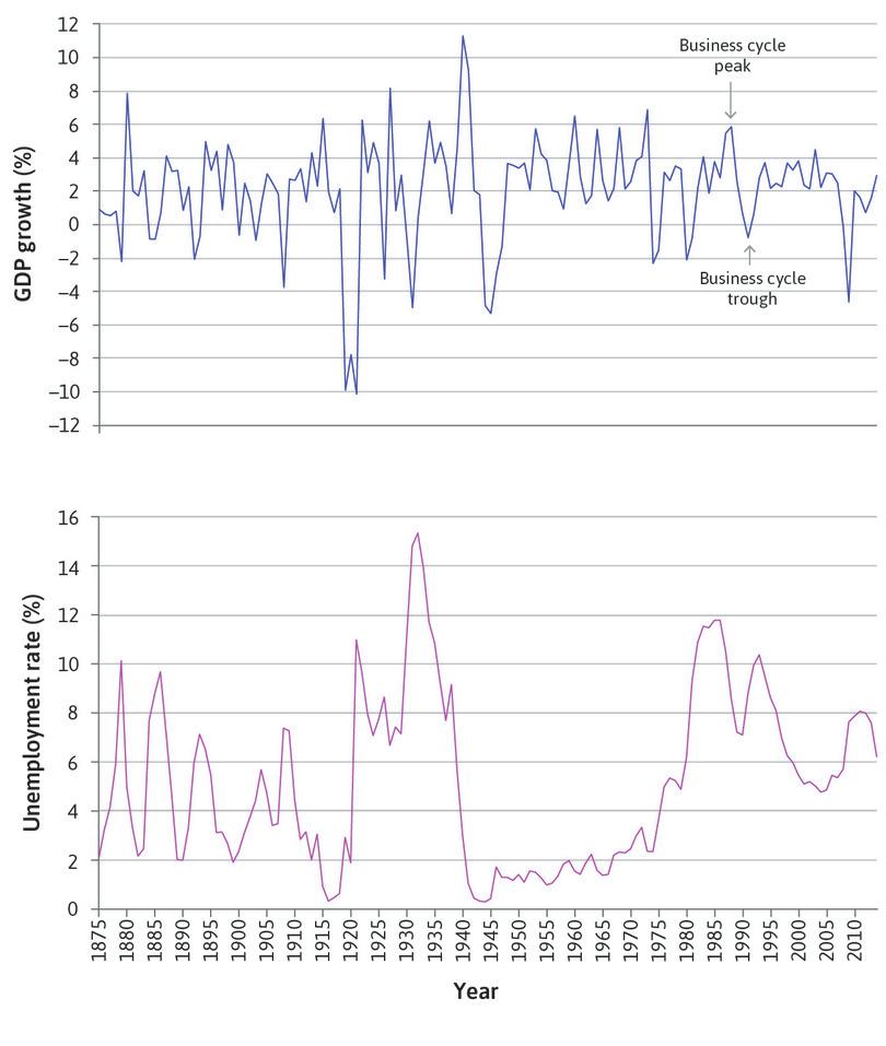
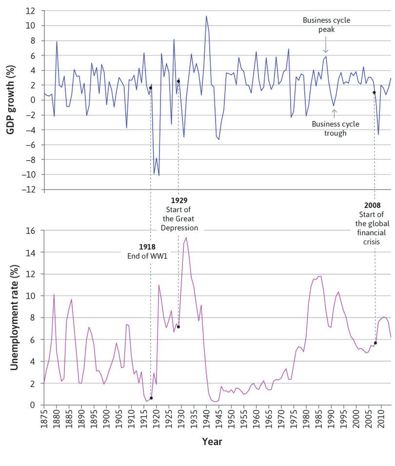
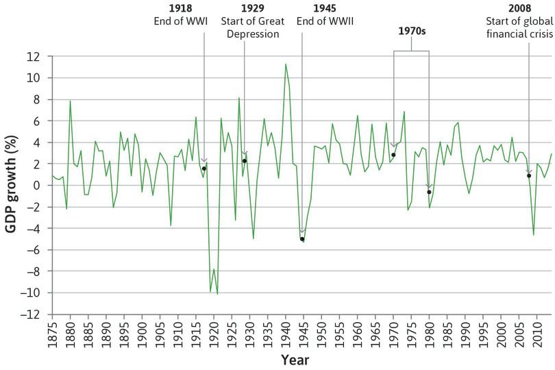
The top panel of Figure 13.3 plots the annual growth rate of UK GDP between 1875 and 2014. Since we want to focus on the size of the economy and how it changes from year to year, we will examine total GDP rather than GDP per capita.
- recession
- The US National Bureau of Economic Research defines it as a period when output is declining. It is over once the economy begins to grow again. An alternative definition is a period when the level of output is below its normal level, even if the economy is growing. It is not over until output has grown enough to get back to normal. The latter definition has the problem that the ‘normal’ level is subjective.
It is clear from the ups and downs of the series in Figure 13.3 that economic growth is not a smooth process. We often hear about economies going through a boom or a recession as growth swings from positive to negative, but there is no standard definition of these words. The National Bureau of Economic Research (NBER), a US organization, defines it like this: ‘During a recession, a significant decline in economic activity spreads across the economy and can last from a few months to more than a year.’ An alternative definition says that an economy is in recession during a period when the level of output is below its normal level. So we have two definitions of recession:
- NBER definition: output is declining. A recession is over once the economy begins to grow again.
- Alternative definition: the level of output is below its normal level, even if the economy is growing. A recession is not over until output has grown enough to get back to normal.
There is a practical problem with the second definition: it is a matter of judgement, and sometimes controversy, over what an economy’s normal output would be (we return to this issue in later units, where we will see that ‘normal output’ is often defined as that consistent with stable inflation).
- business cycle
- Alternating periods of faster and slower (or even negative) growth rates. The economy goes from boom to recession and back to boom. See also: short-run equilibrium.
The movement from boom, to recession, and back to boom is known as the business cycle. In Figure 13.3 you will notice that in addition to the yearly change in GDP, in which recessions measured by negative growth seem to happen about twice every 10 years, there are less frequent episodes of much larger fluctuations in output. In the twentieth century, the big downward spikes coincided with the end of the First and Second World Wars, and with the economic crisis of the Great Depression. In the twenty-first century, the global financial crisis followed a period in which fluctuations were limited.
In the lower part of Figure 13.3 you can see that the unemployment rate varies over the business cycle. During the Great Depression, unemployment in the UK was higher than it had ever been, and it was particularly low during the World Wars.
Exercise 13.2 Defining recessions
A recession can be defined as a period when output is declining, or as a period when the level of output is below normal (sometimes referred to as its ‘potential level’). Look at this article, especially Figures 5, 6, and 7, to find out more.
- Consider a country that has been producing a lot of oil and suppose that from one year to the next its oil wells run out. The country will be poorer than previously. According to the two definitions above, is it in a recession?
- Does knowing whether a country is in recession make a difference to policymakers whose job it is to manage the economy?
Question 13.1 Choose the correct answer(s)
The following is the graph of the natural log of UK real GDP per capita between 1875 and 2014:
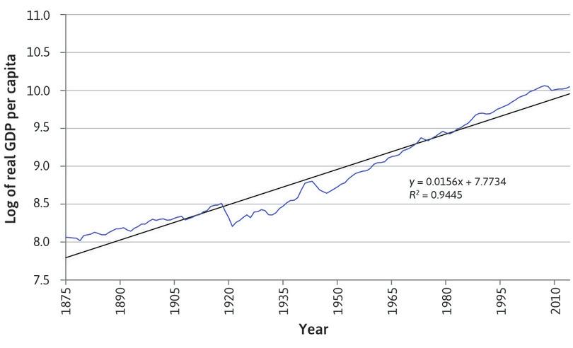
Based on this information, which of the following statements is correct?
- The graph shows that the natural log of GDP per capita in the UK in 1955 was about 8.9, that is, ln(GDP per capita) = 8.9. This means that GDP per capita = e8.9 = £7,332. (It was, in fact, e8.91 = £7,370.)
- This is stated in Figure 13.2, Section 13.1.
- While the log of real GDP per capita was lower immediately after 1921 than before 1918, the slope of the log graph is steeper. This means that the growth rate was higher after 1921 than before 1918.
- The graph of real GDP per capita plotted using a ratio scale would look the same as the graph of the natural log of real GDP per capita plotted on a linear scale.
Einstein Ratio scales and logarithms
In Unit 1, we made frequent use of a ratio or log scale on the vertical axis to display long-run data. For example, we used ratio scales with the units doubling in Figure 1.1b and rising tenfold in Figure 1.2. The ratio scale is also called a logarithmic (or log) scale. We can write a scale where the tick marks on the vertical axis double like this:
Or a scale where they rise tenfold, like this:
The first is called a logarithmic scale in base 2; the second is in base 10.
As we saw in the charts in Unit 1, if the data forms a straight line on a ratio (logarithmic) scale, then the growth rate is constant. A different method of using this property of logarithms is to first convert the data into natural logs and then plot it on a scale that is linear in logs. Natural logs use base e, where e is a number (approximately 2.718) that has mathematically useful properties.
We can use a calculator or a spreadsheet program to convert levels into natural logs. As you can see, when applied to this data, it converts the curved line in Figure 13.2 in the left-hand panel into one that is almost a straight line in the right-hand one.
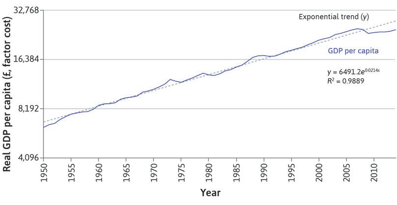
Using the chart functions in Microsoft Excel helps illustrate the relationship between plotting the data with a ratio scale on the vertical axis (Figure 13.4a, which uses the doubling or base 2 scale) and transforming the data into natural logs and plotting on a linear scale (in logs) on the axis (Figure 13.4b). Note that the tick marks double from 4,096 to 8,192 to 16,384 in Figure 13.4a and rise from 8.5 to 9 to 9.5 in Figure 13.4b.
In each chart, a line appears alongside the data series. Using Excel, we created Figure 13.4a by selecting Analysis/Trendline, and then selecting ‘Exponential’. Excel finds the line or curve that best fits the data points: since the scale is a ratio scale, a straight line is displayed. The equation of the line is given. Other spreadsheet or graphing software offers similar features.
We can see that the exponential function uses what is called base e in contrast to base 2 (doubling) or base 10 (increasing tenfold). The exponent on e tells us the compound annual growth rate of the series: it is 0.0214 × 100 = 2.14% per annum.
In Figure 13.4b, if we use Excel to select the ‘Fit a linear function’ option, a straight line appears. This time, we see an equation for a straight line with intercept 8.7782 and slope 0.0214. Now the slope of the line tells us the exponential, or equivalently, the compound annual growth rate of the series: 0.0214 × 00 = 2.14% per annum.
In summary:
- When a data series is plotted, either using a ratio scale or by transforming the data into natural logs, and the outcome is approximately linear, it means that the growth rate of the series is approximately constant. This constant growth rate is called an exponential growth rate.
- The exponential growth rate (known also as the compound annual growth rate or CAGR) is the slope of the line when the natural logarithm of the data series is plotted.
- Notice the persistent deviation of the British economy from the trend line following the 2008 financial crisis.
13.2 Output growth and changes in unemployment
We saw in Figure 13.3 that unemployment goes down in booms and up in recessions.
- Okun’s law
- The empirical regularity that changes in the rate of growth of GDP are negatively correlated with the rate of unemployment. See also: Okun’s coefficient.
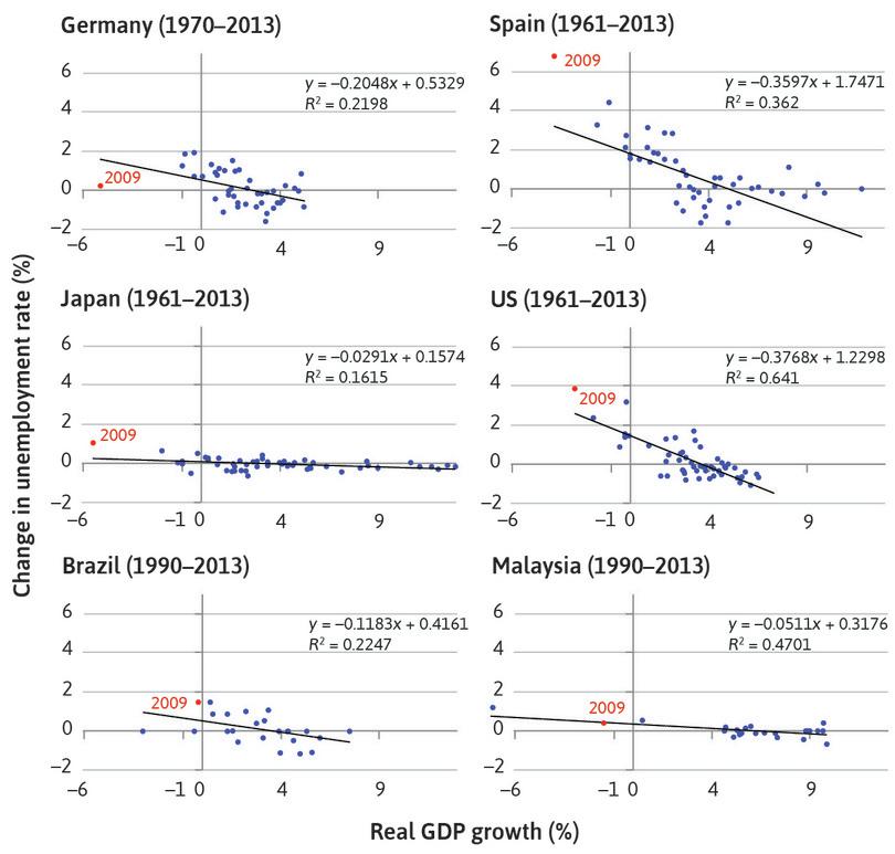
Figure 13.5 shows the relationship between output and unemployment fluctuations, known as Okun’s law. Arthur Okun, an advisor to US President Kennedy, noticed that when a country’s output growth was high, unemployment tended to decrease. Okun’s law has been a strong and stable empirical relationship in most economies since the Second World War.
OECD. 2015. OECD Statistics; The World Bank. 2015. World Development Indicators.
- Okun’s coefficient
- The change in the unemployment rate in percentage points predicted to be associated with a 1% change in the growth rate of GDP. See also: Okun’s law.
Figure 13.5 plots the change in the unemployment rate (vertical axis) and the growth rate of output (horizontal axis) for six countries: higher output growth is clearly associated with a decrease in unemployment. In each country chart, there is a downward-sloping line that best fits the points. In the US, for example, the slope of the line implies that, on average, a 1% increase in the output growth rate decreases the unemployment rate by roughly 0.38 percentage points. We say that Okun’s coefficient is –0.38 in the US. Our Einstein at the end of this section shows how to derive the coefficient.
The dot labeled 2009 in each graph in Figure 13.5 shows the changes in real GDP and unemployment that occurred from 2008 to 2009, during the recession that followed the global financial crisis. We can see that in 2009, all four of the advanced economies experienced their worst output contraction in 50 years. As predicted by Okun’s law, unemployment rose in Spain, Japan, and the US.
In each of these three countries, however, the increase in unemployment was higher than Okun’s law predicted: the red dot is well above the black line of best fit. Germany looks very different: Okun’s law predicted a rise in unemployment of 1.65 percentage points in Germany but, as the red dot shows, German unemployment hardly changed in 2009. An economic policymaker would surely want to know how Germany managed to protect jobs in the face of the largest decline in the economy’s output in 50 years. We will see why this occurred later in this unit.
Brazil and Malaysia also experienced contractions in output and increases in unemployment in 2009. However, like most developing economies, they were hit less hard by the crisis than the advanced economies. Also, Malaysia had recently experienced a much worse contraction during the East Asian crisis in 1998, when growth was –7.4%—bad enough that it would not fit on our chart.
We can summarize the relationship between output, unemployment, and wellbeing like this:
Exercise 13.3 Okun’s Law
- Look at the regression lines (the lines of best fit) in Figure 13.5. What prediction does the regression line show for unemployment when the economy is not growing? Are the results the same for all the countries?
- Assume that the population in the economy is growing. Can you use this assumption to provide an explanation for your results in question 1? What else might explain the differences between countries?
Question 13.2 Choose the correct answer(s)
The following graph shows the relationship between real GDP growth and change in unemployment for the US between 1961 and 2013.
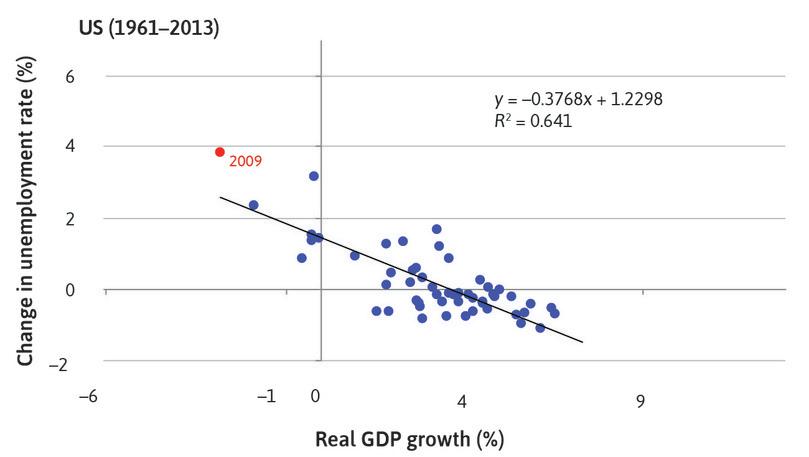
The equation shown is the regression result for the best-fitting line. Based on this information, which of the following statements is correct?
- The graph shows an increase in the unemployment rate when there is zero real GDP growth. Indeed the intercept of the best fitting line with the vertical axis is given as 1.230%.
- Okun’s coefficient is –0.3768, that is, a 1% increase in the output growth rate decreases the unemployment rate by 0.38 percentage points on average.
- That is the best fitting regression result—that on average the unemployment rate has fallen 0.38 percentage points for 1% increase in the real GDP. This does not mean that this will happen next year with certainty.
- This can be inferred from the line or from the equation for the line. The predicted change in the unemployment rate = 1.2298 + (-0.3768) x (-2.8) = 2.285%.
Einstein Okun’s law
This is defined as:
Δut is the change in unemployment rate at time t, (GDP growtht) is the real GDP growth at time t, α is the intercept value, and β is a coefficient determining how real GDP growth is predicted to be translated into a change in unemployment rate. Okun’s Law is an empirical linear relationship that associates real GDP growth with changes in unemployment. The coefficient β, called Okun’s coefficient, is generally found to be negative, suggesting that a positive real GDP growth will be associated with a fall in the unemployment rate.
The estimated Okun’s law relationship for Germany, for the period 1970–2013, has coefficients β = –0.20 and α = 0.53.
When we estimate a line of best fit, we also measure the R-squared (R²), which is a statistic that lies between 0 and 1. It measures how closely the observed data fits the line that we draw through them, with 1 being a perfect fit, and 0 representing no observable relationship between the observations and the prediction. In our case, the R² statistic measures how well Okun’s law approximates the data for real GDP growth and unemployment changes. The R² statistic is 0.22 for Germany for the period 1970–2013, which is much lower than for the estimated Okun’s law equation for the US, which is 0.64.
To work out the predicted percentage change in unemployment for Germany in 2009 using the Okun’s law equation, we simply plug in the value of real GDP growth for Germany in 2009 and solve the equation as follows:
Okun’s law predicts that the fall in GDP of 5.1% in 2009 in Germany should have been associated with an increase in unemployment by 1.58 percentage points.
13.3 Measuring the aggregate economy
Economists use what are called aggregate statistics to describe the economy as a whole (known as the aggregate economy, meaning simply the sum of its parts brought together).
- aggregate output
- The total output in an economy, across all sectors and regions.
In Figure 13.5, aggregate output (GDP) is the output of all producers in a country, not just those of some region, firm, or sector. Recall from Unit 1 that Diane Coyle, an economist who specializes in how we measure GDP, describes it as:
Everything from nails to toothbrushes, tractors, shoes, haircuts, management consultancy, street cleaning, yoga teaching, plates, bandages, books, and the millions of other services and products in the economy.
- national accounts
- The system used for measuring overall output and expenditure in a country.
- value added
- For a production process this is the value of output minus the value of all inputs (called intermediate goods). The capital goods and labour used in production are not intermediate goods. The value added is equal to profits before taxes plus wages.
The national accounts are statistics published by national statistical offices that use information about individual behaviour to construct a quantitative picture of the economy as a whole. There are three different ways to estimate GDP:
- Spending: The total spent by households, firms, the government, and residents of other countries on the home economy’s products.
- Production: The total produced by the industries that operate in the home economy. Production is measured by the value added by each industry: this means that the cost of goods and services used as inputs to production is subtracted from the value of output. These inputs will be measured in the value added of other industries, which prevents double-counting when measuring production in the economy as a whole.
- Income: The sum of all the incomes received, comprising wages, profits, the incomes of the self-employed, and taxes received by the government.
In eighteenth century France, a group of economists, called the Physiocrats, studied the economy and compared the way it functioned to the circular flow of blood in the human body. This was a forerunner to how we think today about the circular flow in the economy that allows us to calculate GDP. Money flows from the spender to the producer, from the producer to its employees or shareholders, and then is spent again on further output, continuing the cycle.
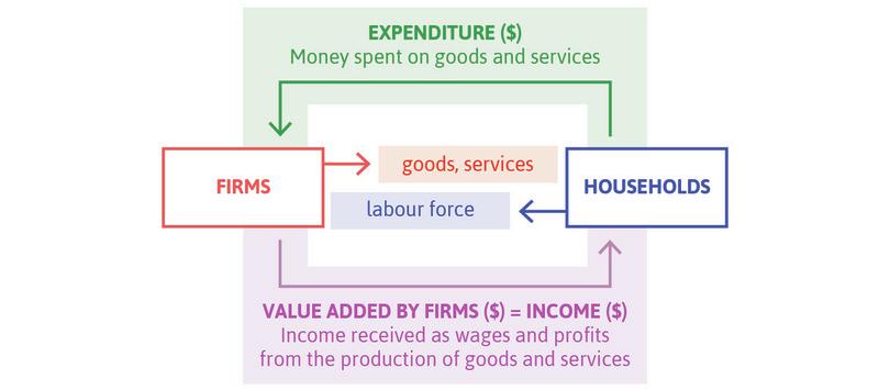
The relationship between spending, production, and incomes in the economy as a whole can be represented as a circular flow: the national accounts measurement of GDP can be taken at the spending stage, the production stage, or the income stage. If accurate measurement were possible, the total of expenditure, output, and incomes in a year would be the same so the point at which the measurement is taken would not matter.
This is because any spending on a good or a service, which must have been produced, is income for whomever sold that output. If you buy a taco from a street vendor for 20 pesos, then your expenditure is 20 pesos, the value added of the taco whose production was necessary for this sale is 20 pesos, and the income received by the street vendor is also 20 pesos. The same point applies if you purchase a car for $20,000, a massage for $50, or insurance for $20 per month.
Households and firms both receive income and spend it. Figure 13.6 shows the circular flow between households and firms (ignoring the role of government and purchases from and sales abroad for now).
In the model of the economy in Figure 1.12, we looked at the physical flows among households, firms, and the biosphere instead of the circular flow of income. In Unit 20, we look at how the interaction of households and firms with the biosphere can be measured.
- imports (M)
- Goods and services produced in other countries and purchased by domestic households, firms, and the government.
- exports (X)
- Goods and services produced in a particular country and sold to households, firms and governments in other countries.
GDP can be defined according to any of these three perspectives. But we have to be careful in the definition because, while it is always the case that one person’s expenditure is another person’s income, globalization means that often the two people are in different countries. This is the case with imports and exports: someone in China may buy rice from someone in Japan, implying that the expenditure is Chinese while the income is Japanese.
How do we account for these transactions? Since GDP is defined as domestic product, it counts as Japanese GDP because the rice was produced (and sold) by Japan. So exports are included in GDP because they are part of domestic production, but imports are not because they are produced elsewhere. For this reason, GDP is defined to include exports and exclude imports:
- as the value added of domestic production, or as expenditure on domestic production
- as income due to domestic production
The circular flow model in Figure 13.6 considered only households and firms, but the government, and the public services the government provides, can be incorporated in a similar way. Households receive some goods and services that are supplied by the government, for which they do not pay at the point of consumption. A good example is primary school education.
The consumption and production of these services can be visualized using the circular flow model:
- Households to government: Households pay taxes.
- Government to households: These taxes pay for the production of public services used by households.
In this way the government can be seen as another producer, like a firm—with the difference that the taxes paid by a particular household pay for public services in general, and do not necessarily correspond to the services received by that household. In Unit 19, we will look at how the payment of taxes and the receipt of public services or benefits varies across households. Since public services are not sold in the market, we also have to make a further assumption: that the value added of government production is equal to the amount it costs the government to produce.
So we can say that if, for example, citizens on average pay $15,000 per year in taxes (the expenditure), that is $15,000 of revenues to the government (the income), which uses it to produce $15,000 worth of public goods and services (the value added).
The fact that expenditure, output, and incomes are all equal means that we can use any one of these perspectives to help us understand the others. We described recessions as periods of negative output growth. But this means they must also be periods of negative expenditure growth (output will only decline if people are buying less). Often, we can even say that output declines because people are buying less. This is very useful because we know a lot about what determines expenditure, which in turn helps us to understand recessions, as we will see in Unit 14.
13.4 Measuring the aggregate economy: The components of GDP
Figure 13.7 shows the different components of GDP from the expenditure side, as measured in the national accounts for economies on three different continents: the US, the Eurozone, and China.
| US | Eurozone (19 countries) | China | |
|---|---|---|---|
| Consumption (C) | 68.4% | 55.9% | 37.3% |
| Government spending (G) | 15.1% | 21.1% | 14.1% |
| Investment (I) | 19.1% | 19.5% | 47.3% |
| Change in inventories | 0.4% | 0.0% | 2.0% |
| Exports (X) | 13.6% | 43.9% | 26.2% |
| Imports (M) | 16.6% | 40.5% | 23.8% |
Decomposition of GDP in 2013 for the US, the Eurozone, and China.
Figure 13.7 Decomposition of GDP in 2013 for the US, the Eurozone, and China.
OECD. 2015. OECD Statistics; The World Bank. 2015. World Development Indicators. OECD reports a statistical discrepancy for China equal to -3.1% of GDP.
Consumption (C)
- consumption (C)
- Expenditure on consumer goods including both short-lived goods and services and long-lived goods, which are called consumer durables.
Consumption includes the goods and services purchased by households. Goods are normally tangible things. Goods like cars, household appliances, and furniture that last for three years or more are called durable goods; those that last for shorter periods are non-durable goods. Services are things that households buy that are normally intangible, such as transportation, housing (payment of rent), gym membership, and medical treatment. Household spending on durable goods like cars and household equipment is counted in consumption in the national accounts, although as we will see, in economic terms the decision to buy these long-lasting items is more like an investment decision.
From the table in Figure 13.7 we see that in the advanced countries, consumption is by far the largest component of GDP, close to 56% in the Eurozone and 68% in the US. This contrasts with China, where final consumption of households accounts for 37% of GDP.
Investment (I)
- investment (I)
- Expenditure on newly produced capital goods (machinery and equipment) and buildings, including new housing.
This is the spending by firms on new equipment and new commercial buildings; and spending on residential structures (the construction of new housing).
- inventory
- Goods held by a firm prior to sale or use, including raw materials, and partially-finished or finished goods intended for sale.
Investment in the unsold output that firms produce is the other part of investment that is recorded as a separate item in the national accounts. It is called the change in inventories or stocks. Including changes in stocks is essential to ensuring that when we measure GDP by the output method (what is produced), it is equal to GDP measured by the expenditure method (what is spent, including investment by firms in unsold inventories).
Investment represents a much lower share of GDP in OECD countries, roughly one-fifth of GDP in the US and the Eurozone. In contrast, investment accounts for almost half of GDP in China.
Government spending on goods and services (G)
- government spending (G)
- Expenditure by the government to purchase goods and services. When used as a component of aggregate demand, this does not include spending on transfers such as pensions and unemployment benefits. See also: government transfers
This represents the consumption and investment purchases by the government (consisting of central and local government, often called ‘general government’). Government consumption purchases are of goods (such as office equipment, software, and cars) and services (such as wages of civil servants, armed services, police, teachers, and scientists). Government investment spending is on the building of roads, schools, and defence equipment. Much of government spending on goods and services is for health and education.
- government transfers
- Spending by the government in the form of payments to households or individuals. Unemployment benefits and pensions are examples. Transfers are not included in government spending (G) in the national accounts. See also: government spending (G)
Government transfers in the form of benefits and pensions, such as Medicare in the US, or social security benefits in Europe, are not included in G because households receive them as income: when they are spent, they are recorded in C or I. It would be double-counting to record this spending in G too.
The share of government spending on goods and services is slightly higher in Europe (21.1%) than in the US (15.1%). Remember, this excludes transfers (such as benefits and pensions). The greater difference in the role of the government between Europe and the US comes from those transfers. In 2012, total government spending including transfers was 57% of GDP in France, compared to 40% of GDP in the US.
Exports (X)
Domestically produced goods and services that are purchased by households, firms, and governments in other countries.
Imports (M)
Goods and services purchased by households, firms, and governments in the home economy that are produced in other countries.
Net exports (X − M)
- trade balance
- Value of exports minus the value of imports. Also known as: net exports. See also: trade deficit, trade surplus.
- trade deficit
- A country’s negative trade balance (it imports more than it exports). See also: trade surplus, trade balance.
- trade surplus
- A country’s positive trade balance (it exports more than it imports). See also: trade deficit, trade balance.
- aggregate demand
- The total of the components of spending in the economy, added to get GDP: Y = C + I + G + X – M. It is the total amount of demand for (or expenditure on) goods and services produced in the economy. See also: consumption, investment, government spending, exports, imports.
Also called the trade balance, this is the difference between the values of exports and imports (X – M).
In 2010, the US had a trade deficit of 3.4% of GDP and China had a trade surplus of 3.6% of GDP. The trade balance is a deficit if the value of exports minus the value of imports is negative; it is called a trade surplus if it is positive.
GDP (Y)
To calculate GDP, which is the aggregate demand for what is produced in the country, we add the purchases by those in other countries (exports) and subtract the purchases by home residents of goods and services produced abroad (imports). Taking China as an example, its GDP is the aggregate demand for China’s output, which includes its exports less its imports.
Working with national accounts data is a way of learning about the economy, and an easy way to do this is to use the Federal Reserve Economic Data (FRED). To learn more about the country where you live and how it compares to other countries, try Exercise 13.4 for yourself.
In most countries, private consumption spending makes up the largest share of GDP (see Figure 13.7 to check). Investment spending accounts for a much smaller share (China’s very high level of investment, shown in Figure 13.7, is exceptional). We use the data in the national accounts to calculate how much each component of expenditure contributes towards GDP fluctuations.
The equation below shows how GDP growth can be broken down into the contributions made by each component of expenditure. We can see that the contribution of each component to GDP growth depends on both the share of GDP that the component makes up and its growth over the previous period.
The table in Figure 13.8 shows the contributions of the components of expenditure to US GDP growth. The data is for 2009, in the middle of the recession caused by the global financial crisis. We can see that:
- Although investment makes up less than one-fifth of US GDP, it was much more important in accounting for the contraction in the economy than the fall in consumption spending.
- Although consumption makes up about 70% of US GDP, the effect of investment on GDP was more than three times larger.
- In contrast to consumption and investment, government expenditure contributed positively to GDP growth. The US government used fiscal stimulus to prop up the economy whilst private sector demand was depressed.
- Net exports also contributed positively to GDP, which reflects both the stronger performance of emerging economies in the aftermath of the crisis and the collapse in import demand that accompanied the recession.
| GDP | Consumption | Investment | Government spending | Net exports | |
|---|---|---|---|---|---|
| 2009 | −2.8 | −1.06 | −3.52 | 0.64 | 1.14 |
Contributions to percentage change in real GDP in the US in 2009.
Figure 13.8 Contributions to percentage change in real GDP in the US in 2009.
Federal Reserve Bank of St. Louis. 2015. FRED. Note that in the national accounts, government investment is counted as government spending and not investment.
Shortcomings of GDP as a measure
Three things need to be kept in mind when using the concept of GDP:
- It is a conventional measure of the size of an economy: We examined what GDP includes in Unit 1. In Unit 20, the concept of green growth accounting is introduced, which shows how to calculate the size of the economy and its growth taking into account environmental degradation.
- Distinguish aggregate GDP from GDP per capita: This is especially important when discussing growth. In this section, the focus has been on GDP and the contributions of the different components of demand to its growth. In other contexts, the relevant concept is a per capita measure. To see the difference, note that GDP in the UK grew by 7% between 2007 and 2015 but GDP per capita grew by only 0.8%. The explanation is that there was a large increase in immigration.
- GDP per capita is a flawed measure of living standards: Recall from Unit 1 that Robert Kennedy’s 1968 speech at the University of Kansas highlighted these flaws (search for ‘Gross National Product’ in the text).
Exercise 13.4 How to use FRED
If you want real-time macroeconomic data on the German unemployment rate or China’s output growth, you do not need to learn German and Chinese, or struggle to get to grips with national archives, because FRED does it for you! FRED is a comprehensive up-to-date data source maintained by the Federal Reserve Bank of St Louis in the US, which is part of the US central banking system. It contains the main macroeconomic statistics for almost all developed countries going back to the 1960s. FRED also allows you to create your own graphs and export data into a spreadsheet.
To learn how to use FRED to find macroeconomic data, follow these steps:
- Visit the FRED website.
- Use the search bar and type ‘Gross Domestic Product’ (GDP) and the name of a major global economy. Select the annual series for both nominal (current prices) and real (constant prices) GDP for this country. Click the ‘Add to Graph’ button at the bottom of the page.
Use the graph you created to answer these questions:
- What is the level of nominal GDP in your chosen country this year?
- FRED tells you that the real GDP is chained in a specific year (this means that it is evaluated in terms of constant prices for that year). Note that the real GDP and the nominal GDP series cross at one point. Why does this happen?
From the FRED graph, keep only the real GDP series. FRED shows recessions in shaded areas for the US economy using the NBER definition, but not for other economies. For other economies, assume that a recession is defined by two consecutive quarters of negative growth. At the bottom of the graph page, select ‘Create your own data transformation’ and click on ‘Percent change from one year’ (FRED gives you a hint about how to calculate a growth rate at the bottom of the page: notes on growth rate calculation and recessions). The series now shows the percentage change in real GDP.
- How many recessions has your chosen economy undergone over the years plotted in the chart?
- What are the two biggest recessions in terms of length and magnitude?
Now add to the graph the quarterly unemployment rate for your chosen economy (click on ‘Add data series’ under the graph and search for ‘Unemployment’ and your chosen country name).
- How does the unemployment rate react during the two main recessions you have identified?
- What was the level of the unemployment rate during the first and the last quarter of negative growth for those two recessions?
- What do you conclude about the link between recession and the variation in unemployment?
Note: To make sure you understand how these FRED graphs are created, you may want to extract the data into a spreadsheet, and create a graph showing the growth rate of real GDP and the evolution of the unemployment rate since 1948 for the US economy.
Question 13.3 Choose the correct answer(s)
Which of the following statements is correct regarding measuring GDP?
- These three different measures of GDP are discussed in Section 13.4.
- Exports are part of domestic production while imports are not. Hence the former is included while the latter is not (imports are subtracted in the aggregate demand equation).
- Government and public services, for example, primary school education, are included.
- Public services, such as primary school education, are not sold in the market. Hence it is assumed that the value added is equal to the amount it costs the government to produce.
Question 13.4 Choose the correct answer(s)
Which of the following would increase GDP?
- Imports represent expenditure on foreign goods and services, so a decline in imports implies that a greater share of C, I and G is being spent on domestic production.
- This will increase domestic income because domestic residents are richer, but it does not imply an increase in domestic production.
- This implies greater expenditure on domestic production.
- This implies reduced expenditure by foreigners on domestic production so it reduces GDP.
13.5 How households cope with fluctuations
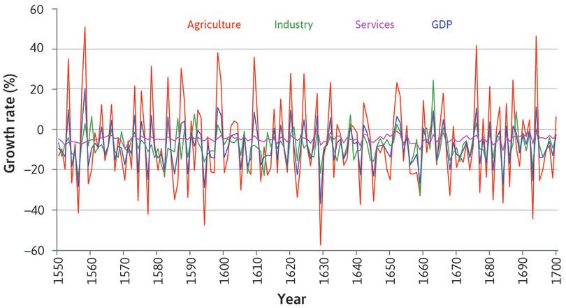
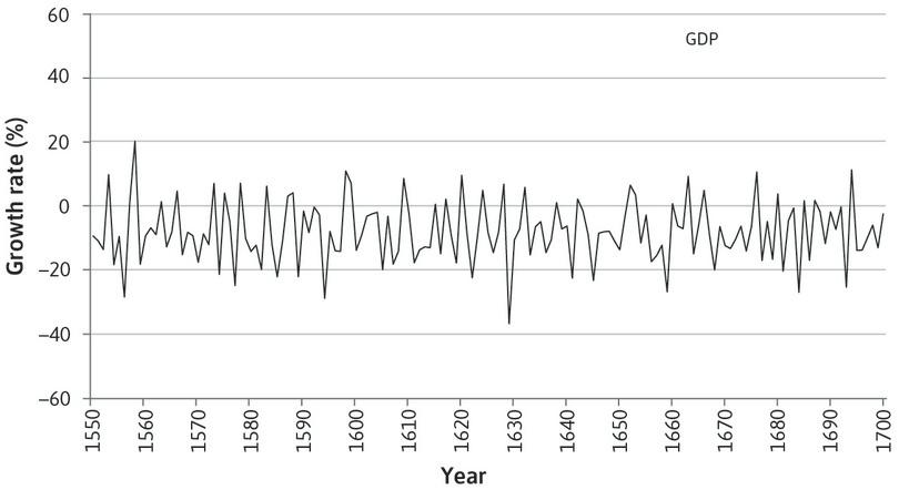
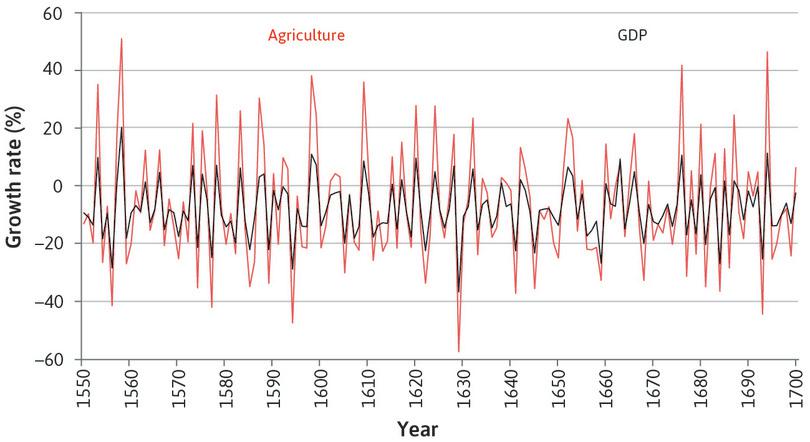
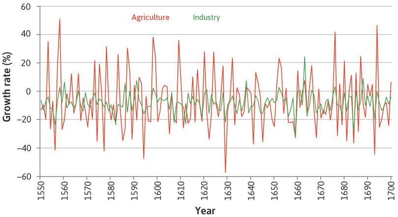
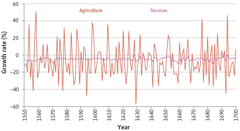
Economies fluctuate between good and bad times. So far we have studied industrialized economies, but this is equally true in economies based on agriculture. Figure 13.9a illustrates fluctuations in production in the largely agrarian British economy between 1550 and 1700. Just as we divided GDP into different components from the expenditure side, we can also divide it into different sectors on the production side. Figure 13.9a shows the growth rate of real GDP and of the three main sectors: agriculture, industry, and services. Follow the analysis in Figure 13.9a to see how the agricultural sector drove fluctuations in GDP.
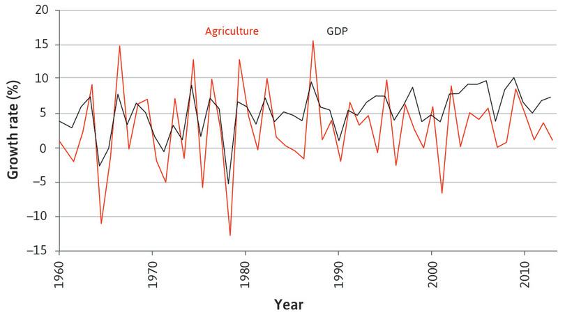
Figure 13.9b shows the growth rates of real GDP and agriculture in India since 1960. In 1960 agriculture comprised 43% of the economy, which had declined to 17% in 2014. Partly due to modern farming methods, agriculture in modern India is not as volatile as it was in Britain before 1700. But it remains nearly twice as volatile as GDP as a whole.
The role of agriculture in the fluctuations of the aggregate economy in India (1961–2014).
Figure 13.9b The role of agriculture in the fluctuations of the aggregate economy in India (1961–2014).
The World Bank. 2015. World Development Indicators.
- shock
- An exogenous change in some of the fundamental data used in a model.
To help us to think about the costs and causes of economic fluctuations, we begin with an agrarian economy. In an economy based on agricultural production, the weather—along with war and disease—is a major cause of good and bad years. The term shock is used in economics to refer to an unexpected event, for example, extreme weather or a war. As we know, people think about the future and usually they anticipate that unpredictable events may occur. They also act on these beliefs. In a modern economy, this is the basis of the insurance industry. In an agrarian economy, households also anticipate that both bad luck and good harvests can occur.
How do households cope with fluctuations that can cut their income in half from one season to the next?
We can distinguish between two situations:
- Good or bad fortune strikes the household: For example, when disease affects a family’s animals, or when a family member who plays an important role in farming is injured.
- Good or bad fortune strikes the economy as a whole: For example, when drought, disease, floods, a war, or an earthquake affects a whole area.
Household shocks
- self-insurance
- Saving by a household in order to be able to maintain its consumption when there is a temporary fall in income or need for greater expenditure.
- co-insurance
- A means of pooling savings across households in order for a household to be able to maintain consumption when it experiences a temporary fall in income or the need for greater expenditure.
People use two strategies to deal with shocks that are specific to their household:2
- Self-insurance: Households that encounter an unusually high income in some period will save, so that when their luck reverses, they can spend their savings. As we saw in Unit 10, they may also borrow in bad times if they can, depending on how credit-constrained they are. It is called self-insurance because other households are not involved.
- Co-insurance: Households that have been fortunate during a particular period can help a household hit by bad luck. Sometimes this is done among members of extended families or among friends and neighbours. Since the mid-twentieth century, particularly in richer countries, co-insurance has taken the form of citizens paying taxes, which are then used to support individuals who are temporarily out of work, called unemployment benefits.
- altruism
- The willingness to bear a cost in order to benefit somebody else.
Informal co-insurance among family and friends is based on both reciprocity and trust: you are willing to help those who have helped you in the past, and you trust the people who you helped to do the same in return. Altruism towards those in need is also usually involved, although co-insurance can work without it.3
These strategies reflect two important aspects of household preferences:
- People prefer a smooth pattern of consumption: As we saw in Unit 10, they dislike consumption that fluctuates as a result of bad or good shocks such as injury or good harvests. So they will self-insure.
- Households are not solely selfish: They are willing to provide support to each other to help smooth the effect of good and bad luck. They often trust others to do the same, even when they do not have a way of enforcing this. Altruistic and reciprocal preferences remain important even when co-insurance takes the form of a tax-supported unemployment benefit, because these are among the motives for supporting the public policies in question.
Economy-wide shocks
Co-insurance is less effective if the bad shock hits everyone at the same time. When there is a drought, flood, or earthquake, it is more difficult for an agrarian economy to protect the wellbeing of the people who are affected. For example, it is not usually possible to store produce from a bumper harvest long enough to get through the next bad harvest, which may take several years to arrive.
But when these shocks hit, co-insurance may be even more necessary, as community survival requires that less badly hit households help the worst-hit households. In farming economies of the past that were based in volatile climates, people practised co-insurance based on trust, reciprocity, and altruism. These are norms, like the fairness norm we discussed in Unit 4, and they probably emerged and persisted because they helped people to survive in these regions that were often hit by bad weather shocks. Recent research suggests that they seem to have persisted even after climate had become largely unimportant for economic activity.
The evidence for this is that people in the regions with high year-to-year variability in rainfall and temperature during the past 500 years now display high levels of trust, and have more modern day co-insurance institutions such as unemployment benefit payments and government assistance for the disabled and poor.4
Exercise 13.5 Health insurance
- Think about the health insurance system in your country. Is this an example of co-insurance or self-insurance?
- Can you think of other examples of both co-insurance and self-insurance? In each case, consider what kinds of shocks are being insured against and how the scheme is financed.
Question 13.5 Choose the correct answer(s)
Figure 13.9a plots the growth rate of real GDP, as well as the growth rates of the agricultural, industrial, and service sectors between 1550 and 1700 in Britain.
Which of the following statements can be deduced from the graph?
- This cannot be deduced from the graph. One can only compare the level of fluctuations.
- The peaks are higher and the troughs deeper in the industrial sector.
- The peaks and troughs in GDP follow those in agriculture very closely.
- Actually, the industrial sector grew while the agricultural sector shrank. The service sector was more or less unchanged. It is the larger size of the agricultural sector that led to the overall contraction of the economy.
13.6 Why is consumption smooth?
A basic source of stabilization in any economy comes from the desire of households to keep the level of their consumption of goods and services constant. Keeping a steady level of consumption means households have to plan. They think about what might happen to their income in the future, and they save and borrow to smooth the bumps in income. This is the self-insurance we discussed above.
We have seen that this behaviour occurs in agrarian societies faced by weather and war shocks, but modern households also try to smooth their consumption. One way to visualize this behaviour is to focus on predictable events. A young person thinking about life can imagine getting a job, then enjoying a period of working life with income higher than the starting salary, followed by years in retirement when income is lower than during working life.
As we saw in Unit 10, people prefer to smooth their consumption because there are diminishing marginal returns to consumption at any given time. So having a lot of consumption later and little now, for example, is worse than having some intermediate amount of consumption in the two periods (Figure 10.3a).
The person contemplating a future promotion and planning their spending would be in a position similar to Julia in Unit 10 (Figure 10.2), who had limited funds in the present but knew she would have more later, and consequently was interested in moving some of her future buying power to the present by borrowing. The model of decision making for the individual that we introduced in Unit 3 and Unit 10 is the basis for thinking about consumption throughout a person’s life. It predicts that, although income fluctuates throughout our lives, our desired consumption is smoother.
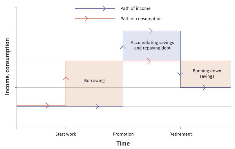
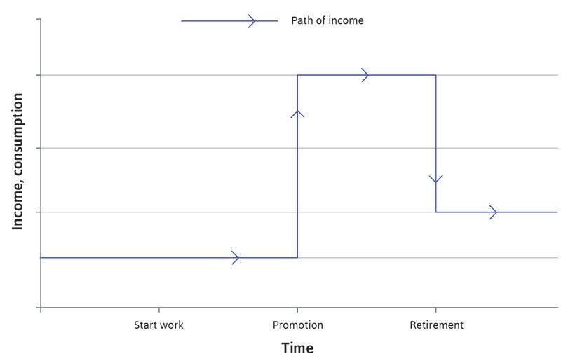
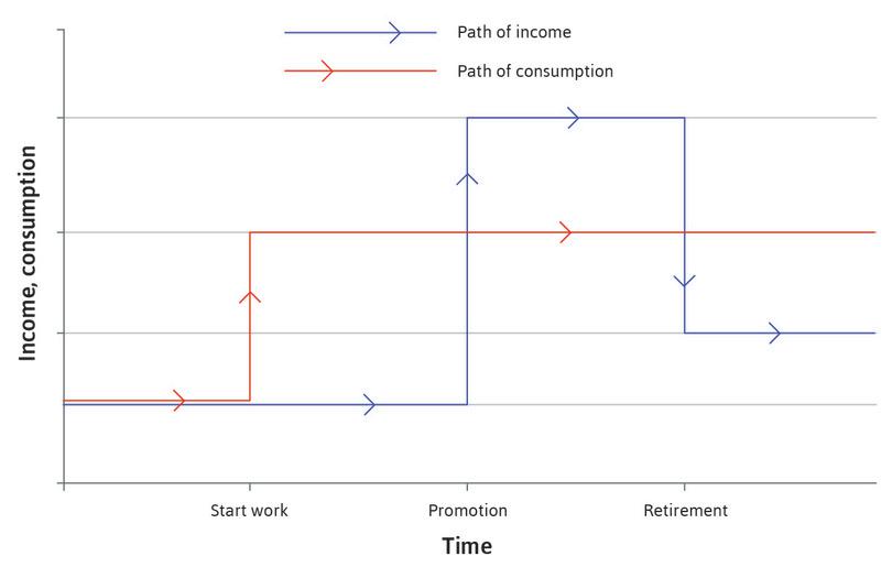
We can use Figure 13.10 to visualize an individual’s tendency to smooth consumption expenditure. In this simple example, before starting work, the individual’s income and consumption expenditure are the same—we assume, for example, that parents support their children until the children start work. Follow the analysis in Figure 13.10 to see their income and consumption over time.
A notable feature of Figure 13.10 is that consumption changes before income does.
Like a family in an agrarian economy that begins saving for a daughter’s dowry before she is old enough to marry, the individual shown in Figure 13.10 anticipates receiving higher income after a promotion, and adjusts consumption upward ahead of time. As we have seen in Unit 10, this assumes that the individual can borrow. Maybe it is possible to convince the bank that the job is secure and prospects are good. If so, the individual can probably get a mortgage now, and live in a more comfortable house with a higher standard of living than would be the case if long-term earnings were to remain at the starting salary. The labels on Figure 13.10 show that the individual borrows while young and income is low, saves and repays the debt when older and earning more, and finally runs down savings after retirement, when income falls again.
The model of decision making highlights the desire of households for a smooth path of consumption. We next ask what happens when something unexpected occurs to disturb the lifetime consumption plan. What if the individual shown in the figure encounters an unexpected income shock? The consumption-smoothing model suggests that:
- The individual will make a judgement: This will be about whether the shock is temporary or permanent.
- If the shock is permanent: We should adjust the red line in Figure 13.10 up or down to reflect the new long-run level of consumption that the individual adopts, consistent with the new pattern of forecast income.
- If the shock is temporary: Little will change. A temporary fluctuation in income has almost no effect on the lifetime consumption plan, because it makes only a small change to lifetime income.
To summarize, when individuals and households behave in the way shown in Figure 13.10, shocks to the economy will be dampened because spending decisions are based on long-term considerations. They aim to avoid fluctuations in consumption even when income fluctuates.
In Portfolios of the Poor: How the World’s Poor Live on $2 a Day, Daryl Collins, Jonathan Morduch, Stuart Rutherford, and Orlanda Ruthven show how poor households manage finances to avoid literally living hand-to-mouth. ‘Smooth Operators’. The Economist. Updated 14 May 2009. Some of the stories can be read online.
What limits a household’s consumption smoothing? Many individuals and households are not able to make or implement long-term consumption plans. Making plans can be difficult because of a lack of information. Even if we have information, we may not be able to use it to predict the future with confidence. For example, it is often very hard to judge whether a change in circumstances is temporary or permanent.
There are three other things that constrain the ways in which households can smooth their consumption when faced with income shocks. The first two concern limits on self-insurance, the third is a limit on co-insurance:
- Credit constraints or credit market exclusion: Introduced in Unit 10, this restricts a family’s ability to borrow in order to sustain consumption when income has fallen.
- Weakness of will: A characteristic of human behaviour that leads people to be unable to carry out the plans—for example, saving in anticipation of a negative income shock—that they know would make them better off.
- Limited co-insurance: So that those with a fall in income cannot expect much support in sustaining their incomes from others more fortunate than them.
Credit constraints
As we saw in Unit 10, the amount a family can borrow is limited, particularly if it is not wealthy. Households with little money cannot borrow at all, or only at extraordinarily high interest rates. Thus the people who most need credit to smooth their consumption are often unable to do so. The credit constraints and credit market exclusion discussed in Units 10 and 12 help explain why borrowing is often not possible.
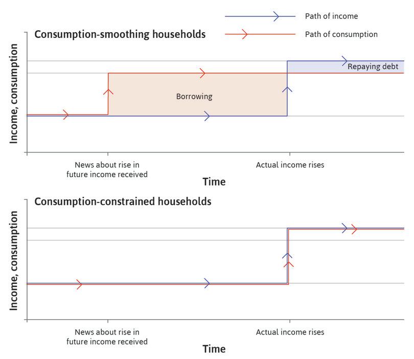
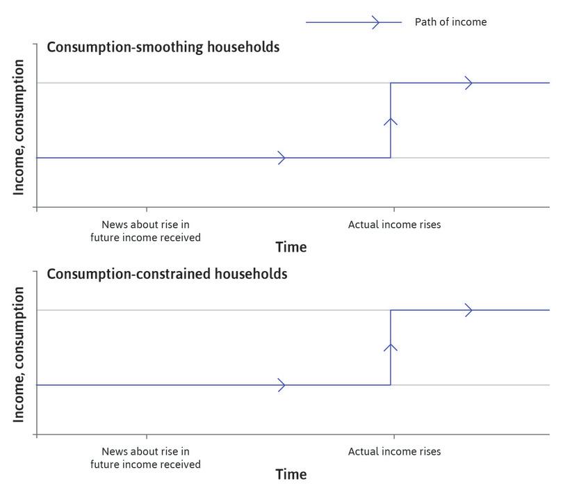
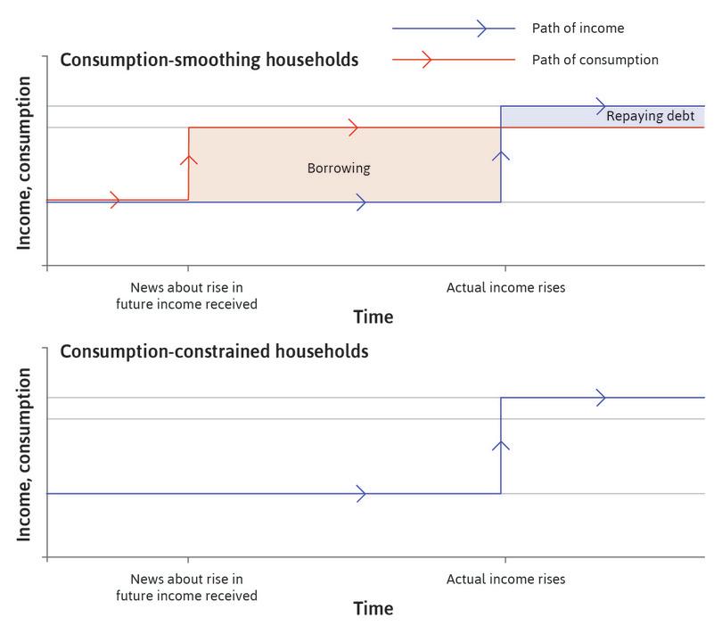
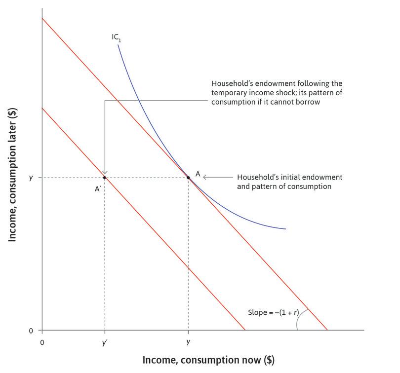
Figure 13.11 shows the reaction of two different types of households to an anticipated rise in income. Households that are able to borrow as much as they like are in the top panel. Credit-constrained households that are unable to get a loan or take out a credit card are in the bottom panel. Follow the analysis in Figure 13.11 to see how the two households react to two key events:
- News is received that income will rise at a predictable time in the future (for example, a promotion or a bequest).
- The household’s income actually rises (the promotion happens, the inheritance comes through).
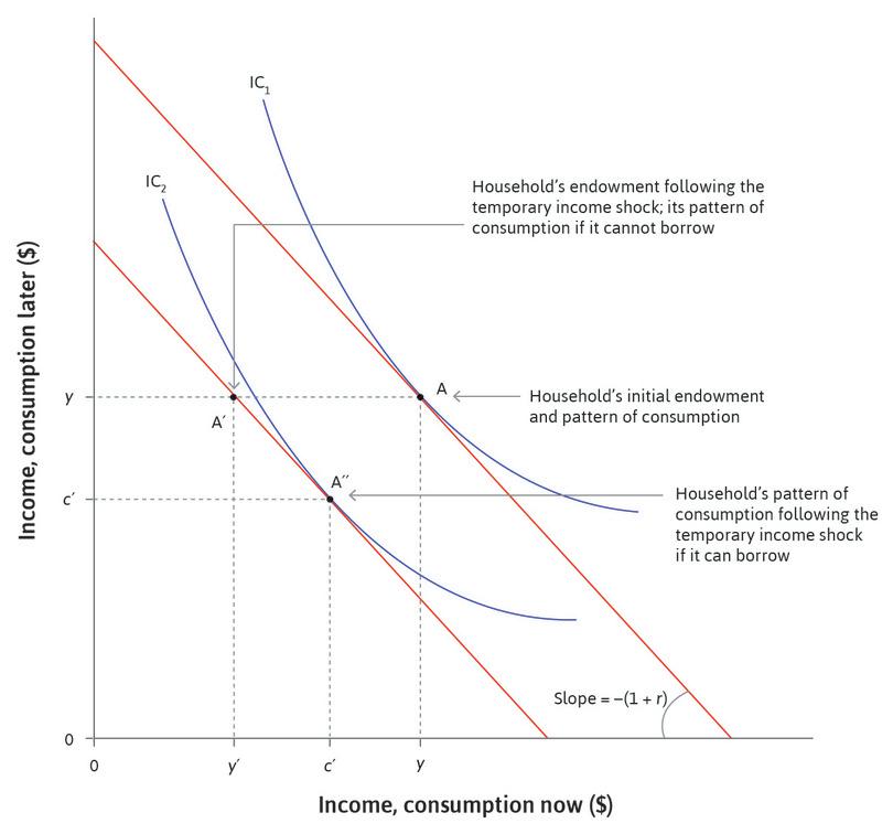
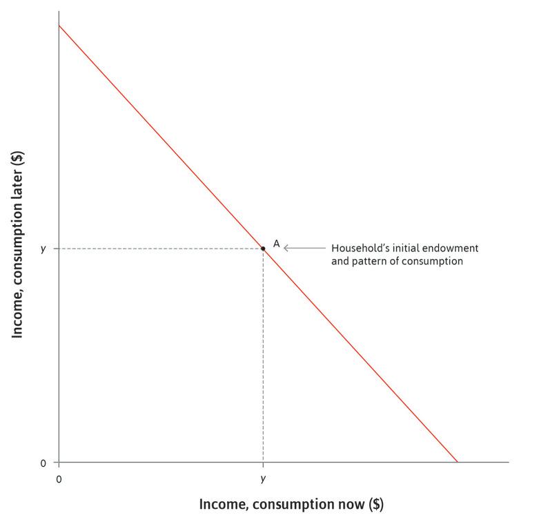
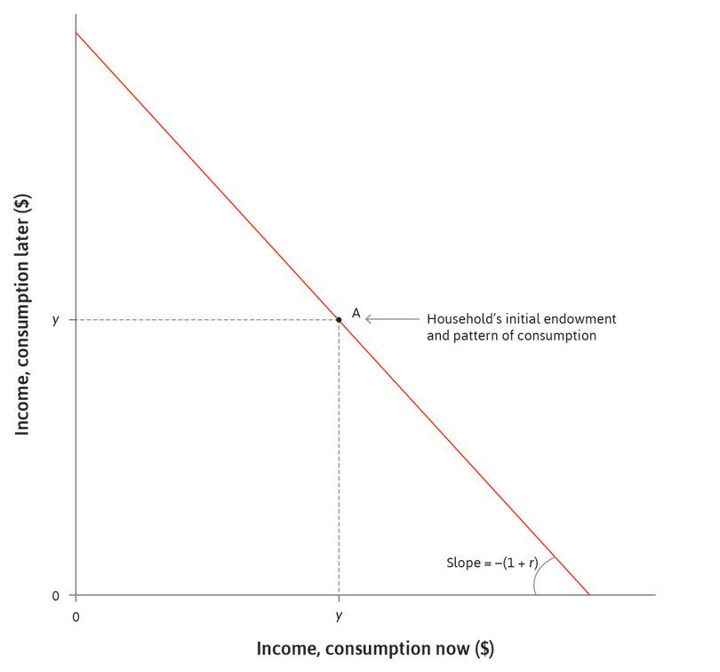
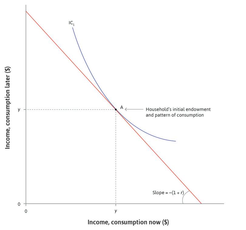
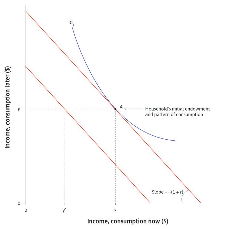
We can think about these decisions using the two-period model of borrowing and lending from Unit 10, shown in Figure 13.12. First consider a household that receives the same income, y, this period and next period, indicated by the endowment point A in Figure 13.12. The interest rate is r so if the household can borrow and save, then it can choose any point on the budget constraint, which has the slope −(1 + r). The budget constraint is another term for the frontier of the feasible set with the slope of −(1 + r) which we used in Unit 10.
We learn from this example that:
- Without borrowing or lending, the endowment point and pattern of consumption coincide.
- Compared with the smoothing household, the credit-constrained household consumes less this period and more next period.
We can also see that the indifference curve that passes through A′ (not shown) is lower than the one that passes through A″. So the household that can smooth consumption by borrowing is better off than the credit-constrained household.
A temporary change in income affects the current consumption of credit-constrained households more than it does that of the unconstrained.
Weakness of will
- weakness of will
- The inability to commit to a course of action (dieting or foregoing some other present pleasure, for example) that one will regret later. It differs from impatience, which may also lead a person to favour pleasures in the present, but not necessarily act in a way that one regrets.
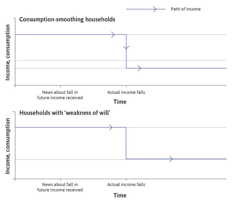
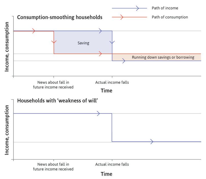
In Figure 13.13, an individual learns that income is going to fall in the future. This could be because of retirement or job loss. It could also be because the individual is becoming pessimistic. Perhaps the newspapers predict an economic crisis. In the top panel of Figure 13.13 we again show a household behaving in a forward-looking manner to smooth consumption. The bottom panel shows a household with weakness of will that consumes all its income today even though it implies a large reduction in consumption in the future.
This feature of human behaviour is familiar to many of us. We often lack willpower.
The problem of not being able to save obviously differs from the problem of not being able to borrow: saving is a form of self-insurance and doesn’t involve anyone else.
How economists learn from facts My diet starts tomorrow
Economists have conducted experiments to test for behaviour that would help to explain why we don’t save even when we can. For example, Daniel Read and Barbara van Leeuwen conducted an experiment with 200 employees at firms in Amsterdam. They asked them to choose today what they thought they would eat next week. The choice was between fruit and chocolate.
When asked, 50% of subjects replied that they would eat fruit next week. But, when next week came, only 17% actually chose to eat fruit. The experiment shows that, although people may plan to do something that they know will be beneficial (eat fruit, save money), when the time comes they often don’t do it.
Read: Daniel, and Barbara van Leeuwen. 1998. ‘Predicting Hunger: The Effects of Appetite and Delay on Choice’. Organizational Behavior and Human Decision Processes 76 (2): pp. 189–205.
Limited co-insurance
Most households lack a network of family and friends who can help out in substantial ways over a long period when a negative income shock occurs. As we have seen, unemployment benefits provide this kind of co-insurance—the citizens who turn out to be lucky in one year insure those who are unlucky. But in many societies the coverage of these policies is very limited.5
A vivid demonstration of the value of smoothing through co-insurance is the experience of Germany during the drastic reduction in income experienced by that economy in 2009 (see Figure 13.5). When the demand for firms’ products fell, workers’ hours of work were cut, but as a result of both government policy and agreements between firms and their employees, very few Germans lost their jobs, and many of those at work were still paid as if they were working many more hours than they did. The result was that although aggregate income fell, consumption did not—and unemployment did not increase.
Empirical evidence shows that, even when income changes in predictable ways, consumption responds. Tullio Jappelli and Luigi Pistaferri. 2010. ‘The Consumption Response to Income Changes’. VoxEU.org.
But most empirical evidence shows that credit constraints, weakness of will, and limited co-insurance mean that, for many households, a change in income results in an equal change in consumption. In the case of a negative income shock such as the loss of a job, this means that the income shock will now be passed on to other families who would have produced and sold the consumption goods that are now not demanded.
We will see in the next unit how the initial shock in income may be multiplied (or amplified) by the fact that families are limited in their ability to smooth their consumption. This in turn helps us understand the business cycle and how policymakers may or may not help to manage it.
Exercise 13.6 Changes in income, changes in consumption
Take the situation in Figure 13.12. Begin at point A′ for the credit-constrained households and at point A for the consumption smoothing (unconstrained) households.
- For each household type, explain the relationship between the change in income and the change in consumption when income returns to normal after the temporary decline.
- Based on this analysis, explain the predicted relationship between temporary changes in income and consumption for an economy with a mixture of the two household types.
Question 13.6 Choose the correct answer(s)
Figure 13.12 shows the consumption choice of a consumer over two periods. His initial endowment is (y, y), that is, an income y in both periods, which is depicted by point A. If possible, the consumer prefers to consume the same amount in both periods. The interest rate is r.
Now assume that there has been a temporary shock such that the income in period 1 is reduced to y′, while the period 2 income is expected to return to y. Assume that a credit-constrained consumer is not able to borrow at all. Based on this information, which of the following statements is correct?
- If the consumer is credit-constrained he will have to consume his endowment (y′, y). Hence he consumes the same amount as he would have done without the temporary shock.
- Even if the consumer can borrow he can only borrow from his period 2 income of y. Therefore he will definitely not be able to consume (y, y).
- The consumer will borrow c′ − y′ to consume c′ in period 1.
- The amount c′ defined by this equation ensures that c′ can be consumed each period and no income is left over.
Question 13.7 Choose the correct answer(s)
The following diagram shows the path of income for a household that receives news about an expected rise and fall in future income at the depicted times.
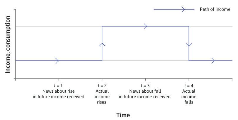
Assume that the household prefers to smooth out its consumption if it can. Based on this information, which of the following statements is correct?
- A credit-constrained household will hope to consume the same level after t = 1. However when it receives the news about the fall in future income at t = 3, it will readjust its consumption to a lower level.
- The fact that the household is credit-constrained implies that it cannot borrow. The fact that it has weakness of will implies that it will not save. So income will be equal to consumption at all times.
- A household with ‘weakness of will’ will not save at t = 3.
- A credit-constrained household will not be able to borrow at t = 1.
13.7 Why is investment volatile?
Households tend to smooth their consumption spending when they can, but there is no similar motivation for a firm to smooth investment spending. Firms increase their stock of machinery and equipment and build new premises whenever they see an opportunity to make profits. But, unlike eating and most other consumption expenditures, investment expenditures can be postponed. There are several reasons why this is likely to produce clusters of investment projects at some times, while few projects at other times.
In Unit 2, we saw how firms responded to profit opportunities in the Industrial Revolution by innovating. This helps explain why investment occurs in waves. When an innovation like the spinning jenny is introduced, firms using the new technology can produce output at lower cost or produce higher-quality output. They expand their share of the market. Firms that fail to follow may be forced out of business because they are unable to make a profit using the old technology. But new technology means that firms must install new machines. As firms do this, there is an investment boom. This will be amplified if the firms producing the machinery and equipment need to expand their own production facilities to meet the extra demand expected.
In this case, investment by one firm pushes other firms to invest: if they don’t, they may lose market share or even be unable to cover their costs and eventually have to leave the industry. But investment by one firm can also pull other firms to invest by helping to increase their market and potential profits.
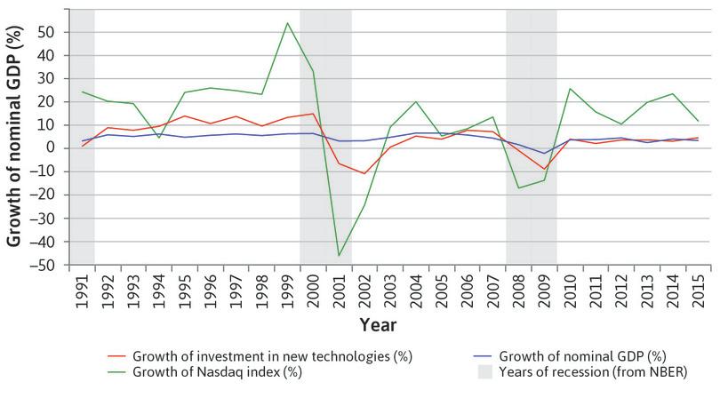
An example of push investment is the hi-tech investment boom in the US. From the mid-1990s, new information and communications technology (ICT) was introduced into the US economy on a large scale. Figure 13.14 shows the sustained growth of investment in new technologies through the second half of the 1990s.
Investment in new technologies and the dotcom bubble (1991–2015).
Figure 13.14 Investment in new technologies and the dotcom bubble (1991–2015).
US Bureau of Economic Analysis. 2015. Fixed Assets Accounts Tables. Note: the series are in current US dollars. Nasdaq value is the yearly average of the close price value of the Nasdaq. Investment in new technologies is the investment in information processing equipment, computers and peripheral equipment, communication equipment, communication structure, and IPPR investments for software, semiconductors, and other electronic components and computers.
As we saw in Unit 11, investment in new technology can lead to a stock market bubble and over-investment in machinery and equipment. The chart shows in red the behaviour of the US stock market index on which hi-tech companies are listed. This is the Nasdaq index, introduced in Unit 11.
Robert Shiller has explained in a VoxEU podcast how animal spirits contribute to the volatility of investment.
The index rose strongly from the mid-1990s to an all-time peak in 1999 as stock market investors’ confidence in the profitability of new tech firms grew. Investment in IT equipment (the red line) grew rapidly as a result of this confidence, but dropped sharply following the collapse in confidence that caused the fall of the stock market index. This suggests that over-investment in machinery and equipment had occurred: investment did not begin growing again until 2003. Robert Shiller, the economist, argued that the Nasdaq index was driven high by what he called ‘irrational exuberance’, as you might recall from Unit 11. Beliefs in the future of hi-tech led not only to share prices rising to levels that were unsustainable, but also to excessive investment in machinery and equipment in the hi-tech sector.
Credit constraints are another reason for the clustering of investment projects and the volatility of aggregate investment. In a buoyant economy, profits are high and firms can use these profits to finance investment projects. Access to external finance from sources outside the firm is also easier: in the US hi-tech boom, for example, the expansion of the Nasdaq exchange reflected the appetite of investors to provide finance by buying shares (stocks) in firms in the emerging ICT industries.
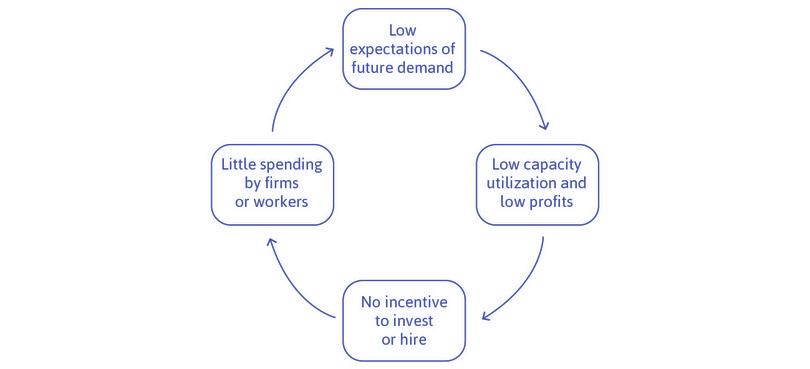
To understand how one firm’s investment can induce another firm to invest, think of a local economy comprising of just two firms. Firm A’s machinery and equipment are not fully used, so the firm can produce more if it hires more employees. But there is not enough demand to sell the products it would produce. This situation is called low capacity utilization. The owners of Firm A have no incentive to hire more workers or to install additional machinery (that is, to invest).
- capacity utilization rate
- A measure of the extent to which a firm, industry, or entire economy is producing as much as the stock of its capital goods and current knowledge would allow.
Firm B has the same problem. Because of low capacity utilization, profits are low for both. Thus when we think about both firms together we have a vicious circle:
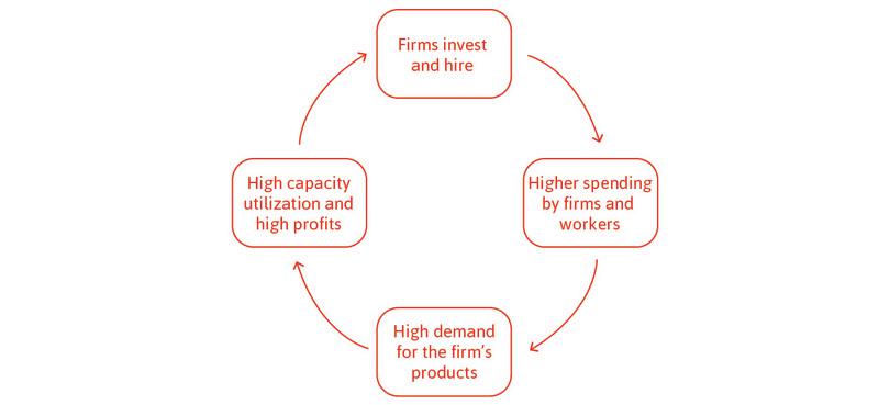
If the owners of both A and B decide to invest and hire at the same time, they would employ more workers, who would spend more, increasing the demand for the products of both firms. The profits of both would rise, and we have a virtuous circle:
These two circles highlight the role of expectations of future demand, which depend on the behaviour of other actors. A game similar to those studied in Unit 4 can illustrate how to get out of the vicious circle and into the virtuous one. As in every game, we specify:
- The actors: The two firms.
- The actions that they can take: Invest, or do not invest.
- The information they have: They decide simultaneously, so they do not know what the other has done.
- The payoff: The profits resulting from each of the four pairs of actions that they could possibly take.
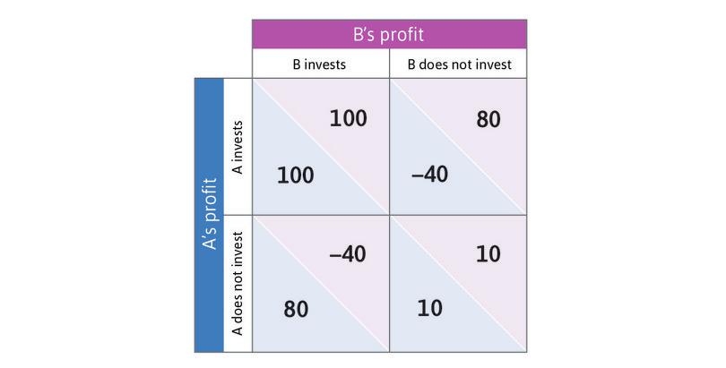
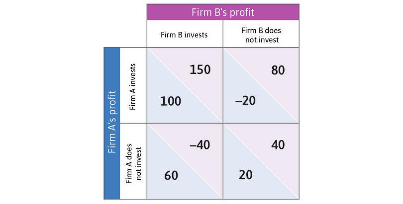
The four possible outcomes of the interaction and the payoffs are given in Figure 13.17.
From this figure you can see what happens when the virtuous (both invest) and vicious (neither invest) circles occur. Note what happens if one of the firms invests but the other does not. If Firm A invests and B does not (the upper-right cell in the figure) then A pays to install new equipment and premises, but because the other firm did not invest there is no demand for the products that the new capacity could produce; so A makes a loss. But had B known that A would invest, then B would have made higher profits by investing as well (getting 100 rather than only 80). On the other hand, had B known that A was not going to invest, then it would have done better to also not invest.
In this game, the two firms will do better if they do the same thing, and the best outcome is when both firms invest. This is another reason that investment tends to fluctuate a lot. If owners of firms think that other firms will not invest, then they will not invest, confirming the pessimism of the other owners. This is why the vicious circle is self-reinforcing. The virtuous circle is self-reinforcing for the same reason. Optimism about what other firms will do leads to investment, which sustains the optimism.
- Nash equilibrium
- A set of strategies, one for each player in the game, such that each player’s strategy is a best response to the strategies chosen by everyone else.
There are two Nash equilibria in this game (upper-left and lower-right). To find the Nash equilibria use the ‘dot’ and ‘circle’ method of Unit 4, beginning with A’s best responses to B’s choices. If B invests, A’s best response is also to invest so a dot goes into the upper-left cell. If B does not invest, A chooses also not to invest so we place a dot in the bottom right-hand cell. Notice that A does not have a dominant strategy. Now, we consider B’s best responses. If A invests, B’s best response is to invest and if A does not invest, B chooses not to invest. The circles showing B’s best responses coincide with the dots: B also does not have a dominant strategy. Where the dots and circles coincide, there are Nash equilibria.
The Nash equilibrium (lower-right) in which both firms have low capacity utilization and low hiring and investment is not Pareto efficient, because there is a change in which both make higher profits, namely if both firms decide to invest. This situation is like the driving on the right or left side of the road game, discussed in Unit 4, or the interaction described in Figure 4.15 concerning specialization in different crops, or global climate change described in Figure 4.17b. These are all called coordination games.
Coordination game
A game in which there are two Nash equilibria and in which one may be Pareto superior to the other is called a coordination game.
- Driving on the right or the left is a coordination game in which neither equilibrium is preferable to either player.
- In the crop specialization coordination game in Unit 4 (Figure 4.15), specialization in the ‘right’ crops (a different crop for the two farmers, which their land is more suited for) is better for both than the ‘wrong specialization’.
- In the investment coordination game (Figure 13.17), an outcome in which both invest is better for both than neither investing.
The name is very apt here because to make the move from the vicious to the virtuous circle, the firms have to coordinate in some way (both agree to invest) or develop optimistic beliefs about what the other will do. This kind of optimism is often called business confidence, and it has a major role in the fluctuations in the economy as a whole. As we will see in the next unit, under some circumstances, government policy can also help shift an economy from the Pareto-inefficient outcome to the Pareto-efficient outcome.
We can generalize the argument about the role of coordination in investment to say that investment spending by firms will respond positively to the growth of demand in the economy. Once an increase in aggregate spending on home’s production of goods and services (that is, on C + I + G + X – M) occurs, this helps to coordinate the forward-looking plans of firms about their future capacity needs, and stimulates investment spending.
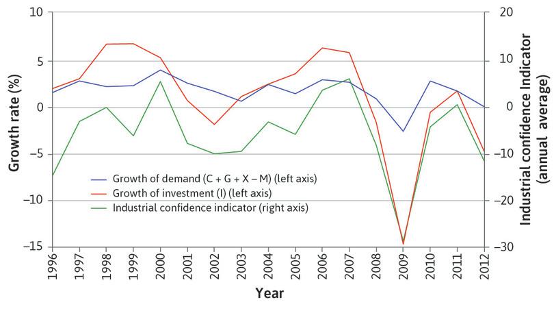
Figure 13.18 illustrates the relationship between the growth of aggregate demand (excluding investment), business confidence, and investment for the Eurozone. The business confidence indicator moves closely with aggregate demand (excluding investment) and investment.
Investment and business confidence in the Eurozone (1996–2012).
Figure 13.18 Investment and business confidence in the Eurozone (1996–2012).
Eurostat. 2015. Confidence Indicators by Sector. Federal Reserve Bank of St. Louis. 2015. FRED.
Therefore we would expect the data from the national accounts to confirm that consumption spending is smoother and investment spending more volatile than GDP in the economy as a whole.
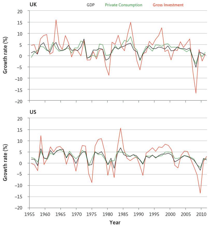
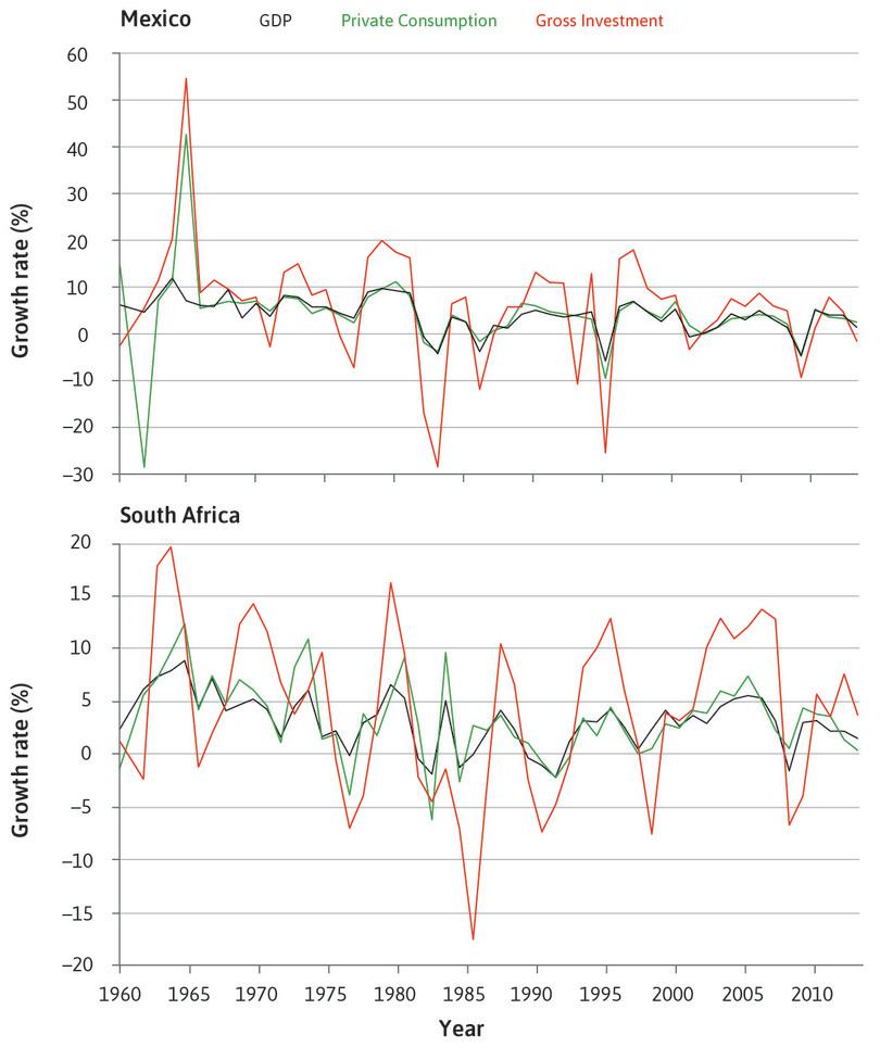
As expected, Figures 13.19a and 13.19b show that investment is much more volatile than consumption in two rich countries (the UK and the US) and two middle-income countries (Mexico and South Africa). The upward and downward spikes in the red series for investment are larger than those for the green series for consumption.
A close look at the charts for the rich countries also shows that, as predicted, consumption is less volatile than GDP. The purple peaks and troughs for GDP are larger than the green ones for consumption. This is less evident in the middle-income countries, perhaps because households are more credit-constrained and therefore are less able to borrow in order to smooth their consumption.
Growth rates of consumption, investment, and GDP in the UK and US, per cent per annum (1956–2012).
Figure 13.19a Growth rates of consumption, investment, and GDP in the UK and US, per cent per annum (1956–2012).
Federal Reserve Bank of St. Louis. 2015. FRED.
Growth rates of consumption, investment, and GDP in Mexico and South Africa (1961–2012).
Figure 13.19b Growth rates of consumption, investment, and GDP in Mexico and South Africa (1961–2012).
OECD. 2015. OECD Statistics; The World Bank. 2015. World Development Indicators.
How volatile is government spending? Unlike investment, government spending (the G in the national accounts) does not respond to innovation or fluctuate with business confidence. We would predict it to be less volatile than investment. And net exports? The demand for exports will fluctuate with the business cycle in other countries, and will be affected more by the booms and recessions of the countries that are large export markets. Find out about the volatility of government spending and net exports by consulting FRED.
Exercise 13.7 Consulting FRED
For your own country, use data from FRED to construct charts for the growth rate of real GDP, consumption, investment, net exports, and government expenditure.
- How has government expenditure evolved in your own country throughout the period for which data is available?
- Comment on the relationship between the growth rate of output and government spending during this period.
- Describe the volatility of government spending and net exports relative to that of GDP and suggest an explanation for the patterns you observe.
Question 13.8 Choose the correct answer(s)
Consider a local economy comprising of just two firms, Firm A and Firm B. Currently both firms have low capacity utilization. The following table shows the profits (or losses if negative) when the firms invest or do not invest:
Based on this information, which of the following statements is correct?
- When the other firm invests, the best response strategy is for the firm to invest. Similarly, when the other firm does not invest, the best response strategy is for the firm not to invest. Therefore there is no dominant strategy.
- Both firms not investing is also a Nash equilibrium.
- Firm A investing and Firm B not investing is Pareto-inefficient, but it is not a Nash equilibrium.
- The Pareto-efficient Nash equilibrium is when both firms invest, and to achieve this outcome, both have to believe that the other firm will invest. If either thought the other would not invest, then they would also not invest.
13.8 Measuring the economy: Inflation
In Figures 13.20a and 13.20b we repeat the graphs from Figure 13.3, showing the growth rate of GDP and the unemployment rate in the UK from 1875 to 2014.
- inflation
- An increase in the general price level in the economy. Usually measured over a year. See also: deflation, disinflation.
- deflation
- A decrease in the general price level. See also: inflation.
In Figure 13.20c, we show the rate of inflation over this period. Inflation is an increase in the general price level in the economy, usually measured over a year. For the British economy, inflation ranges from a low level, with prices actually falling (called deflation) for much of the inter-war period before and after the Great Depression, to a peak of nearly 25% per annum in 1975.
Previously we saw that the downward spikes of economic crises were associated with upward spikes of unemployment; we now see that inflation was especially low in the 1930s and especially high in the 1970s. The peak in inflation followed the first of two oil price shocks (1973 and 1979) that were major disturbances to the global economy.
Ryland Thomas and Nicholas Dimsdale. (2017). ‘A Millennium of UK Data’. Bank of England OBRA dataset.
Ryland Thomas and Nicholas Dimsdale. (2017). ‘A Millennium of UK Data’. Bank of England OBRA dataset.
Ryland Thomas and Nicholas Dimsdale. (2017). ‘A Millennium of UK Data’. Bank of England OBRA dataset.
Figure 13.21 shows average rates of inflation in different regions of the world, and how they have changed over time. Upward spikes in inflation have tended to occur in periods of economic crisis, but the general trend worldwide since the 1970s has been a decline in inflation rates. The figure also shows that inflation tends to be higher in poor than in rich countries. For instance, since 2000, inflation has averaged 6.0% in sub-Saharan Africa and 6.6% in south Asia, in contrast to only 2.2% in the high-income OECD countries.
Inflation levels and volatility in high- and low-income economies.
Figure 13.21 Inflation levels and volatility in high- and low-income economies.
The World Bank. 2015. World Development Indicators.
What is inflation?
Take your favourite chocolate bar. If its price goes up during the year from 50p to 55p, how do you know that is a symptom of inflation in the economy? It could just be that the chocolate bar has become more expensive relative to everything else, as a result of a rightward shift in the demand curve or a leftward shift in the supply curve of the kind we studied in Unit 8. To see what has happened to prices across the economy, take a giant shopping basket and fill it with every product and service that you buy in January. Has the price of this same giant basket increased when you check the prices in January the following year? And what about the baskets of other people?
To answer this question, and to understand how inflation is measured, it’s best to listen to the people who work it out. In the UK, the Office for National Statistics (ONS) does this. Until 2016 Richard Campbell was the head of the team in charge of measuring inflation, and while he was at the ONS he made an animation to explain how the task is done.
- consumer price index (CPI)
- A measure of the general level of prices that consumers have to pay for goods and services, including consumption taxes.
The Consumer Price Index (CPI) measures the general level of prices that consumers have to pay for goods and services, including consumption taxes. The basket of goods and services is chosen to reflect the spending of a typical household in the economy. For this reason, the change in the CPI, or CPI inflation, is often considered to measure changes in the ‘cost of living’.
The CPI is based on what consumers actually buy. It includes the prices of food and drink, housing, clothing, transportation, recreation, education, communications, medical care, and other goods and services. The goods and services in the basket are weighted according to the fraction of household spending they account for. The CPI excludes exports, which are consumed by foreign residents, but includes imports, which are consumed by households in the home economy. The change in the CPI over the past year is commonly used as a measure of inflation.
- GDP deflator
- A measure of the level of prices for domestically produced output. This is the ratio of nominal (or current price) GDP to real (or constant price) GDP.
The GDP deflator is a price index like the CPI, but it tracks the change in prices of all domestically produced final goods and services. Instead of a basket of goods and services, the GDP deflator tracks the price changes of the components of domestic GDP, that is, of C + I + G + X – M (the GDP deflator includes exports, which are produced by the home economy, but excludes imports, which are produced abroad).
The GDP deflator can also be expressed as the ratio of nominal (or current price) GDP to real (or constant price) GDP. The GDP deflator series is most commonly used to transform a nominal GDP series into a real GDP series. As we saw in Section 1.2 and Unit 1’s Einstein section, the real GDP series shows how the size of the home economy changes over time, taking into account changes in the price of domestically produced goods and services.
Exercise 13.8 Measuring inflation
After watching Richard Campbell’s animation, answer these questions:
- How do we construct a giant representative shopping basket for the whole population?
- If inflation this year is 2.5%, then what is the current price of the representative shopping basket that cost £100 last year?
The official national inflation rate does not necessarily reflect your own personal inflation rate. If you want to calculate your own personal inflation rate and how it deviates from the national one, some national statistics agencies offer a personal inflation calculator, such as Statistics Netherlands or Statistics South Africa. Your own office of national statistics may also have a personal inflation calculator.
- Using a personal inflation calculator, calculate your personal inflation rate and comment on how and why it differs from the official inflation rate for your country.
Exercise 13.9 The CPI and the GDP deflator
- Use the data from FRED to construct charts for real GDP growth, the unemployment rate, and the inflation rate for the US. Select the period from 1960 until the most recent year available. In addition, download the data for the US GDP deflator (search for GDPDEF).
Use the data you downloaded to answer the following questions (remember that the CPI is calculated from the price of goods consumed in the home country, while the GDP deflator is calculated from the price of the goods produced in the home country):
- The main difference in the evolution of the series for the CPI and the GDP deflator takes place in 1974–75 and 1979–2000. What could explain this pattern? (Hint: think about the likely impact of an oil crisis on the price of imported goods and, in particular, on your own transport and fuel bills.)
- What do you notice about the evolution of unemployment and inflation in the early 1980s?
- Now construct the same charts for your own country. Write a brief report on the evolution of inflation, unemployment, and the real GDP growth rate over the same period.
13.9 Conclusion
In this unit, we have introduced two essential tools for understanding the economy: the national accounts used to measure aggregate economic activity, and a set of models that allow us to organize the data in ways that illuminate economic fluctuations. Economists are often asked to provide forecasts about the future development of the economy, and they use both data and models to do this. We have learnt in this unit that households and firms make forecasts when deciding on their spending.
In the following two units, we focus on government policy. We shall see that in order to make good forecasts and good policies, the government and central bank need to take into account how households and firms think about the future and what may disrupt their plans.
Concepts introduced in Unit 13
Before you move on, review these definitions:
13.10 References
- Carlin, Wendy and David Soskice. 2015. Macroeconomics: Institutions, Instability, and the Financial System. Oxford: Oxford University Press. Chapters 1 and 10.
- Clark, Andrew E., and Andrew J. Oswald. 2002. ‘A Simple Statistical Method for Measuring How Life Events Affect Happiness’. International Journal of Epidemiology 31 (6): pp. 1139–1144.
- Collins, Daryl, Jonathan Morduch, Stuart Rutherford, and Orlanda Ruthven. 2009. Portfolios of the Poor. Princeton: Princeton University Press.
- Durante, Ruben. 2010. ‘Risk, Cooperation and the Economic Origins of Social Trust: An Empirical Investigation’. Sciences Po Working Paper.
- Fletcher, James. 2014. ‘Spurious Correlations: Margarine Linked to Divorce?’. BBC News.
- Jappelli, Tullio, and Luigi Pistaferri. 2010. ‘The Consumption Response to Income Changes’. VoxEU.org.
- Naef, Michael, and Jürgen Schupp. 2009. ‘Measuring Trust: Experiments and Surveys in Contrast and Combination’. IZA discussion Paper No. 4087.
- OECD. 2010. Employment Outlook 2010: Moving Beyond the Jobs Crisis.
- Shiller, Robert. 2009. ‘Animal Spirits’. VoxEU.org podcast. Updated 14 August 2009.
- The Economist. 2009. ‘Smooth Operators’. Updated 14 May 2009.
- The Economist. 2012. ‘New Cradles to Graves’. Updated 8 September 2012.
-
Andrew E. Clark and Andrew J. Oswald. 2002. ‘A Simple Statistical Method for Measuring How Life Events Affect Happiness’. International Journal of Epidemiology 31 (6): pp. 1139–1144. ↩
-
‘New Cradles to Graves’. The Economist. Updated 8 September 2012. ↩
-
Michael Naef and Jürgen Schupp report comparisons between surveys and experiments using trust. Michael Naef and Jürgen Schupp. 2009. ‘Measuring Trust: Experiments and Surveys in Contrast and Combination’. IZA Discussion Paper No. 4087. ↩
-
Ruben Durante. 2010. ‘Risk, Cooperation and the Economic Origins of Social Trust: An Empirical Investigation’. Sciences Po Working Paper. ↩
-
OECD. 2010. Employment Outlook 2010: Moving Beyond the Jobs Crisis. ↩

