Unit 20 Economics of the environment
How economic activity affects the fragile biosphere of our planet, and how the resulting environmental problems can be addressed
- Production and distribution of goods and services unavoidably alter the biosphere.
- Climate change resulting from economic activity is a major threat to future human wellbeing, and it illustrates many of the challenges of designing and implementing appropriate environmental policies.
- Well-designed environmental policies implement the least-cost ways of reducing environmental damages and balance the cost of reducing environmental damage against the benefits.
- Some policies use taxes or subsidies to alter prices so that people internalize the external environmental effects of their production and consumption decisions; other policies directly prohibit or limit the use of environmentally damaging materials and practices.
- Some environmental systems exhibit processes of degradation, in which substantial and hard to reverse environmental damage occurs abruptly. Prudent policies avoid triggering such processes.
- Evaluating environmental policies raises challenging questions about how to value our natural surroundings and the wellbeing of future generations.
In 1980, one of the most famous bets in science history took place. Paul Ehrlich, a biologist, predicted that rapidly increasing population would make mineral resources scarcer. Julian Simon, an economist, thought that humanity would never run out of minerals because higher prices would stimulate the search for new reserves, and ways of economizing on the use of resources. Ehrlich bet Simon that the price of a basket of five commodities—copper, chromium, nickel, tin, and tungsten—would increase in real terms over the decade, reflecting increased scarcity.
- inflation-adjusted price
- Price that takes into account the change in the overall price level.
On 29 September 1980, they bought $200 of each of the five commodities (a total wager of $1,000). If prices of these resources went up faster than inflation over the next 10 years, Simon would pay Ehrlich the difference between the inflation-adjusted prices and $1,000. If real prices fell, Ehrlich would pay Simon the difference. During that time, the global population increased by 846 million (19%). Also during that time, income per person increased by $753 (15%, adjusted for inflation in 2005 dollars). Yet, in those 10 years, the inflation-adjusted prices of the commodities fell from $1,000 to $423.93. Ehrlich lost the bet and sent Simon a cheque for $576.07.
The Ehrlich-Simon bet was motivated by the question of whether the world was ‘running out’ of natural resources, but an interval of 10 years is unlikely to tell us much about the long-run scarcity of raw materials. The basic framework of supply and demand (see Units 8 and 11) tells us why. Commodities such as copper or chromium generally have inelastic (steep) short-run demand and supply curves because there are few substitutes for these resources. This means that relatively small demand or supply shocks generate large and sudden changes in the market-clearing price, similar to the market for crude oil that you encountered in Unit 11.
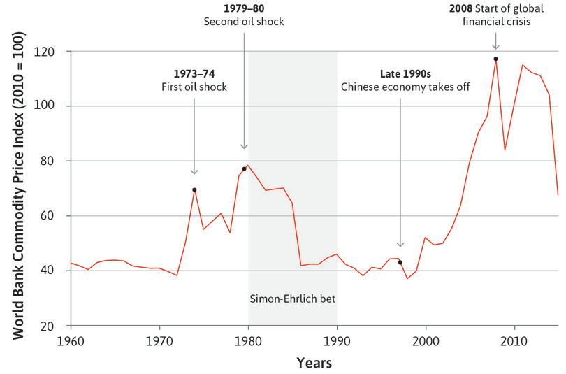
Global commodity prices (1960–2015).
Figure 20.1 Global commodity prices (1960–2015).
The World Bank. 2015. ‘Commodity Price Data.’
But what should happen to the price and availability of copper or chromium in the long run?
As the price of copper rises, producers have an incentive to invest in new technologies that will make its extraction cheaper. Consumers will substitute away from copper to other raw materials. Both of these forces push prices down.
As prices of copper begin to fall, firms cut down on new extraction investments and consumers demand more copper. This pushes the prices back up. The presence of market prices for raw materials therefore ensures that despite increases in population and affluence, we do not ‘run out of resources’. The ratio of known reserves to production does not fall far.
- resources (natural)
- The estimated total amount of a substance in the earth’s crust. See also: reserves (natural resource).
Over the last 200 years, prices for many mineral resources have not changed much, although extraction has increased dramatically. Although prices fluctuate from year to year, the overall trend is flat. This indicates that the supply of many raw materials in the earth’s crust—natural resources—is quite vast.
The transformation of living standards since the Industrial Revolution has been possible because of the combination of human ingenuity and available resources in the form of air, water, soil, metals, hydrocarbons like coal and oil, fish stocks, and so on. These were all once abundant and free, apart from the costs of extraction. Some, like hydrocarbons and mineral resources, are still abundant. Others, like unpolluted air, biodiversity (including coral reefs and many land and marine species), forests (due to deforestation and desertification), and clean water, are becoming scarce.
But the absence of prices is not the only reason why managing renewable natural resources is so hard. In some cases, the fragility of our environment under pressure from the growth of economic activity can lead not only to progressive degradation, but also to accelerating, self-reinforcing collapse. An example is the Grand Banks cod fishery, in the north of the Atlantic Ocean. In the eighteenth and nineteenth centuries, legendary schooners such as the Bluenose (Figure 20.2) raced back to port to sell their catch to be the first on the market, and to offer fresh fish. By the late twentieth century, the Grand Banks had sustained the livelihoods of the US and Canadian fishing communities for 300 years.

The Grand Banks fishing schooner, The Bluenose.
Figure 20.2 The Grand Banks fishing schooner, The Bluenose.
Then suddenly, the fishing industry in the Grand Banks died and, along with it, many of the old fishing towns. Figure 20.3 gives the quantity of cod caught over 163 years, showing a gradual upward trend and a pronounced spike coinciding with the introduction of industrial fishing less than 50 years before the eventual disappearance of cod from the Grand Banks. You learned some reasons why an open-access resource is likely to be overexploited in Units 4 Unit 12, and it appears that in this case the cod was greatly overfished. North Atlantic fisheries are now recovering after governments imposed restrictions, but we still do not know if the cod will come back in their previous numbers.
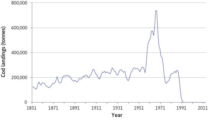
The amount of cod caught in the Grand Banks (North Atlantic) fisheries (1851–2014).
Figure 20.3 The amount of cod caught in the Grand Banks (North Atlantic) fisheries (1851–2014).
Millennium Ecosystem Assessment. 2005. Ecosystems and Human Well-Being: Synthesis. Washington, DC: Island Press.
- positive feedback (process)
- A process whereby some initial change sets in motion a process that magnifies the initial change. See also: negative feedback (process).
Rapid changes like the Grand Banks cod disappearance are referred to as ecosystem collapse, and result from environmental vicious circles. In the Amazon, for example, change may become self-reinforcing due to the positive feedback processes illustrated in Figure 20.4. Past a certain level of deforestation, the process becomes self-sustaining even without further expansion of farming.
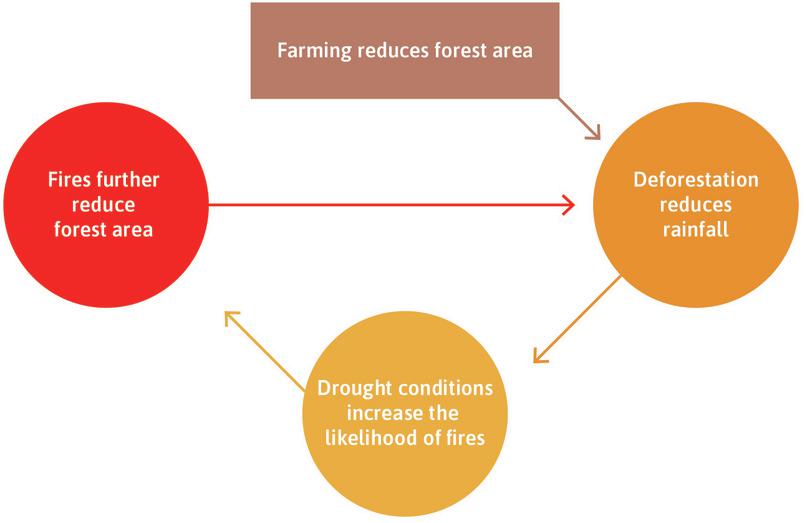
Positive feedback processes and deforestation in the Amazon.
Figure 20.4 Positive feedback processes and deforestation in the Amazon.
Similarly, the process of global warming can be self-reinforcing due, for example, to its impact on Arctic ice cover, as we will see later in Section 20.8.
The depletion of commodities and global warming are two aspects of environmental degradation. But we will see that there is also an important difference between the two: commodities are priced and traded, and so over-use of some resources may self-correct as prices of scarce commodites rise. Negative external environmental effects are usually only corrected through coordinated policy or political action, which is harder to achieve. This action has often been too little or too late, as we will see.
In the rest of this unit, we will show that environmental problems are as diverse as nature itself, and that understanding the economics of the environment will require you to employ not only the tools you have learned already, but also to study the interaction of physical and biological processes with human economic activity.
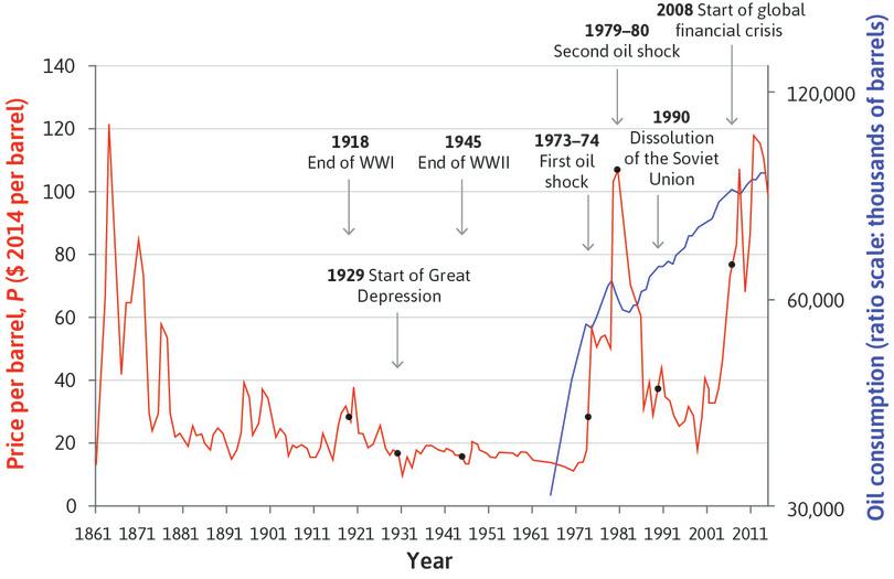
Look back at Figure 11.7 showing world oil prices and global oil consumption to answer Question 20.1.
Question 20.1 Choose the correct answer(s)
Figure 11.7 shows the world oil price (in 2014 prices) and global oil consumption.
You also have the additional information that the world reserves of oil more than doubled to 1.7 trillion barrels between 1981 and 2014. More than 1 trillion barrels were extracted and consumed in the same period. Based on this information, which of the following statements is correct?
- False. The 1970s oil shock was caused by a reduction of supply, not an increase in demand.
- False. The global financial crisis caused a fall in demand, rather than supply.
- False. Reserves increased by more than the amount extracted, suggesting that the increases in supply were greater than the increases in demand.
- True. Reserves increased by more than extraction. This is likely to be largely due to technological improvements that allowed more oil to be identified and economically extracted.
20.1 Recap: External effects, incomplete contracts, and missing markets
The study of environmental economics began in Unit 1 of this course, where we saw that economic activity (the production and distribution of goods and services) takes place within the biological and physical system. As we saw in Figure 1.5 and Figure 1.12, the economy is embedded within society, but also within the ecosystem. Resources flow from nature into the human economy. Waste, such as carbon dioxide (CO₂) emissions, or toxic sewage produced by firms and households, flows back into nature—mainly into the atmosphere and the ocean. Scientific evidence suggests that the planet has a limited capacity to absorb the pollutants that the human economy generates. In this unit, we investigate the nature of the global ecosystem, which provides the resources that feed economic processes and the sinks where we dispose of our wastes.
In Unit 4, we introduced environmental problems at a local level, among people who were similar in most respects. Anil and Bala were neighbouring landowners with a pest management problem. They could choose between an environmentally damaging pesticide and benign pest management systems. The outcome was inefficient and environmentally destructive because they could not make a binding agreement (a complete and enforceable contract) in advance about how they would act. In Unit 4, we also discovered that contributing to sustaining the quality of the environment is, to some extent, a public good, and that there are strong self-interested motives to free ride on the activities of others. So, while everyone would benefit if we all contributed to protecting the environment, we often do not do our part.
When small numbers of individuals interact, however, we saw that informal agreements and social norms (a concern for the others’ wellbeing, for example) might be sufficient to address environmental problems. Examples found in real life include irrigation systems and the management of common land.
In Unit 12, we expanded the scope of environmental problems to include two groups of people pursuing different livelihoods. We considered a hypothetical pesticide called Weevokil (based, again, on real-world cases) and its effects on fishing and the jobs of workers who produce bananas. In this case, there was a missing market—the plantation owners did not need to buy the right to pollute the fisheries, because they could do it for free. This is another case of an incomplete contract.
In cases like this, taxes can increase the polluter’s marginal private cost of production so that it equals the marginal social cost, resulting in the socially optimal level of production (and pollution). We canvassed a variety of solutions to the environmental problem (the external effects of the pesticide on the downstream fisheries), including bargaining between the organizations of fishermen and the plantation owners, and legislation (in the real-world case that inspired our Weevokil model, the government eventually banned the chemical).
Figure 20.5 reproduces a segment of Figure 12.8 that summarizes the nature of market failures in interactions between economic actors and the environment, and lists some possible remedies.
| Decision | How it affects others | Cost or benefit | Market failure (misallocation of resources) | Possible remedies | Terms applied to this type of market failure |
|---|---|---|---|---|---|
| A firm uses a pesticide that runs off into waterways | Downstream damage | Private benefit, external cost | Overuse of pesticide and overproduction of the crop for which it is used | Taxes, quotas, bans, bargaining, common ownership of all affected assets | Negative external effect, environmental spillover |
| You take an international flight | Increase in global carbon emissions | Private benefit, external cost | Overuse of air travel | Taxes, quotas | Public bad, negative external effect |
External environmental effects.
Figure 20.5 External environmental effects.
In this unit, we also consider the problem of climate change. Like the market failures above, climate change arises due to missing markets. However, unlike local environmental issues, climate change is global in scope. It involves people with vastly differing interests, ranging from those whose entire nation may be submerged by rising sea levels to those who profit from the production and use of the carbon-based energy that contributes to global climate change. We will see that many of the concepts developed already, such as feasible sets and indifference curves, apply in these cases as well.
The problem of climate change combines missing markets, uncertainty about its effect on the economy, the possibility of positive feedbacks and environmental tipping points, the need for international cooperation, and intergenerational issues. It is the greatest challenge of our time, and we need to use our entire toolkit (and more) to see how we can address it.
Question 20.2 Choose the correct answer(s)
Refer to Figure 20.5.
Based on this information, which of the following statements is correct?
- False. For instance, bargaining may not be effective when the number of people affected by the externality is very large. With climate change, those affected potentially includes everyone alive today as well as unborn future generations.
- True. The market price will not reflect the additional costs imposed on downstream fisheries.
- False. Negative externalities result in overuse, whereas positive externalities result in underuse.
- False. Insofar as additional taxes reflect the social cost of air travel (due to emissions, noise pollution and so on), the reduction in air travel is economically efficient.
20.2 Climate change
Many scientists now see climate change as the greatest threat to future human wellbeing. We focus on climate change because of its importance as an environmental problem, and because it illustrates the difficulties of designing and implementing adequate environmental policies. This problem tests our framework of efficiency and fairness to the limit, because of five features that climate change shares with other environmental problems:
- greenhouse gas
- Gases—mainly water vapour, carbon dioxide, methane and ozone—released in the earth’s atmosphere that lead to increases in atmospheric temperature and changes in climate.
- Stabilizing yearly emissions is not sufficient: Climate is affected by the total amount of greenhouse gases in the atmosphere. This is increasing due to the annual flow of emissions. But merely stabilizing emissions at current levels will not be enough, because the stock of greenhouses gases would then continue to increase.
- Irreversibility of climate change: Increases in the amount of CO₂ in the atmosphere are partially irreversible, which means that our current actions have long-lasting effects on future generations.
- The worst-case scenario: Experts are uncertain about the scale, timing, and global pattern of the effects of climate change, but most agree that climate change could be catastrophic. Therefore, the most likely scenario should not be the only guide to policy. We need to take into account a range of possible scenarios, including some very unlikely but disastrous ones.
- A global problem requiring international cooperation: The contributions to climate change come from all parts of the world, and its effects will be felt by all of nearly 200 autonomous nations. It will be solved only by a high level of cooperation between the largest and most powerful nations, at a minimum, on a scale without historical precedent.
- Conflicts of interest: The impacts of climate change differ among people according to their economic circumstances, both across the globe and within countries. Future generations will experience the effects of today’s emissions, but also the actions we take to reduce them. It is unclear how to balance the competing interests of individuals in different economic circumstances, and the interests of current and future generations.
Climate change and economic activity
Figure 20.6 shows the data on the stock of CO₂ (in parts per million) using the right-hand scale, and global temperature (as the deviation from the average over the period 1961–1990) using the left-hand scale, for the period since 1750.
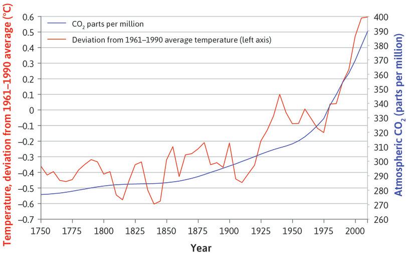
Global atmospheric concentration of carbon dioxide and global temperatures (1750–2010).
Figure 20.6 Global atmospheric concentration of carbon dioxide and global temperatures (1750–2010).
Years 1010–1975: David M. Etheridge, L. Paul Steele, Roger J. Francey, and Ray L. Langenfelds. 2012. ‘Historical Record from the Law Dome DE08, DE08-2, and DSS Ice Cores’. Division of Atmospheric Research, CSIRO, Aspendale, Victoria, Australia. Years 1976–2010: Data from Mauna Loa observatory; Tom A. Boden, Gregg Marland, and Robert J. Andres. 2010. ‘Global, Regional and National Fossil-Fuel CO2 Emissions’. Carbon Dioxide Information Analysis Center (CDIAC) Datasets. Note: This data is the same as in Figures 1.6a and 1.6b. Temperature is average northern hemisphere temperature.
Burning fossil fuels for power generation and industrial use leads to emissions of CO₂ into the atmosphere. These activities, together with CO₂ emissions from land-use changes, generate greenhouse gases equivalent to around 36 billion tonnes of CO₂ each year. Concentrations of CO₂ in the atmosphere have increased from 280 parts per million in 1800 to 400 parts per million, currently rising at 2–3 parts per million each year. CO₂ allows incoming sunlight to pass through it, but traps reflected heat on the earth, leading to increases in atmospheric temperatures and changes in climate. Some CO₂ also gets absorbed into the oceans. This increases the acidity of the oceans, killing marine life.
Figure 20.6 illustrates a key fact of climate science: that global warming is an effect of the amount of CO₂ and other greenhouse gases in the atmosphere. To use the language of Unit 10, where we discussed income (a flow) and wealth (a stock), climate change is caused by the stock of atmospheric greenhouse gases, not by the flow of our annual emissions. It’s what’s in the tub that matters. Figure 20.7 presents this new use of the bathtub model to illustrate the problem.
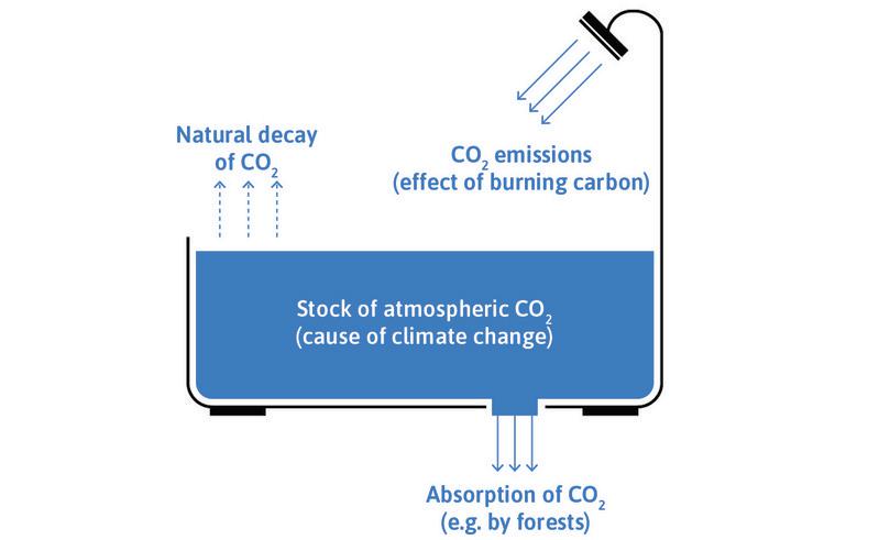
Another bathtub model: The stock of atmospheric CO2.
Figure 20.7 Another bathtub model: The stock of atmospheric CO2.
The increase in CO₂ in the atmosphere is occurring because the processes reducing the stock (natural decay of the CO₂ and absorption of CO₂ by forests) are far less than the new emissions that we add annually. Moreover, deforestation in the Amazon, Indonesia and elsewhere is reducing the CO₂ ‘outflows’ while also adding to CO₂ emissions. These forests are often replaced by agricultural activities that produce further greenhouse gas emissions in the form of methane releases from livestock and nitrous oxide releases from fertilizer overuse.
Martin Weitzman argues there is a non-trivial risk of a catastrophe from climate change in an EconTalk podcast.
The natural decay of CO₂ is extraordinarily slow. Of the carbon dioxide that humans have put in the atmosphere since the mass burning of coal that started in the Industrial Revolution, two-thirds will still be there a hundred years from now. More than a third of it will still be ‘in the tub’ a thousand years from now. The natural processes that stabilized greenhouse gases in the atmosphere in pre-industrial times have been entirely overwhelmed by human economic activity. And the imbalance is accelerating.
It is estimated that we can emit only a further 1 to 1.5 trillion tonnes of CO₂ into the atmosphere to give reasonable odds of limiting the increase in temperature to 2°C above pre-industrial levels. Should we manage to achieve this limit on emissions, there is still a probability of around 1% that temperature increases would be more than 6°C, causing a global economic catastrophe. If we exceed the limit and temperature rises to 3.4°C above pre-industrial levels, the probability of a climate-induced economic catastrophe would rise to 10%.1
Figure 20.8 shows the relationship between estimated temperature increases and CO₂ emitted. It also shows the amount of CO₂ that would be emitted if we:
- reserves (natural resource)
- The amount of a natural resource that is economically feasible to extract given existing technologies. See also: resources (natural).
- burnt the fossil fuels that can be economically extracted at current prices and technology (reserves)
- burnt all fossil fuels in the earth’s crust (resources)
Figure 20.8 indicates that keeping the warming to 2°C implies that the majority of fossil fuel reserves and resources should remain in the ground.
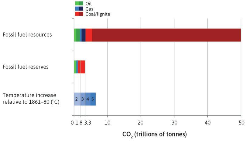
Carbon dioxide contained in fossil fuel reserves and resources, relative to the atmospheric capacity of the earth.
Figure 20.8 Carbon dioxide contained in fossil fuel reserves and resources, relative to the atmospheric capacity of the earth.
Calculations by Alexander Otto of the Environmental Change Institute, University of Oxford, based on: Aurora Energy Research. 2014. ‘Carbon Content of Global Reserves and Resources’; Bundesanstalt für Geowissenschaften und Rohstoffe (The Federal Institute for Geosciences and Natural Resources). 2012. Energy Study 2012; IPCC. 2013 Climate Change 2013: The Physical Science Basis. Contribution of Working Group I to the Fifth Assessment Report of the Intergovernmental Panel on Climate Change. Cambridge: Cambridge University Press; Cameron Hepburn, Eric Beinhocker, J. Doyne Farmer, and Alexander Teytelboym. 2014. ‘Resilient and Inclusive Prosperity within Planetary Boundaries’. China & World Economy 22 (5): pp. 76–92.
Exercise 20.1 Assessing the economic impacts of global warming
In 1896, Swedish scientist Svante Arrhenius estimated the impact of doubling CO2 concentrations in the atmosphere, and later suggested that ‘the colder regions of the earth’ might want to burn more coal so as to enjoy a ‘better climate’.
In the next century, entire countries may disappear as the level of the oceans rise in response to the melting of the West Antarctic and Greenland ice sheets.
Find out what you can about which regions, industries, occupations, firms, or cities are likely to be:
- most positively affected by climate change
- most negatively affected by climate change
What are the main reasons why the effects of climate change differ across these groups?
Exercise 20.2 Climate change causes and evidence
Use information from the National Aeronautics and Space Administration web page on climate change, and the latest report of the Intergovernmental Panel on Climate Change to answer the following questions:
- Explain what climate scientists believe to be the main causes of climate change.
- What evidence is there to indicate that climate change is already occurring?
- Name and explain three potential consequences of climate change in the future.
- Discuss why the three consequences you have listed may lead to disagreements and conflicts of interest about climate policy. (Hint: You may find it useful to draw on your answers to Exercise 20.1 about the winners and losers from climate change.)
Question 20.3 Choose the correct answer(s)
Figure 20.8 shows the temperature increase arising from the CO2 emitted, generated at different levels of use of fossil fuel reserves (which can be technically and economically extracted) and resources (estimated total amounts) in the earth’s crust. For example, it states that a further 1 to 1.5 trillion tonnes of CO2 emissions would be likely to lead to a 2°C increase in temperature, compared to the pre-industrial average.
You are also given that 36 billion tonnes of CO2 are generated each year currently. Based on this information, which of the following statements is correct?
- False. Whether we should stop using coal depends on the costs of further temperature increases relative to the benefits of coal use.
- False. Temperatures would increase by 3°C if we used all fossil fuel reserves.
- False. 1 to 1.5 trillion tonnes of CO2 emission would be likely to lead to a 2°C increase in temperature. However, larger increases in temperature are possible due to uncertainty concerning the link between emissions and temperature.
- True. Stabilizing emissions will cause a constant increase in the stock of CO2 in the atmosphere, leading to further temperature increases.
20.3 The abatement of environmental damages: Cost-benefit analysis
- abatement policy
- A policy designed to reduce environmental damages. See also: abatement.
Like other environmental problems, climate change can be addressed by environmental damage abatement policies such as:
- discovering and adopting technologies that are less polluting
- choosing to consume fewer or less environmentally damaging goods
- banning or limiting the use of environmentally harmful substances or activities
However, the economic costs of immediately eliminating all CO₂ emissions would surely exceed the environmental benefits. But what level of environmental abatement should be adopted instead?
This is in part a question about the facts: What is the trade-off between the benefits of producing and consuming more, and the enjoyment of a less-degraded environment? It is also an ethical question: how should we value environmental quality? How should we trade off consumption now, with environmental quality enjoyed both by current and future generations?
If we ask citizens about their views of proposed environmental policies, we expect their responses will differ, partly because a deteriorating environment affects different people in different ways. Your point of view may depend on whether you work outdoors (you will benefit more from a less polluted local environment) or in fossil fuel production (you may lose your job if the higher abatement costs levied on your firm causes it to shut down). It may depend on whether you have no choice but to live near a source of air pollution, or are wealthy enough to have a second home in the countryside.
Your opinion about how much we should spend today to protect future environments would no doubt differ from the values of those who make up the distant future generations that would be affected by our choices, if we could ask them. People’s views are strongly influenced by their self-interest but, as you would expect from the behavioural experiments in Unit 4, not totally so. We worry about the effect on others, even complete strangers.
For simplicity, we begin by setting aside these differences and consider a population composed of identical individuals. We ignore future generations, or optimistically assume that we will all live forever. We will begin by also assuming that everyone enjoys (or suffers from) the same level of environmental quality. Later in this unit we will look at what changes when we do not make these assumptions.
We will also start off with what we call the ‘ideal policymaker’ who seeks to serve the citizens’ interests.
How can economics help the policymaker determine the level of environmental quality that we would like to enjoy, knowing that people may have to consume less so they can enjoy a better environment? The first thing to think about is the actions that we can take and their consequences: the feasible set of outcomes.
To do this, we need to consider the ways that the resources of the society could be diverted from their current uses to reduce the environmentally degrading effects of economic activity. The nation may adopt policies to limit environmental damage. We refer to such policies as abatement policies, since they abate (reduce) pollution and environmental damage. The amount of reduction in emissions caused by these policies is referred to as the quantity of abatement. Abatement policies include taxes on emissions of pollutants, and incentives to use fuel-efficient cars.
In the rest of this section, we use a specific example to illustrate the general approach to environmental cost-benefit analysis. The specific case is the choice of global policies that reduce greenhouse gas emissions. Keep in mind that we are assuming that the policymakers throughout the world are able to implement these policies.
Abatement costs and the feasible set
- global greenhouse gas abatement cost curve
- This shows the total cost of abating greenhouse gas emissions using abatement policies ranked from the most cost-effective to the least. See also: abatement policy.
To get some idea of how economists assess abatement policy options, we look at the estimated cost of reduction of global greenhouse gas emissions in Figure 20.9, which shows the relationship between potential abatement and the cost of abatement per tonne. It is the marginal cost curve for the good, which we refer to as the global greenhouse gas abatement cost curve. These estimates were made by the consultancy firm McKinsey.
The measure of potential abatement, gigatonnes (10⁹ tonnes) of carbon dioxide equivalent (GtCO2e), is a unit used by the UN climate change scientific panel, the IPCC, to measure the effect of a technology or process on global warming. It expresses how much warming a given type of greenhouse gas would cause by using the equivalent amount of CO2 emissions that would have the same effect.
Each bar represents a change that could reduce carbon emissions. The height shows the cost of using the technology to reduce carbon emissions, in terms of euros per tonne of reduced CO₂ emissions. The width shows the reduction of CO₂ emissions, compared to the level without policy intervention. Therefore, for each method, a short bar means that there is a lot of abatement per euro spent. A wider bar means that this method has a higher potential to abate emissions.
Note that in this figure we have only included policies which have a cost. There are many other policies that are win-win, because they both reduce carbon emissions and save money, such as fitting insulation in older houses. The full range of policies can be seen in Figure 20.26; the costly ones are in Figure 20.9. We discuss the implications of win-win policies in Section 20.10. You may wish to read that section now before working through the rest of the unit.
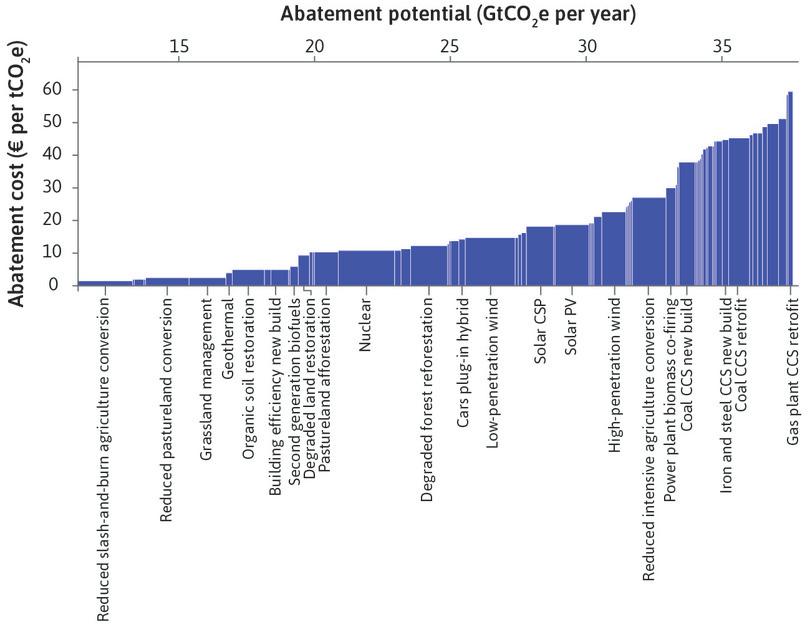
The cost of potential global greenhouse abatement in 2030 (compared with business as usual), using different policies.
Figure 20.9 The cost of potential global greenhouse abatement in 2030 (compared with business as usual), using different policies.
McKinsey & Company. 2013. Pathways to a Low-Carbon Economy: Version 2 of the Global Greenhouse Gas Abatement Cost Curve. McKinsey & Company.
In Figure 20.9, we order the policies from those with the least cost per tonne of CO₂ abated on the left to the highest cost per tonne abated on the right. By this measure, abating carbon emissions through changes in agriculture is the most efficient method, if we disregard the win-win policies. Nuclear, wind, and solar photovoltaics are all moderately efficient. At the time these estimates were produced, retrofitting gas-fired power plants for carbon capture and storage is the highest-cost policy per tonne of CO₂ abated. Together, the bars form a marginal cost curve, showing the cost of an additional tonne of abatement at any given level of abatement, assuming that we adopt the most efficient technologies first.
The science in this field is young, and technologies are continuously developing. As knowledge advances, the estimated abatement cost curve will change—indeed, it is likely to have changed already from the data shown here, which was published in 2013. For instance, rapid reductions in costs of solar power are likely to increase the efficiency of solar abatement, and therefore reduce the height of the bars associated with solar energy (see Figure 20.19a).
But even focusing on only the most efficient bars, implementing any of these abatement policies would divert resources from the production of other goods and services: the opportunity cost of an improved environment would be reduced consumption.
We can use data from the marginal cost curve for abatement (as in Figure 20.9) to estimate how much abatement we get for any level of expenditure, assuming we implement the most efficient methods first. These calculations are given in Figure 20.10. We would start by implementing the cheap and effective measures, such as land management and conversion policies. Having exhausted these policies, the curve becomes flatter at higher levels of expenditure, where we would be devoting more resources to less efficient methods such as carbon capture and storage (CCS) modifications to power stations. For more detail on the calculations of marginal abatement costs, see the Einstein at the end of this section.
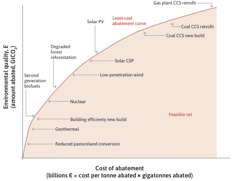
The least-cost abatement curve: How total abatement (at least cost) depends on total abatement expenditures.
Figure 20.10 The least-cost abatement curve: How total abatement (at least cost) depends on total abatement expenditures.
McKinsey & Company. 2013. Pathways to a Low-Carbon Economy: Version 2 of the Global Greenhouse Gas Abatement Cost Curve. McKinsey & Company.
The curve in the figure, called the least-cost abatement curve, gives all the combinations of expenditures and resulting abatement when the lowest-cost changes are introduced first and the higher-cost ones are introduced later.
Using figures like 20.10, we can establish all of the possible combinations of consumption and abatement that are feasible. The available abatement technology is shown by the shaded set of points in Figure 20.11. In this figure, the horizontal axis measures the expenditure on abatement. The vertical axis measures environmental quality by the amount of abatement achieved. The zero point on the vertical axis is a situation in which no abatement occurs.
- dominated
- We describe an outcome in this way if more of something that is positively valued can be attained without less of anything else that is positively valued. In short: an outcome is dominated if there is a win-win alternative.
The shaded area is the feasible set of abatement expenditures and environmental outcomes. Points like A in the interior of the set are inefficient abatement policies. At A, we can see that there are alternative measures that would achieve the same level of abatement (25 gigatonnes) at lower cost (€400 billion rather than €600 billion). Similarly, for an expenditure of €600 billion, the choice of the most cost-effective abatement techniques would deliver 30 tonnes of CO₂ abatement and therefore higher environmental quality than at point A. Economists say that a point like A is dominated by points A′ and A″ and all the points in between. This means that at any of these other points there could be lower abatement costs and the same level of abatement (A′), or greater abatement at the same cost (A″).
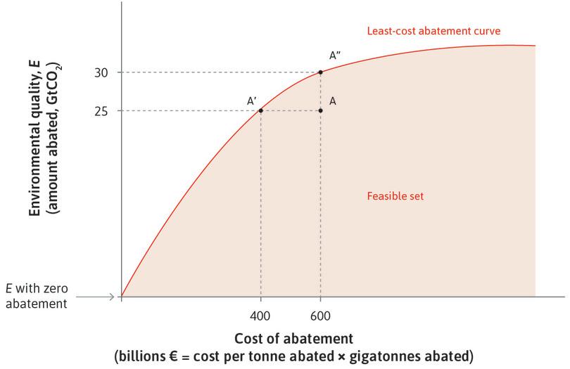
The least-cost abatement curve: The trade-off between total cost of abatement and amount of abatement.
Figure 20.11 The least-cost abatement curve: The trade-off between total cost of abatement and amount of abatement.
How would an inefficient point like A in Figure 20.11 occur? In Figure 20.10, the policies were ordered so that the first expenditures on abatement are devoted to the most effective abatement policy. After exhausting the potential of each policy we moved to the next most effective policy.
To highlight the difference between an efficient and an inefficient abatement policy, Figure 20.12 shows the abatement options based on the data in Figure 20.9, but with more costly policies adopted first. If a society has committed to spend €8.37 billion on abatement, and spends it all on coal carbon capture, nuclear, and other less effective options, then the least-cost abatement curve would be as shown in Figure 20.12.
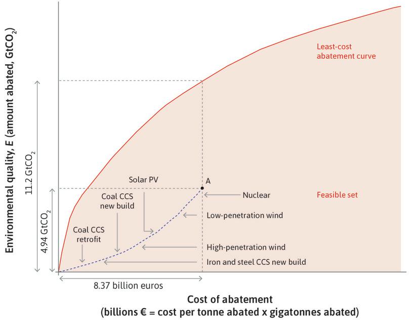
An abatement cost curve in which more costly technologies are adopted first.
Figure 20.12 An abatement cost curve in which more costly technologies are adopted first.
We can see that if €8.37 billion were spent on abatement, the level of abatement would be 4.94 gigatonnes of CO₂, rather than the abatement of 11.2 gigatonnes that would have occurred if the society implemented least-cost policies, as shown in Figure 20.10.
Figures 20.10 and 20.12 send a clear message about priorities. If we have a limited amount to spend on abatement, and abatement technology does not change, focus on reducing pastureland conversion. According to Figure 20.10, we should also adopt nuclear power (assuming that waste storage and other security issues can be addressed), solar, and wind power before building new coal plants with carbon capture and storage (CCS), or retrofitting old coal plants for CCS.
To study environment-consumption trade-offs, we invert the least-cost abatement curve, just as we did with the grain production function in Unit 3. Suppose that, after a given level of government expenditure on other policies and also a given level of investment, the maximum amount that people could consume in the economy if no abatement is implemented is €500 billion of goods and services. Then the feasible choices are the shaded portion of Figure 20.13.
In Figure 20.13, the vertical axis still measures the quality of the environment, but the horizontal axis now measures the goods available for consumption after abatement costs (from left to right). So, abatement expenditures are now measured from right to left.
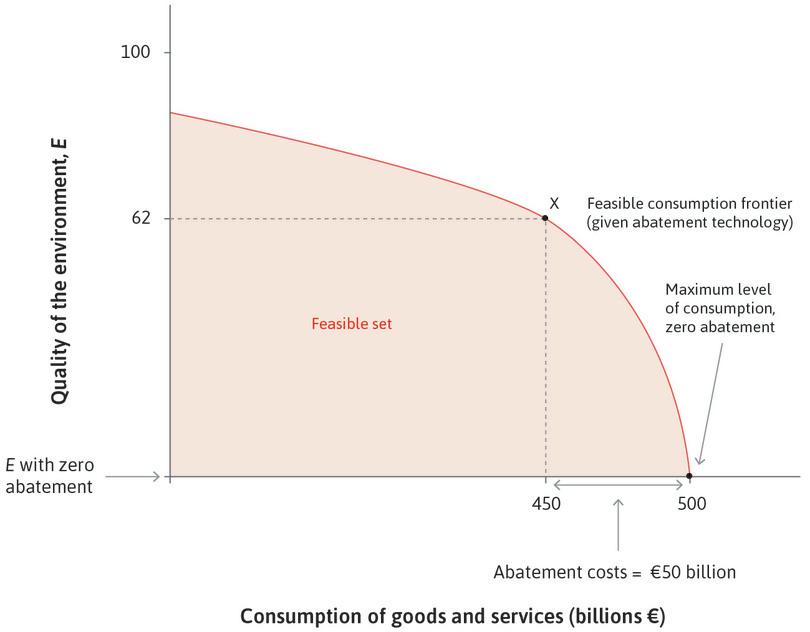
Feasible consumption and environmental quality.
Figure 20.13 Feasible consumption and environmental quality.
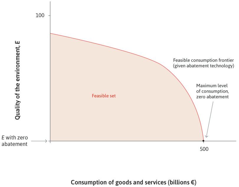
If no abatement policies are adopted
If abatement costs are zero, the nation can have €500 billion of consumption.
Figure 20.13a If abatement costs are zero, the nation can have €500 billion of consumption.
€50 billion of abatement costs
The nation is at point X after spending this amount.
Figure 20.13b The nation is at point X after spending this amount.
The abatement choice problem now looks familiar. The policymaker wishes to select a point among the alternatives on the feasible frontier. Recall from the earlier units that the slope of the feasible frontier, also known as the marginal rate of transformation (MRT), is how much of the quantity on the vertical axis you would get by giving up one unit of the quantity on the horizontal axis. In the consumption-environment feasible frontier, this is the marginal rate of transformation of foregone consumption into environmental quality:
The steeper the feasible frontier (the greater the slope), the smaller the opportunity cost, in terms of foregone consumption, of further environmental improvements.
Environment-consumption indifference curves
Which point on the feasible set will the policymaker choose? The answer can be found by studying the policymaker’s environment-consumption indifference curves in Figure 20.14, which show how much consumption citizens are willing to trade in exchange for better environmental quality.
We can write the slope of the indifference curve, the marginal rate of substitution (MRS) as:
The policymaker’s MRS will be high (a steep indifference curve) if consumption is valued highly by the citizens (a large marginal utility of consumption), and if citizens do not place a high value on additional abatement to improve environmental quality (marginal utility of abatement is low). Conversely, if the citizens value additional environmental quality highly relative to consumption, the MRS will be less steep.
In Figure 20.14, the indifference curves are straight lines because we have assumed for simplicity that the marginal utility of consumption and the marginal utility of environmental quality are both constant. That means they do not depend on the quantity of consumption or on the amount of abatement.

The ideal policymaker’s choice of the abatement level.
Figure 20.14 The ideal policymaker’s choice of the abatement level.
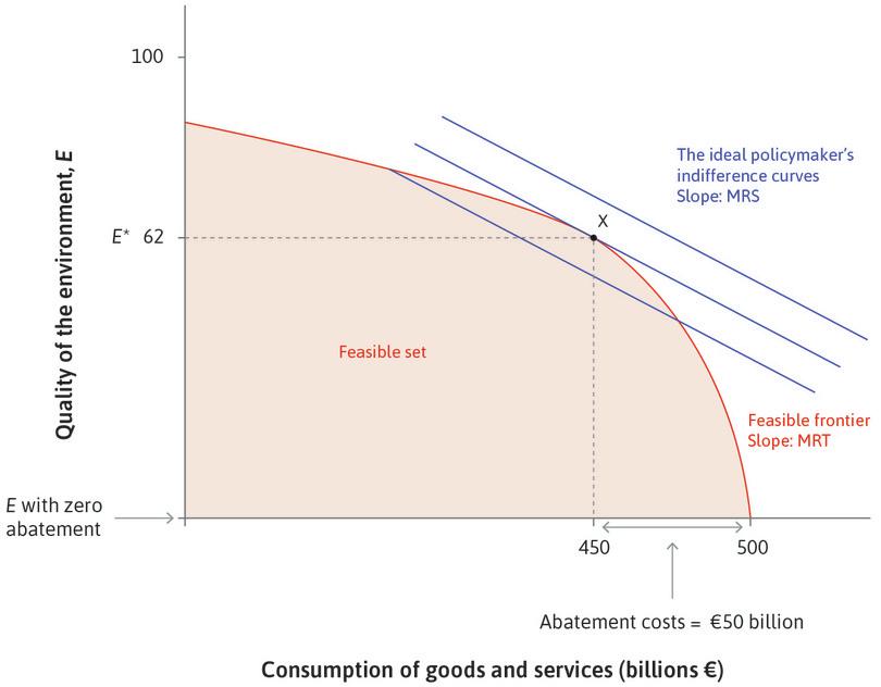
Allocating €50 billion to abatement
Point X is the level of environmental protection that the policymaker would wish to implement, with environmental quality at E*.
Figure 20.14a Point X is the level of environmental protection that the policymaker would wish to implement, with environmental quality at E*.
Allocating less than €50 billion to abatement
At B, the MRS is less than the MRT (the slope of the feasible set at B), so the policymaker would be better off by switching more resources from consumption into improving environmental quality. Spending more on abatement shifts the policymaker onto higher indifference curves until point X is reached.
Figure 20.14b At B, the MRS is less than the MRT (the slope of the feasible set at B), so the policymaker would be better off by switching more resources from consumption into improving environmental quality. Spending more on abatement shifts the policymaker onto higher indifference curves until point X is reached.
To think about how citizens’ preferences affect the optimal policy chosen, we suppose that the policymaker takes account of the preferences of all of the citizens, counting them equally. This means that if citizens decide to value environmental quality more, then the indifference curves of the policymaker will be flatter to reflect this.
Cost-benefit analysis: The ideal policymaker chooses an abatement level
Our policymaker uses two principles to make a decision about the level of abatement:
- She considers only abatement policies on the frontier of the feasible set: This eliminates higher-cost abatement policies that are inside the shaded area.
- She chooses the combination of environmental quality and consumption that puts her on the highest possible indifference curve.
To satisfy both conditions, she finds the point on the feasible frontier that equates the MRT (the slope of the feasible frontier) with the MRS (the slope of her highest possible indifference curve).
We can see from Figure 20.14 that point X is the level of environmental protection that the policymaker will wish to implement. The benefit indicated by the environmental quality index of 62 is achieved at a cost of reducing consumption by €50 billion and allocating it to abatement.
What would produce a different choice of abatement level?
- Different values: If the citizens cared less about the environment, then the indifference curves would be steeper than those in Figure 20.14, and the policymaker would choose a point like B, with higher consumption and lower abatement.
- Different costs of abatement: If abatement became cheaper than shown in Figure 20.14, then the feasible set would be steeper at each level of abatement. This would expand the production frontier upwards, implying that the policymaker would choose a higher level of abatement and lower consumption.
Exercise 20.3 Choosing abatement strategies
Look at the high-cost abatement strategies that we use to illustrate an inefficient abatement policy in Figure 20.12. Can you think of reasons why these policies might be introduced instead of the more cost-effective ones?
Exercise 20.4 Optimistic and pessimistic policies
In Figure 20.14, we described how a policymaker representing a uniform group of identical citizens chooses the optimal amount of abatement.
- Draw the indifference curves of the policymaker if she were to represent two different groups of citizens (again, we assume that all citizens in each group are identical, and the marginal utility of consumption and environmental quality are both constant). In the first group, citizens care more about environmental quality than consumption, and in the other group, citizens care more about consumption of goods and services. Explain why the optimal level of abatement costs will differ across groups.
- Now consider the example in the text of the abatement of global greenhouse gases. What are the main simplifications in the model that might lead the policy maker who uses this model to ignore important aspects of the problem of global greenhouse gas abatement?
In reality, there is uncertainty about the effectiveness of abatement expenditure and hence how costly abatement of environmental damage will be.
- On a new diagram, draw the feasible consumption frontier based on an optimistic assessment of the costs of abatement.
- Now draw the feasible consumption frontier based on a pessimistic assessment of the costs of abatement on the same diagram.
- By adding the policymaker’s indifference curves to your diagram in each case (assuming all citizens are identical), show how actual environmental quality chosen by the policymaker will differ, even if preferences are the same, depending on whether costs of abatement are assessed optimistically or pessimistically.
Question 20.4 Choose the correct answer(s)
Figure 20.9 shows a global greenhouse gas abatement curve, defined as the abatement in 2030 compared with ‘business as usual’, produced by McKinsey in 2015. The width of each bar indicates potential abatement measured in gigatonnes of CO2, while the height indicates the cost of abatement per tonne.
Based on this information, which of the following statements is correct?
- False. The ‘Nuclear’ bar is shorter than the ‘Solar PV’ or ‘Solar CSP’ bars, indicating a lower cost of abatement per tonne.
- True. The nuclear bar is wider, indicating greater abatement potential.
- False. The abatement potential is relatively small, but the cost per tonne abated is very low. It will therefore likely form one component of a least-cost mix of abatement opportunities.
- False. Solar energy is indicated in the diagram to be less efficient, in terms of abatement per euro spent. There may, however, be reasons unrelated to efficiency (such as safety) that justify preferring it to nuclear power.
Question 20.5 Choose the correct answer(s)
Figure 20.11 shows the graph of the amount abated against its total cost, under different abatement policies.
Based on this information, which of the following statements are correct?
- False. A is in the feasible set.
- False. A′ is lower cost but also has lower abatement. A″ is higher cost but achieves more abatement. In general, no point on the feasibility frontier is ever dominated.
- True. The diminishing slope indicates that the initial technologies adopted offer the most abatement per euro spent. Technically, the slope of this curve is the inverse of the marginal cost curve, therefore the decreasing slope indicates increasing marginal cost.
- False. The diminishing slope indicates that the technologies are being adopted in increasing order of their cost, so no higher curve can be attained.
Einstein Marginal abatement costs and the total productivity of abatement expenditures
How do we construct the line segments that define the boundary of the feasible set in Figure 20.10 from the data in Figure 20.9?
Let the height of the first bar (the most cost-effective abatement expenditure) in Figure 20.8 be y and the width of that bar be x. Then, in Figure 20.10:
- the initial slope of the curve is 1/y
- the horizontal axis value of the first point is xy
- this point’s vertical axis value is x
The other line segments making up the curve in Figure 20.9 are constructed in the same way.
20.4 Conflicts of interest: Bargaining over wages, pollution, and jobs
Conflicts of interest arise because environmental quality is never the same for everyone. Some people benefit or suffer more than others, depending on their location and income, as we saw in the banana pesticide case studied in Unit 12.
Here are two examples of how costs and benefits are not equally shared. In 2008 and 2009, two oil spills in the Niger River delta destroyed fisheries. The spills resulted from the oil extraction activities of the Anglo-Dutch company, Royal Dutch Shell. Lawyers for the Ogoni people, who suffered these external effects, brought a lawsuit against the Nigerian subsidiary of Shell in the British courts. In 2015, Shell settled out of court and paid £3,525 per person, of which £2,200 was paid to each individual, and the rest to support community public goods. This award amounted to more than most Ogoni people would earn in a year. Lawyers representing the community helped to set up bank accounts for the 15,600 beneficiaries.
The transfers may have compensated the Ogoni in part for the loss of a healthy environment, restoration of which the UN Environment Programme has estimated will cost $1 billion and take 30 years. For Royal Dutch Shell, the settlement at least partially internalizes the negative external effects of their activities, and might lead the company’s owners (and others extracting oil in the delta) to consider a change in their behaviour.
In 1974 a giant lead, silver, and zinc smelter owned by the Bunker Hill Company was the only major employer in the town of Kellogg, in the American state of Idaho, employing 2,300 people. Many children in the town developed flu-like symptoms. Doctors discovered that they were the result of high lead levels in their blood—high enough to impair cognitive and social development of children.
Three of the children of Bill Yoss, a welder at the smelter, had been found to have dangerously high levels of lead poisoning. ‘I don’t know where we’ll end up,’ he told a People reporter, ‘We may pull out of the state.’
The company refused to release its own tests of the smelter’s lead emission levels. Unless the state’s emissions regulations were relaxed, it said, the smelter would shut down, which it did, in 1981. Former employees looked for work elsewhere. The value of the homes and businesses in the town fell to a third of its earlier level. The local schools, which were supported by property taxes, did not have the funding to cope with those who remained.
We model this problem by considering a hypothetical town, Brownsville, with a single business that employs the entire labour force but whose toxic emissions are a threat to the health of the citizens. The firm can vary the level of emissions that it imposes on the town, but the costs of implementing emissions capture and storage means lost profits. The single owner of the firm (who bears the costs of reducing the level of emissions) lives far enough away that the level of emissions he selects does not affect the quality of his environment. Therefore citizens and the business will have a conflict of interest over the level of emissions in the town, and also over the wages paid. You can think of the citizens as valuing ‘environmental quality’, which decreases when emissions increase and can be measured by an air quality index.
The citizens of the town have some bargaining power because each is free to leave Brownsville and seek employment elsewhere. So the business must offer them a package of environmental quality and wages that is at least as desirable as their reservation option, which is what they might expect to receive if they left Brownsville. We call this limit on what the business must offer the citizens the ‘leave town condition’.
The business owner has bargaining power, too, because the wage and environment package that he offers must result in profits high enough that the firm does not simply shut down or relocate (we call this the firm’s ‘shutdown condition’). The citizens cannot demand more than this wage, or they would be unemployed (remember there are no other firms in Brownsville). Thus the firm’s reservation option places limits on the bargain that the citizens can strike with the firm.
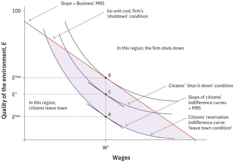
We represent the relationship between the business and the citizens in Figure 20.15. The wage paid to the employees of the firm is on the horizontal axis. The level of environmental quality experienced by the citizens is on the vertical axis. We make the following assumptions:
- Citizens are identical and so experience the same environmental quality.
- The owner is unaffected by the level of pollution: For him, the environmental external effects resulting from his decision about emissions are borne by others. Pollution for him is a private ‘good’, and he does not consume any of it.
Work through the analysis in Figure 20.15 to see how the choices of the citizens and businesses are modelled.
Conflicts of interest over wages and abatement.
Figure 20.15 Conflicts of interest over wages and abatement.
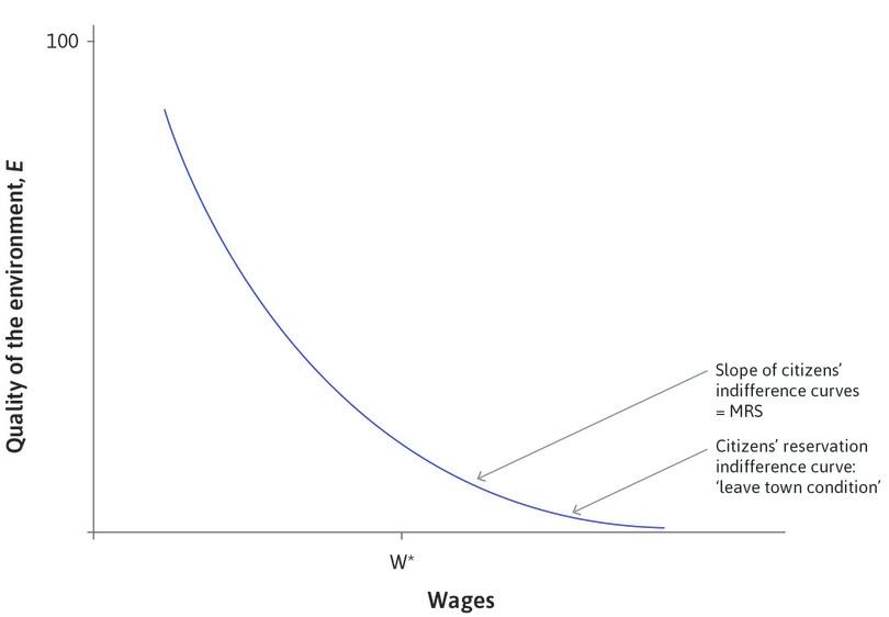
The representative citizen’s reservation indifference curve is the ‘leave town condition’
This gives all the combinations of wages and environmental quality that would be just barely sufficient to induce a representative citizen to stay.
Figure 20.15a This gives all the combinations of wages and environmental quality that would be just barely sufficient to induce a representative citizen to stay.
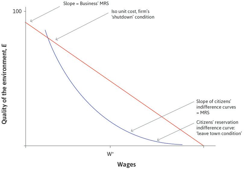
The firm’s ‘shutdown condition’
This shows the combinations of wages and environmental quality offered by the firm that would just barely keep the firm in Brownsville.
Figure 20.15b This shows the combinations of wages and environmental quality offered by the firm that would just barely keep the firm in Brownsville.
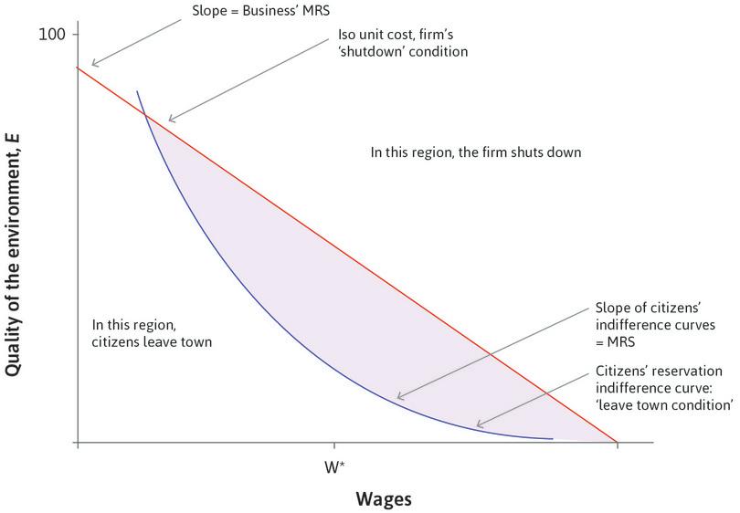
Infeasible options
The portions of the figure above the firm’s shutdown condition and below the citizen’s leave town condition are infeasible.
Figure 20.15c The portions of the figure above the firm’s shutdown condition and below the citizens’ leave-town condition are infeasible.
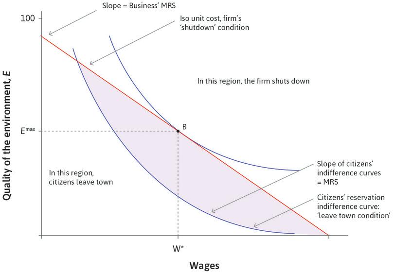
The citizens have power, point B
Suppose the citizens could impose a legally enforceable level of environmental quality in the town and set their own wages. Consistent with the firm remaining in town, the citizens set wages at w* and quality of the environment at Emax.
Figure 20.15d Suppose the citizens could impose a legally enforceable level of environmental quality in the town and set their own wages. Consistent with the firm remaining in town, the citizens set wages at w* and quality of the environment at Emax.

A take-it-or-leave-it ultimatum, point A
On the other hand, if the firm could announce a take-it-or-leave-it ultimatum, it would minimize costs whilst ensuring the citizens do not choose to leave town at Emin.
Figure 20.15e On the other hand, if the firm could announce a take-it-or-leave-it ultimatum, it would minimize costs whilst ensuring the citizens do not choose to leave town at Emin.
The difference between Emax and Emin
This is a measure of the extent of mutual gains the citizens and the business may enjoy. Any outcome in the shaded area is preferred by both parties to their outside option, but only the points between A and B, such as C, are Pareto efficient.
Figure 20.15f This is a measure of the extent of mutual gains the citizens and the business may enjoy. Any outcome in the shaded area is preferred by both parties to their outside option, but only the points between A and B, such as C, are Pareto efficient.
You may recall that this figure is very similar to Figure 5.8, in which Angela the farmer and Bruno the landowner were bargaining over the amount of grain Angela would transfer to Bruno. As in that problem, the study of a bargaining problem is easier if the slope of the indifference curves remains unchanged at a given wage as utility increases.
Here, the conflict is about the amount of emissions that the townspeople will suffer. The firm’s profits depend on the emissions, and profits are greater if it can dispose of more toxic materials freely.
The position of the citizens’ reservation indifference curve depends on what they would expect to get in some other location. If they could find a high-paying job in a non-toxic community, the curve would be higher and to the right of the one that is shown. Its slope, the marginal rate of substitution, is the citizens’ marginal utility of higher wages, divided by the marginal utility of environmental quality.
We assume that the citizens’ marginal valuation of improvements in the environment is constant, but (in contrast to the model in Section 20.3) they have diminishing marginal utility of receiving higher wages. At high wages (and very poor environmental quality) on the far right of the reservation indifference curve, the MRS is small (the curve is almost flat) because citizens would not care much about wages (as they are already getting paid a high wage) but they are very concerned about the poor environment. At low wages the curve is steep, because they place a high value on wage increases.
The firm’s shutdown condition shows the combinations of wages and environmental quality offered by the firm that would barely keep the firm in Brownsville. All of the points on this line have the same cost of producing a unit of output and, as a result, the same profit rate. The firm’s profits are increasing as you move towards the origin. It is like the isocost curve in Unit 2, and the isocost lines for effort in Unit 6.
The cost of raising the wage by $1 is $1. Assume the cost incurred by the owner if he reduces emissions is p per unit of abatement, so the owner’s MRS = 1/p. A steep line indicates that p is small—avoiding emissions and thereby allowing a healthier environment is cheap.
The firm faces a trade-off. If it is at point B in the figure, it pays wages and produces emissions at a level that makes it barely profitable enough to stay in business. Therefore, if it offers a higher-quality environment to the citizens, it can only do this by offering a lower wage. The opportunity cost of one unit of a better environment is p in reduced wages.
Any combination of wages and environmental quality in the shaded portion of the figure is a feasible outcome of this conflict. Any combination on the vertical line between A and B is a Pareto-efficient outcome. We cannot say which feasible outcome will occur, though, unless we know more about the bargaining power of the citizens and the firm.
The firm has all the bargaining power
If the firm could simply announce a take-it-or-leave-it ultimatum, then it would choose point A in Figure 20.15. The firm’s costs will then be well below the shutdown level of costs because they will be freely emitting toxic materials, which reduce the citizen’s environmental quality from Emax, the least emissions (and highest quality environment) consistent with the firm staying in business, to Emin. This difference (Emax − Emin) shows up as cost reductions, and hence as additional profits, in the firm’s accounts. It also shows up as exposure to health hazards in the medical records of the people who live in the town.
The firm’s chosen point, A, is on the citizens’ reservation indifference curve where the vertical distance between the firm’s shutdown condition and the citizens’ leave town condition is the greatest. This will occur when:
Citizens have all the bargaining power
If the bargaining power had been reversed, then the citizens would choose to impose Emax and wages w*. This ensures that the citizens are on their highest possible indifference curve, while also satisfying the firm’s shutdown condition. Again, at this point the MRS of the business is equal to the MRS of the citizens.
Dividing the mutual gains
The difference between Emax and Emin measures the extent of mutual gains the townspeople and the business may enjoy. Any outcome between A and B on the figure is preferable to the next best alternative for the business (shut down) and the citizens (leave town). You can think of the mutual gains as a pie that the citizens and the business owner will divide. How the pie is divided up between the two parties depends, as we have seen in Units 4 and 5, on their relative bargaining power.
A point such as C in Figure 20.15 might be possible if the citizens, acting jointly through their town council, imposed a legal minimal level of environmental quality and wages for the business to continue to operate. Acting together, the citizens would have more bargaining power than if they used the threat to leave town as individuals: they could require that the business at least meet the citizens’ ‘shut-it-down condition’ shown in Figure 20.15.
Bargaining power in this case would be affected not only by the two parties’ reservation options but also by:
- Enforcement capacity: The town government may not have enforcement capacities to impose an emissions limit on the firm.
- Verifiable information: The citizens may not have sufficient information about the levels and dangers of emissions to win a case in court. If so, the firm would not comply with an agreed-upon emissions level such as at C in Figure 20.15.
- Citizen consensus: If the town’s citizens were not in agreement about the dangers of the emissions, the elected officials of the town who legislate an emissions limit might not be re-elected.
- Lobbying: The firm may be able to convince the citizens that their health concerns were misplaced, or had little to do with the firm’s emissions.
- Legal recourse: The firm may be legally entitled to emit any level of emissions that it finds profitable (perhaps subject to having purchased permits allowing it to do this).
So far we have focused on the question of how much abatement there should be. Now we consider a second question: How should the desired level of abatement be accomplished?
Question 20.6 Choose the correct answer(s)
Consider a town with a single business that employs the entire labour force, whose toxic emissions are a threat to the health of the citizens. Figure 20.15 shows the business’ ‘shutdown’ curve (the combination of wages and environmental quality offered by the firm that would just about keep the firm operating) and the citizens’ indifference curves for the quality of environment and their wage income. The citizens’ reservation indifference curve is also shown.
Based on this information, which of the following statements is correct?
- True. At any of these points, at least one of the parties would prefer to take their outside option.
- False. Point A would be chosen, because it is the point that maximizes profits while satisfying the citizens ‘leave town condition’.
- False. Point B would be chosen, because it is the point that places citizens on their highest indifference curve while satisfying the firms ‘shutdown condition’. They strictly prefer B to the point where the ‘shutdown’ curve intersects the horizontal axis, which is the highest feasible wage.
- False. All points within the feasible set where the firm and citizen’s indifference curves are tangent are Pareto efficient (the line AB), including A, B, and C.
20.5 Cap and trade environmental policies
- price-based environmental policy
- A policy that uses a tax or subsidy to affect prices, with the goal of internalizing the external effects on the environment of an individual’s choices.
- quantity-based environmental policy
- Policies that implement environmental objectives by using bans, caps, and regulations.
In Unit 12, we saw possible remedies for the market failure that arose from the negative external effects of pesticide use. The range of remedies included private bargaining between the pesticide users and the fishing community whose livelihoods were threatened, taxes to make the pesticides (or the bananas produced using them) more expensive, ownership of all affected assets by a single business or other decision-making entity, and quotas or outright bans on the use of the pesticide. Some of these policies would have made it more expensive to harm the environment so as to provide incentives for greener economic decision making (price-based policies). Others would have made it illegal (quantity-based policies).
- cap and trade
- A policy through which a limited number of permits to pollute are issued, and can be bought and sold on a market. It combines a quantity-based limit on emissions, and a price-based approach that places a cost on environmentally damaging decisions.
A policy called cap and trade is a policy that combines a legal limit on the amount of emissions with an incentive-based approach to assigning the abatement required to meet this legal limit among firms and other actors.
Here is the idea:
- The government or governments set the total level of abatement required: This is called the ‘cap’ and it constitutes the ‘quantity’ side of the policy.
- The government creates permits: The number of permits issued limits total emissions to the size of the cap.
- The government allocates permits: They can be given to the firms operating in industries emitting the pollutant, or they can be auctioned to polluting firms by the government.
- The permits are traded: For some firms, polluting is very profitable and abatement costly. They will buy permits from other firms. Firms that produce little pollution or have low costs of abatement may have excess permits, which they can sell. Trade occurs until the gains from trade are eliminated.
- The firms submit permits to government to cover their emissions: For each tonne of emissions produced, firms are required to provide one permit to the government. Ideally, government monitoring ensures that firms cannot cheat, and any firms caught violating the law are penalized with large fines.
Cap and trade policies are a way of implementing some desired level of emissions (or, equivalently, the total level of abatement required, E*) as the ideal policymaker did in Figure 20.13.
The desired level, however decided, is shown by the length of the horizontal axis in Figure 20.16. The question addressed by cap and trade is: given that firms vary in their production technologies, how will the total amount of required abatement be divided among them? The objective of a scheme for trading permits is that the abatement should be done by the firms for which this is least costly because this saves scarce resources that can be used elsewhere.
To see how this works, go through the analysis in Figure 20.16, which shows the case where the number of permits is initially divided equally between two firms with different costs of abatement.
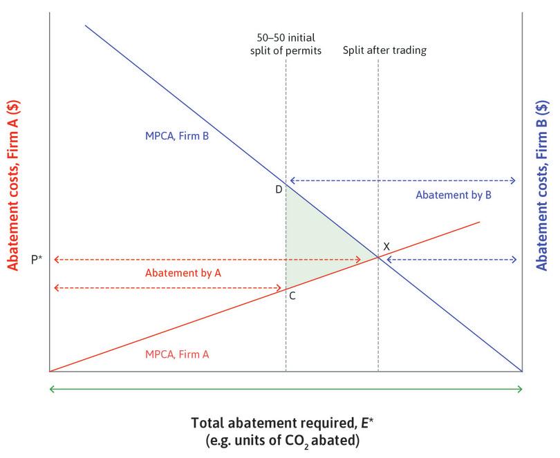
Cap and trade: Buying and selling permits to pollute.
Figure 20.16 Cap and trade: Buying and selling permits to pollute.
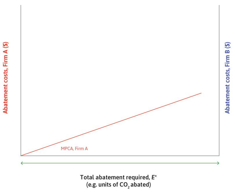
The marginal private cost of abatement (MPCA) of firm A
This is shown in red and measured in the usual way from the left-hand axis. It rises as its cost of abatement increases. Firm A uses a relatively low-emissions technology to produce its product.
Figure 20.16a This is shown in red and measured in the usual way from the left-hand axis. It rises as its cost of abatement increases. Firm A uses a relatively low-emissions technology to produce its product.
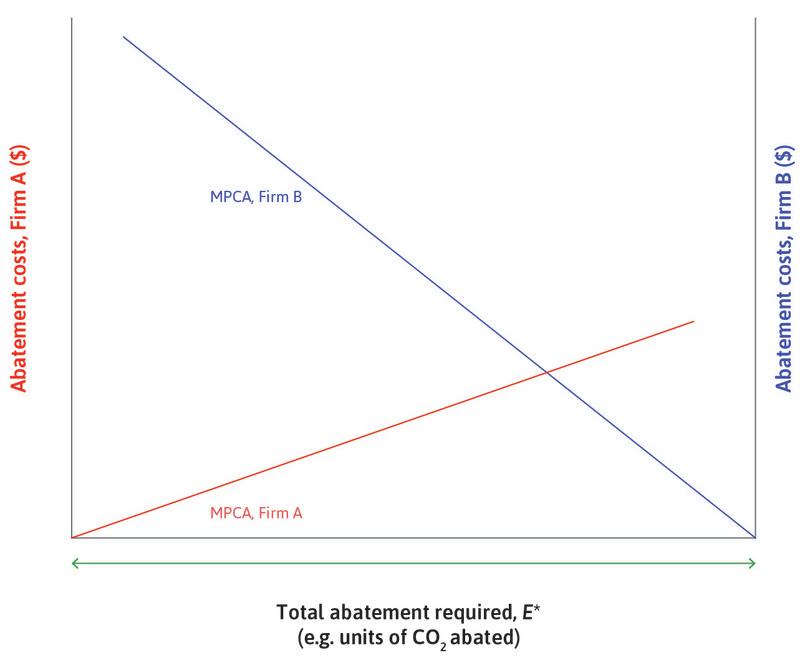
The marginal cost of abatement (MPCA) of firm B
This is shown in blue and measured from the right-hand axis, so it rises from the right origin as B engages in more abatement. Firm B uses a more emissions-intensive technology to produce its product, and therefore its marginal cost of abatement is higher than for Firm A.
Figure 20.16b This is shown in blue and measured from the right-hand axis, so it rises from the right origin as B engages in more abatement. Firm B uses a more emissions-intensive technology to produce its product, and therefore its marginal cost of abatement is higher than for Firm A.
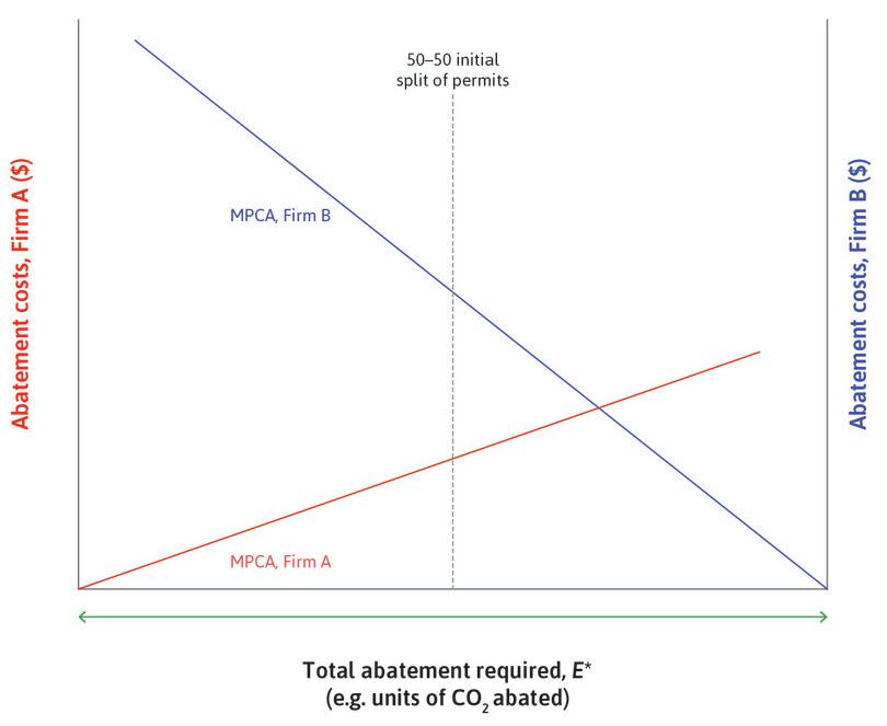
Permits split 50–50
Let’s see what happens if the permits to pollute are initially split 50–50 between the two firms.
Figure 20.16c Let’s see what happens if the permits to pollute are initially split 50–50 between the two firms.
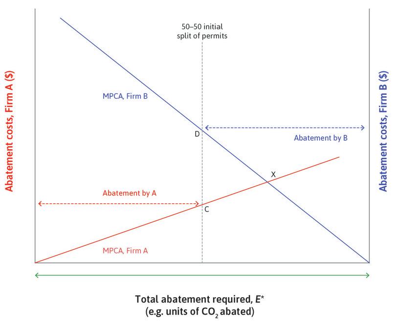
Permits split 50–50: The possibility of gains from trading permits.
Firm B has a higher MPCA. If it can buy a permit to pollute more from Firm A for a price less than its marginal cost, it will purchase the permit, rather than abate. This creates the possibility of gains from the trade in permits.
Figure 20.16d Firm B has a higher MPCA. If it can buy a permit to pollute more from Firm A for a price less than its marginal cost, it will purchase the permit, rather than abate. This creates the possibility of gains from the trade in permits.
Firm B will buy permits from A: How many?
How many permits will they exchange? As long as MCPA of firm B exceeds the MPCA of Firm A, both benefit by A selling permits to B. If the market is competitive, we expect trading until the MPCA is equalized across all firms.
Figure 20.16e How many permits will they exchange? As long as MCPA of firm B exceeds the MPCA of Firm A, both benefit by A selling permits to B. If the market is competitive, we expect trading until the MPCA is equalized across all firms.
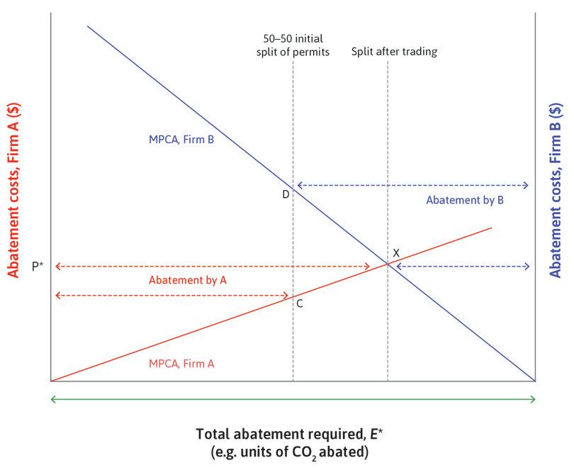
The gains from trade
The shaded triangle shows the gains from trade created by the market for permits. P* is the permit price and is equal to the marginal cost of abatement in the economy. The green area above the red dashed line is the share of the gains from trade that Firm B receives, while the area below is Firm A’s share of the gains from trade.
Figure 20.16f The shaded triangle shows the gains from trade created by the market for permits. P* is the permit price and is equal to the marginal cost of abatement in the economy. The green area above the red dashed line is the share of the gains from trade that Firm B receives, while the area below is Firm A’s share of the gains from trade.
There are many ways in which the permits might be traded once they are issued. One is the auction-type market studied in Unit 11, in which we saw (from an experiment) that the traders quickly converged to trading at a price like P*, which is the market-clearing price. The trading of permits achieves the desired level of abatement at the lowest resource cost to the economy. P* is the permit price and is equal to the marginal cost of abatement in the economy.
Cap and trade: Examples of emissions trading
One of the earliest cases of successful emissions trading was the sulphur dioxide (SO₂) cap and trade scheme in the US, implemented in the 1990s and intended to reduce acid rain. By 2007, annual SO₂ emissions had declined by 43% from 1990 levels, despite electricity generation from coal-fired power plants increasing more than 26% during the same period.
The European Union Emissions Trading Scheme (EU ETS), launched in 2005, is the largest CO₂ cap and trade scheme in the world, and now covers 11,000 polluting installations across the EU. National governments auction 57% of permits in the EU ETS, and the overall emission cap (that is, the amount E* in Figure 20.16) is tightened every year. Some of the auction proceeds are used to fund low-carbon energy innovation. Similar carbon trading schemes exist in other countries and regions.
The EU ETS has been less successful than the US SO₂ scheme. Some analysts think this is due largely to the fact that the permitted level of emissions was too high (too large a cap). After the financial crisis in Europe, lower aggregate demand caused the demand for electric power to shrink and with it, firms’ profit-maximizing emissions levels. With demand exceeding supply, the price of permits fell dramatically, providing little incentive for firms to undertake abatement expenditures. These effects are shown in Figure 20.17.
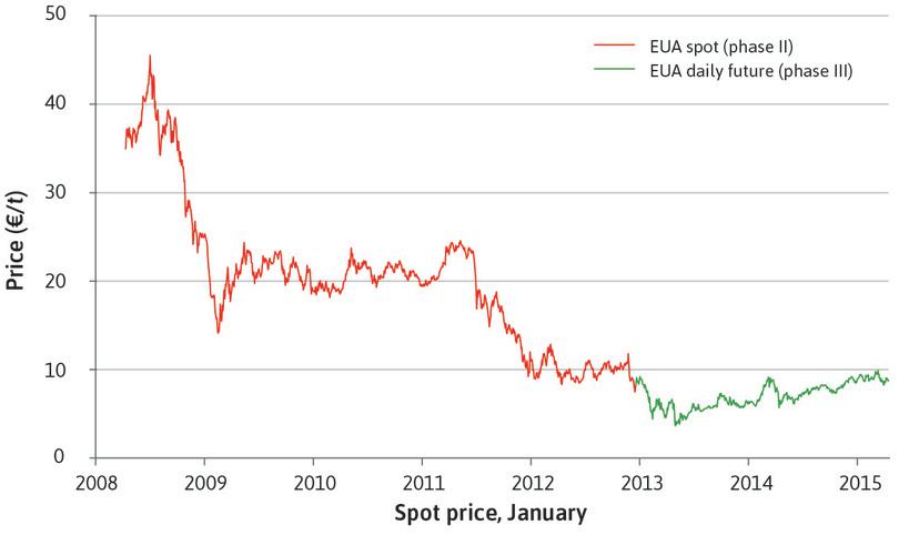
Permit prices in the European Union Emissions Trading Scheme (EU ETS).
Figure 20.17 Permit prices in the European Union Emissions Trading Scheme (EU ETS).
Data provided by SendeCO2 based on prices from Bloomberg Business.
This highlights a drawback of cap and trade. The price signal is not necessarily a reliable guide for future abatement investment decisions. In Germany, for example, the fall in permit prices led to several high-emitting coal power plants reopening, because dirty technology was profitable again.
But emissions trading schemes do not need to leave the market entirely free. The UK, for example, uses a carbon price floor, which sets a minimum price for British participants in the Emissions Trading Scheme. They do this to avoid the ‘virtually free pollution’ outcome that occurs when the permit price crashes.
The estimated total external cost of a tonne of carbon dioxide emissions differs depending on how we value future generations, as we shall see in Section 20.9. A low-end estimate in 2017 dollars is about $40 per tonne of CO₂ emissions, and it is rising fast because the greater the amount of CO₂ in the atmosphere, the higher the marginal effect on climate of adding more. The recent price of a permit on the European Union Emissions Trading Scheme (shown in Figure 20.17) is less than a fifth of this cost, so the permit plan is inducing decision-makers to internalize only a small fraction of the negative external effects.
Ideally, a tax on fossil fuels could entirely offset these external effects, with the added advantage that businesses and others would then face less uncertainty about the cost of burning carbon. A tax on carbon would raise the cost of emitting carbon in exactly the same way as having to pay for an emissions permit would do. In fact, the effect on costs would be identical if the market-determined cost of the permit were to be the same as the tax rate per tonne of emissions set by the government. The effect of the increase in costs would be higher prices of emissions-intensive goods and hence, ceteris paribus, demand for such goods would fall. Both the cap and trade and a carbon tax are said to be a way to ‘put a price on’ the external effects of carbon emissions.
How high should the price of carbon emissions be?
Given that producers and users of fossil fuels are usually heavily subsidized (at very different rates from country to country) the tax or the cost of a permit would have to exceed $40. On average around the world, fossil fuel subsidies are about $15 per tonne, so an optimal tax would be $55 per tonne (to internalize the external costs and to offset the subsidy). A simpler policy would be to eliminate the subsidies and set the carbon tax at our best estimate of the external cost of burning carbon.
The pros and cons of these two policies:
- a cap and trade permit based system with a sufficiently low cap
- a carbon tax at a sufficiently high rate to offset the external costs (and subsidies, if these remain)
These have been actively debated among environmental economists, with no clear consensus other than that either is preferable to the policies being pursued in most countries. Cap and trade, however, has been more popular, perhaps because it has the advantage of flexiblity. The ability to set the carbon price, but then to control the way in which permits are allocated and traded, gives the policymaker two ‘levers’. In contrast, a single tax may be politically unpopular for a policymaker to implement.
Exercise 20.5 Assessing cap and trade policies
- Explain why the green area in Figure 20.16 represents the total gains from trade. Hint: think about the first permit that Firm B buys from Firm A. How much is the most that Firm B would have been willing to pay? How much was the least that Firm A would have been willing to accept in order to part with the permit?
- How would you explain the way a cap and trade policy works to someone who has not studied economics? How would you respond to their concerns that the policy is likely to be ineffective or unfair? Many newspapers and blogs publish ‘op-eds’, that is, opinion editorials from the public. A common length limit is 600 words. Find some op-eds on climate policy, and having looked at how they are written, draft your answer to this question in the form of an op-ed.
Exercise 20.6 A successful tradable emissions permit program
The cap and trade sulphur dioxide permit program in the US successfully reduced emissions. The program costs were approximately one-fiftieth of the estimated benefits.
Read Robert Stavins and colleagues’ views on the US sulphur dioxide cap and trade program at VOXeu.org.
- In the view of the authors, why are cap and trade systems such powerful tools to achieve reductions in emissions?
Also read ‘The SO2 Allowance Trading System’ by Richard Schmalensee and Robert Stavins of the MIT Center for Energy and Environmental Policy Research.
- Summarize the evolution of permit prices using Figure 2 in the article.
- How well can the price movements in permit prices be explained by the analysis in Figure 20.16?
Look again at Hayek’s explanation of prices as messages (Unit 11), and the analyses of asset price bubbles (Unit 11) and housing bubbles (Unit 17).
- Could we use similar reasoning to explain price movements in Figure 2 of the paper by Schmalensee and Stavins?
Exercise 20.7 Would a carbon tax reduce emissions more than regulation?
In 2017, economists Martin Feldstein and Greg Mankiw (respectively economic advisors to US Presidents Ronald Reagan and George W. Bush), together with Ted Halstead, a climate campaigner, suggested in the op-ed ‘A Conservative Case for Climate Action’ that an ideal climate policy in the US should consist of three parts:
- A single carbon tax should replace all regulations that are aimed at reducing carbon emissions.
- Revenues collected from the tax should be refunded to American taxpayers in quarterly paychecks (‘carbon dividend’).
- American firms that export to countries without carbon taxes should not pay a carbon tax, while importers should face an import tax on the carbon contents of their products (a ‘carbon border adjustment’).
- Explain the economic reasoning behind each part of the proposal.
- Why do the economists think replacing regulations with a single carbon tax would be more efficient?
- Some environmental groups oppose the carbon dividend. They argue that the money could be better spent. Do you agree? What should carbon revenues be spent on? Do you think citizens are more likely to support a carbon tax if there is a carbon dividend?
- Why do the economists think a border carbon adjustment is necessary? What would be the effect of a domestic carbon tax without a border carbon adjustment? What incentives does it create for American companies and for foreign companies? Is it fair on firms from developing countries (who often generate a lot of electricity from high emissions coal) who export their products to the US?
- Do you support the proposal by Feldstein, Mankiw, and Halstead. Explain why or why not. What changes would you make?
20.6 The measurement challenges of environmental policy
To implement environmental policies using the framework we have provided, we need to measure the value of abatement.
Placing a value on the benefits of abatement is challenging because we are dealing with missing markets for environmental quality and uncertain long-term impacts. What is the value of preserving a rainforest, saving a threatened species, creating better air, or less noise? To answer these questions, different methods are used depending on whether the environmental issue in question is affecting environmental wellbeing, health, consumption, or future assets.
- hedonic pricing
- A method used to infer the economic value of unpriced environmental or perceptual qualities that affect the price of a marketed good. It allows a researcher to put a price on hard-to-quantify characteristics. Estimations are based on people’s revealed preferences, that is, the price they pay for one thing compared to another.
- contingent valuation
- A survey-based technique used to assess the value of non-market resources. Also known as: stated-preference model.
We examine two methods of measuring the benefits of abatement: hedonic pricing and contingent valuation.
Contingent valuation
Among the easiest and most widely used methods of valuing the benefits of abatement is simply to ask people. For example, after the 1989 Exxon Valdez oil spill in Alaska, which released 11 million gallons (42 million litres) of crude oil into beautiful Prince William Sound, the court used contingent valuation to assess the value of the losses (such as the value of natural beauty) caused by the spill. They did this in a survey by asking respondents how much they would be willing to pay to prevent a new spill. The study estimated the lost value in 1990 to be at least $2.8 billion. Exxon eventually paid $1 billion in damages in a settlement with the governments of Alaska and the US.
Researchers used contingent valuation techniques to get a quantitative estimate of the value of elephant conservation in Sri Lanka. Farmers were killing elephants to protect crops and homes. The researchers wanted to know how much Sri Lankans would be willing to pay to the farmers as compensation for the damages caused by the elephants, if the farmers stopped killing them.2
Contingent evaluation is called a stated preference approach because it is survey-based and accepts the respondents’ statements of their values as indicative of their true preferences. This is not the case for hedonic pricing.
Hedonic pricing
Hedonic pricing is called a revealed preference approach because it uses people’s economic behaviour (not their statements) to reveal what their preferences are. Laboratory experiments are a similar method of studying revealed preferences, as we saw in Unit 4. But lab experiments are not very useful in valuing the environment.
For example, how much do you value having your residence being free of the sound of aircraft flying overhead? Economists observe that houses under aircraft flight paths are sold for less than equivalent houses in quieter locations. By comparing data on house prices, we can calculate the amount people are prepared to pay to avoid the noise pollution.
This technique was used in the UK to set the tax for landfill waste. The marginal benefits of abatement were estimated in a study that used data on more than half a million housing transactions over the period 1991–2000. By controlling for a large number of factors that can account for the variation in house prices, the researchers then tested whether any of the variation left unexplained could be accounted for by the proximity of the house to a landfill site. The researchers found that being within a quarter of a mile (400 metres) of a working landfill site reduced house prices by 7%. They calculated that the marginal benefit from reducing the proximity to a landfill site was £2.86 per tonne of waste (in 2003 prices).
Hedonic pricing and contingent valuation give us a way to measure the way people value a particular change in the environment given their experience of this change. Green growth accounting gives us a way to estimate the value of conserving environmental resources for society as a whole, today and in the future. Below, you will learn about how some economists are placing a monetary value on society’s use of natural assets.
How economists learn from facts Natural capital and green growth
- depreciation
- The loss in value of a form of wealth that occurs either through use (wear and tear) or the passage of time (obsolescence).
Recall that depreciation refers to the wearing out or using up of the physical capital goods used in production. In the green growth accounting framework, the environment is similarly considered as an asset that can be used up. The environment is part of what society needs to produce goods and services. Thus, environmental degradation reduces the assets of the society in much the same way as the wear and tear or obsolescence of machines used in production.
Remember that income is the most a person, or a nation, could consume without reducing its capacity to produce in the future. This was the message of the bathtub in Unit 10. Income is the flow of water into the tub minus the amount of evaporation that is reducing the total amount of water in the tub. Income according to this definition is gross income minus depreciation.
Although environmental degradation is not measured in conventional national accounts, it should be, because using up our natural capital is no different from the wear and tear on the machines and other equipment we use.
The World Bank estimates that in low-income countries, natural capital comprises 36% of wealth, so using some of this up and not counting the loss overstates how fast income is really growing. By how much though? In order to take natural capital loss into account, we must figure out how much it will cost (per year) to replace the lost natural capital and then subtract it from the annual GDP figure (remember that the most common measure of income, GDP, does not even take account of the depreciation of capital goods because of difficulties with measurement).
- green adjustment
- Accounting adjustment made to conventional measures of national income to include the value of natural capital.
If you make this accounting adjustment (also known as a green adjustment), ‘success stories’ of economic growth look less impressive. When Indonesian government policy generated a timber boom between 1979 and 1982, Robert Repetto and his colleagues from the World Resources Institute estimated that the country used up more than $2 billion of potential forest revenues. They showed that, after considering deforestation, oil depletion, and soil erosion, Indonesia’s true average annual rate of growth of income (net of used up natural capital)—originally reported as 7.1% from 1971 to 1984—was in reality only 4%. A similar exercise was carried out for Sweden between 1993 and 1997, where the loss of natural assets was estimated to be around 1% of GDP per year.
When economists disagree Willingness to pay versus the right to a livable environment
The Constitution of the Republic South Africa asserts the citizen’s ‘right to an environment which is not detrimental to his or her health or wellbeing’. The Supreme Court of India ruled that the ‘right to life’ guaranteed by the Constitution of India ‘includes the right to enjoyment of pollution-free water and air …’ Similar rights are granted in at least 13 other constitutions, including those of Portugal, Turkey, Chile, and South Korea. Use the Constitute Project website to check the constitution of your country, or any other in which you are interested, to see if you can find these guarantees.
Political movements opposing the privatization of water supply have used similar language. Access to clean water, they argue, is a human right. When a feature of the environment such as proximity to a landfill, noise pollution, or toxic emissions from a smelter is valued in monetary terms using the methods described above, this ignores the principle advanced by many that people have a right to an environment free of these hazards.
But in response, others ask: why should the quality of the environment that you experience be any different from the quality of the car that you drive or the food that you eat? You get what you pay for, and if you are unwilling to pay, then why should the policymaker worry about your values? If you believe this, the benefits of abatement policies can be measured by the citizens’ willingness to pay (WTP) for the improved environment that the abatement will allow.
The WTP measure is criticized by some economists and citizens because it implies that people with hardly any money place a limited value on the environment, just as they have a limited willingness to pay for anything else. They do not lack the will, but they lack the way. Therefore using WTP as the method of estimating the benefits of abatement—for example, when either contingent valuation or hedonic pricing is used—means that policies that improve environmental hazards that mostly affect the poor, like ensuring safe drinking water in urban areas, will be valued less than policies that raise the environmental quality experienced by rich people, like pristine rivers, lakes, and oceans to enjoy while boating.
Also, this value may depend on how the question that determines the stated preference is asked. If, instead of our WTP for preservation of the environment, we are asked what compensation we are willing to accept (WTA) for the same proposed reduction in the quality of the same environment, empirical evidence is that the result would be a higher number.
- merit goods
- Goods and services that should be available to everyone, independently of their ability to pay.
If a safe environment is a right, an economist would term it a merit good, which you may recall from Unit 12. It is like the right to vote, or legal representation in court, or an adequate education: a good that should be available to all citizens irrespective of their ability to pay.
The advantage of the approach based on willingness to pay is that it makes use of information on how people value the environment. This should be relevant to how much we invest in environmental quality. Defining the environment as a right has the advantage that it does not give priority to the preferences of those with higher incomes in shaping environmental policy.
Exercise 20.8 Wealth and natural capital
Download the World Bank data in ‘The Changing Wealth of Nations’ dataset.
- Using the total wealth data, calculate the change in natural capital between 1995 and 2000 and between 2000 and 2005 in absolute terms for three high income, middle income, and low income countries. Summarize and interpret your results.
Go to the World Bank’s open data website. Find and download GDP (in constant prices) for your chosen countries for 1995, 2000, and 2005.
- Calculate the change in GDP between these periods in absolute terms. Draw a scatter plot with the percentage change in GDP on the vertical axis and the percentage change in natural capital on the horizontal axis. Does it look like there is a relationship between these two variables? Suggest explanations for any relationship you find.
Question 20.7 Choose the correct answer(s)
Which of the following statements is correct regarding valuation of the benefits of abatement?
- False. GDP calculations typically do not include natural capital or physical capital depreciation.
- False. This describes the contingent valuation methodology. Hedonic pricing would use observed behavior, such as the reduction in house prices near airports, to estimate the willingness to pay for noise reduction.
- False. This describes the hedonic pricing methodology. Contingent valuation would use surveys to directly ask local residents how much they would pay to avoid living close to a landfill.
- True. Since the marginal benefit of income is lower for the rich, they are generally willing to pay more for environmental goods. As a result, environmental goods that are largely of benefit to the rich may be valued highly using willingness to pay methodologies.
20.7 Dynamic environmental policies: Future technologies and lifestyles
The trade-offs given by the feasible sets and indifference curves we have used in our analysis will change as people adopt new values and lifestyles and develop new technologies, and as our impact on the environment intensifies.
Prices, quantities and green innovation
- marginal productivity of abatement expenditures
- The marginal rate of transformation (MRT) of abatement costs into improved environment. It is the slope of the feasible frontier. See also: marginal rate of transformation, feasible frontier.
Improvements in technology can enlarge the feasible set. Some improvements may make abatement more efficient, lowering the opportunity cost of an improved environment. Others may improve methods of producing goods, reducing the environmental costs of consumption as a result. Figure 20.18 illustrates the effect of a technological improvement, which improves the marginal rate of transformation of foregone consumption into abatement (otherwise known as the marginal productivity of abatement expenditure), and hence into an improvement in environmental quality. By increasing the marginal productivity of abatement expenditure, it makes the feasible frontier steeper.
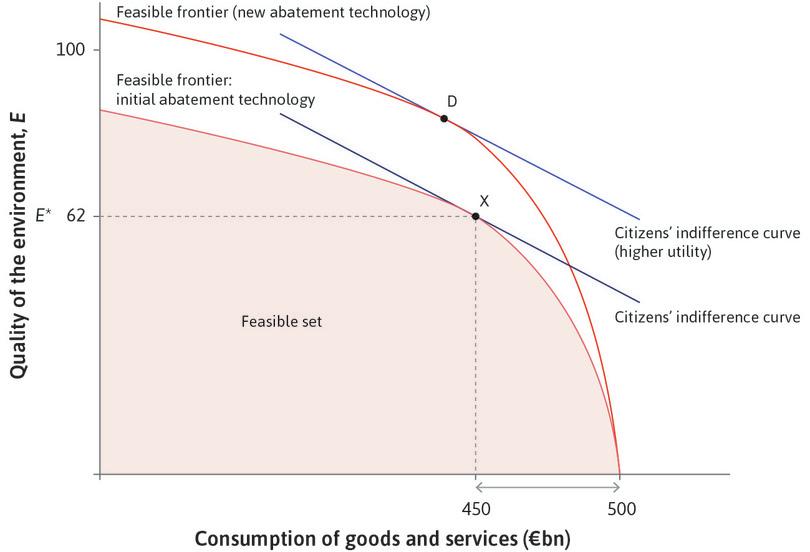
The abatement technology changes.
Figure 20.18 The abatement technology changes.
In Unit 2, you learned how the rents from innovation drive progress and the improvement of productivity. If the right incentives exist to create innovation rents, we would expect technological breakthroughs that can deliver substitutes for some resources that would otherwise be used up, or that need to stay in the ground if climate change is to be safely limited. One such case is the technological progress achieved in solar energy.3
- learning by doing
- This occurs when the output per unit of inputs increases with greater experience in producing a good or service.
Subsidies to firms producing the panels and other equipment has helped fund research and development in these new sources of electricity. Subsidies to those installing solar panels have increased demand. The growth of demand has in turn led to a sharp decrease in the price of solar panels thanks to learning by doing in the production process, which makes production cheaper and cheaper.
The idea that environmental regulation can create greater efficiency and be an incentive to innovation is known as the ‘Porter Hypothesis’, because it was first argued by Michael Porter, an economist, in 1995. He argued that the costs of regulation led firms to look for cleaner, more efficent technologies. The benefits of these technologies compensate both the costs of regulation, and the costs of innovation.
Figures 20.19a and b show the dramatic improvement in photovoltaic cell efficiency over the last few decades, which has led to a reduction in the cost of producing solar electricity.
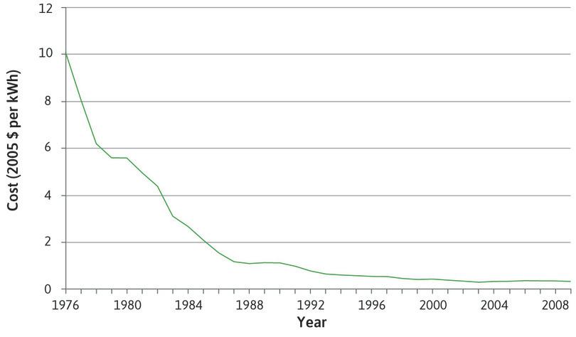
Cost of generating electricity (new capacity) using photovoltaic cells in the US (1976–2009).
Figure 20.19a Cost of generating electricity (new capacity) using photovoltaic cells in the US (1976–2009).
Gregory F. Nemet. 2006. ‘Beyond the Learning Curve: Factors Influencing Cost Reductions in Photovoltaics’. Energy Policy 34 (17): pp. 3218–32; Béla, J. Nagy, Doyne Farmer, Quan M. Bui, and Jessika E. Trancik. 2013. ‘Statistical Basis for Predicting Technological Progress’. PLoS ONE 8 (2). Public Library of Science (PLoS).
In the US, many renewable energy technologies can already compete with fossil fuel generation without the need for subsidies, in terms of the total cost per unit of electricity generated, as shown in Figure 20.19b. However, since we can only generate wind power when the wind blows and solar power when the sun shines, renewable energy generation can be less reliable than fossil fuel generation. Fossil fuel generation may therefore be preferred in the absence of subsidies, even though the unit costs for solar power are lower.
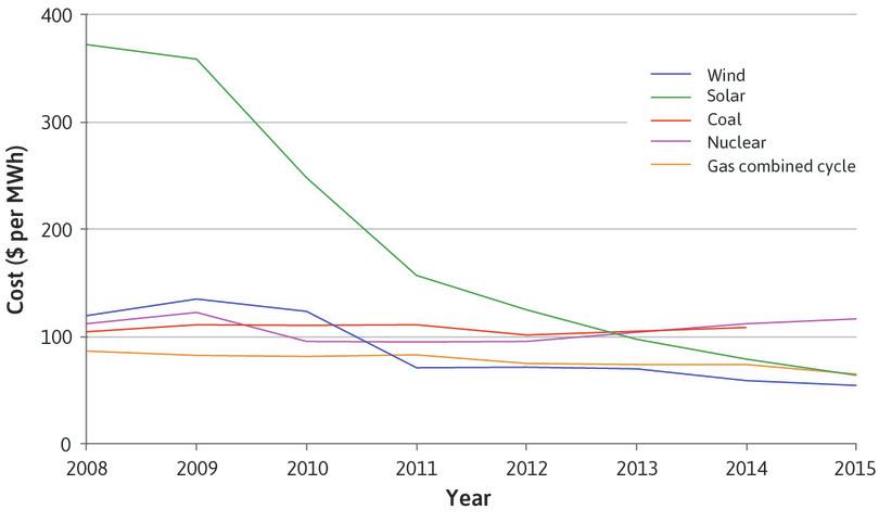
Cost of generating electricity (new capacity) from different sources in the US (2008–2015).
Figure 20.19b Cost of generating electricity (new capacity) from different sources in the US (2008–2015).
Lazard. 2015. ‘Levelized Cost of Energy Analysis 9.0’. Lazard.com. Updated November 17 2015.
To illustrate how a tax can create innovation rents by changing relative prices and promote innovation by the private sector, we apply a model introduced in Unit 2. Imagine a textile producer called Olympiad Industries (a hypothetical business), located in a country where the supply of electricity is intermittent, and so like most firms in the country it owns a coal-fired power generator. Burning fossil fuel generates greenhouse gases but the alternative (solar power) is more expensive. While the firm has installed some solar panels, it relies primarily on coal for electricity generation.
Figure 20.20 illustrates the cost comparison. You will be familiar with the model: it is the one in Unit 2 in which we explained how relatively high wages in England made the introduction of a labour-saving innovation (the spinning jenny) profitable. The difference is that we are not considering an innovation that saves labour but instead saves environmental resources, many of which (unlike labour in England in the eighteenth century) have no price.
In this figure, we study the effects of a tax on carbon-based energy sources on a firm’s choice of technology. Prior to the tax, the coal-intensive technology was the cost-minimizing way to produce. Hence there was no incentive for a firm to develop and use renewable energy sources, and as a result, there were no profits to gain from developing the alternative to coal. After the tax, the firm would save the equivalent of a tonne of coal per unit of output by developing and using the solar technology.
Olympiad Industries’ choice of technology: The effect of an environmental tax on firm behaviour.
Figure 20.20 Olympiad Industries’ choice of technology: The effect of an environmental tax on firm behaviour.
Technologies A and B
Both technologies produce 100 metres of textiles: A is coal-intensive and B is solar-intensive. The new technology, B, uses almost entirely solar power with just a bit of coal use for periods of the year when solar power is unreliable.
Figure 20.20a Both technologies produce 100 metres of textiles: A is coal-intensive and B is solar-intensive. The new technology, B, uses almost entirely solar power with just a bit of coal use for periods of the year when solar power is unreliable.
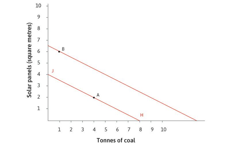
The firm’s isocost line
The isocost line shows all of the possible combinations of solar and coal (sufficient to produce 100 metres of textiles) that have the same cost. If the isocost is HJ, firms use technology A, because B costs more (it lies outside the line HJ). The flat slope of the isocost line says that coal is a bargain.
Figure 20.20b The isocost line shows all of the possible combinations of solar and coal (sufficient to produce 100 metres of textiles) that have the same cost. If the isocost is HJ, firms use technology A, because B costs more (it lies outside the line HJ). The flat slope of the isocost line says that coal is a bargain.
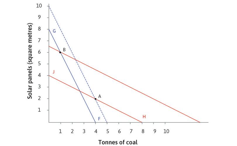
Taxing fossil fuels
A tax per kilowatt-hour on the use of coal for energy-generation is introduced. This means that for the same cost as 4 tonnes of coal, the firm could now be using 8 solar panels.
Figure 20.20c A tax per kilowatt-hour on the use of coal for energy-generation is introduced. This means that for the same cost as 4 tonnes of coal, the firm could now be using 8 solar panels.
The new isocost line
The solar-intensive technology B is on the blue isocost line and is now cheaper than the status quo A-technology.
Figure 20.20d The solar-intensive technology B is on the blue isocost line and is now cheaper than the status quo A-technology.
The comparison of costs gives the owner of Olympiad a reason to adopt solar technology. Here the tax has changed the message sent by prices. It now says that you can make a profit by using renewable sources of energy. It also says that sticking with coal may mean being undercut by your competitors, if they switch to the lower-cost technology.
Environmental policy and long-term changes in lifestyles
In the long run, in addition to the role of policy in green innovation, how much we value the goods that contribute to our wellbeing can also change. Recall our discussion of social preferences from Unit 4. We saw that individual behaviours can be motivated by a desire to contribute to the common good. Below, you see how economists apply this general idea of pro-social preferences to evaluate the potential contribution of such preferences to environmental conservation.
How economists learn from facts Social preferences and environmental sustainability
- social preferences
- Preferences that place a value on what happens to other people, and on acting morally, even if it results in lower payoffs for the individual.
Do the kinds of altruistic and reciprocal social preferences that we studied in Unit 4 motivate people to act in ways that will sustain the environment? This is not an easy question to answer because people are naturally happy to attribute their environmentally friendly actions to their green values, even if the latter were not really the reason for the action.
But two experimental studies suggest that social preferences do support green actions.
In the northeastern region of Brazil, shrimp are caught in large plastic bucket-like contraptions; the fishermen cut holes in the bottoms of the traps to allow the immature shrimp to escape, thereby preserving the stock for future catches. The fishermen thus face a real-world social dilemma like the ones we studied in Unit 4: the expected income of each would be greater if he were to cut smaller holes in his traps (increasing his own catch) while others cut larger holes in theirs (preserving future stocks).
In prisoners’ dilemma terms, small trap holes are a form of defection that maximizes the individual’s material payoff irrespective of what others do (it is the dominant strategy). But a shrimper might resist the temptation to defect if he were both public spirited toward the other fishermen and sufficiently patient to value the future opportunities that they all would lose if he were to use traps with smaller holes.
Experimental economists Ernst Fehr and Andreas Leibbrandt implemented both a public good experimental game and an experimental measure of impatience with the shrimpers. Like the experiments in Unit 4, both were played anonymously and the payoffs were real. Those who did not contribute in the public goods game went home with more money than the cooperative types who contributed.4
The researchers found that the shrimpers with both greater patience and greater cooperativeness in the experimental game punched significantly larger holes in their traps, thereby protecting future stocks for the entire community. The effects, controlling for a large number of other possible influences on hole size, were substantial.
Additional evidence that social preferences can support green outcomes comes from a set of experiments and field studies with 49 groups of herders of the Bale Oromo people in Ethiopia, who were engaged in forest-commons management. Devesh Rustagi and his co-authors implemented public-goods experiments with a total of 679 herders, and also studied the success of the herders’ cooperative forest projects.5
The most common behavioural type in the experiments, constituting just over a third of the subjects, were ‘conditional cooperators’, who reciprocated higher contributions by others by contributing more to the public good themselves. Controlling for a large number of other influences on the success of the forest projects, the authors found that groups with a larger number of conditional cooperators were more successful (planted more new trees) than those with fewer conditional cooperators.
This was in part because members of groups with more conditional cooperators spent significantly more time monitoring others’ use of the forest. As with the Brazilian shrimpers, differences in the fraction of conditional cooperators in a group were associated with substantial increases in trees planted or time spent monitoring others.
This does not mean that generous, cooperative, and reciprocal preferences are sufficient to address problems of environmental sustainability. But it does show that these social preferences can help.
We saw above that environmental behaviours can arise because of pro-social preferences. But they can also arise because of changes in lifestyles. The example of the Netherlands will illustrate this point.
In Figure 3.1, you saw that production workers in the Netherlands worked fewer than half as many hours in the year 2000 as they had in 1900. In 2000 they enjoyed a lot more free time and consumed less than half as many goods and services as they would have done had they continued working more than 3,000 hours a year, as they did in 1900. If they still worked long hours and used all these earnings for consumption, their adverse impact on the environment would be larger.
Look ahead to Figure 20.25a, which shows the CO₂ emissions and GDP per capita for a wide range of countries. As a thought experiment, imagine that the Netherlands were twice as rich as it is in that graph. What would be the environmental impact in terms of CO₂ emissions? In that figure the Netherlands is slightly below the ‘predicted’ line so if we assume that this was also true of our hypothetical workaholic Dutch nation, we can determine the level of CO₂ emissions using the line of best fit. Instead of emitting 11 tonnes of CO₂ per capita per year, they would be emitting more than 20 tonnes. This would make the Netherlands among the top polluters in the world.
The Netherlands experienced an unusually large fall in its work hours (Figure 3.1 shows that work hours in France and the US fell, but not on the same scale as the Dutch). But even for these and other countries, if free time had not expanded at the opportunity cost of less consumption, the impact on global climate change would have been worse.
A lifestyle that is rich in free time, and less rich than it could be in goods and services produced in the economy, is a ‘greener’ lifestyle. Environmental policies can contribute to people adopting this lifestyle.
To see how, imagine that Omar is considering how far to travel by air for his holiday. Omar has enough income to fly anywhere, but he knows that burning aviation fuel is a major source of greenhouse gases. He would also like to have more free time, but realizes that a shorter working week would mean he has less money for his next holiday.
We represent the trade-offs affecting his choice in Figure 20.21. On the horizontal axis we measure hours of free time per year. On the vertical axis we indicate his kilometres of air travel during the year. The red line gives the total amount of air travel that he can afford for each choice of free time. The red line is therefore his feasible air travel/free time frontier.
The feasible frontier is constructed as follows. Suppose Omar makes $50 an hour after taxes and that he is free to set his own hours of work. He spends $90,000 on things other than air travel and to earn this amount, he must work 1,800 hours during the year. So, from the 8,760 hours in the year that he could give to work (as in Unit 3), he chooses to work 1,800 hours. Thus he has 6,960 hours of free time if he takes no air travel at all: this is the horizontal axis intercept of the frontier. How much air travel will he choose if $1 buys 4 km of air travel?
Omar’s preferences for free time and air travel are given by the indifference curves shown. The slope of the indifference curve indicates how much he values free time relative to air travel, that is, his MRS of free time for air travel.
Work through the analysis in Figure 20.21 to follow Omar’s decision making.
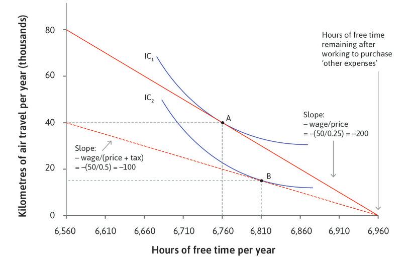
Omar’s choice: The effect of an environmental tax on choices of air travel and free time.
Figure 20.21 Omar’s choice: The effect of an environmental tax on choices of air travel and free time.
The feasible frontier
The marginal rate of transformation of foregone free time into air travel is the slope of the feasible frontier. By giving up an hour of free time, Omar can work for an additional hour and earn $50. Each dollar gets him 4 km of air travel, so the MRT is 200. Giving up an hour of free time gets him 200 km of feasible air travel.
Figure 20.21a The marginal rate of transformation of foregone free time into air travel is the slope of the feasible frontier. By giving up an hour of free time, Omar can work for an additional hour and earn $50. Each dollar gets him 4 km of air travel, so the MRT is 200. Giving up an hour of free time gets him 200 km of feasible air travel.
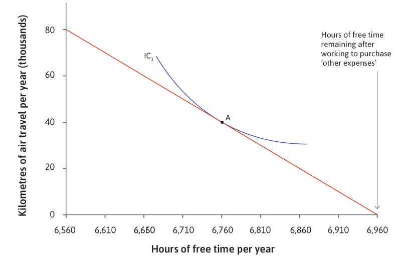
The highest indifference curve that Omar can reach
This is point A. It results from his choosing to work 200 extra hours so he has 6,760 hours of free time and 40,000 km of air travel.
Figure 20.21b This is point A. It results from his choosing to work 200 extra hours so he has 6,760 hours of free time and 40,000 km of air travel.
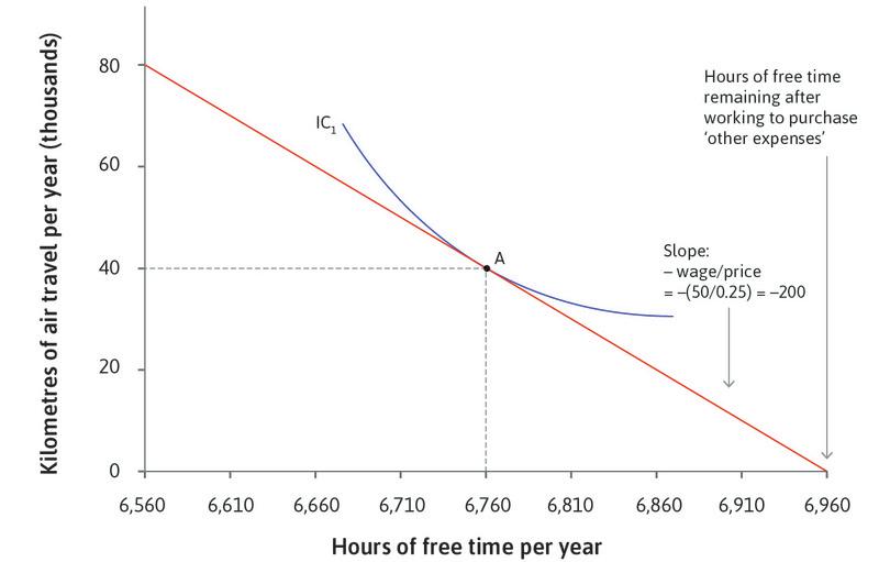
The private cost of travel
To Omar, the private cost of 1 km of air travel is $0.25.
Figure 20.21c To Omar, the private cost of 1 km of air travel is $0.25.
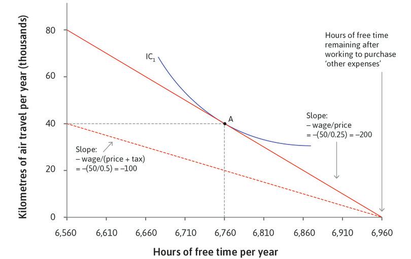
A fuel tax
Consider a tax levied on aviation fuel, so that the price of air travel rises. As a result, a dollar spent on a ticket now purchases only 2 km of air travel. This tax could force airlines and consumers to account for the negative environmental effects of air travel.
Figure 20.21d Consider a tax levied on aviation fuel, so that the price of air travel rises. As a result, a dollar spent on a ticket now purchases only 2 km of air travel. This tax could force airlines and consumers to account for the negative environmental effects of air travel.
Omar’s choice
Omar chooses the point on the new dashed feasible frontier that is on the highest indifference curve, which is now point B.
Figure 20.21e Omar chooses the point on the new dashed feasible frontier that is on the highest indifference curve, which is now point B.
- income effect
- The effect that the additional income would have if there were no change in the price or opportunity cost.
- substitution effect
- The effect that is only due to changes in the price or opportunity cost, given the new level of utility.
Omar flies less. There are two reasons for the change:
- The income effect: Omar’s choices are now more limited than before because the price of something that he consumes has gone up. His real income has fallen.
- The substitution effect: The tax has increased the relative price of air travel, leading Omar to substitute to other ways of having a good life, by consuming other goods (not shown in the figure), working less, or both.
Exercise 20.9 Improvements in technology
- Redraw Figure 20.18 to show an improvement in the technology for producing consumption goods, instead of an improvement in abatement technology.
- Based on your diagram, explain what happens to the feasible frontier and the optimal choice of environmental quality and consumption, assuming nothing else changes.
Exercise 20.10 The price elasticity of demand
A study of vehicle use and gasoline prices in California estimated that the short-run price elasticity of demand for the number of miles a car is driven is –0.22. Suppose the price of gas is now $3 per gallon and a proposed tax would raise the price to $4 per gallon.
- For someone who drives 200 miles per week, what is the predicted reduction in the miles driven if the tax is implemented?
The same study found that people with higher incomes responded more to gas price changes than people with lower incomes.
- Can you think of reasons why this may be the case?
- Sketch two demand curves reflecting the difference in price responsiveness among different income groups: one for high-income people and one for low-income people. Show why the tax will impose a larger cost on the low-income group.
Question 20.8 Choose the correct answer(s)
In Figure 20.20, points A and B are the two technologies available to a firm in its production. Specifically, technology A uses 4 tonnes of coal and 2 m² of solar panel to produce 100 metres of textiles, while technology B uses 1 tonne of coal and 6 m² of solar panel for the same output.
Initially, the price of 1 tonne of coal is half that of the price of using 1 m² of solar panel. In its latest budget statement, the government proposes a tax on the use of coal such that the price ratio increases from 1/2 to 2. Based on this information, which of the following statements is correct?
- False. The firm’s isocost line at the original prices is given by JH.
- False. The firm chooses technology A because it is on the lower isocost line, indicating lower costs per unit of output.
- True. This is shown in the graph as the shift from JH to GF.
- False. The firm chooses technology B because it is on the lower isocost line, indicating lower costs per unit of output.
Question 20.9 Choose the correct answer(s)
The following diagram shows a consumer’s choice of the amount of air travel per year, using indifference curves between hours of free time per year and kilometres of air travel. The consumer cannot afford air travel when he chooses 6,960 hours of free time. The consumer’s after-tax hourly wage is $50.
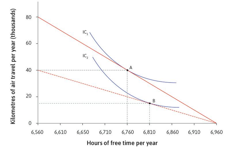
Initially, the cost of a 1 km of air travel is $0.25. In its latest budget statement, the government proposes a fuel tax such that the cost of 1 km of air travel doubles to $0.50. Based on this information, which of the following statements is correct?
- False. The marginal rate of transformation falls from 200 to 100 due to the tax.
- False. The substitution effect implies that the consumer substitutes away from air travel. We have assumed that consumption of other goods is fixed, so the consumer instead substitutes into free time. In reality, the consumer may substitute into both free time and consumption of other goods.
- False. The income effect could increase or decrease free hours, depending on the preferences of the consumer.
- True. The diagram indicates that 15,000 km per year is the optimal choice at the new price, which internalizes all the relevant externalities from air travel.
20.8 Environmental dynamics
Equilibrium is a fundamental concept of economics. It is essential to the way we predict the prices of goods using the model of supply and demand, or the level of unemployment using the model of the labour market. But for practical purposes we need to know more than simply the equilibrium of a model. In Units 16 and 18, for example, you learned that it may take a very long time for the labour market to move from one equilibrium to another, so what happens along the way is important.
And as the examples of the Grand Banks fisheries collapse or the threats to the Amazon rainforest described at the beginning of the unit showed, there may be more than one equilibrium. A healthy sustainable environment could be an equilibrium—think of Grand Banks cod fishing in the 100 years prior to 1950. And another could be the same geographical location devoid of cod, an example of environmental collapse. We sometimes refer to the process of getting to the second equilibrium as a vicious cycle, and environmental sustainability as a virtuous cycle.
- disequilibrium process
- An economic variable may change either because the things that determine the equilibrium value of that variable have changed (an equilibrium process), or because the system is not in equilibrium so that there exist forces for change that are internal to the model in question (a disequilibrium process). The latter process applies when the economy moves towards a stable equilibrium (which itself is not moving) or away from a tipping point (an unstable equilibrium).
The passage from one of these equilibria to another—called a disequilibrium process—can be rapid, because it is propelled by positive feedback processes, which you studied in Unit 17 in the case of housing markets. Just as in the case of a house price bubble, the reduction in fish stocks in the Grand Banks became self-reinforcing.
Here we study these disequilibrium processes. We explain why, when they are present and when we lack important pieces of information about what kinds of human actions will set off a collapse, we need a different approach to policymaking, one that stresses the need to avoid a cataclysmic environmental collapse.
The dynamics of the biosphere
Long before human economic and other activity began to have a substantial effect, the natural environment was constantly changing as a result of the chemical and physical processes that make up the biosphere.
Over tens of thousands of years, an ice age would give way to a period of warming in which glaciers and sea ice covers retreated towards the poles, to be followed by a new period of cold temperatures with the advance of the ice sheets into what are now temperate climates. On shorter time scales, clouds of dust sent up by massive volcanic eruptions blocked out the sun, as occurred during the ‘little ice age’ 500 years ago (you can see the drop in average temperature around the middle of the fifteenth century in Figure 1.6b).
Climate today is heavily influenced by human economic activity, but it is a process with its own dynamics of change. A challenge to environmental policymaking is that some natural processes themselves set in motion positive feedback processes so that small initial changes can lead to much larger effects, resulting in faster and greater deterioration than anticipated.
- tipping point
- An unstable equilibrium at the boundary between two regions characterized by distinct movements in some variable. If the variable takes a value on one side, the variable moves in one direction; on the other, it moves in the other direction. See also: asset price bubble.
- prudential policy
- A policy that places a very high value on reducing the likelihood of a disastrous outcome, even if this is costly in terms of other objectives foregone. Such an approach is often advocated where there is great uncertainty about the conditions under which a disastrous outcome would occur.
Like the Grand Banks fisheries and the Amazon rainforest, many freshwater systems, such as lakes and rivers, are subject to similar vicious circles of deterioration and collapse.
Where positive feedbacks are important there may be some level of environmental deterioration called a tipping point, which if passed, sets in motion a process leading to abrupt and hard-to-reverse destruction of an environmental resource. When this is the case, environmental policy must go beyond balancing the costs and benefits of the abatement of environmental damage. Instead, policymakers must devise measures to ensure that a tipping point—especially if it is uncertain—for a critical resource is not passed. In this context, a prudential policy would seek to avoid the risk that the given situation may itself be radically and irreversibly degraded.
Environmental equilibria
To understand the idea of planetary boundaries and environmental collapse, we will use the example of Arctic sea ice. This is an example of an environmental system that may have already passed a tipping point due to global climate change. Figure 20.22 shows that for the past 50 years, the extent of the sea ice at the end of summer has been declining at an increasing rate. The insert in the figure illustrates the change in the last few decades.
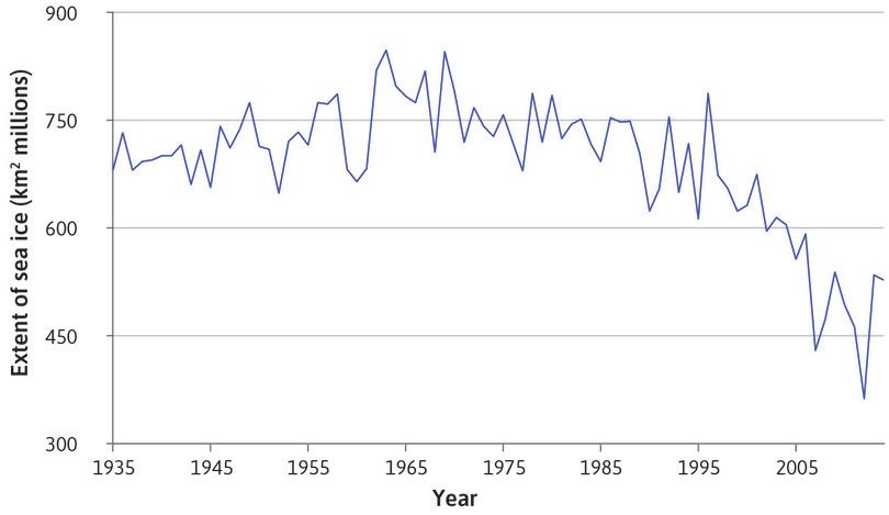
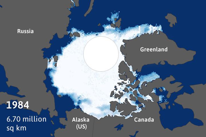
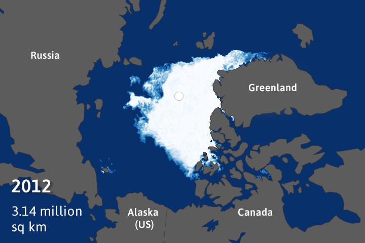
Arctic sea ice coverage (1935–2014).
Figure 20.22 Arctic sea ice coverage (1935–2014).
Miguel Ángel Cea Pirón and Juan Antonio Cano Pasalodos. 2016. ‘Nueva serie de extensión del hielo marino ártico en septiembre entre 1935 y 2014’. Revista de Climatología, Vol. 16 (2016): pp. 1–19.
First, consider the vicious cycle. Open sea surface area is darker than ice so more open sea surface area leads the earth’s surface to reflect less radiation. It therefore absorbs more radiation and warms up. The resulting higher winter and spring surface temperatures in turn cause less ice in the summer. The virtuous cycle is just the opposite: when there is extensive summer ice, the radiation is reflected rather than absorbed and the temperatures stay low, maintaining the ice which reflects the radiation, keeping temperatures low, and so on.
‘Extensive summer sea ice’ and ‘no summer sea ice’ are the stable equilibria of the Arctic sea ice ecology. Each of these states is reinforced by the positive feedback loop shown in Figure 20.23. You may want to compare this positive feedback process to the one causing housing price bubbles and busts discussed in Unit 17.
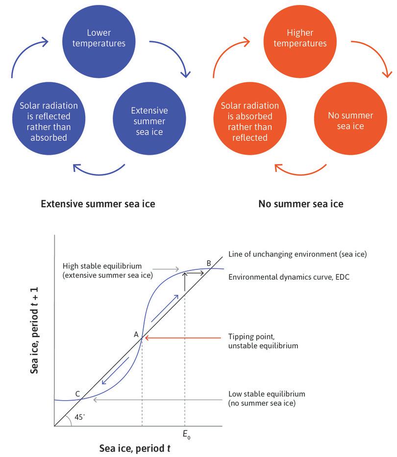
The environmental dynamics curve and the environmental tipping point.
Figure 20.23 The environmental dynamics curve and the environmental tipping point.
Environmental tipping point
- On one side of an environmental tipping point, processes of environmental degradation are self-limiting.
- On the other side, positive feedbacks lead to self-reinforcing, runaway environmental degradation.
What happens ‘in between’ these two stable equilibria? We analyse this using the model introduced in Unit 17 for the housing market. You will note the similarity between Figure 20.23 and Figure 17.18 of boom and bust in a housing market. But now, instead of the house price this year and next on the axes, the horizontal axis is the extent of sea ice today (called Et to refer to the environment this year). The vertical axis is sea ice next year. This figure shows how the extent of sea ice today maps to the extent of sea ice tomorrow.
The 45-degree line depicts an unchanging environment, since along that line any value of sea ice this period on the horizontal axis is the same next period (on the vertical axis). The S-shaped line is the ‘environmental dynamics curve’ or EDC for short. Just as in Unit 17, points at which the EDC crosses the 45-degree line are equilibria. This is because the amount of sea ice this year is the same as next year (remember an equilibrium is something stationary, that is, unchanging from year to year). Two of the equilibria are stable: each equilibrium is stabilized by self-reinforcing feedback processes shown in the upper panel. You can refer back to Figures 11.18 and 11.19 for the adjustment processes around a stable and an unstable equilibrium. Point A is the unstable equilibrium or tipping point. Any slight change in sea ice at the unstable equilibrium leads in the direction of either B or C.
At any point in between the two stable equilibria at B and C, from year to year the sea ice cover will either be increasing towards the virtuous equilibrium at B or disappearing towards the no-sea-ice equilibrium at C. For example, beginning with a sea ice extent of E₀, the EDC shows the (higher) level the following year and the arrow indicates the adjustment to the equilibrium at point B.
This occurs as follows: from an initial level of E₀ with a cold climate and Arctic summer ice, the sea ice next year would be more than this year as shown, since the EDC is above the 45-degree line. When there is a lot of ice, the feedback in the direction of maintaining the ice cover is strong, and we tend to stay there even when variations in temperatures (due to seasons or decadal variation in ocean currents) cause temporary warming and temporary reductions in sea ice. The extent of the ice means that the system ‘rebounds’ towards the high equilibrium.
Planetary boundaries
As we have seen, the two stable equilibria are separated by an unstable equilibrium at A. So a reduction in sea ice below the tipping point will be amplified, rather than dampened. At that point, the feedback becomes stronger in the direction of reducing the ice cover and bringing the system to the no-Arctic-summer-ice state. The capacity of the system to recover would have been pushed beyond its limits.
What is the role of climate change in all that? We shall see that to analyse this we need to explain why the S-shaped environmental dynamics curve can shift down. If it shifts, the system will not stabilize around the high-summer-ice equilibrium at B.
A warming climate does two things, one of which is gradual, the other cataclysmic. First, starting from the high equilibrium, a warming climate brings the system closer to a tipping point, illustrated by a downward shift in the S-shaped curve. Second, it may change the system such that at some point, the equilibrium with extensive summer sea ice disappears.
To understand these effects, take a look at Figure 20.24. A warmer climate means that for any amount of sea ice this year, the amount that will be there next year is less. This is not a movement along the EDC but instead a downward shift of the whole curve. As a result, less ice forms in the winter and the whole system is more vulnerable to the increase in temperature and open surface area in the summer.
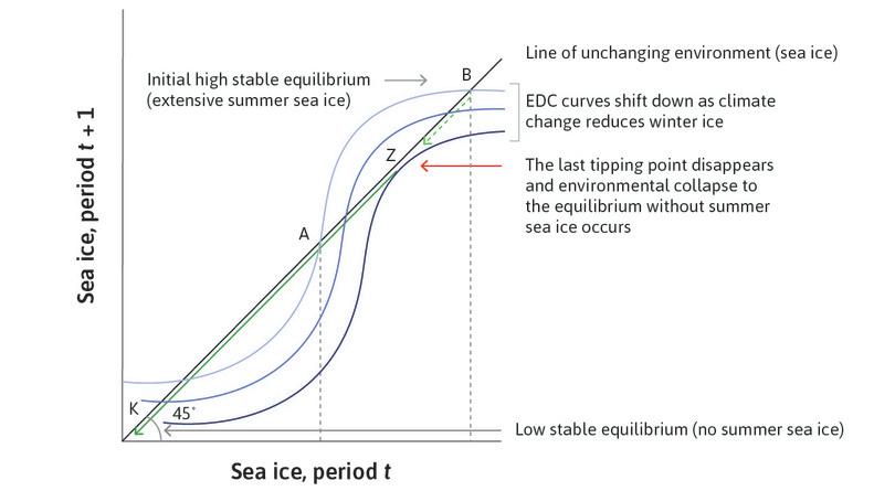
Climate change and irreversible loss of summer Arctic sea ice.
Figure 20.24 Climate change and irreversible loss of summer Arctic sea ice.
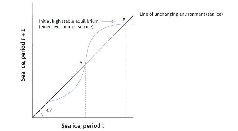
Initial high stable equilibrium
The environment starts at equilibrium point B.
Figure 20.24a The environment starts at equilibrium point B.
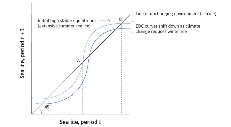
Global warming lowers the EDC curve
A warmer climate means that for any amount of sea ice this year, the amount that will be there next year is less. The whole curve shifts downward.
Figure 20.24b A warmer climate means that for any amount of sea ice this year, the amount that will be there next year is less. The whole curve shifts downward.
System collapse to ice-free summers
Beyond a certain amount of winter warming, the EDC shifts down so much that there is no longer a high stable equilibrium. The last tipping point, Z, disappears and the system is permanently locked in the no-sea-ice stable state at K.
Figure 20.24c Beyond a certain amount of winter warming, the EDC shifts down so much that there is no longer a high stable equilibrium. The last tipping point, Z, disappears and the system is permanently locked in the no-sea-ice stable state at K.
In Figure 20.24, the shift down in the EDC has moved the ‘high’ equilibrium downwards, so there will be less sea ice from year to year. Notice too that the warmer climate has also shifted the tipping point upwards to Z from its initial position at A, which widens the ‘danger zone’ of environmental collapse.
Is this what has been happening over the last century? From Figure 20.22, it appears that until the late 1960s, the Arctic sea ice was approaching a high equilibrium (like B). Thereafter, the extent of sea ice declined at first gradually, illustrated in Figure 20.24 by the movement from B downwards towards Z. But then Figure 20.22 shows that from the mid-1980s, the reduction in sea ice was much more rapid, as would occur if the last tipping point had been passed and the system was in freefall towards no summer sea ice at all (point K).
Combining the model and the available evidence, the change from the Arctic with extensive summer ice to the Arctic with no-summer-ice equilibria appears to be underway. Scientists are unsure how reversible this loss of the Arctic summer ice is even if we reverse global warming. We may have crossed a point of no return. The lack of Arctic sea ice—if that is what is in store—will add to the already powerful forces creating a warmer climate.
The sea ice might be restored eventually by a new ice age of sharply colder climate. Given the pattern of climate change over the past 800,000 years, this might be expected 50,000 years from now.
Prudential policies to address tipping points
The aim of policies to slow global warming would be to keep the EDC within the set of feasible environmental equilibria shown by the green dashed line between B and Z. In the presence of tipping points, prudential policies should reduce the risk that a tipping point will be crossed.
The need to be prudent arises not just because there is a tipping point but also because of the uncertainty about how close we are to the last tipping point. Prudent policy means seeking to avoid cataclysmic risks even if their likelihood is extremely small. The closer we are to a tipping point, the higher the chance of unknowingly crossing it and finding it impossible to reverse the degradation and avoid a catastrophic outcome.
- biodiversity loss (rate of)
- Proportion of species that become extinct every year.
Planetary boundaries are defined for critical environmental variables (such as temperature and biodiversity loss), and give levels of these variables that scientists think will keep us sufficiently far away from problematic tipping points to be within a ‘safe operating space’. Respecting planetary boundaries is a prudential policy.
The value of prudence has implications for which kinds of policies are most appropriate. To see this, suppose there is no uncertainty about either:
- The state of the environment: How close to a tipping point the ecosystem was, for example.
- The effect of tax incentives: What will the effect be on carbon emissions?
Given this level of certainty, a tax on carbon emissions or a cap and trade policy could obtain the same outcome. Cap and trade would impose the desired level of abatement and the carbon tax would set the right price for carbon emissions, also leading to the desired level of abatement. In both cases, the policymaker must decide on the desired level of abatement before selecting the most appropriate policy.
However, we are often highly uncertain about both the state of the environment and the effectiveness of tax or subsidy policies. In these cases, cap and trade is more prudent because it can guarantee a particular level of emissions (the cap), which can be set sufficiently far away from the possible thresholds.
Exercise 20.11 Representing regime shifts
The Regime Shifts DataBase documents different types of regime shifts (another word for tipping point) that we have evidence for in human-dominated ecological systems. Choose one from the database and describe the situation in your own words, including the types of equilibria and their characteristics, and how the system transitions from one equilibrium to another. Draw a diagram similar to Figure 20.23 to represent it, and explain the feedback loops that are involved.
Exercise 20.12 Self-reinforcing processes
Self-reinforcing processes, such as the ones described above, do not happen only in nature. In Unit 17, for example, we discussed how increases in house prices can reinforce a boom and become self-sustaining, leading to a housing price bubble.
Explain the ways in which the cumulative self-reinforcing processes described by environmental scientists are similar to (or different from) processes that occur in a housing or stock price bubble.
20.9 Why is addressing climate change so difficult?
While scientists agree that climate change is occurring and that our economic activity is contributing to it, there are large gaps in scientific understanding of the processes involved and the costs of containing them.
Moreover, as we have seen in Sections 20.3 and 20.4, conflicts of interest over the extent and methods of abatement make it difficult for national governments to adopt broadly supported strategies for mitigating environmental degradation. These conflicts include disagreements about what climate science has shown. In 2015 in the US, 64% of Democratic Party supporters were of the opinion that global warming is both occurring and a result of human activity, but the similar fraction among Republicans was 23%.
Also, owners and employees of companies producing or using fossil fuels anticipate income losses as the result of policies to reduce emissions, and spend heavily to influence public opinion on environmental questions. You can read about the impact of this spending in a New York Times article on lead poisoning and examine a list of chemical industry lobbying expenditure for 2015 on OpenSecrets.org.
Lack of adequate information and conflicts of interest are impediments to good public policy in many other areas, but climate change poses two unusual challenges: the problem cannot be solved by national governments acting alone, and those affected by our choices today include generations in the distant future.
International cooperation
- tragedy of the commons
- A social dilemma in which self-interested individuals acting independently deplete a common resource, lowering the payoffs of all. See also: social dilemma.
Using the tools of game theory in Unit 4, we saw that avoiding the tragedy of the commons that affects the supply of public goods depends on the rules of the game (the institutions). Where there are repeated interactions of the players and there are opportunities to punish those who do not contribute to the public good, the socially optimal outcome can be sustained. The presence of sustainable water-use systems or fish stocks in several continents shows that the tragedy of the commons is avoidable.
- dominant strategy equilibrium
- An outcome of a game in which every player plays his or her dominant strategy.
In the case of climate change, game theory helps us understand the obstacles to its solution. Recall the way we modelled the climate change game as a prisoners’ dilemma in which two countries (the US and China) can either restrict carbon emissions or continue with business as usual (see Figure 4.17). Complete self-interest makes the business as usual scenario the dominant strategy equilibrium.
To understand how an international agreement might be negotiated to avoid the business as usual outcome, we introduced inequality aversion and reciprocity. If citizens of the US and China give some weight to the wellbeing of citizens in the other country or experience less wellbeing when inequality rises, and if they are willing to implement costly measures as long as this is also done in the other country, then an outcome where both countries restrict emissions is possible.
Our hypothetical model of climate change negotiations between China and the US gave rise to two Nash equilibria if citizens had both inequality aversion and reciprocity. It is also not completely unrealistic: after intense negotiations following failed talks and a non-binding agreement in Copenhagen in 2009, all countries committed to eventual emission cuts at the United Nations Conference on Climate Change in Paris in December 2015, with the goal of stabilizing global temperatures at 2°C above pre-industrial levels. Virtually all countries also submitted their individual plans for cutting emissions, but these plans are not yet consistent with this temperature stabilization goal.
Unrepresented generations
Our economic activity today will affect climate changes in the distant future, so we are essentially creating consequences that others will bear. This is just an extreme form of external effects that we have studied throughout the course. It is extreme not only in its potential consequences, but also in that those who will suffer the consequences are future generations.
In many countries, public policies have been adopted to address other kinds of environmental external effects, such as local pollution, under pressure from voters bearing the costs of these effects. If you look ahead at Figure 20.25b, you will notice that many of the stars (well above the line) on the Environmental Performance Index are, and have long been, electoral democracies. This is not the case for most of the low performers.
But the future generations that will bear the consequences of our decisions are unrepresented in the policymaking process today. The only way the wellbeing of these unrepresented generations will be taken into account at the environmental bargaining tables around the world is the fact that most people care about, and would like to behave ethically toward, others, as we have seen in Unit 4.
These social preferences underlie the debates among economists about how much we should value the future benefits and costs of the climate change decisions that we make today.
In considering alternative environmental policies, how much we value the wellbeing of future generations is commonly measured by an interest rate, which is literally the rate at which we discount future generations’ costs or benefits. There are, however, debates about how this discounting process should be done.
When economists disagree The discounting dilemma: How should we account for future costs and benefits?
- discounting future generations’ costs and benefits
- A measure of how we currently value the costs and benefits experienced by people who will live in the future. Note that this is not a measure of individual impatience about one’s own future benefits and costs.
- discount rate
- A measure of the person’s impatience: how much the person values an additional unit of consumption now relative to an additional unit of consumption later. It is the slope of the person’s indifference curve for consumption now and consumption later, minus one. Also known as: subjective discount rate.
When considering policies, economists seek to compare the benefits and costs of alternative approaches. Doing this presents especially great challenges when the policy problem is climate change. The reason is that the costs will be borne by the present generation but the benefits of a successful abatement policy will be enjoyed by people in the future, many of whom are not yet alive.
Put yourself in the shoes of the impartial policymaker we studied earlier and ask yourself: are there any reasons why, in summing up the benefits and costs of an abatement policy, I should value the benefits expected to be received by future generations any less than the benefits and costs that will be borne by people today? Two reasons come to mind:
- Technological progress: The people in the future may have either greater or lesser needs than we do today. For example, as a result of continuing improvements in technology, they may be richer (either in goods or free time) than we are today, so it might seem fair that we should not value the benefits they will receive from our policies as highly as we value the costs that we will bear as a result.
- Extinction of the human species: There is a small possibility that future generations will not exist because humanity becomes extinct.
- pure impatience
- This is a characteristic of a person who values an additional unit of consumption now over an additional unit later, when the amount of consumption is the same now and later. It arises when a person is impatient to consume more now because she places less value on consumption in the future for reasons of myopia, weakness of will, or for other reasons.
These are good reasons why we might discount the benefits received by future generations. Notice that neither of these reasons for discounting is related to pure impatience.
This was the approach adopted in the 2006 Stern Review on the Economics of Climate Change (read the executive summary on the WWF website). Nicholas Stern, an economist, selected a discount rate to take account of the likelihood that people in the future would be richer. Based on an estimate of future productivity increases, Stern discounted the benefits to future generations by 1.3% per annum. To this he added a 0.1% per annum discount rate to account for the risk that in any future year there might no longer be surviving generations. Based on this assessment, Stern advocated policies that would have implemented substantial abatement investments today in order to protect the environment of the future.
Several economists, including William Nordhaus, criticized the Stern Review for its low discount rate. Nordhaus wrote that Stern’s choice of discount rate ‘magnifies impacts in the distant future’. He concluded that, with a higher discount rate, ‘the Review’s dramatic results disappear’.6
Nordhaus advocated the use of a discount rate of 4.3%, which gave vastly different implications. Discounting at this rate means that a $100 benefit occurring 100 years from now is worth $1.48 today, while under Stern’s 1.4% rate it would be worth $24.90. This means a policymaker using Nordhaus’ discount rate would approve of a project that would save future generations $100 in environmental damages only if it cost less than $1.48 today. A policymaker using Stern’s 1.4% would approve the project only if it cost less than $24.90.
Not surprisingly, then, Nordhaus’ recommendations for climate change abatement were far less extensive and less costly than those that Stern proposed. When comparing the use of cap and trade with a carbon tax in Section 20.5, we referred to $40 per tonne as a low-end estimate of the external cost of carbon emissions. This is comparable to the carbon price of $35 per tonne in 2015 proposed by Nordhaus to deter the use of fossil fuels. Stern recommended a price of $360.
Why did the two economists differ by so much? They agreed on the need to discount for the likelihood that future generations would be better off. But Nordhaus had an additional reason to discount future benefits: impatience.
Reasoning as we did in Unit 10 for Julia’s and Marco’s consumption now or later, Nordhaus used estimates based on market interest rates as measures of how people today value future versus present consumption. Using this method, he came up with a discount rate of 3% to measure the way people discount future benefits and costs that they themselves may experience. Nordhaus included this in his discount rate, which is why Nordhaus’ discount rate (4.3%) is so much higher than Stern’s (1.4%).
Critics of Nordhaus pointed out that in evaluating the claims that future generations should have on our concern, a psychological fact like our own impatience is not a reason to discount the needs and aspirations of other people in future generations.
Stern’s approach counts all generations as equally worthy of our concern for their wellbeing. Nordhaus, in contrast, takes the current generation’s point of view and counts future generations as less worthy of our concern than the current generation, much in the way that, for reasons of impatience, we typically value current consumption more highly than our own future consumption.
Is the debate resolved? The discounting question ultimately requires adjudicating between the competing claims of different individuals at different points of time. This involves questions of ethics on which economists will continue to disagree.7
Exercise 20.13 Simulating different discount rates
Download the simple discount rate simulation spreadsheet from our CORE website. The simulator allows you to calculate the present value of receiving $1 in one, 10, 50, and 100 years from now for four discount rates.
In the spreadsheet, the first three discount rates are fixed: zero, Stern’s suggestion, and the alternative suggested by Nordhaus.
- Explain the effect of different discount rates on the present value of receiving $1 in the future.
The fourth rate is your choice: use the slider in the table to choose a discount rate you think is appropriate for the evaluation of the benefits and costs of climate change policy in the distant future.
- Justify your choice. Is it closer to the Nordhaus or Stern proposal? Or is it higher than or lower than both?
- Try to find out what discount rate your government (or another government of your choice) uses to evaluate public investment projects. Do you think it is appropriate?
Question 20.10 Choose the correct answer(s)
The following table shows the present values of a $1 payment in the future, discounted at different rates. For example, $1 paid in 10 years’ time is worth $0.82 today when discounted at 2% annually.
| Discount rate (%) | Years in the future | ||||
|---|---|---|---|---|---|
| 0 | 1 | 10 | 50 | 100 | |
| 0.0% | $1.00 | $1.00 | $1.00 | $1.00 | $1.00 |
| 1.0% | $1.00 | $0.99 | $0.90 | $0.61 | $0.37 |
| 2.0% | $1.00 | $0.98 | $0.82 | $0.37 | $0.14 |
| 5.0% | $1.00 | $0.95 | $0.61 | $0.09 | $0.01 |
Based on this information, which of the following statements are correct?
- True. Across the full range of discount rates presented, present values remain quite similar when payment is due in one years’ time—for instance, the gap between the present value at 1% and 5% discounting is only $0.04. When the payment is in 50 years, by contrast, the gap between present value at 1% and 5% discounting has grown to $0.24.
- False. For instance, at a 5% discount rate the present value of a $1 payment due in five years is $1 × (0.95)⁵ = $0.77. The present value of a $1 payment due in ten years is $1 × (0.95)10 = $0.60.
- False. For instance, at a 1% discount rate, the present value of a $1 payment due in ten years is $1 × (0.99)10 = $0.90. At a 2% discount rate, the present value is $1 × (0.98)10 = $0.82.
- True. A discount rate of 0% implies that you do not discount the future at all, so present values do not decline as the length of time until payment increases.
20.10 Policy choices matter
Differences between countries
Environmental policies make a difference. We can see that countries vary greatly in the global environmental damage they inflict and in their success at managing environmental quality in their country. Figure 20.25a shows CO₂ emissions per capita for each country in 2010 alongside income per capita. Richer countries produce more CO₂ per capita than poorer ones. This is to be expected because greater income per capita is the result of a higher level of production of goods and services per capita, with associated impacts on the biosphere. This is shown by the upward-sloped line that indicates the relationship between the two variables.
Carbon dioxide emissions are higher in richer countries …
Figure 20.25a Carbon dioxide emissions are higher in richer countries …
The World Bank. 2015. ‘World Development Indicators.’ Note: Three small very high-income countries (Kuwait, Luxembourg, and Qatar) are not shown.
But notice, too, that among countries at approximately the same level of per capita income, some emit much more than others. Compare the high emissions levels in the US, Canada, and Australia with the lower emissions levels of France, Sweden, and Germany, countries at approximately the same level of per capita income. Another way to read the graph is horizontally: Norway has the same emissions level that would be predicted (by the line) for a country $20,000 poorer in per capita income. Russia pollutes as much as would be expected from a country $20,000 richer.
Measured by its direct emissions, Singapore is a high-performing outlier. It is a high-income city-state with an effective public transport network and a commercial rather than industrial economic base, resulting in limited levels of pollution. In addition to public transportation, the government has adopted other effective environmental policies. For example, if you want to use a car in Singapore, you are first required to purchase a permit for a car at an auction, and then pay the congestion charge (a tax) every time you drive into the city.
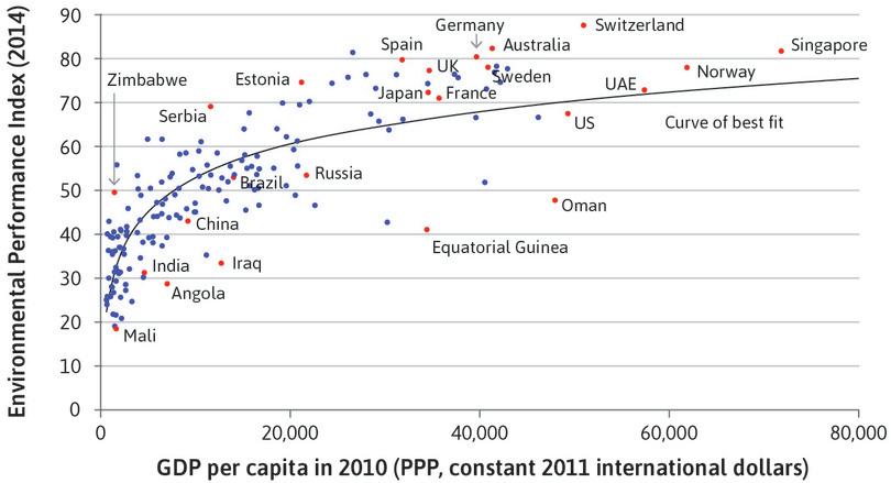
… but so is the quality of their local environment.
Figure 20.25b … but so is the quality of their local environment.
Development indicators; EPI. 2014. ‘Environmental Protection Index 2014.’ Yale Center for Environmental Law & Policy (YCELP) and the Center for International Earth Science Information Network.
Though richer countries emit more CO₂ per capita, they have also adopted more effective policies to manage their own environmental resources, such as forests, soil, biodiversity, and water. Figure 20.25b plots the Environmental Performance Index (EPI) against GDP per capita. The EPI is a broad index of country-level environmental health and ecosystem vitality, including the state of wastewater treatment, fisheries, and forests. It brings together 20 different country-level indicators including trends in carbon emissions, fish stocks, changes in forest cover, quality of wastewater treatment, access to sanitation, air pollution, and child mortality. In this case, a curved rather than straight line fits the data better, indicating that differences in per capita income are associated with major differences in the EPI for very poor countries, but not as major for the richer countries, on average.
As in Figure 20.25a, Russia underperforms, with the Environmental Performance Index expected of a country half as rich. Germany, Sweden, and Switzerland are high performers. Notice that Australia, which is an unusually big emitter of CO₂ (Figure 20.25a), is a top performer on the national environmental amenities measured by the EPI. A good part of the environmental damage done by economic activity in Australia is thus imposed as a cost on those outside the country.
The message of Figure 20.25b is similar to the previous one. Countries, even at similar levels of income per capita, differ greatly in their environmental performance. Compare Switzerland with the US or Spain with Russia, for example. Both India and China are substantially below the line. These country differences suggest the importance of the kinds of policies that are adopted and enforced.
Lessons from the existence of win-win policies
We have introduced many difficult trade-offs confronting environmental policies, for example, between our consumption now and our environmental quality now. But we have also uncovered some evidence of win-win opportunities.
In Figure 20.26, we look again at the estimates of the marginal abatement costs that we previously saw in Figure 20.9. The global abatement cost curve is displayed vertically in Figure 20.26. In Figure 20.9, we only included measures that are costly and would have to be promoted as an objective of government policy. In Figure 20.26, when the monetary benefit is greater than the cost, the bar extends to the left of the vertical axis. When cost is greater, it extends to the right.
All of the actions to the left of the vertical axis in Figure 20.26 would not only accomplish significant abatement, but would also be privately beneficial in the sense that they result in monetary benefits greater than the costs. These are win-win actions because they improve the environment, and their cost savings also allow greater consumption.
Replacing incandescent light bulbs with LED bulbs in our houses is one of these win-win opportunities. It is the most cost-saving policy of all but it is a narrow bar, meaning it does not have a big abatement potential. Fuel-efficient vehicles, insulation in houses and offices, and other technologies with bars to the left of the axis are also cost-saving. Note that if we were only to adopt cost-saving policies between now and 2030, we would still achieve more than a quarter of the total potential abatement shown in the figure.
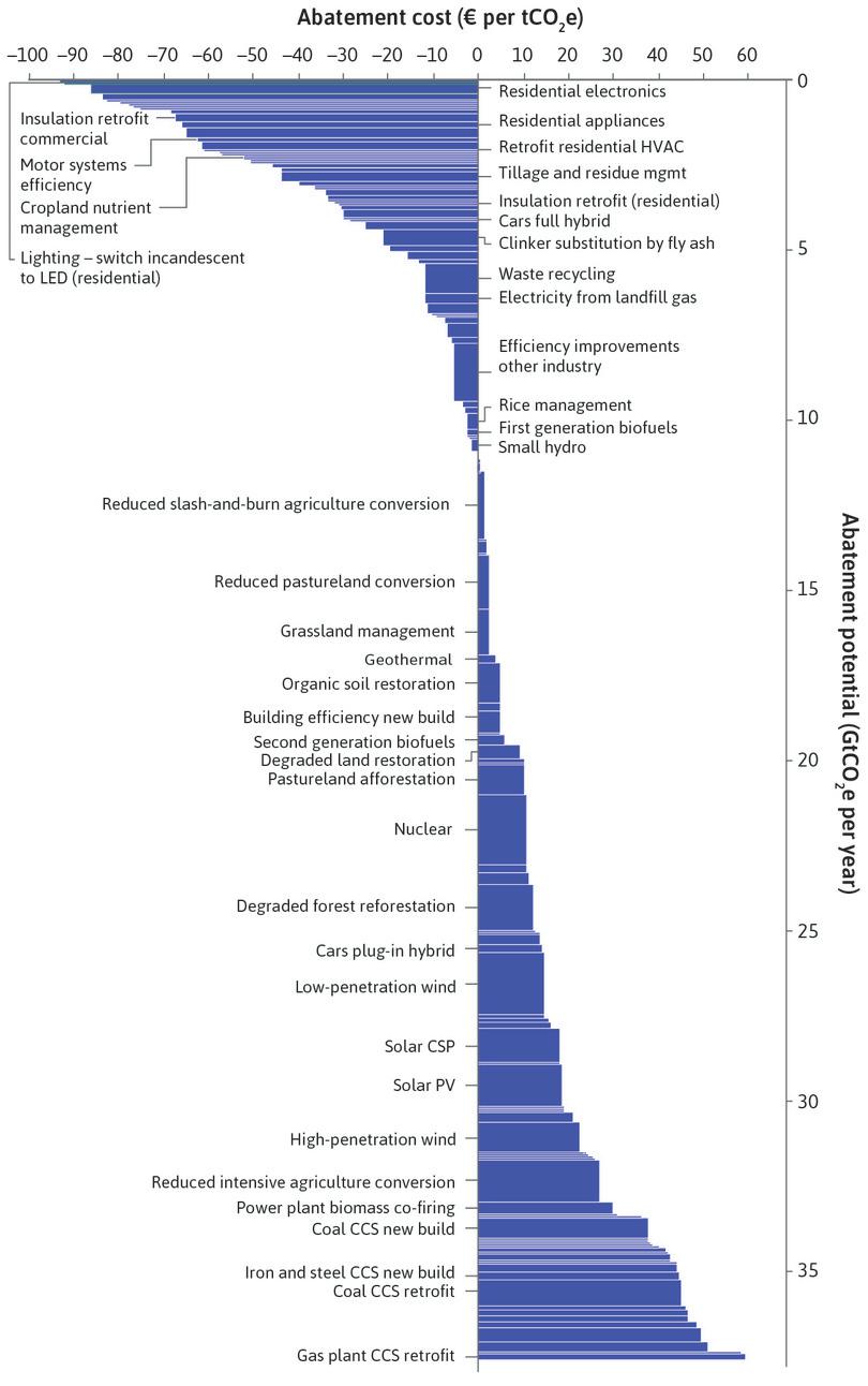
Global greenhouse gas abatement curve: Abatement in 2030, compared with business as usual.
Figure 20.26 Global greenhouse gas abatement curve: Abatement in 2030, compared with business as usual.
McKinsey & Company. 2013. ‘Pathways to a Low-Carbon Economy: Version 2 of the Global Greenhouse Gas Abatement Cost Curve.’ McKinsey & Company.
We can represent the unrealized abatement potential of these changes in the feasible set figure. The dashed line in Figure 20.27 is the feasible frontier that we have been using thus far, which ignored the win-win opportunities shown on the left side of Figure 20.26. The solid feasible frontier takes account of the possible use of these win-win options.
Start at point C on the horizontal axis in Figure 20.27. The evidence from Figure 20.26 is that implementing the measures (starting at the top of Figure 20.26, with replacement of incandescent bulbs by LEDs) will generate abatement benefits and at the same time allow for higher consumption of other goods and services.
This produces the positively sloped part of the feasible frontier, with both environmental quality and consumption rising from C to D. Once all the win-win measures have been introduced, at D, it begins to be costly to achieve further abatement and the feasible frontier is negatively sloped, as we saw when we analysed the implications of Figure 20.9.
The unrealized abatement potential of changes, that would save money for the individuals or firms implementing them, suggests that implementation by market incentives may be slow and incomplete. The fact that environmental benefits could be generated by economic decisions that would provide monetary benefits (not costs) to the decision-maker means mutual gains are feasible but are not being realized. Thus, Figure 20.27 provides another piece of evidence that contemporary economies are often not even close to being Pareto efficient.
These factors point to a primary advantage of policies to make some environmentally harmful practices illegal rather than simply making them more expensive. In those cases where the government has the necessary information and enforcement capacities, implementation can be rapid and complete. An example is the dramatic reduction in the use of lead in petrol in many countries around the world, following a ban. But as we will see in Unit 22, governments often lack the information and administrative capabilities to design and implement effective policies of this kind.
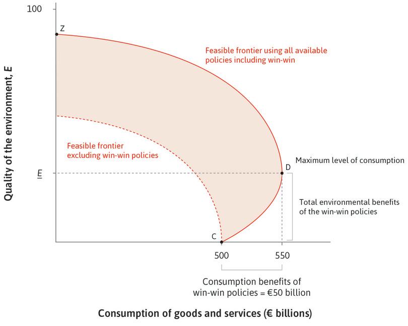
Is there always a trade-off between consumption and environmental quality?
Figure 20.27 Is there always a trade-off between consumption and environmental quality?
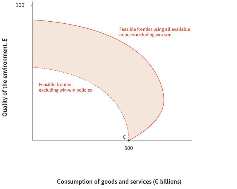
Unrealized potential
We use the feasible set figure to represent the unrealized abatement potential.
Figure 20.27a We use the feasible set figure to represent the unrealized abatement potential.
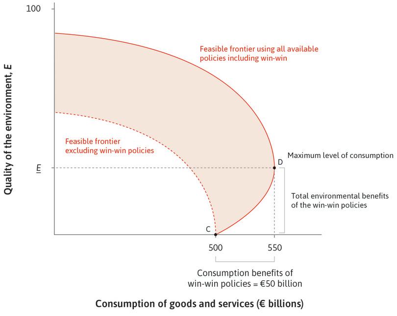
Win-win actions
Moving from C to D takes the quality of the environment up to E. Consumption rises because costs (for example for lighting) fall.
Figure 20.27b Moving from C to D takes the quality of the environment up to E. Consumption rises because costs (for example for lighting) fall.
Implementing abatement along the feasible frontier
Moving from D to Z takes the quality of the environment above E, but at the cost of lower consumption.
Figure 20.27c Moving from D to Z takes the quality of the environment above E, but at the cost of lower consumption.
Is ‘make the polluter pay’ fair?
- polluter pays principle
- A guide to environmental policy according to which those who impose negative environmental effects on others should be made to pay for the damages they impose, through taxation or other means.
Think about the polluter pays principle. This principle can be interpreted as an application of the basic economics of environmental policies. Environmental external effects often impose costs on others, and making the polluter pay for these external effects is a way to internalize (and therefore eliminate) them.
This could be accomplished by taxing the polluting activity so as to equate the marginal private cost with the marginal social cost. This may be an efficient way to abate the pollution. But as we saw in Unit 12, the same abatement could be accomplished by providing the firm with a subsidy for the use of an alternative technology that resulted in a lower level of pollution.
The firm’s view of these two policies may be that the tax is the stick and the subsidy the carrot. The tax, which reflects the polluter pays principle, lowers the profits of the firm. A subsidy raises the firm’s profits. Whether the carrot or the stick is the right policy depends on the feasibility and cost of implementing the subsidy compared to the tax, and whether raising or lowering the income of the target of the policy is desired on fairness grounds.
Seen in this light, the polluter pays principle is not always a good guide to the best policy. Think of a large city in a low-income country in which much of the cooking is still done over wood fires, generating high levels of airborne particulate matter and causing asthma and other respiratory illnesses:
- Fairness: It is mostly poor families who lack the income or access to electricity that would allow them to cook and heat their homes with fewer external environmental effects. In this case, many would object to making the polluters pay on the grounds of fairness, and instead favour subsidizing kerosene or providing a better electricity supply.
- Effectiveness: Subsidizing kerosene is likely to be cost-effective in reducing smog, compared to tracking down and extracting payments from hundreds of thousands of people who are polluting the city’s air with wood fires.
This example is helpful because it shows not only the value of considering fairness as well as efficiency, but also the importance of being clear about which objective we are pursuing when we design policies.
Exercise 20.14 High and low performers
Consider the labelled countries above the best-fit curve in Figure 20.25b and those below it.
- What characteristics about the countries and the way they are governed do you think might explain their status as high and low performers respectively?
- Find out about the environmental policies and political systems of one or more of these countries using the World Bank Development Indicators, the Freedom in The World 2016 data, and your own research. What information from these sources helps you to explain the differences between high and low performers, and how does it help?
Question 20.11 Choose the correct answer(s)
Figure 20.27 is the diagram of the amount abated for the total cost of abatement using different abatement policies.
Based on this information, which of the following statements is correct?
- False. The upward slope indicates that the policies being adopted both increase abatement and consumption.
- False. The optimal policy choice depends on both the feasible frontier and citizens’ preferences. D maximizes consumption and will therefore only be the optimal choice if the policymaker puts no value on abatement.
- False. Assuming that the policymaker values both consumption and abatement, point D will always provide a better outcome than any point on segment CD.
- True. This point corresponds to maximizing consumption and will therefore only be the optimal choice if the policymaker puts no value on abatement. In other words, any indifference curves that are not vertical lines will be tangent to the feasible frontier at a higher level of abatement.
20.11 Conclusion
For 100,000 years or more, humans—like other animals—lived in ways that modified the biosphere but did not substantially and irreversibly degrade its capacity to support life on the planet. Starting 200 years ago, humans learned how to use the energy available from nature (burning carbon) to transform how we produced goods and services, radically increasing the productivity of our labour.
The capitalist economy provided both the carrots and the sticks that made the technological revolution profitable to private firms and hence a permanent feature of our lives. The result was a sustained increase in the output of goods and services per person.
In many countries, the extension of the vote to people who worked as employees, and their organization into trade unions and political parties enhanced the bargaining power and the wages of workers (Figure 2.19). The increasing costs of hiring labour provided ongoing incentives for owners of firms to seek innovations that would use less labour, replacing human labour with machinery and the non-human energy of coal and other fuels that powered them.
In many countries, this process of increased productivity and bargaining power of labour resulted in growing living standards for workers. But the replacement of human labour by non-human energy to power the machines also led to an impoverishment of nature.
A degraded and threatened environment cannot be reversed, however, by the same mechanism that created this affluence. When it came to developing an economically equitable society, workers were their own advocates, and their success in pursuing their private interests of seeking a higher living standard led to wage increases and a pattern of technological change in which less labour was used in production.
You could imagine that a similar process would raise the price of using our natural environment, leading to nature-saving technical change, just as higher wages led to labour-saving innovations. But the biosphere does not have the vote. Political organizations of soon-to-be-extinct animals will not be formed. Future generations of our own species and non-human elements of the contemporary and future biosphere are not capable of advocating for saving nature in the same way that workers indirectly advocated for saving labour, that is, by raising its price.
Public policies to impose prices on the use of nature sufficient to deter the degrading external effects of the production of goods and services today will be propelled not by the silent voices of the biosphere and generations unborn, but by people today, concerned not only about their private interests, but about the preservation of a flourishing biosphere in the future.
Economists along with other scholars can clarify the costs and benefits of alternative environmental policies and practices and help to inform public debate on these policies.
Concepts introduced in Unit 20
Before you move on, review these definitions:
- Abatement
- Abatement policies
- Natural resources and reserves
- Global greenhouse gas abatement cost curve
- Marginal productivity of abatement expenditures
- Price- and quantity-based environmental policies
- Cap and trade
- Contingent valuation
- Hedonic pricing
- Discounting future generations’ costs and benefits
- The polluter pays principle
- Tipping point, disequilibrium process
- Prudential policy
20.12 References
- Ackerman, Frank. 2007. ‘Debating climate economics: the Stern Review vs. its critics’. Report to Friends of the Earth, July 2007.
- EconTalk. 2015. ‘Martin Weitzman on Climate Change’. Library of Economics and Liberty. Updated 1 June 2015.
- Fehr, Ernest and Andreas Leibbrandt. 2011. ‘A Field Study on Cooperativeness and Impatience in the Tragedy of the Commons’. Journal of Public Economics 95 (9–10): pp. 1144–55.
- Freedom House. 2016. ‘Freedom in the World 2015’.
- Nordhaus, William D. 2007. ‘A Review of the Stern Review on the Economics of Climate Change’. Journal of Economic Literature 45 (3): pp. 686–702.
- OpenSecrets.org. 2015. ‘Lobbying Spending Database Chemical & Related Manufacturing’.
- Porter, Michael E., and Claas van der Linde. 1995. ‘Toward a New Conception of the Environment-Competitiveness Relationship’. Journal of Economic Perspectives 9 (4): pp. 97–118.
- Rustagi, Devesh, Stefanie Engel, and Michael Kosfeld. 2010. ‘Conditional Cooperation and Costly Monitoring Explain Success in Forest Commons Management’. Science 330: pp. 961–65.
- Schmalensee, Richard, and Robert N. Stavins. 2013. ‘The SO2 Allowance Trading System: The Ironic History of a Grand Policy Experiment’. Journal of Economic Perspectives 27 (1): pp. 103–22.
- Smith, Stephen. 2011. Environmental Economics: A Very Short Introduction. Oxford: Oxford University Press.
- Stavins, Robert N., Gabriel Chan, Robert Stowe, and Richard Sweeney. 2012. ‘The US Sulphur Dioxide Cap and Trade Programme and Lessons for Climate Policy’. VoxEU.org. Updated 12 August 2012.
- Stern, Nicholas. 2007. The Economics of Climate Change: The Stern Review. Cambridge: Cambridge University Press.
- Wagner, Gernot, and Martin L. Weitzman. 2015. Climate Shock: The Economic Consequences of a Hotter Planet. Princeton, NJ: Princeton University Press.
- Wilkins, Barbara. 1974. ‘Lead Poisoning Threatens the Children of an Idaho Town’. People.com.
- World Bank, The. 2011. ‘The Changing Wealth of Nations’.
- World Bank, The. 2015. ‘Commodity Price Data’.
- World Bank, The. 2015. ‘World Development Indicators’.
-
Gernot Wagner and Martin L. Weitzman. 2015. Climate Shock: The Economic Consequences of a Hotter Planet. Princeton, NJ: Princeton University Press. ↩
-
Stephen Smith. 2011. Environmental Economics: A Very Short Introduction. Oxford: Oxford University Press. ↩
-
Michael E. Porter and Claas van der Linde. 1995. ‘Toward a New Conception of the Environment-Competitiveness Relationship’. Journal of Economic Perspectives 9 (4): pp. 97–118. ↩
-
Ernst Fehr and Andreas Leibbrandt. 2011. ‘A Field Study on Cooperativeness and Impatience in the Tragedy of the Commons’. Journal of Public Economics 95 (9–10): pp. 1144–55. ↩
-
Devesh Rustagi, Stefanie Engel, and Michael Kosfeld. 2010. ‘Conditional Cooperation and Costly Monitoring Explain Success in Forest Commons Management’. Science 330: pp. 961–65. ↩
-
William D. Nordhaus. 2007. ‘A Review of the Stern Review on the Economics of Climate Change.’ Journal of Economic Literature 45 (3): pp. 686–702. ↩
-
Frank Ackerman. 2007. ‘Debating climate economics: the Stern Review vs. its critics’. Report to Friends of the Earth, July 2007. ↩
